Pixel 9Ahow about instead of a redesign, they focus on making stuff better! The keyboard sucks. The autocorrect is gotten way worse. We need a numbers row on top. Apple ai and Siri are just dumb now. Siri can’t even do simple things anymore. This is what’s wrong with Apple now days. I would move to android if there was a decent android small phone. But my mini is the perfect size.
Got a tip for us?
Let us know
Become a MacRumors Supporter for $50/year with no ads, ability to filter front page stories, and private forums.
Apple Announces iOS 26 With 'Liquid Glass' Design, Live Translation, Overhauled Phone App, and More
- Thread starter MacRumors
- Start date
- Sort by reaction score
You are using an out of date browser. It may not display this or other websites correctly.
You should upgrade or use an alternative browser.
You should upgrade or use an alternative browser.
At least if they do I can completely change it.No worry. We'll see Google introduce "Material 4 Glossy" design language for Android in next couple of years.
So I downloaded the Dev Beta 1 and used it for an hour or so. Currently restoring my phone back to iOS 18 so I can restore from physical backup.
I absolutely hated it. It was more usable with Reduce Transparency enabled, but the biggest takeaway is every single green *hurt* my eyes. The border of the green call button hurt to look at. The borders of the icons hurt to look at. The borders of the icons in the calendar app hurt to look at.
I'm the kind of person who always uses public betas, tends to like change, and I've been wanting change for a while. I think VisionOS is gorgeous and the teaser icons from WWDC looked interesting and unique. The actual beta causes so much eye strain that I just can't do it, and I pray it changes by iPhone Air launch. If not, I may have to reduce transparency and change to always-dark modern an attempt to save my eyes.
Attachments

Last edited:
And still no individual volume controls. Why on Earth can’t we have simple level settings for ringtone, alarm, notifications and app audio individually. The iPhone must be the only system that doesn’t allow this. It’s just nuts.
Because that's how we ended up with a U2 album on every single iPhone. A bunch of middle-aged white men thought everybody in the world must love U2 as much as they do.What does race and sex have to do with anything?
This is an example of the bias that can occur. I'm using it to show that there are certain cultural biases at Apple's top-level management. Not all are related to gender and skin colour. But these biases are present, and there's a desperate need for a fresh outlook.
There was windows Aero which was awesome (still best looking windows IMHO) and now we have this which feels like aero but... with readability like 10 times worse wtf...
While Ive is a good designer, even great, I don't think he's up there with the Gods of design. You haven't got to try hard to create a critical evaluation.I think Jony is a brilliant industrial designer who has moved beyond that into areas he doesn't have any particular aptitude for, or useful ideas to offer.
He coasted on a few good ideas for decades, such as the aluminum MacBook Pro. AirPods were essentially the classic iPod/iPhone ear buds but wireless – literally. Yes, iteration is often better than innovation, but there are many who say Ive generated countless fresh design ideas. It just isn't so.
And a lot of the early successes were very much Jobs-Ive coproductions. Yes, Jobs wasn't an industrial designer and Ive undoubtedly contributed more and did all the hard work. But from whom the original concepts and ideas sprouted is a little hazy. And of course, a lot of the design concepts were stolen wholesale from 1950s-era Braun.
There were also quite a few outright failures. The iOS UI colour system, for example, that was quietly dropped over the later releases of iOS. The floating screen iMac G4. The Trashcan Mac Pro. The "composite gold" high-end Apple Watches from the first iterations. The Apple Car, which was said to resemble a loaf of bread on wheels and didn't even make it to market.
Liquid Glass is really lame idea. I hope they'll provide functions in Accessibility to disable all of this. Apple blabbering how it behaves like real glass.
Well liquid glass is kind of difficult to use, because you need at least 800 C to melt it. Cold glass is rather hard to use, brittle, sharp and pretty cumbersome. Which is ideal metaphor for Apple's Liquid Glass UI.
It seems iPadOS menu bar is the only worthwhile update. 10 years too late, but it's finally here.
I have confession to make. Steve Ballmer was right.") I never thought that Vista's Aero will look awesome. Compared to Liquid Glass it does by galaxy length. This whole presentation was super meh. I was getting more an more disillusioned where this is going with every passing minute. Weak.
I never thought that Vista's Aero will look awesome. Compared to Liquid Glass it does by galaxy length. This whole presentation was super meh. I was getting more an more disillusioned where this is going with every passing minute. Weak.
Well liquid glass is kind of difficult to use, because you need at least 800 C to melt it. Cold glass is rather hard to use, brittle, sharp and pretty cumbersome. Which is ideal metaphor for Apple's Liquid Glass UI.
It seems iPadOS menu bar is the only worthwhile update. 10 years too late, but it's finally here.
I have confession to make. Steve Ballmer was right.
I never thought that Vista's Aero will look awesome. Compared to Liquid Glass it does by galaxy length. This whole presentation was super meh. I was getting more an more disillusioned where this is going with every passing minute. Weak.looking forward to try this out. Some places seem rough, but others quite interesting. Difficult to judge. But I have no complaints about notifications, or that they are difficult to read. I have disabled them on my phone no place for them on phone!
no place for them on phone!Google finally did it, Android 16 poops all over this dribble gl@ss.
Even the video showcasing it was aimed at kids, not adults.
Apple are going further down the wrong path.
Even the video showcasing it was aimed at kids, not adults.
Apple are going further down the wrong path.
Material 3 expressive walks all over this hot garbage tbh.No worry. We'll see Google introduce "Material 4 Glossy" design language for Android in next couple of years.
Sorry, but you seem to have missed somethingApple Watch
Apple Silicon
AirPods
Apple Silicon was planned by Jobs when he acquired P.A. Semi in 2008. Yes what a long run and what a genius he has been. Jobs planned the transition to ARM and Apple Silicon.
https://thehustle.co/11102020-apple-chip
The Apple Watch was invented and created by Ivy who had the idea long time ago. Jobs had influence and insight into the project.
https://businessplus.ie/tech/apple-watch-jony-ive/.
The Airpods - just another iPhone "Accessory" like the AirTags, yes they were developed when Tim was CEO, but he hasn‘t had any influence into the product like Steve Jobs would have had
https://as2.ae/who-is-the-inventor-...ANWLKe8jrgdYE55NC7a-oQc0H1IL#Airpods_Inventor
So. Tim Cook is a Sales person. He has excellent knowledge in supply chains and money. But Tim Cook neither is nor has he ever been a product guy. He cares about money, wake up. When he questions himself which direction Apple should take, money is his primary goal. Jobs always wanted to create the BEST product and money will come along naturally if you have the best product.
I always wonder about people thinking that Cook was responsible for anything else than money. He simply seems to have no idea about what the core of Apple is. Easy to use and beautiful technology. Not hundreds of thousands of features, but a reduced feature set that is absolutely bulletproof and easy to use.
Jobs didn't want a dozen different iPhone models. He always wanted the customer to enter the Apple store, buy "the iPhone" and be sure to have the best product in the world.
Tim created lots of different product versions to maximize profit.
Last edited:
It's an absolute joke they hide this stuff away in accessibility. It needs to be an easy to find option that allows you to adjust the amount of transpareny- not just on or offLooking forward to drilling down into accessibility to hopefully disable as much of this as I can. With as many near senior citizens as there are at apple , do they have no idea how much ones eyesight needs more contrast, not less as the years take their toll?
I don’t believe you for a second that you switched to Android just cuz of the announcementsMore and more glad that I went to Android after these announcements.
I have a strange feeling some of this will be peeled back through the next few updatesI'll reserve complete judgement for now, but I'm not a fan. You can't look at any of that and call it tasteful. I wish they'd gone a completely different way and introduced something new and innovative that was genuinely a game changer. I really am not looking forward to staring at this on my screen(s) for the next ten years...
It is not that
In an OS I don't need any glass refractions that only eat computing power and make thing harder to recognize/read. We already had an animation overkill in the skeuomorphic area of macOS. This is against Apples own design principles and Apple should drop this approach as fast as they can.
The "no" refers to your "I don’t think it really matters what Apple does, ". It is just Apple continues to walk on the wrong path. Instead of changing their business fundamentally in order to realize that reality has changed, they are killing the usability of their OS by putting lipstick on the pig.Sorry, I might be misunderstanding, but ‘nope’ at what exactly? I’m not sure my original post had a yay or nay response. Could you elaborate?
In an OS I don't need any glass refractions that only eat computing power and make thing harder to recognize/read. We already had an animation overkill in the skeuomorphic area of macOS. This is against Apples own design principles and Apple should drop this approach as fast as they can.
Well you would be correct. I have already switched, and now I'm even more glad I did. I think it's pretty clear to understand.I don’t believe you for a second that you switched to Android just cuz of the announcements
Apple must have invested in prescription glasses and contacts to introduce so much eye strain.
Here was me hoping we’d get some much needed feature improvements to apps people actually use, scheduled alarms for example (not just repeat on X day/X time) or hell the ability to have two audio sources playing at once, or at least the ability to watch one thing muted with the audio of another playing. If both have audio output you’re out of luck currently even if you mute the one you don’t want to listen to. I’d like the ability to PIP any video source also.
Instead we get Genmoji and Image Playground “enhancements” and the ability to make text harder to read, great job Apple!
VisionOS needs transparency because of the use case, you need to be able to see what is behind your windows so you can see your surroundings, there’s no use case for transparency on app icons or notification windows on a phone. Furthermore, iOS seems to be getting slower and less responsive and Android is plugging that gap, so Apple’s solution is to introduce a more memory intensive UI? *slow clap*
I haven't seen the full keynote yet, but...
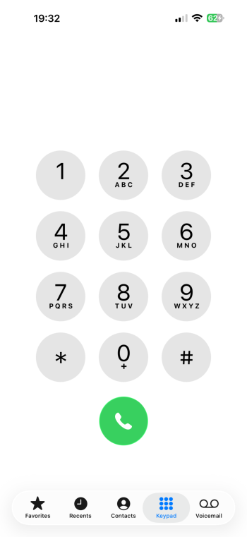
While I kind of like the liquid look, I already very much dislike the new contact 'feature' that puts my Favorites to the top where is it very hard to reach for me.
And Safari - I really hope that there will be an option to put the address bar back to the top and not have favorites buried two clicks away...
I'm gonna watch the rest now. 😉
Edit: OK, good news. The Phone app layout is apparently optional and in Safari we will have three choices for the tab bar. Yeah!
Last edited:
No: it's not an actual material: it's a virtual screen effect, designed to imitate something in reality. Isn't there a word for that?Liquid Glass is a translucent material
This is so hideous… aqua design was cool when we had OS X - but that is the worst design of interface that Apple has done in a long time…. I hate the fact that we will have to adopt the design without having a choice. Will make my Apple devices look like kindergarten and the fact that I am getting older I would have appreciated contrast - but heck who thought photoshop 3 bevel and emboss, background blur and drop shadows were dead- think again 🤮
Register on MacRumors! This sidebar will go away, and you'll see fewer ads.