Got a tip for us?
Let us know
Become a MacRumors Supporter for $50/year with no ads, ability to filter front page stories, and private forums.
Apple Executives Talk About iPhone 14 Pro's Dynamic Island in New Interview
- Thread starter MacRumors
- Start date
- Sort by reaction score
You are using an out of date browser. It may not display this or other websites correctly.
You should upgrade or use an alternative browser.
You should upgrade or use an alternative browser.

ct2k7
macrumors G3
Apologies, to me the pill and DI are the same thing, because effectively, it’s a pill shape that expands and contracts and sometimes expands downwards and or sideways.Did you even read what I posted, or how you worded your question?
You asked what I used “the pill” for. The pill itself is the hardware, not Dynamic Island. I use that by not using it, it’s hardware for the front facing camera and Face ID (selfies and unlocking device).
I gave you an example above what I would “use” DI animations for if I had multiple apps running. But now that I think about it, I use it mostly for entertainment. I like throwing in my AirPods and calling someone just to watch the voice animation. Easily entertained.
👊😉👍
Yikes…Did you even read what I posted, or how you worded your question?
You asked what I used “the pill” for. The pill itself is the hardware, not Dynamic Island. I use that by not using it, it’s hardware for the front facing camera and Face ID (selfies and unlocking device).
I gave you an example above what I would “use” DI animations for if I had multiple apps running. But now that I think about it, I use it mostly for entertainment. I like throwing in my AirPods and calling someone just to watch the voice animation. Easily entertained.
👊😉👍
Dynamic island is truly terrible design.
klasma
macrumors G4
People complained about the notch being distracting and cutting into the usable screen area. I’m not sure the DI is solving those issues…It's a great solution to an issue that so many people have whined about. Sadly, I expect that will continue, though.
In a new interview, Apple's senior vice president of software engineering, Craig Federighi, and Apple's vice president of human interface design, Alan Dye, sat down to discuss the thinking behind the iPhone 14 Pro's Dynamic Island and how it was developed.
During the interview with the Japanese magazine Axis, Federighi, who oversees the development of iOS, said Dynamic Island represents the first major user experience change for the iPhone since the iPhone X five years ago.
Dye, who presented Dynamic Island during Apple's "Far Out" event last month, said Dynamic Island further blurs the line between where the hardware ends and the software begins on iPhone, calling it an example of "Apple-like development."

Because they literally have nothing better to talk about.
Speaking about where the idea of Dynamic Island originated from, Dye said that the team thought about what the extra space at the top of the display could be used for, thanks to the smaller TrueDepth camera system.
Dye said the status bar area is a small yet crucially important part of the iPhone experience. "It is an area where our hard work put into every pixel has a very big effect," Dye said. "So, there was a story about doing something more special in this area anyway. Something that is very elegant, yet very useful."
Federighi noted that during the iPhone 14 Pro's event at the Steve Jobs Theater at Apple Park, there was an audible sense of surprise when Dynamic Island was revealed for the first time, saying that he had the same reaction when he saw it for the first time internally. "Personally, I felt as if there was a new life-saving identity on my iPhone," Federighi said. "It's a very delicate animation effect, but it's a little different from anthropomorphism, but I think it gave the iPhone a new strong personality and vitality."
Since its introduction, Dynamic Island has received positive reactions from users and customers online, with some calling it one of Apple's best designs in years. Already, some Android makers are looking to replicate the Dynamic Island experience on other smartphones.
Article Link: Apple Executives Talk About iPhone 14 Pro's Dynamic Island in New Interview
hagjohn
macrumors 68000
Once we see 3rd parties developing for DI, I think we can then decide if it a win or a loss. At this point, we do not know that yet. In the mean time, we need OS bug fixes badly.
Mac Fly (film)
macrumors 68040
needsomecoffee
macrumors 6502a
What is the area size of the pill vs. notch ?? Seems like they moved the notch down into the screen creating a noticeable set of zombie pixel rows above it. Rounded the ends, and built a UI around it. Happy that folks love the Island, but it seems less radical than one thinks, and if they did not need the row of zombie pixels then flash vs. substance (IMHO).
Hahaha this is hilarious.DI feels "blah" right now because third-party apps haven't gotten to really take advantage and all of Apple's apps haven't even made use of it.
Give it time and watch all the creative ideas people have for it.
Buddy even Apple’s designs are insanely distracting. I can’t imagine how awful third-parties will do with it.
It’s a disastrously awful design and I’d make it a million times better.
Has to be static if it’s in the status bar and it has to not have distracting contrast like the giant orange against black as seen with the Timer.
Pathetic design
Yeah that would be a real shame.I 100% agree. I just hope it’s a total success for Apple and DOES NOT end up like Touch-Bar. 🙏
FattiesGoneWild
macrumors 6502a
It’s so lame and gimmicky to constantly tout this. They make this sound like it’s a must have groundbreaking feature. I showed a couple people on my 14 Pro Max and they said that’s it? Chuckled and rolled their eyes.
Alex3917
macrumors newbie
> At Apple, it's very difficult to trace the source of ideas.
I dunno, it looks almost exactly like what Bret Victor (a former Apple employee) is describing in his Magic Ink book. And its name is almost exactly the same as the name of the consulting company he founded after he left Apple, Dynamic Land.
I dunno, it looks almost exactly like what Bret Victor (a former Apple employee) is describing in his Magic Ink book. And its name is almost exactly the same as the name of the consulting company he founded after he left Apple, Dynamic Land.
Kabeyun
macrumors 68040
No! Say it isn’t so!Already, some Android makers are looking to replicate the Dynamic Island experience on other smartphones.
Eldaerenth Faexidor
Cancelled
I love DI, it feels sophisticated and it’s nice and subtle. Great stuff!
It’s fluid. Makes using the iPhone “new” again. Love it and want more functionality
bettaboy123
macrumors regular
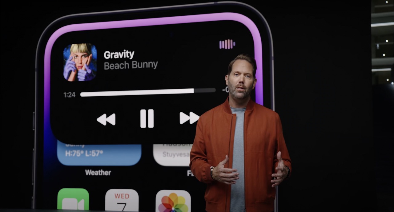
I like it better than the notch but it’s certainly not life-changing. It’s kinda nice to be able to just jump straight into my podcast or audiobook and skip forward/back if needed or quickly tapping into the playback controls for whatever I’m playing on the Apple TV without swiping down into the remote in Control Center. But it’s not being used for much else than media controls right now, which is fine, but I’m hoping it gets more functionality from developers.
dumastudetto
macrumors 603
I see Dynamic Island as a paradigm shift in modern-day computing. And, you know, we're just getting started.
pinkkie
macrumors regular
it's just a glorified app switcher - bigger gimmick than the touchbar
I think this may move beyond notifications. I feel this is a stepping stone to the display covering the sensors when they are not needed. The Dynamic Island could provide an elegant way to uncover the sensors. I hope this is the direction in the next few years. I don’t care about folding phones, but having the sensors blend in more would be an amazing next step in form-factor evolution.
nwcs
macrumors 68030
You make some bold assertions. Beyond just saying “it’s bad” perhaps you can detail precise why it’s bad and any professional qualifications you have that lend more weight to your opinion being anything beyond simply your opinion.Yikes…
Dynamic island is truly terrible design.
antiprotest
macrumors 601
I was not blown away by the initial presentation at all, and was puzzled at how everyone was so easily impressed. But perhaps I was too cynical because the dynamic notch turned out slightly more useful and pleasant than I expected. And I assume that it will become even more useful. It's been LESS THAN A MONTH since it came out.I feel like people give it too much credit. I was blown away by the reveal like everyone but essentially, it’s just a different way to show notifications. The interactions with it are mostly optional. It’s a UI change, not UX!
Squillace
macrumors 6502
The only ting i see is like apple saying “look at us…we have found a way to hide our big black pill in the screen”…rather then making a small pinhole for the camera and making fingerprin reader under the screen like all the other mobile manufactures…
apple was once an innovative company and esthetic company…..now it’s just old wine in old bottles…boring an predictable
So... you would like Apple to innovate by doing the exact same thing "like all the other mobile manufacturers"?
So... if Apple is so predictable, did you see Dynamic Island coming?
This is just pathetic.
Apple made it clear that FaceID is part of their future. TouchID is most likely not going back. And for now, FaceID can't be hidden inside a small pinhole. The tech requires more physical space than that. Dynamic Island exists to make things around it less boring.
The Dynamic Island is garbage and unintelligent design. It is pure distraction and I’m embarrassed the designers are so inept.
The STATUS BAR NEEDS TO BE STATIC. IT NEEDS TO BE SUBTLE. IT NEEDS TO NOT DISTRACT.
No it doesn't. None of us has the absolute need to have the hours of the day, the name of the cellular carrier, the percentage of the battery or the Wi-Fi signal indicator, visible all the time under all circumstances. It's ok if for a few seconds the "T-Mobile" indication goes away. It's ok if for a few seconds you don't see that your Wi-Fi is 3 bars strong.
Last edited: