Become a MacRumors Supporter for $50/year with no ads, ability to filter front page stories, and private forums.

MacRumors

macrumors bot
Original poster
Apr 12, 2001
63,558
30,889


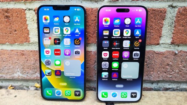
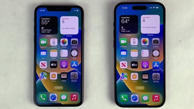
With the iPhone 14 Pro models in 2022, Apple introduced the Dynamic Island, which can morph and expand to display system alerts, sports scores, and a variety of other information. The feature makes the space surrounding the front camera and Face ID sensors useful compared to the notch on older iPhone models.
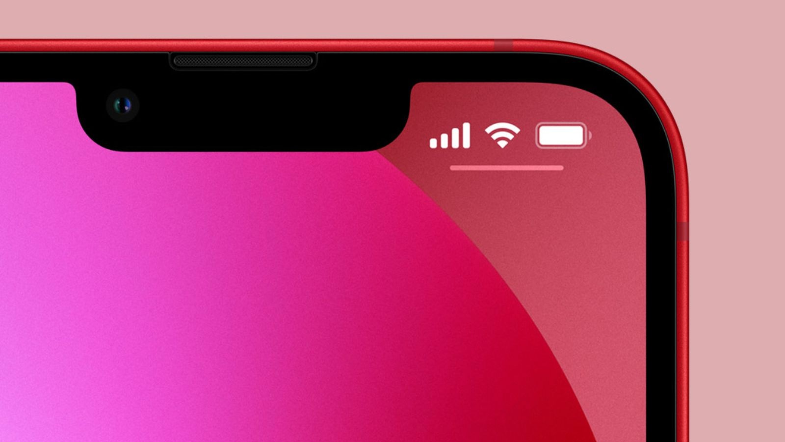
iPhone-Notch.jpg

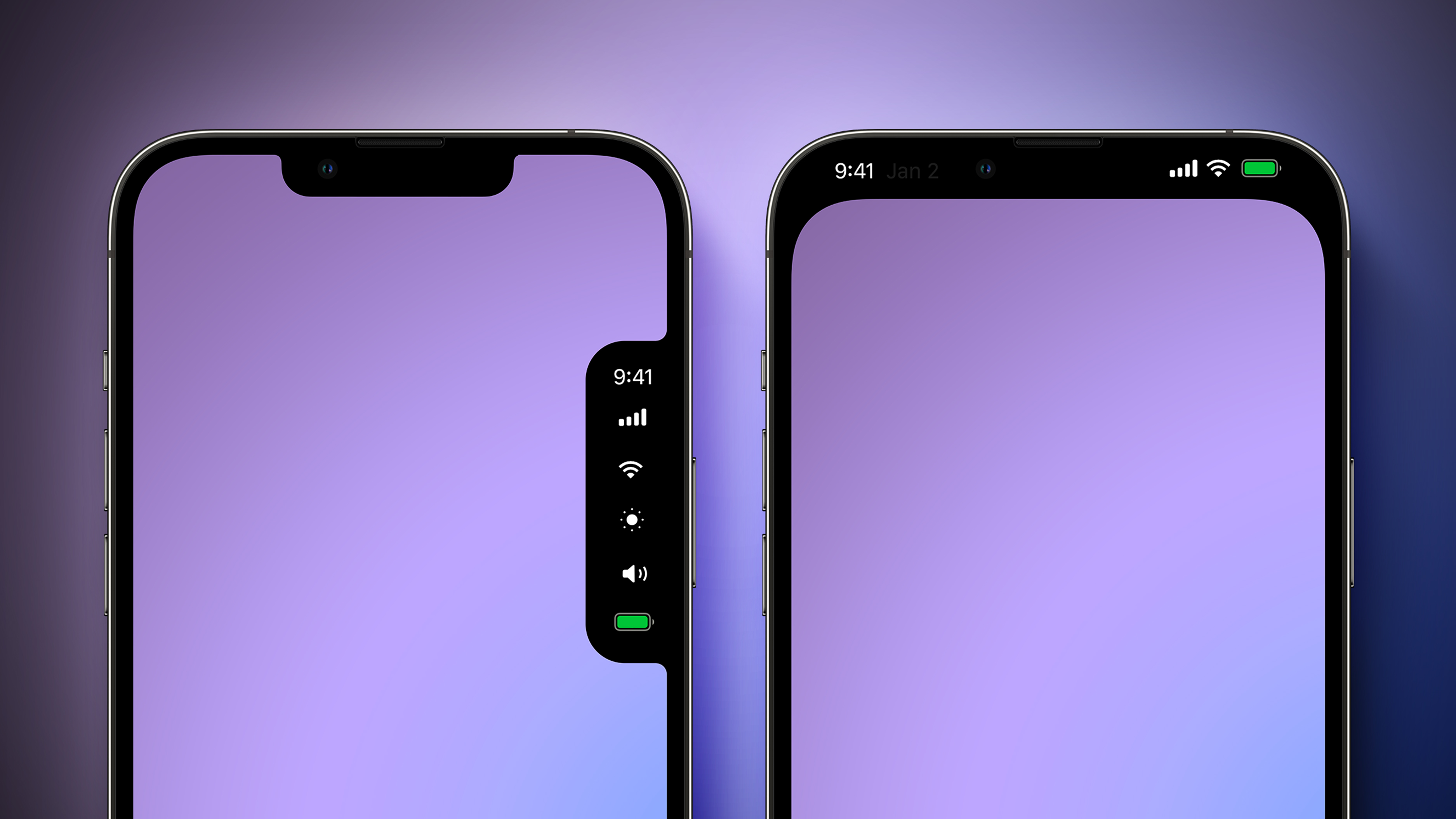
Apple explored a variety of ideas for the iPhone's notch area over the years before arriving at the current Dynamic Island design, according to information obtained by MacRumors. We recreated the images below based on our source material to provide a never-before-seen look at some of the concepts that Apple considered.

Before the Dynamic Island, Apple explored a popover menu on the right side of the screen that would have provided users with quick access to the time, cellular signal and Wi-Fi strength, display brightness, volume, and battery charge level. The menu essentially looks like a second notch, and it would disappear when not in use.

Another idea that Apple considered was hiding the notch with an all-black status bar area at the top of the screen. OLED displays show the color black by turning off individual pixels, so this design would have contributed to battery life savings.
Alternate-Notch-Design-Mock-Feature.jpg

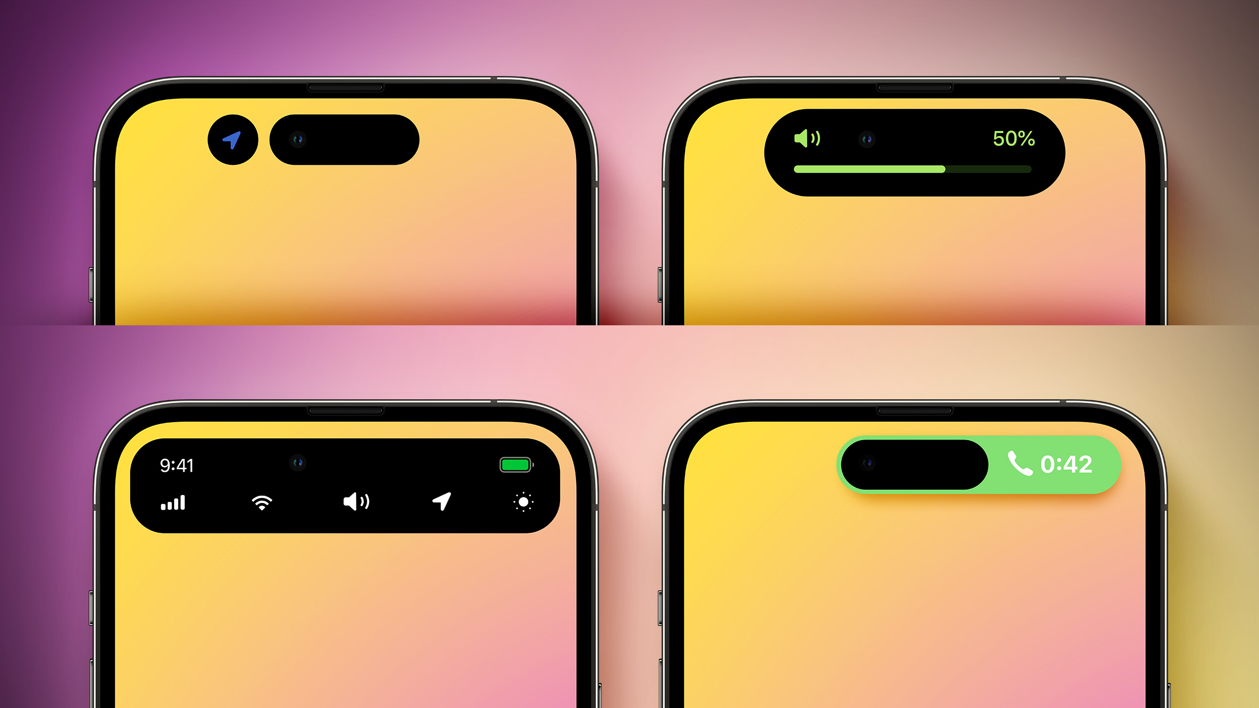
Apple later came up with the idea of the Dynamic Island, and it explored a variety of different designs for this, as pictured below.

Apple initially made the Dynamic Island permanently elongated across the top of the screen, before deciding that it would be less intrusive if it changed size as necessary. Apple also considered showing volume and a full row of system shortcuts in the Dynamic Island, tested a never-used layout for ongoing phone calls, and more.
Alternate-Dynamic-Island-Design-Mock-Feature.jpg

Apple has since expanded the Dynamic Island to all iPhone 15 models, while it continues to sell the iPhone 13, iPhone 14, and iPhone 14 Plus with a notch. Rumors suggest that Apple eventually plans to move the iPhone's front camera and Face ID sensors under the display, but this transition is not expected to begin until next year at the earliest.

Article Link: Apple Explored These Notch and Dynamic Island Designs for iPhones
 
Last edited:

Marty80

macrumors 6502
Sep 17, 2015
411
386
Melbourne
Man hiding the notch with an all-black status bar area at the top of the screen was the best option.

As the time, battery, wifi etc indicators where more visible & the notch was less pronounced.

I will not buy a iphone until the face id camera gets removed, as the full dynamic island looks hideous.
 

JPack

macrumors G5
Mar 27, 2017
12,556
23,271
Some of these supposed designs seem like a joke, especially the purple ones. Makes you question the legitimacy of the source.

A popover that takes more screen real estate and doesn't always show the clock? How annoying is that?

A top black bar that looks like a cheap Android device? After all the expense Apple went through to get all around slim bezels, they propose a top black bar?

A "permanently elongated" Dynamic Island? Why would Apple shrink the cutout from notch to island, then decide to elongate it?

I don't think so.
 

bodhisattva

macrumors 6502
Dec 7, 2008
251
357
Personally, I think expanding the notch would have been the winner (without the radii). Close to the rounded one near the top of the original post.

View attachment 2352415
So basically go back to a slight variations of every iPhone screen pre-iPhone X. Progression.. one step each version closer to the true full screen with cameras behind the glass.
 

Attachments

  • phone.png
    phone.png
    1.9 MB · Views: 242

zachz

macrumors regular
Jun 18, 2012
242
784
I’m at a loss with Dynamic Island, unsure whether I like it or not.

Having gone from the iPhone 7 Plus to iPhone 12 mini (first notched iPhone for me), to the 13 mini, I didn’t like it at first but then it became standard and I didn’t mind it. I then went from the mini to a Fold 3 and S24+, and I got to like the hole punch after a while.

Now, I’m back to iPhone with the 15 Pro Max and the Dynamic Island just seems so intrusive compared to the hole punch and notch. I think it’s because the status bar beside the notch has a similar function to the MacBook’s notch, whereas the DI seem like it’s just stamped in the middle of the top portion of a screen. Idk maybe I’ll get used to it.

That being said, I love the software features of the DI. I wish I could disable the top part of the island, similar to the notch on that pixel phone that came out around the iPhone X time lol
 

dmk1974

macrumors 68020
Sep 16, 2008
2,389
464
Some of these supposed designs seem like a joke, especially the purple ones. Makes you question the legitimacy of the source.

A popover that takes more screen real estate and doesn't always show the clock? How annoying is that?

A top black bar that looks like a cheap Android device? After all the expense Apple went through to get all around slim bezels, they propose a top black bar?

A "permanently elongated" Dynamic Island? Why would Apple shrink the cutout from notch to island, then decide to elongate it?

I don't think so.
The dynamic island sucks up way more usable screen real estate than a shallower "forehead". Having pixels at the top between the collapsed island and the top bezel is just dumb. Might as well keep the notch and expand it if desired.
 

NT1440

macrumors G5
May 18, 2008
14,674
21,117
Some of these supposed designs seem like a joke, especially the purple ones. Makes you question the legitimacy of the source.

A popover that takes more screen real estate and doesn't always show the clock? How annoying is that?

A top black bar that looks like a cheap Android device? After all the expense Apple went through to get all around slim bezels, they propose a top black bar?

A "permanently elongated" Dynamic Island? Why would Apple shrink the cutout from notch to island, then decide to elongate it?

I don't think so.
With the care that Apple put into giving the Dynamic Island a fun “personality” with its animation style, I sincerely doubt there was ever any other serious contenders for the design.

People here poo-poo it, but any person I’ve witnessed see the Dynamic Island for the first time (4 or 5 colleagues at work), you can see a flicker of amusement.

It kind of has that “alive” feel that stuck out to me interacting with macOS for the first time. The genie effect on minimizing to the dock spoke to me about how much of the difference in “feel” there is between windows and macOS at the time.

I think the Dynamic Island has that same kind of effect on newcomers to the iPhone 🤷‍♂️

I strongly believe this is the kind of thing Jobs was speaking to when he discussed Apple as being a company at the intersection of technology and the arts.
 

JPack

macrumors G5
Mar 27, 2017
12,556
23,271
The dynamic island sucks up way more usable screen real estate than a shallower "forehead". Having pixels at the top between the collapsed island and the top bezel is just dumb. Might as well keep the notch and expand it if desired.

The Dynamic Island isn't perfect, but it makes iPhone far more immersive than the notch simply because the active display area is bigger. Yes, the Island sits a half dozen pixels lower, but developers have gotten used to designing apps outside that top area for years now.

SSkAPZXkt99zKoN5fAf93Q.jpg
maxresdefault.jpg
 

JPack

macrumors G5
Mar 27, 2017
12,556
23,271
Personally, I think expanding the notch would have been the winner (without the radii). Close to the rounded one near the top of the original post.

View attachment 2352415

Your design would make the entire Apple design team cry.


coolfactor

macrumors 604
Jul 29, 2002
7,075
9,749
Vancouver, BC
The dynamic island sucks up way more usable screen real estate than a shallower "forehead". Having pixels at the top between the collapsed island and the top bezel is just dumb. Might as well keep the notch and expand it if desired.

I'm surprised that they didn't extend the animated island to notch phones, too. But I guess they needed some competitive advantage to encourage upgrades.
 

tgwaste

macrumors 68000
Sep 18, 2013
1,742
3,449
I know it means less screen real estate, but I much prefer the right-side purple one. Yes, I've "gotten used to it," but the notch is still a design crime.
Well.. if they would let us customize the springboard stuff like this could be doable anyway.. but that d4mn homescreen still looks the same from the very first freaking day of the iphone and it makes me so so mad. We should at least have basic stuff by now
- grid size
- remove lables
- placement anywhere
but nooooooo..
 
Register on MacRumors! This sidebar will go away, and you'll see fewer ads.