When the DI starts to disappear into the “sea of pixels” surrounding it I will call it global warming.I wonder what will happen when Apple decides to go full android with the circular cutout with either the 17 Pro or 18 Pro as some of the rumors indicate. I can see some people complaining about how the iPhone now looks like an Android phone when that change happens.
Got a tip for us?
Let us know
Become a MacRumors Supporter for $50/year with no ads, ability to filter front page stories, and private forums.
Apple Explored These Notch and Dynamic Island Designs for iPhones
- Thread starter MacRumors
- Start date
- Sort by reaction score
You are using an out of date browser. It may not display this or other websites correctly.
You should upgrade or use an alternative browser.
You should upgrade or use an alternative browser.
Wish they could have done that one the laptops as well. I'm running my MBP 16" at 2056x1258 (effectively skipping the use of the top area with the notch) because of all the stuff in the menu bar that got hidden under the notch.Man hiding the notch with an all-black status bar area at the top of the screen was the best option.
That option with the sides of the top bezel blacked out is seriously ugly. Looks like a Pixel 4, which was a real munter (presumably because Google couldn’t fit the technology into a smaller space, so had to make the device ugly to make it all fit).
The dynamic island sucks up way more usable screen real estate than a shallower "forehead". Having pixels at the top between the collapsed island and the top bezel is just dumb. Might as well keep the notch and expand it if desired.
They should have left the camera (and other sensors) above the screen entirely. The obsession of having (almost) no bezels is stupid.
I find the upper part of the screen kind of troublesome already. Notification banners covering buttons of apps; inadvertently touching banners that suddenly pop up while navigating through menus of an app (or website) that are so often in the same position. That has made me disable most notification banners and use the notification center (and sounds) instead.
Exactly. The thing I have found most baffling about the whole DI thing is that it just looks like an unnecessary self-inflicted wound in terms of complexity. To me it looks like someone at Apple decided to go whole hog “form over function” to justify removing all bezels for an edge2edge screen, moving the camera inside the display area, which then called for all the necessary adjustments at the OS and API level to deal with that. Then they had to try to make it attractive (convince developers to use it) and DI was born.True, true. But dynamic island can exist without the slot. Except it can not be there when not needed, and not be jet black when it is 👍
A plain rectangular screen in no way precludes experimentation with novel notification paradigms and the placement of such elements. Now that kind of exploration is restricted, at least for the foreseeable future, because they decided to punch a hole in the display. SMH
I find it strange why so many people are so fond of face id. Not having it wouldn’t be to bad.
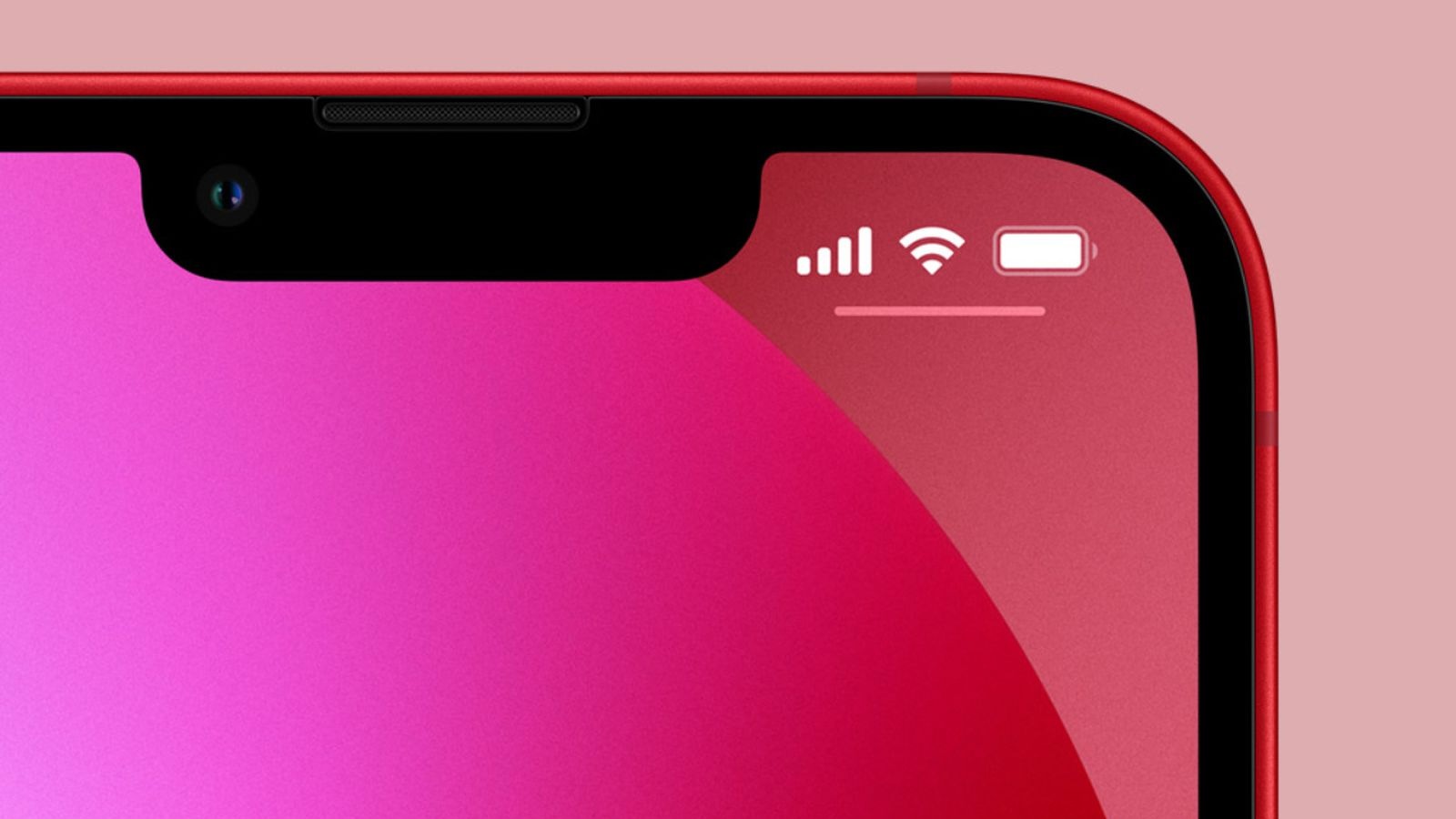
With the iPhone 14 Pro models in 2022, Apple introduced the Dynamic Island, which can morph and expand to display system alerts, sports scores, and a variety of other information. The feature makes the space surrounding the front camera and Face ID sensors useful compared to the notch on older iPhone models.
Apple explored a variety of ideas for the iPhone's notch area over the years before arriving at the current Dynamic Island design, according to information obtained by MacRumors. We recreated the images below based on our source material to provide a never-before-seen look at some of the concepts that Apple considered.
Before the Dynamic Island, Apple explored a popover menu on the right side of the screen that would have provided users with quick access to the time, cellular signal and Wi-Fi strength, display brightness, volume, and battery charge level. The menu essentially looks like a second notch, and it would disappear when not in use.
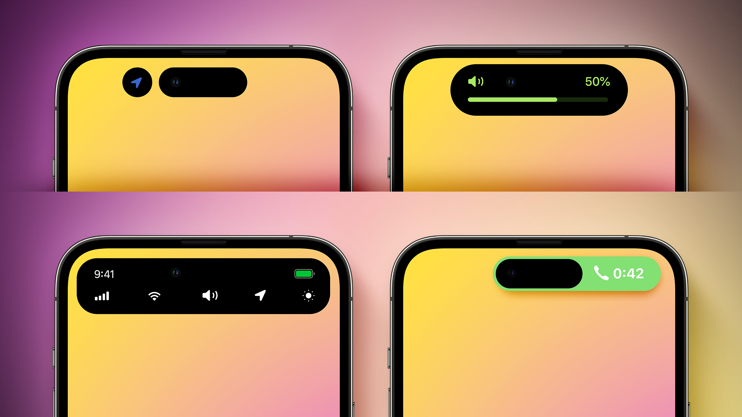
Another idea that Apple considered was hiding the notch with an all-black status bar area at the top of the screen. OLED displays show the color black by turning off individual pixels, so this design would have contributed to battery life savings.
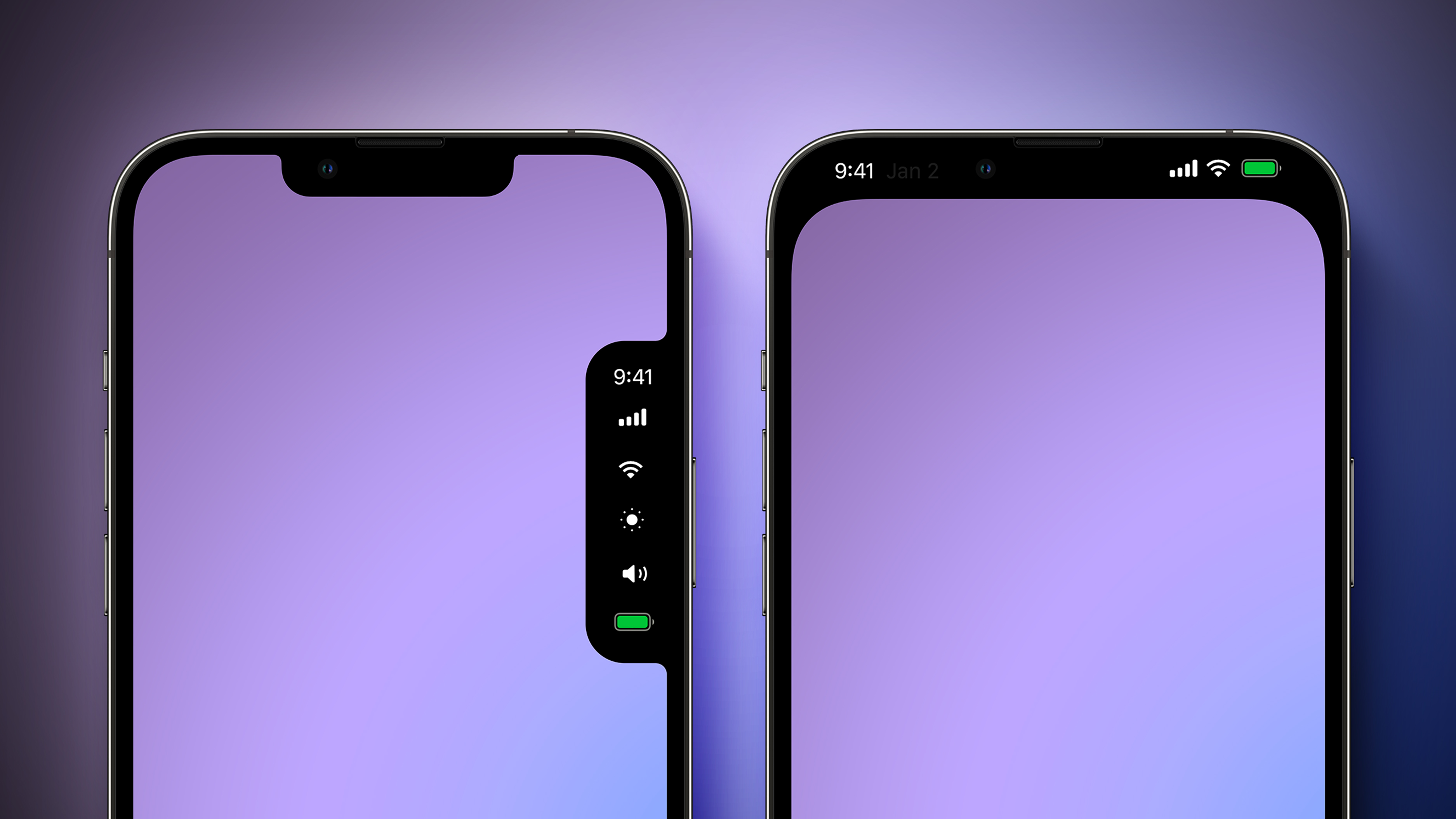
Apple later came up with the idea of the Dynamic Island, and it explored a variety of different designs for this, as pictured below.
Apple initially made the Dynamic Island permanently elongated across the top of the screen, before deciding that it would be less intrusive if it changed size as necessary. Apple also considered showing volume and a full row of system shortcuts in the Dynamic Island, tested a never-used layout for ongoing phone calls, and more.
Apple has since expanded the Dynamic Island to all iPhone 15 models, while it continues to sell the iPhone 13, iPhone 14, and iPhone 14 Plus with a notch. Rumors suggest that Apple eventually plans to move the iPhone's front camera and Face ID sensors under the display, but this transition is not expected to begin until next year at the earliest.
Article Link: Apple Explored These Notch and Dynamic Island Designs for iPhones

Besides having no notch a iphone with one or more fingerprintreaders would have a few downsides but even more upsides in user friendliness.
Downside would be: gloves don’t work when unlocking your phone (but your screen also does not react to gloves so you have to take them off anyways)
Upsides would be:
-You could unlock your phone in your pocket.
-You would never have to re angle it to hit your face right when using it to pay etc.
-You could unlock your phone with any type of sunglasses.
-Your phone could have a perfect screen without notches or dynamic floating notches.
In several situations faceid isn’t very convenient. I for example must unlock my iphone to make Siri do certain tasks (for security reason i have this setting enabled) and being able to reach into my pocket whilst cycling and unlocking my phone through a fingerprint reader in the power button would have bean very convenient. Often face id does not recognise my face when i want to read when lying on my side. I then have to lift my head awkwardly or position the phone high up in a unnatural position to uock it.
The dynamic island is actually more in your face then the notch. It basically is a moved down notch that twitches and grows into a mega notch. The ‘old notch’ really is not that visible when looking at the center of the screen.
I find it actually really strange that apple accepts the ugly notch and all the compromises they are making designwise to have face id in their iphones.
Makes me almost think that there must be a reason for apple doing all this other then creating a user friendly product. Money? Maybe they do plan to use our facedata in the end?
It wouldn’t surprise me if in 10 years time something pops up, the societal standards have changed and suddenly Apple does take our face data off device to make money with it. Just some good ‘reasons’ needs to be made up for it and no one can do anything about it because the face data of bilion humans already is there, waiting for them on their iphones.
By then the frog has been cooked slowly and it will be a breeze to monetise on the ‘feature’.
Facial monitoring to ‘help ai understand our emotions’ will probably also be normalised by then.
Anyone similar thoughts?
Last edited:
Well androids don’t have notchesI thought that looked like the display of a cheap android phone...
I think it’s good the way it is, I don’t like it on the right side.
With the iPhone 14 Pro models in 2022, Apple introduced the Dynamic Island, which can morph and expand to display system alerts, sports scores, and a variety of other information. The feature makes the space surrounding the front camera and Face ID sensors useful compared to the notch on older iPhone models.
Apple explored a variety of ideas for the iPhone's notch area over the years before arriving at the current Dynamic Island design, according to information obtained by MacRumors. We recreated the images below based on our source material to provide a never-before-seen look at some of the concepts that Apple considered.
Before the Dynamic Island, Apple explored a popover menu on the right side of the screen that would have provided users with quick access to the time, cellular signal and Wi-Fi strength, display brightness, volume, and battery charge level. The menu essentially looks like a second notch, and it would disappear when not in use.
Another idea that Apple considered was hiding the notch with an all-black status bar area at the top of the screen. OLED displays show the color black by turning off individual pixels, so this design would have contributed to battery life savings.
Apple later came up with the idea of the Dynamic Island, and it explored a variety of different designs for this, as pictured below.
Apple initially made the Dynamic Island permanently elongated across the top of the screen, before deciding that it would be less intrusive if it changed size as necessary. Apple also considered showing volume and a full row of system shortcuts in the Dynamic Island, tested a never-used layout for ongoing phone calls, and more.
Apple has since expanded the Dynamic Island to all iPhone 15 models, while it continues to sell the iPhone 13, iPhone 14, and iPhone 14 Plus with a notch. Rumors suggest that Apple eventually plans to move the iPhone's front camera and Face ID sensors under the display, but this transition is not expected to begin until next year at the earliest.
Article Link: Apple Explored These Notch and Dynamic Island Designs for iPhones

You’ve obviously never worked in design as good designers explore all options before selecting the best one. Best is subjective of course, but I prefer the Dynamic Island over the all black forehead.Who ever does Apple‘s software design esthetic needs to be fired for coming up with those option…🤮
Side comment, it’s interesting that none of these alternates ideas were the dot + pill design MacRumors kept showing prior to the DI reveal. The closest to it is that one with can show the location icon dot in addition to the wider island.
This is what the MacBook notch contains; its debatable whether Apple could have the screen in front of those empty screw holes without making the lid thicker.Okay, I understand the notch on the iPhone because of the Face ID sensor. However, even though the MacBook doesn't have a Face ID sensor, I definitely don't understand why it's such a big notch. On a MacBook, a notch like this would be enough.
View attachment 2352551

…how much stuff do you have to have in the menubar to have the notch be a problem? Usually that area is dead spaceWish they could have done that one the laptops as well. I'm running my MBP 16" at 2056x1258 (effectively skipping the use of the top area with the notch) because of all the stuff in the menu bar that got hidden under the notch.
Apple isn’t just iterating away from notch to notch-lessness to address current hardware limitations.
It is concurrently introducing us to a future of fully free-floating, multi-dimensional, fully customizable Dynamic Islands of varying shapes, colors and sizes that pop-up and disappear all over the screen based on application need and function.
Dynamic Island was chosen as a design feature because of its key role in the future of iOS. Once everything goes under glass, it will reach its full potential and glory. We are watching evolution of software under the guise of addressing hardware limitations.
Unfortunately there are quite som tools there (I'm a software dev):…how much stuff do you have to have in the menubar to have the notch be a problem? Usually that area is dead space
Left to right:
1Password
Docker
Tunnelblick VPN
MenuBar Stats
Rectangle Pro
Default Folder
CopyClip
Parallels Tools
JetBrains Toolbox
SnagIt
Bitdefender
Mountain Duck
Monitors
SpaceId
Have you considered using Bartender? You can have them all appear in a floating bar if you click on the … .Unfortunately there are quite som tools there (I'm a software dev):
View attachment 2352584
Left to right:
1Password
Docker
Tunnelblick VPN
MenuBar Stats
Rectangle Pro
Default Folder
CopyClip
Parallels Tools
JetBrains Toolbox
SnagIt
Bitdefender
Mountain Duck
Monitors
SpaceId

I will not buy another iPhone if it has a Dynamic Island. I’m not paying $1000 or more for an eye sore and lost pixels. It makes watching movies crap, it makes games unplayable.I know it means less screen real estate, but I much prefer the right-side purple one. Yes, I've "gotten used to it," but the notch is still a design crime.
And yes I can watch a movie with a black box around it. But why am I paying LG OLED 60” TV prices to watched a gimped version of my media??
Last edited:
I’m a software dev too, you have a lot more things that are resident in the toolbar than I do lolUnfortunately there are quite som tools there (I'm a software dev):
View attachment 2352584
Left to right:
1Password
Docker
Tunnelblick VPN
MenuBar Stats
Rectangle Pro
Default Folder
CopyClip
Parallels Tools
JetBrains Toolbox
SnagIt
Bitdefender
Mountain Duck
Monitors
SpaceId
TIL about this, gonna check it out! ThanksHave you considered using Bartender? You can have them all appear in a floating bar if you click on the … .
View attachment 2352586
")
Thanks for reminding me - gave it a try when migrating to the MBP back in 2021 but had some issues, mainly with JetBrains and Docker causing Bartender to crash. I see version 5 is out and will give it a try.Have you considered using Bartender? You can have them all appear in a floating bar if you click on the … .
View attachment 2352586
The island makes zero sense to me. Why didn't they just keep it as a notch? Video gets cut off so much more with the island than the notch. You could also make a notch a full taskbar via software. I don't know, the island just seems like such an aesthetically idiotic decision.
The Dynamic Island isn't perfect, but it makes iPhone far more immersive than the notch simply because the active display area is bigger. Yes, the Island sits a half dozen pixels lower, but developers have gotten used to designing apps outside that top area for years now.
View attachment 2352424
View attachment 2352426
The notch, to me, is MUCH more immersive exactly because it gets out of the way. At worst it can be seen as a large taskbar or just an overly large bezel. That space above the island is utterly useless.
Instead of giving up vertical screen space, you need to get a couple of utility apps asap.Wish they could have done that one the laptops as well. I'm running my MBP 16" at 2056x1258 (effectively skipping the use of the top area with the notch) because of all the stuff in the menu bar that got hidden under the notch.
TopNotch will make your menubar dark so you won’t notice the notch.
Bartender will give you control over which app icons appear in the menubar. You probably have needed this app for longer than the notch existed. I used it for a couple of years before. There are always too many icons trying to squeeze into that limited area. Bartender lets you decide which one show and which ones to move to an alternate bar. You can toggle between two sets of icons with a tap or mouse over. It is not free but not expensive and they do regular updates. There are also free alternatives if you don’t want to pay for tools.
Register on MacRumors! This sidebar will go away, and you'll see fewer ads.