Become a MacRumors Supporter for $50/year with no ads, ability to filter front page stories, and private forums.
I think Apple clearly cheated when they went from the 8 design to the X. Eliminating the bottom button and heel along with the fat top area that were unused (remember, way back when we had truly rectangular screens with sharp screen corners?). Notch, bubble, whatever....they eat into the usable area. Radii cheat the true screen size. Is it a "theoretical" sharp corner or true diagonal? If they measured X and Y (to the bottom of the dynamic island) I think people would be disappointed in the screen size.

The thin top row with the earpiece, camera, and coner stats in as think an area as possible is 100% better than the dumb island eating up space so far from the top.

Also, I think screen symmety is way more important than border symmetry.
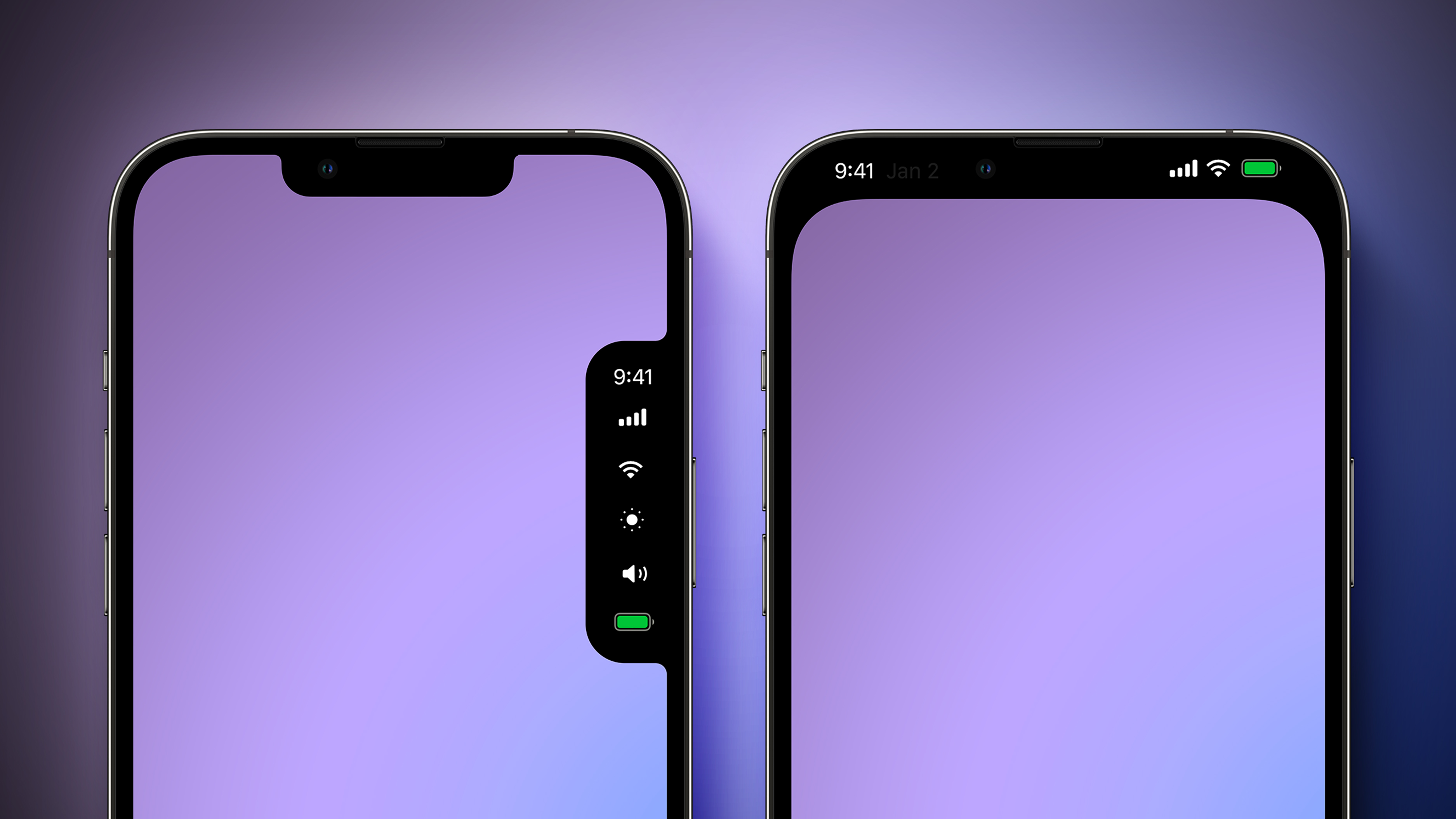
Agreed that measuring screen size diagonally with rounded corners and missing areas don’t make sence(really diagonally measurements stopped making sense when screen ratios were no longer standard) screen size should just be total screen area. But a notch or Dynamic Island has both, screen symmetry and border symmetry(at least left/right). The top row design might have inner screen symmetry (so did the iPhone 8 and previous iPhones) but looks bad. I know that comes down to personal preference, but all those cheap Android phones(and even some very expensive Samsungs) had each border a different size and looked like crap.

i personally would ditch a front facing camera completely for all screen with rounded corners and no notch/island, but couldn’t image have to go bad to Touch ID. Maybe some form of Apple Watch security for those that don't want Touch ID. But Face ID works so much better in most situation.
 
  • Like
Reactions: dmk1974

^most who dislike notches (or cutouts) will probably agree that the purple one on the R would've been best.

honestly it should've just been an option from the very beginning, to be able to leave the top few rows black and usable only for info & status icons (not for content). notches (and cutouts) look dumb and are such an eyesore when viewing pictures, videos, etc.

same problem with the latest Macs (can't believe they brought notches to their laptops!) - but at least now there are resolution options (with the latest MacOS versions) that crop out the pixel rows at the top of the screen, which completely eliminates the notch (which is even better than just hiding it with a black menubar)...!
 
The selected design is best. Everything else looks like something Android would do. It’s non intrusive, non dedicated, and helpful when it needs to be if devs use it according to the guidelines.
 
I want that Jon Ivy look, a clear piece of glass, no holes etc. So while I went from hating the notch to tolerating it, seeing the Dynamic Island made me appreciate the notch and just look at the Dynamic Island with disgust. Like really, this was the solution?
I wonder what will happen when Apple decides to go full android with the circular cutout with either the 17 Pro or 18 Pro as some of the rumors indicate. I can see some people complaining about how the iPhone now looks like an Android phone when that change happens.
 
  • Haha
  • Like
Reactions: gusmula and Apple$
I wonder what will happen when Apple decides to go full android with the circular cutout with either the 17 Pro or 18 Pro as some of the rumors indicate. I can see some people complaining about how the iPhone now looks like an Android phone when that change happens.
At least that in theory should make for a smaller Dynamic Island. Honestly I just want the technology to reach that clear piece of glass look, camera under the screen etc. I know the technology is not there yet,
 

I am not surprised to see how many people are saying they prefer the top-right design here,

But it is obvious why Apple did not blackout the entire top of the phone:

It doesn't actually use, or show, what the difference & benefit of the larger screen is over an iPhone 8. There is only a marginal bezel gain if you black it out.

Reminds me of these old pre-iPhone X mockups that thought Home would be an on-screen button like this:

sMjdUUQ.jpg

At this point it isn't functionally any different from an iPhone 8 with a full forehead & chin, you can see why Apple made decisions like the Notch and the Home Bar.
 
  • Like
Reactions: Tagbert
Just please don’t bring that to the iPad. It would be such a distraction while trying to watch a movie. I assume people who watch movies on their phones don’t really care?
 
  • Like
Reactions: 3530025
I am not surprised to see how many people are saying they prefer the top-right design here,

But it is obvious why Apple did not blackout the entire top of the phone:

It doesn't actually use, or show, what the difference & benefit of the larger screen is over an iPhone 8. There is only a marginal bezel gain if you black it out.

Reminds me of these old pre-iPhone X mockups that thought Home would be an on-screen button like this:

sMjdUUQ.jpg

At this point it isn't functionally any different from an iPhone 8 with a full forehead & chin, you can see why Apple made decisions like the Notch and the Home Bar.
I actually like the mock-up you are showing a lot better. If that virtual home button had TouchID I'd buy it in a heartbeat. I miss TouchID and the Home Button so damn much. The UI has too many swipe functions now because of the loss of a physical input method that the phone gets confused about what I'm trying to do far too often. Never had issues like that with a Home Button and TouchID. i would prefer a real button come back (or at least still have the indent so I can find it without looking).
 
I want that Jon Ivy look, a clear piece of glass, no holes etc. So while I went from hating the notch to tolerating it, seeing the Dynamic Island made me appreciate the notch and just look at the Dynamic Island with disgust. Like really, this was the solution?

Dynamic Island is the solution that created its own problem just so that it could exist. I mean they literally had to design the problem into the solution. The Engineering Gods are angry 😡
 
You mean a phone where content isn’t obscured by the notch or island in landscape mode?
What’s obscured? Apps don’t draw in the notch area. Photos don’t show there unless you zoom in. Most videos don’t go into the notch area except some oddball aspect ratio videos. Games don’t if they are properly written.
 
Last edited:
  • Angry
Reactions: 3530025
Let's call each of those designs what they really are: a notch with varying amount of lipstick
Let's say we were past the notch, island, and a hole punch. I would still want the Dynamic Island feature with all the extras that come with it such as live activities and faster flashlight off button just to name a couple things. Dynamic Island has been the first thing that has drastically changed how I use a phone since I guess getting a phone for the first time.
 
  • Like
Reactions: Tagbert
I know it means less screen real estate, but I much prefer the right-side purple one. Yes, I've "gotten used to it," but the notch is still a design crime.
Despite the age old username that would suggest otherwise… I’m not on my knees for Apple when I say… People have overreacted about this notch since its inception. Obviously everybody has a different opinion, but I have never understood why people care so much. It’s genuinely nonexistent to me, even when watching videos fullscreen.
 
  • Like
Reactions: Tagbert
Despite the age old username that would suggest otherwise… I’m not on my knees for Apple when I say… People have overreacted about this notch since its inception. Obviously everybody has a different opinion, but I have never understood why people care so much. It’s genuinely nonexistent to me, even when watching videos fullscreen.

I also have never had a real gripe with the notch. Actually kinda like it. It's a straightforward and pragmatic solution to a problem that existed with the slim bezels paradigm. Dynamic Island, on the other hand, deliberately seeks to make that same problem much worse in the name of alleged innovation. It increases the vertical encroachment into screen space, it has totally wasted pixels above it, and it's generally a far greater distraction than a notch that largely melts into the perimeter.

I suppose it's subjective and I'm all for diversity of opinion, but really...anyone who has a problem with the notch because it's a distraction but alternatively loves a giant black slot in its place needs to give their head a wobble. Personally I'd rather jettison all front facing cameras and have under-display Touch ID but that's never going to happen :(
 
Last edited:
The right purple one is the best, but please without a rounded display corner! The main advantage of a black bar is that the display does not have to follow the rounded corner of the device. I am a "Monk" when it comes to display shapes. A display has to be rectangular. Each column of pixels needs to have the same number of pixels and each row of pixels needs to have the same number of pixels. That is also true for tablets and notebooks. I am glad that TV do not have rounded corners (yet).
 
Never had an issue with the notch or dynamic island. Satisfied with the current implementation. Expecting the dynamic island to get smaller when FaceID goes under the screen.
 
  • Like
Reactions: Tagbert
Calling it now: when the day finally comes and Apple gives us a design featuring a full screen, people are still going to complain. Some might even cry about how they preferred the dynamic island.
 
Calling it now: when the day finally comes and Apple gives us a design featuring a full screen, people are still going to complain. Some might even cry about how they preferred the dynamic island.

True, true. But dynamic island can exist without the slot. Except it can not be there when not needed, and not be jet black when it is 👍
 
Register on MacRumors! This sidebar will go away, and you'll see fewer ads.