Think you missed my post. I noted above that it's a factor of resolution and screen size, both of which impact readability. 8.5% for a font is pretty big when most of the world doesn't have 20/20 vision.Think you misread my post. The X and XS support it and they share the same software resolution as the 12 mini and 13 mini. The screen size difference between the 13 mini and a X is 8.5%.
Got a tip for us?
Let us know
Become a MacRumors Supporter for $50/year with no ads, ability to filter front page stories, and private forums.
Apple Limiting iOS 16 Beta 5 Battery Percentage Display to Select iPhones: Here Are the Supported Devices
- Thread starter MacRumors
- Start date
- Sort by reaction score
You are using an out of date browser. It may not display this or other websites correctly.
You should upgrade or use an alternative browser.
You should upgrade or use an alternative browser.

Nobodies at all...?And whose fault is that the iPhone 11 has a lower resolution display?
I don’t have 20/20 vision, and I can see the screen and text of the 12 mini and 13 mini absolutely fine with or without my glasses on.Think you missed my post. I noted above that it's a factor of resolution and screen size, both of which impact readability. 8.5% for a font is pretty big when most of the world doesn't have 20/20 vision.
The screen is the same width (5.8cm) as the iPhone 6,7,8,SE2/3 and due to height is overall larger than the iPhone 3G,4,5,5S,6,7,8,SE1/2/3, of which the SE2/3 and 8 have battery percentage.
Also according to the WHO, half of the world do not have vision impairment , it’s estimated at 2.2 billion out of a global population around 7.9 billion.
So glad the XR isn’t getting it when the X and XS are! Clearly the greater thermal capacity of the X and XS is needed for this high performance feature!
Apple this week brought back one of the most highly requested features from iOS users since the launch of the iPhone X in 2017: the ability to see your battery percentage directly in the status bar.
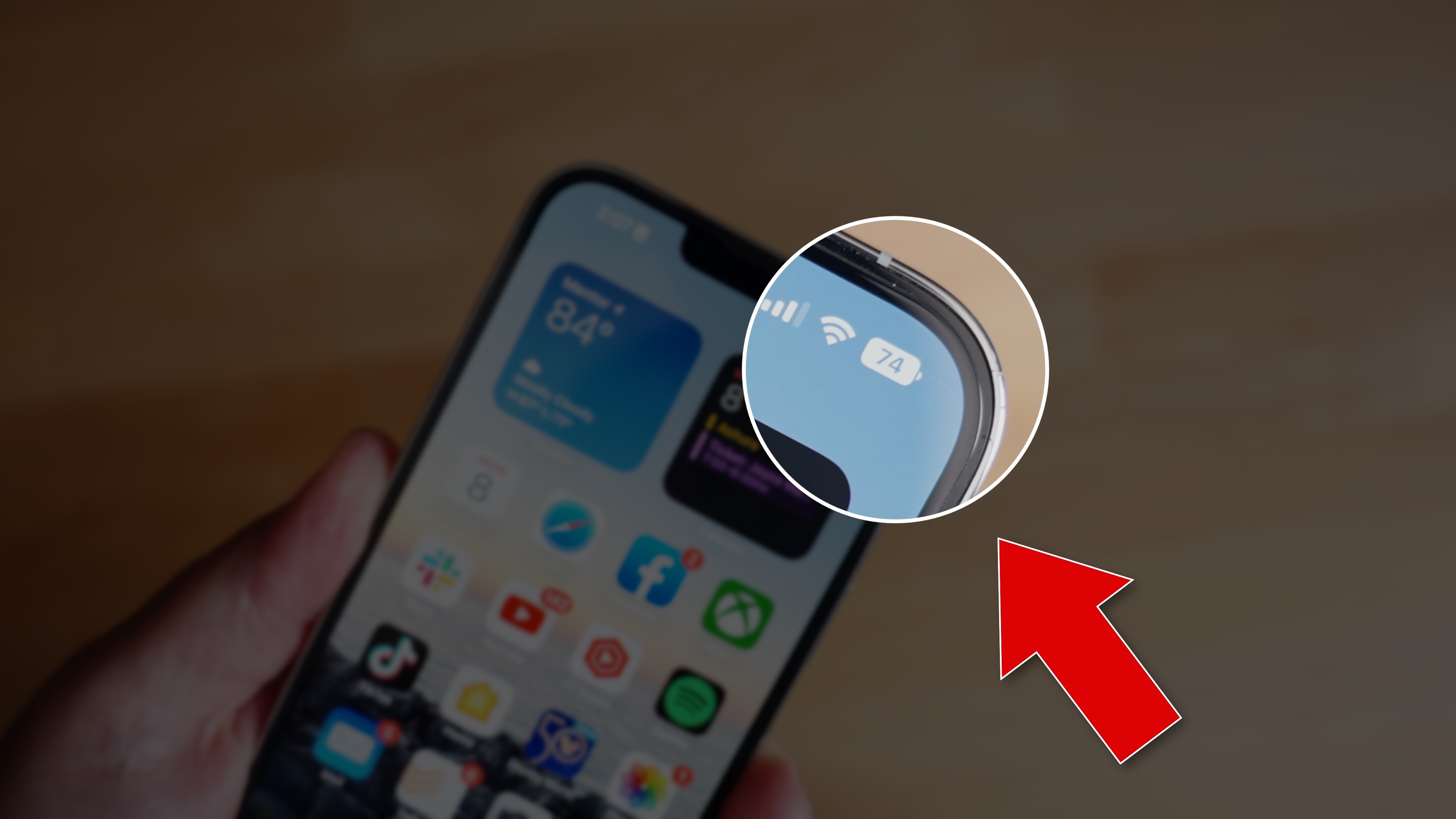
Ever since the launch of the iPhone X with the notch, Apple has not allowed users to show their battery percentage directly in the status bar, forcing them to swipe down into Control Center to glance at their current battery level.
With the launch of iOS 16 in just a few weeks, that's set to change. The fifth developer beta of iOS 16 includes a new toggle that allows users to always show their battery percentage in the status bar.
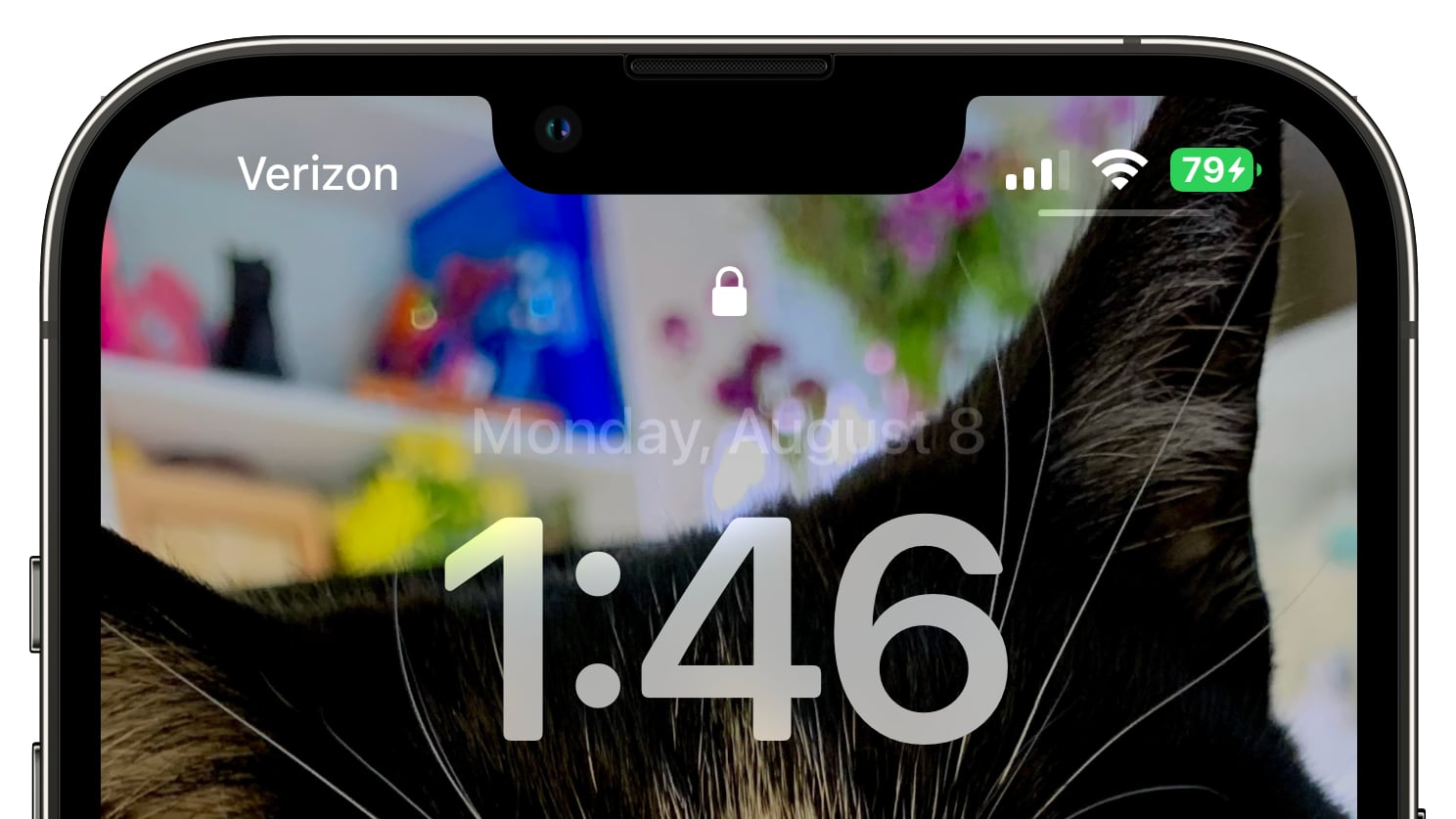
When Low Power Mode is enabled, the battery glyph and the percentage turn yellow, and when low on battery, it turns red. When charging your iPhone, it turns green. The battery percentage is visible in the status bar across the system, including on the Lock Screen.
All flagship iPhones since the iPhone X have had a notch, yet not all customers with notched iPhones will gain this new feature.
Here is the list of iPhones that will gain the ability to display the battery percentage directly in the status bar:
- iPhone 13 Pro Max
- iPhone 13 Pro
- iPhone 13
- iPhone 12 Pro Max
- iPhone 12 Pro
- iPhone 12
- iPhone 11 Pro Max
- iPhone 11 Pro
- iPhone XS Max
- iPhone XS
- iPhone X
All other iPhones, including the smaller iPhone 13 mini and iPhone 12 mini, the iPhone 11, and the iPhone XR, do not have the battery percentage option. As iOS 16 is still in beta testing, Apple may decide to expand the list to include other iPhones in the future so we'll have to wait and see.
While it's not entirely clear why Apple has chosen to limit the availability of this feature, it may be due to space constraints on the smaller displays.
Article Link: Apple Limiting iOS 16 Beta 5 Battery Percentage Display to Select iPhones: Here Are the Supported Devices

what a fail from Apple.
Last edited:
Squinting to see several pixels that form numbers in a battery shaped icon.I bought a mini for a reason... let me squint
Seems stupid but I do understand their decision. The answer lies in the pixel density of the screen and available space. Those battery numbers are really small. Almost all iPhones with OLED screen get it because it is always @3x screen, so there is more pixels to display the number inside the battery. iPhones from the mini line aren't getting it because the battery widget itself is too small and the amount of pixels available isn't enough. Same goes for iPhones with LCDs (11 and XR) because they have @2x screen and less available pixels. Apple is known for only delivering features that provide good experience (or at least trying to).
What I don't get is that LCD iPhones may have less logical pixels but they have exactly the same amount of physical subpixels due to OLEDs being pentile displays so crispness of the text could be matched if they spent more time designing the font.
What I don't get is that LCD iPhones may have less logical pixels but they have exactly the same amount of physical subpixels due to OLEDs being pentile displays so crispness of the text could be matched if they spent more time designing the font.
Don't forget this is a beta with no announcement and no release notes for this really minor feature. For all we know, they're not done yet. They may decide the battery percentage looks stupid and take it away next week or they may introduce it to more phones. We just don't know, but the mere appearance of a feature doesn't mean it's done. There are probably at least four more releases before final. Until then, everything could change.Seems stupid but I do understand their decision. The answer lies in the pixel density of the screen and available space. Those battery numbers are really small. Almost all iPhones with OLED screen get it because it is always @3x screen, so there is more pixels to display the number inside the battery. iPhones from the mini line aren't getting it because the battery widget itself is too small and the amount of pixels available isn't enough. Same goes for iPhones with LCDs (11 and XR) because they have @2x screen and less available pixels. Apple is known for only delivering features that provide good experience (or at least trying to).
What I don't get is that LCD iPhones may have less logical pixels but they have exactly the same amount of physical subpixels due to OLEDs being pentile displays so crispness of the text could be matched if they spent more time designing the font.
Seems stupid but I do understand their decision. The answer lies in the pixel density of the screen and available space. Those battery numbers are really small. Almost all iPhones with OLED screen get it because it is always @3x screen, so there is more pixels to display the number inside the battery. iPhones from the mini line aren't getting it because the battery widget itself is too small and the amount of pixels available isn't enough. Same goes for iPhones with LCDs (11 and XR) because they have @2x screen and less available pixels. Apple is known for only delivering features that provide good experience (or at least trying to).
What I don't get is that LCD iPhones may have less logical pixels but they have exactly the same amount of physical subpixels due to OLEDs being pentile displays so crispness of the text could be matched if they spent more time designing the font.
iPhone X/XS
- 2436x1125 = 458dpi
iPhone 12/13mini
- 2436x1125 software resolution = 495dpi
- 2340x1080 hardware resolution = 476dpi actual
There are plenty of other small text items on the mini iPhones, since the software resolution is the same as the X/XS And overall the screen is only 8.5% smaller.
In fact this mark’s the first time the iPhone mini is different from the iPhone X/XS, up until now they both showed the same content 8.5% smaller.
Seems obvious that it’s a screen resolution issue. They don’t want to have it look too jagged so it’s available on phones with iPhone X or larger resolutions. The 11 and XR are physically larger but have much lower screen resolution.
Maybe they can make it an optional upgrade. iOS 16 Pro with pro features like a battery level indicator 😂Don't give apple any ideas.
Honestly, for 90% of my usage, I don’t mind swiping down into Control Center to see the charge percent for the same reason I don’t have a power reserve complication on my Apple Watch. If I’m curious, it’s only a swipe away, and I honestly don’t need to know at precisely what percent my battery is at at any given moment. The icon provides enough information for me (“full”, “still pretty high”, “getting close to halfway”, “getting pretty low, you might want to charge before doing anything intensive”, “getting real low, probably ought to consider charging”, “battery is in red, charge me you idiot!”). Knowing the specifics can be helpful at times, but when I want to know the specifics, I can just swipe into Control Center.
Actually, I think the numeric display is a lot like digital clock faces. Years ago, I found that I generally read and process an analog watch face faster than a digital face. I had an ana-digital watch and the battery was winding down. The digital face was showing the wrong time but it took me a while to notice because I’d been reading the time on the analog face subconsciously, and it was correct. I think it has something to do with geometry and fuzzy time, while digital watch faces are a numeric string of numbers that have to be interpreted to some extent to get a sense of the time. Now, obviously, digital time readouts are easier to learn how to use, but analog is faster. I used to live in the UTC-6 time zone during Winter, so, in the time when the US was off Daylight Savings Time, I could get the time in London by looking across from the hour hand, which was faster than trying to mentally add 6 and potentially modulo by 12. Even during Daylight Savings Time, it was probably easier to look at the hour across from the hand and subtract one than to mentally add 5 and potentially modulo by 12. Apparently, I’m quite used to thinking geometrically and/or visually, but maybe I’m the exception to the rule. Maybe numeric displays are faster for others, but, for me, numbers convey meaning, sure, but I actually have to consciously think for a moment what the numbers represent while geometry processes faster than consciousness for me (plus, knowing how much is left in the hour is usually more important than precisely knowing that it is 10:19, 10:19 is basically 10:20 for most purposes).
Actually, I think the numeric display is a lot like digital clock faces. Years ago, I found that I generally read and process an analog watch face faster than a digital face. I had an ana-digital watch and the battery was winding down. The digital face was showing the wrong time but it took me a while to notice because I’d been reading the time on the analog face subconsciously, and it was correct. I think it has something to do with geometry and fuzzy time, while digital watch faces are a numeric string of numbers that have to be interpreted to some extent to get a sense of the time. Now, obviously, digital time readouts are easier to learn how to use, but analog is faster. I used to live in the UTC-6 time zone during Winter, so, in the time when the US was off Daylight Savings Time, I could get the time in London by looking across from the hour hand, which was faster than trying to mentally add 6 and potentially modulo by 12. Even during Daylight Savings Time, it was probably easier to look at the hour across from the hand and subtract one than to mentally add 5 and potentially modulo by 12. Apparently, I’m quite used to thinking geometrically and/or visually, but maybe I’m the exception to the rule. Maybe numeric displays are faster for others, but, for me, numbers convey meaning, sure, but I actually have to consciously think for a moment what the numbers represent while geometry processes faster than consciousness for me (plus, knowing how much is left in the hour is usually more important than precisely knowing that it is 10:19, 10:19 is basically 10:20 for most purposes).
They already use a small font size for web page titles, so the argument that it would be too small doesn’t make sense to me.
e.g. (crude mock up on my iPhone 13 Mini, made the icon green and literally pasted the number without changing the size).

e.g. (crude mock up on my iPhone 13 Mini, made the icon green and literally pasted the number without changing the size).
Well, there’s the potential for contrast issues between the battery icon and the numeric icon. You kinda cheesed it a little by using a white or beige square on the battery icon in your mockup (it’s the square from the background of the Safari toolbar, correct?). And even then, there are still some contrast issues. I find it a little hard to read at a glance despite being able to read the “90” in the Safari toolbar just fine, and I can generally read compact print books without difficulty.They already use a small font size for web page titles, so the argument that it would be too small doesn’t make sense to me.
e.g. (crude mock up on my iPhone 13 Mini, made the icon green and literally pasted the number without changing the size).
I suppose on a smaller device, it’s also an accessibility issue. You can’t really increase the size of that number without increasing the size of the icon. As a matter of fact, on iOS 15 on my iPhone XR, turning on Larger Text in the Accessibility settings and turning the text size to its largest does nothing to the text in the status bar.
I can barely read it on 13PM. Maybe if they get a setting to always have the text black it will be betterI bought a mini for a reason... let me squint
Yes they need a way to keep it black when the battery is white or yellow and whatever contrasts well if it's red. But if it's red I will already know I'm low.Well, there’s the potential for contrast issues between the battery icon and the numeric icon. You kinda cheesed it a little by using a white or beige square on the battery icon in your mockup (it’s the square from the background of the Safari toolbar, correct?). And even then, there are still some contrast issues. I find it a little hard to read at a glance despite being able to read the “90” in the Safari toolbar just fine, and I can generally read compact print books without difficulty.
I suppose on a smaller device, it’s also an accessibility issue. You can’t really increase the size of that number without increasing the size of the icon. As a matter of fact, on iOS 15 on my iPhone XR, turning on Larger Text in the Accessibility settings and turning the text size to its largest does nothing to the text in the status bar.
SE has no notch, so it's next to the battery iconiPhone SE has a LCD screen and it shows the battery percentage...so why can't the iPhone 11?!?! 🤦♂️
Even on 13PM, it's small. I can see it in apps that are dark, but with it being transparent on light backgrounds, it's hard to read. Just make it black all the time, and maybe another color when the battery is red.Mini’s screen size is so small though. Not gonna lie, on my 13 Pro, it’s pretty small….
It is. Settings > BatteryMaybe they can make it an optional upgrade. iOS 16 Pro with pro features like a battery level indicator 😂
I didEven that doesn't make sense, if you look at the list.
You could argue they decuded to give it to phones that are old enough anyway ,and whose battery aren't very good .
It's only after the 11 that battery got somewhat good .
The x and xs users are likely to change their phones either way ,however giving features to the 11 might lead their users into keeping them longer
Just guessing
I can see why you'd give it to a phone that's already old enough but not to a mid-old one
Well, there’s the potential for contrast issues between the battery icon and the numeric icon. You kinda cheesed it a little by using a white or beige square on the battery icon in your mockup (it’s the square from the background of the Safari toolbar, correct?). And even then, there are still some contrast issues. I find it a little hard to read at a glance despite being able to read the “90” in the Safari toolbar just fine, and I can generally read compact print books without difficulty.
I suppose on a smaller device, it’s also an accessibility issue. You can’t really increase the size of that number without increasing the size of the icon. As a matter of fact, on iOS 15 on my iPhone XR, turning on Larger Text in the Accessibility settings and turning the text size to its largest does nothing to the text in the status bar.
Yes, I just cut and pasted a rectangle around the text. You make fair points, but surely they’re not insurmountable issues. I’d take an option to just swap the icon for a number for instance. If people couldn’t see the number because it’s too small for them they could stick with the icon. It just seems ironic if Apple are making a big (heh) deal of being able to customise the lock screen so much in iOS16 but don’t let users do something so basic as decide how the battery indicator to look and function. But maybe they will at some point.
Pixel density clearly isn’t the issue (at least not for the minis, which have the highest PPI of any iPhone).
Space might be an issue, but don’t all iPhones have exactly the same vertical status bar space? The status bar never really dips below the notch, which I believe is the same size on all iPhones. Vertical space would be the limiting factor in font size, and if all iPhones have the same available vertical space, than the battery indicator should be the same size on the mini as on the pro max. Bear in mind, I don’t own a notched iPhone, let alone two of different sizes, so I could be completely wrong about this.
Either way, it seems likely that this will be added to the minis in another beta or two, and quite possibly the 11 as well.
Side note: I made an account just to talk about battery percentage indicators returning to the iPhone. What am I doing with my life?
don't these phones show the time? stuff like "AT&T" or "T-Mobile" in the same area? They can't fit "100"?Seems obvious that it’s a screen resolution issue. They don’t want to have it look too jagged so it’s available on phones with iPhone X or larger resolutions. The 11 and XR are physically larger but have much lower screen resolution.
Ok, I’ve either got a weird phone (8) or not understanding this thread as my battery percentage is on the screen - or are we only talking
about phones with a notch?
about phones with a notch?
Ive seen images on reddit of it on the 11 Pro Max. I no longer have my 11 Pro (non max) to personally check, however.
yeahOk, I’ve either got a weird phone (8) or not understanding this thread as my battery percentage is on the screen - or are we only talking
about phones with a notch?
Register on MacRumors! This sidebar will go away, and you'll see fewer ads.