Oh, how I would love to peruse those style guides for hours. Just lovely.Suggestion: back in the 80s and 90s Apple produced "style guides" that laid down a lot of good rules for the design of user interfaces - like how to make functionality easily discoverable and consistent by (e.g.) using consistent visual cues to distinguish buttons and controls from static content, how to label buttons on dialog boxes to avoid ambiguity about what "OK" or "Cancel" did, etc. etc.
The books were quite heavy and should produce adequate blunt force trauma when applied vigorously to the heads of the clowns who designed the current iOS music app. If they're only available online, I'd suggest that an iPad 3 (nice and heavy, with tapered edges) would hurt the most.
I'm not sure if they cover things like 'not hanging on a white screen because you can't find the Internet even though my entire music collection is stored on the iPad".
Got a tip for us?
Let us know
Become a MacRumors Supporter for $50/year with no ads, ability to filter front page stories, and private forums.
Apple Music Set for Design Overhaul in Time for WWDC in June
- Thread starter MacRumors
- Start date
- Sort by reaction score
You are using an out of date browser. It may not display this or other websites correctly.
You should upgrade or use an alternative browser.
You should upgrade or use an alternative browser.
"more easier to use"
Who writes this stuff?
Right! That merger 2 years ago!
Sad, that they couldn't get it right the first time, its not like this is the first time they did music. I'm looking forward though a new design that will make it a bit easier to use.
apple music is very much like beats.app was.. they basically used beats but added some apple specific connections/buttons in there..
i agree with 'they should of done it right to begin with' sentiments because the mashup isn't entirely user friendly.
my point is more that apple didn't do it the first time yet.. they just put their name on an app they purchased.
hopefully, this rumored overhaul will be more of a ground-up/square-one application instead of a mashup with an existing service.
Nor was iCloud their first attempbut it is the first time they offer streaming music
But did MobileMe really have that many issues? I seem to remember it actually doing more than what iCloud ended up supporting. I am one of the few that apparently never had a problem with that service. Why fix what's not broken rings true.
The Apple I expect will:
-Skylake everything and not mention it.
-Discontinue the MBA
-Release a 14" MacBook with a single USB-C port. Because that concept is perfect.
-Discontinue the Mac Pro.
-Release a new music app that functions just like iMove. But it will have skins that match the new watch bands.
-Start using a custom 7-point screw in all products that requires a driver made from MP35N alloy.
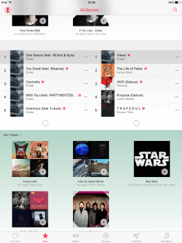
This will be a welcome upgrade if it's true. I've just upgraded to family membership. I love the idea of Apple Music, but the interface on the iPhone App is an absolute mess!! It takes me ages to find my playlists. Before I upgraded to family membership it wouldn't let me listen to tracks that I had previously purchased through iTunes if someone else in my household was listening to Apple Music on another device. It's difficult to download individual tracks locally on the iPhone app, but it will let you download whole albums. There is no easy way of purchasing an Apple Music track via iTunes (without the DRM) for use in other apps. It doesn't work on the AppleTV (the last gen one anyway - although you can stream Apple Music from your phone). Ok the list goes on and on with gripes with it. The idea is great, but the implementation is poor. And don't get me started on how Apple have screwed up iTunes...
Ages to find your playlists? I just picked up my phone. I tapped the music app, then at the bottom, I tapped playlists. Clearly we define "ages" differently.
Personally I've had no issues. The only thing that doesn't work consistently is Connect. It'll be good to see what they do though.
I have no problem finding my music on the iPhone app. It's easy. Not sure why all the complaints.
I'm not familiar with the beats app, so maybe that's why I thought they should have done better.apple music is very much like beats.app
I never had an issue with Apple Music. Once you understand there are two distinct sections for music, the catalog and your Library (and that you can add components of the streaming catalog into your library), it's pretty easy to use. The only issue I had is that clicking search doesn't always return a result. At all.
My hope is that we have an expansion of the Beats music channels. Would be nice to have some additional variety.
Yeah, the search function could use some work. You have to spell the name of the artist/album/song EXACTLY right in order to get the correct results. I feel like it could be more predictive when it comes to knowing what you're trying to input.
Besides that I don't have any complaints about AM. I could live without Connect (and apparently so can many artists b/c they rarely use it), but I simply don't use it so it doesn't bother me.
I basically just use Siri to play me categories of music instead of trying to hunt around for music. So it isn't to difficult if you just have Siri retrieve your music in general categories.
I never had an issue with Apple Music. Once you understand there are two distinct sections for music, the catalog and your Library (and that you can add components of the streaming catalog into your library), it's pretty easy to use.
I think this separation is not what makes Apple Music so unintuitive. For me, the complexity lies in three things: the abundance of drill-down menus, the bloated ’New’ section (where Apple put everything that did not fit anywhere else) and in iTunes the mixed use of right-click menu and three-dots menu.
On iOS, you can drill down into menus ad infinitum, because there are just no end points. You can go from Song > Artist > Songs > Artist > Albums > Artist > ... and so forth. You can lose track of your exact location really quickly. It is even worse when you throw a search into the mix, because the search results will just be put on top of that hierarchy. In iTunes, there are no horizontal navigation views with clear back buttons, but the entire views change whenever you click on something. You can only go back with this browser-like back button that may or may not take you back where you came from. It frequently threw me back to the beginning, not the last step. Sometimes when you want to see more songs from a particular artist, it throws you from My Music to a search page on New, where the back button will not work at all.
The ’New’ section is not really all about ’new’ stuff, it is basically everything that is not ‘For You’. If you scroll through that section, it does not make all that much sense. It is also a huge list to scroll through, with lots of sub-sections that you can check out. I almost never got to the bottom of that list. They should have used a segmented control at the top, like they use in the iTunes Store app. They could rename ‘New’ into ‘Discover’ and offer sections for ’New’, ’Top’ and ‘Activities’.
In iTunes, you can often choose between the standard right-click menu and the three-dots menu, but there are lots of places where you can only use the latter. In the ‘New’ section you cannot use the right-click menu at all. In those places where you can choose, the menus are not even consistent. Menu items are not in the same location and it seems as though you are always looking for the right button to click. It felt tedious after a while to constantly adjust to this silly three-dots menu when everything else on OS X uses a right-click menu.
Apple Music is just not the intuitiveness and focus that I have come to expect of Apple software. It feels like an attempt to put as much functionality into a small app. I’ve seen several WWDC developer sessions on UI design and to me Apple Music seems like an example of how to fail at basic design conventions.
Apple Music is great and worth it but... The interface is quiet simply the worst POS I have ever seen and makes it unusable. I have poor reading vision and cannot use it unless I put on my strongest glasses and concentrate. If I'm running or biking it cannot be used as every button is so small, poorly marked, low contrast and has zero finger tip spacing to account for possible miss hits.
PLEASE, PLEASE, PLEASE go look at other music players for inspiration!
Oh, iTunes on the desktop is a joke as well but it's been that way since the second design.
PLEASE, PLEASE, PLEASE go look at other music players for inspiration!
Oh, iTunes on the desktop is a joke as well but it's been that way since the second design.
Honestly Apple's music services have been in decline for many years. For example, on Apple Music, I would be able to simply bookmark a song if I am listing to the radio stations - this doesn't appear to be available. It is very hard to make songs and albums available for offline listening as well.
So accrording to rumors for WWDC we should expect:
Skylake MBP (with redesign)
Skylake Mini
Skylake iMac (all the line)
New MP
Watch bands
Watch 2
14 MBA
New Apple Music
New iTunes
New Mac OS (preview)
New iOS (preview)
Seems like they should have booked for 4 hours keynote......
I think you'd be lucky to see:
- Skylake MBP w/ redesign
- MacOS
- iOS (and all of its derivatives)
- Apple Music
LP
What service did Apple got right the first time??
iTools?? Ping? Mobile me ? iCloud? The reality is that Apple has never been so strong with services but awesome with Hardware and Software.....but the "it just works" never really applied to any service, and it is starting not to apply to HW and SW lately
Good point. Although, I don't remember any issues with iTunes Match until Apple Music came out, then Match went to hell.
The thing that is surprising though, music is not technically a new service for apple. They do have a long history of providing music.
Better point. Music is not anything new to them and in many ways, Apple set the standard on what to expect with Music related Apps.
At least for me, iTunes started to suck when they removed multiple windows for playlists. Not sure why they would ever do that. As for the iOS music app, it was fine until iOS 9. Besides functionality issues, the full screen ads for Beats1 and AM, It is like Apple wants me to hate it.
Finally, removing iTunes Radio for Match subscribers made me make a full change over to Pandora. I don't even buy music from iTunes anymore.
for me, i was a beats subscriber since they started.. it wasn't bad though i wouldn't say the UI was awesome.. when apple acquired the company, i imagined they'd fix up the app.. instead, it became more complicated or, lacks attention to the small details.I'm not familiar with the beats app, so maybe that's why I thought they should have done better.
this rumored overhaul is what i was hoping for upon the initial purchase of beats.. so now i'm back to hoping apple makes beats into something special. we'll see.
In short, the new re-design will make it more harder to load up your own music and listen to it.
There will be big logos of Apple music which will be a highlight. There will be a tiny section hidden away which will have a broken function to sync and listen to your own music. You will be greeted with messages like "You are disgrace to the planet because you chose to listen to your own music instead of Apple Music" after listening to few songs.
Good ol' days where we could plug in our iPhones or iPods to iTunes and sync music are coming to an end.
Surprisingly, I listen to music less. The music app is not inviting enough. Then there is a taunting "Showing only music on this iPhone. Show All Music" banner which does not go away if one wants pure offline mode.
Actually, those days are gone! Damn!
Register on MacRumors! This sidebar will go away, and you'll see fewer ads.