Become a MacRumors Supporter for $50/year with no ads, ability to filter front page stories, and private forums.
Ouch...okay...yet another redesign.

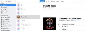
How do I get the icons on the left to show images? Some do, most don't.

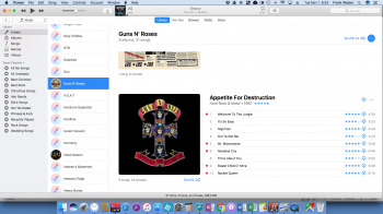
How do I reduce the size of the album art on the right? Sure, I guess...but it is huge!

Same here.. I at least want the option to change the size of the cover icons. If its a real software update then maybe Apple can get away with constant updates to the software but when its just some interface fascist at Cupertino who thinks thier idea of how my itunes interface should look I am beginning to get really pissed off. Not the first redesign interface for no apparent user gain but this one seems even less customisable with no user control over the way it displays.
If you just want to remind me how wonderful Apple is dont keep mucking about with how I see my music etc.
Very hacked off with 12.5.1
 
  • Like
Reactions: MrGuder
Apple's software is getting worse with every iteration. I used to complain about Microsoft programs being buggy but Apple has surely captured that throne from them.

Coupled with the stupid pink microphone logos on the Artists view and the UI getting less and less intuitive, iTunes is becoming more annoying with every new version.
 
Last edited:
I had 12.5 for about 2 days and finally reverted back to 12.4

However when I had 12.5 I noticed the only way to decrease the super size album artwork while in artist view was to find the slider bar in between the bubbles column and the large artwork and move that column slider bar more to the right which makes your album artwork smaller but leaves you with a lot of dead extra space on the bubbles column which looked stupid to me. The problem was that the artwork was either extra large or extra small there was no happy medium. This was another thing I didn't like.

If you remember in iTunes 12.4, you could regulate how large you wanted your album artwork to show while in artist view. Go to top header that says View>Options>Show View Options then a window would pop with a slider view that you could increase or decrease in 5 different increments the size you wanted your artwork to show. Unfortunately....iTunes 12.5 took that option away at least I could not find it at all in 12.5

They made changes just to make changes for no apparent reason or no enrichment for the user, it just looks terrible. It was a pain to revert back but I finally got it all back to where I had it before this terrible change they made in iTunes and the music app on the iPhone.
 
Actually, i'll back-peddle on this..

I like the new design... Finally in Apple music search results u can see at a glace the cloud or + icon instead of needing to click a pesky down arrow (even that didn't always change) to see whats been added in your playlist.

One of the biggest improvements actually i reckon and a real time saver.
 
Don't upgrade your itunes to 12.5 as you will see all blank mic's where you should see your artists artwork. Your embedded artwork will still be there but along the side bar when you click artists view on the left side are all these microphones bubbles (you can't get rid of their default and there to stay) but those microphone bubbles should have pictures of all your artists instead almost all of them will be missing except for maybe a few, it looks terrible and you also lose the cool color contrast with each album artwork, instead they removed the color contrast and give you all white, more and more white but worst of all is the font is so large.

Example

artist name say is this...but it will be this big plus bolded

ABBA

underneath all your artists names like above will be your song titles and play times like usual and that is all like normal font your use to. It looks so bad. It's like a 10 year old intern made this and Apple approved it. Seriously it's terrible looking not uniform at all.
Exactly what I am complaining about. The new look of iTunes 12.5.1 is really really horrible... I had it on my Mac for not even 30 minutes and went straight back to 12.4.3. I have no clue what the guy(s) who are responsible for iTunes at Apple were thinking when they made these design change decisions...
Only question I have, as long as I stay at 12.4.3 I probably also can't sync iOS10 devices with iTunes, right? I'm still at iOS9, if I would upgrade via OTA update syncing with 12.4.3 would not be possible?
 
Last edited:
12.5.2 has been released, apparently. Does anyone who has updated know whether the issue of album covers being replaced by a microphone icon has been fixed?
 
I've seen the future on my crystal ball. Apple will kill iTunes and replace it by a new app called Music. It'll be way sh¡ttier (as in Photos versus iPhoto).
 
  • Like
Reactions: jb-net and whsbuss
Nope - still have mic icons in my library

12.5.3 was released today for the Mac. Still seeing the microphone for most artist. But I did notice that Guns n Roses is now showing this for the artist picture, which in my opinion is way better than a picture of the band. I don't recall seeing that with the prior release, but it's possible I missed it.
[doublepost=1478007379][/doublepost]
I had 12.5 for about 2 days and finally reverted back to 12.4

However when I had 12.5 I noticed the only way to decrease the super size album artwork while in artist view was to find the slider bar in between the bubbles column and the large artwork and move that column slider bar more to the right which makes your album artwork smaller but leaves you with a lot of dead extra space on the bubbles column which looked stupid to me. The problem was that the artwork was either extra large or extra small there was no happy medium. This was another thing I didn't like.

If you remember in iTunes 12.4, you could regulate how large you wanted your album artwork to show while in artist view. Go to top header that says View>Options>Show View Options then a window would pop with a slider view that you could increase or decrease in 5 different increments the size you wanted your artwork to show. Unfortunately....iTunes 12.5 took that option away at least I could not find it at all in 12.5

They made changes just to make changes for no apparent reason or no enrichment for the user, it just looks terrible. It was a pain to revert back but I finally got it all back to where I had it before this terrible change they made in iTunes and the music app on the iPhone.


Also discovered that you can reduce the size of your window, dragging in from the right and it will have the same effect w/o having to have your artist bubbles section so large. See screenshots below. I don't usually use mine on the full screen anyway, so it works for the most part for me, although it does reduce how much you can see at a time in Apple Music or even in song view if you have a lot of columns like I do.
 

Attachments

  • Screen Shot 2016-11-01 at 8.29.54 AM.png
    Screen Shot 2016-11-01 at 8.29.54 AM.png
    143.5 KB · Views: 106
  • Screen Shot 2016-11-01 at 8.33.53 AM.png
    Screen Shot 2016-11-01 at 8.33.53 AM.png
    573.6 KB · Views: 127
  • Screen Shot 2016-11-01 at 8.34.01 AM.png
    Screen Shot 2016-11-01 at 8.34.01 AM.png
    483.4 KB · Views: 100
12.5.3 was released today for the Mac. Still seeing the microphone for most artist. But I did notice that Guns n Roses is now showing this for the artist picture, which in my opinion is way better than a picture of the band. I don't recall seeing that with the prior release, but it's possible I missed it.
[doublepost=1478007379][/doublepost]


Also discovered that you can reduce the size of your window, dragging in from the right and it will have the same effect w/o having to have your artist bubbles section so large. See screenshots below. I don't usually use mine on the full screen anyway, so it works for the most part for me, although it does reduce how much you can see at a time in Apple Music or even in song view if you have a lot of columns like I do.
I'm glad it's working for you but for me those screen caps are a reminder of how much I disliked what they changed in iTunes. That whole column of microphones is a waste of space and it just looks ugly with those microphone icons. I spent too much of my own time importing all my CD's creating my own 500x500 pixel artwork covers from my own scans to see a bunch of microphones. Also I hate the bubbles artwork should be square not round this is not messaging it's music. Also I hate all that white I much prefer the coloring overlay in the background that matches the album, always thought that was a classy touch. For me they made changes just to make changes with no enrichment to the user experience.
 
I'm glad it's working for you but for me those screen caps are a reminder of how much I disliked what they changed in iTunes. That whole column of microphones is a waste of space and it just looks ugly with those microphone icons. I spent too much of my own time importing all my CD's creating my own 500x500 pixel artwork covers from my own scans to see a bunch of microphones. Also I hate the bubbles artwork should be square not round this is not messaging it's music. Also I hate all that white I much prefer the coloring overlay in the background that matches the album, always thought that was a classy touch. For me they made changes just to make changes with no enrichment to the user experience.

To clarify, I dislike it as well. I was just advising about a "work around" I found to make the artwork a bit smaller and slightly less annoying. I hate that we have to look for work arounds at all. But I completely agree with all of your points above.
 
Register on MacRumors! This sidebar will go away, and you'll see fewer ads.