Apple Releases New iPhone 5c 'Plastic Perfected' Ad

For some strange reason, when "plastic" shows up, people keep forgetting that the iPhone 3G and 3GS were plastic.

Leo
 
I really do dig the 5C design. I think I would do yellow or blue body. And then get a handful of Apple's cases, change it up every few days.

However I will be getting a gold 5S. Would do a plastic case with 5S guts if it were an option this year, but alas, it's not. :(
 
I don't know why, but the color seems "off" for me. somethings not right, can't put my finger on it though...

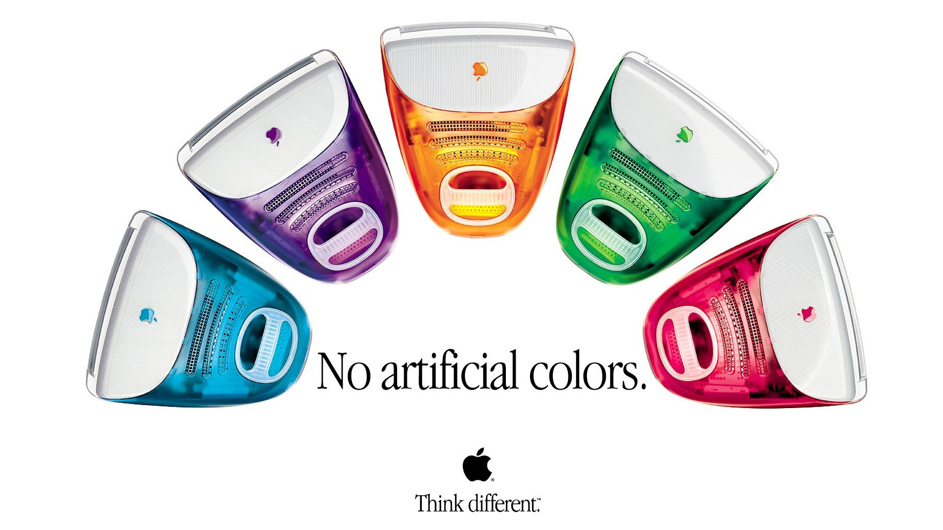
but I like this color a lot:

imac-artificial-colors.png

Yes, the colors seem almost from another time like the 1950's or 1960's. I have a few generations back iPod Nano and the blue is really rich and strong.
 
I want more of those quieter, subtler ads that focused on people rather than the product and set to calmer music. Guess they can't do that all the time, though.
 
I don't know why, but the color seems "off" for me. somethings not right, can't put my finger on it though...

but I like this color a lot:

imac-artificial-colors.png

as more of an accessory that you carry in your hand everyday, I think apple made a good choice of color for 5c that states a more fashionable style, the colors of imac do look good.. but they are not in trend anymore.. and believe me... a glossy 5c with those color will look a bit cheap.. a matt finish might make a difference... :D
 
I don't know why, but the color seems "off" for me. somethings not right, can't put my finger on it though...

but I like this color a lot:

imac-artificial-colors.png

The colors are way off. I just looked at the iPod Nano 5th generation again and those are good colors. Green is dark, red is red etc... plus they still have the issue of not matching the front with the back which is an insanely odd design choice, if they want color they go all out. I think there are many other ways this could have looked better from design to colors.

For some strange reason, when "plastic" shows up, people keep forgetting that the iPhone 3G and 3GS were plastic.

Leo

It may not be that people forgot just that we thought Apple moved beyond plastic.
 
Last edited:
I guess I'm not really feeling all that inspired by Apple lately. Everything, including this ad, is solid but just not "magical." That's the price for always leading, eventually you hit maturity on a product and there's no where to go but down. iOS 7 is a good example of trying to breath life into something stale. I'm hoping it works.
 
I kind of agree with you. For starters, I just don't like the feel of it. But also, it will probably be at least half way through the commercial before people even realize it is a commercial for a phone and/or Apple product. And lastly, the music seems too low-key to me. The iconic colorful iPod commercials always seemed to have really energetic music playing.

Don't forget, commercials are designed to be seen 1,000 times on television, not a single time on the web when they first come out. Therefore, low-key is good, and if they don't get it the first time, they'll probably figure it out the next 999 times. :)

On another note, it seems kinda silly to attribute the song to whatever-their-name-is when it's 90% a Funkadelic sample from the song "Can You Get To That". :rolleyes:
 
I Like It

I actually thought it was a peaceful way to introduce color. No need to be LOUD with color. I am sure like other iPhone campaigns that they will have other versions soon. It actually has a cool feel to it. The iPhone 5S should have the I KICK ASS, I AM APPLE feel to it.
 
I think the 5C looks awesome. I just upgraded to a 5 from a 4 a few months ago but will be upgrading my second line to a 5C. Plenty to like about the 5S but I think the 5C is going to be extremely popular.
 
Register on MacRumors! This sidebar will go away, and you'll see fewer ads.
Back
Top