hmm, not sure I follow, but this is what I mean:
Image
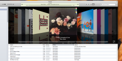
Not only are the artist pictures unnecessary but they are also way too big there, which forces each field to be bigger vertically & leaves less room for artists names horizontally. You can barely see 5 artists on the screen at once.
I also hate how pressing through into an artist will put you in a song view with album "headers", meaning if you have a lot of albums for an artist you have scroll through to the bottom.
I dunno. I am not a designer or anything, but the layout of the music app on iOS 7 makes no sense to me at all.

")