Got a tip for us?
Let us know
Become a MacRumors Supporter for $50/year with no ads, ability to filter front page stories, and private forums.
Apple Releases OS X Yosemite Developer Preview 4, Public Beta Coming Later This Month
- Thread starter MacRumors
- Start date
- Sort by reaction score
You are using an out of date browser. It may not display this or other websites correctly.
You should upgrade or use an alternative browser.
You should upgrade or use an alternative browser.
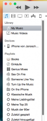
Disappointed that they removed the option to show the sidebar in iTunes.
well its not removed now its just appears when you select playlists( see pictures i posted) it actually make sense now also when you plugin your phone it auto appears so no complains
It's getting a bit late for a public beta isn't it? It seems to be nearly ready to be released.
me thinks the 'public beta' will be basically the release of the product
how do i activate dark mode?
go in settings and then general and then just chose dark mode there should me a tick box option saying enable dark mode for dock and menu bar
Image
and it kicks in when you plugin phone to iTunes ....you can see a lil phone icons appears on left bar
It was always automatically connected on wifi, not this time, had to plug it in, then allow it to connect to my computer, never had that before, hope it is only once it asks for permissions.
----------
The itunes sidebar is not translucence
On my itunes nothing is???
It was always automatically connected on wifi, not this time, had to plug it in, then allow it to connect to my computer, never had that before, hope it is only once it asks for permissions.
----------
On my itunes nothing is???
yes it only asks once for permissions
----------
It was always automatically connected on wifi, not this time, had to plug it in, then allow it to connect to my computer, never had that before, hope it is only once it asks for permissions.
----------
On my itunes nothing is???
there is no transluency in iTunes 12
....and the dark mode still shows the faded icons !
looks sooooo bad !
Welcome to betas..
Wow.....and the dark mode still shows the faded icons !
looks sooooo bad !
If you can't deal with these kinds of imperfections you shouldn't be running a Developer Preview of OS X.
In album view, when the window slides to reveal an album's titles, the background is now translucent, and no longer displays colors inspired by the album's cover...
i dont really understand the purpose of "playlists" on music, movies, tv shows etc cuz if i am in the movies tap and click playlists i get my music playlists? how is that usability friendly. seems so stupid to me
translucent but still inspired by the artwork for me

In album view, when the window slides to reveal an album's titles, the background is now translucent, and no longer displays colors inspired by the album's cover...
translucent but still inspired by the artwork for me
There is still lag in animations in mission control. Hopefully that will be sorted out soon.
Thank goodness someone else addressed this. I'ts literally the only place where there's slugishness or stuttering. And it's also the only thing I use on a regular basis.
You're right ! I got confused by the following video :
First Look At iTunes 12 https://www.youtube.com/watch?v=NpwY2v1oW_Q
The calculator GUI has zero distinctiveness between numerical buttons and everything else. The plain flat perfect squares without spaces between them make each button blend in to the whole thing to an undesirable level. It all just looks the same. It's just awful. Worst calculator app GUI I've seen in a long time. It looks like the early 80s with sharper lines.
Last edited:
The calculator GUI has zero distinctiveness between numerical buttons and everything else. The plain flat perfect squares without spaces between them make each button blend in to the whole thing to an undesirable level. It all just looks the same. It's just awful. Worst calculator app GUI I've seen in a long time. It looks like the early 80s with sharper lines.
Apart from color and the numeric labels themselves. Take a look at your physical keypad right now, does it have to have different shapes to let you know that it is a numeric keypad? Think about it.
The calculator GUI has zero distinctiveness between numerical buttons and everything else. The plain flat perfect squares without spaces between them make each button blend in to the whole thing to an undesirable level. It all just looks the same. It's just awful. Worst calculator app GUI I've seen in a long time. It looks like the early 80s with sharper lines.
Looks like something out of Windows 8.1.
I'm still holding out hope that it gets re-instated, or some key combination/shortcut gets it back. Unlikely at the moment, it seems.
The setting under View is missing in iTunes 12, whereas it exists in 11. That's a good indicator...so far.
Anyone confirm that when you have multiple TV Shows, that each Season has its own artwork displayed - even though its group together as a show. I still hate it in the current iTunes, that a TV Show will display the "last" Season artwork overall, even if you click through the previous one. Biggest thing that annoyed me and hope it gets fixed with iTunes 12.
That would be a Negative, sir. In fact, when you click between different seasons, the color changes slightly (sometimes, and randomly) to do the color matching with the latest season artwork. Totally annoying to me as well.
Register on MacRumors! This sidebar will go away, and you'll see fewer ads.