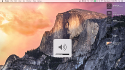
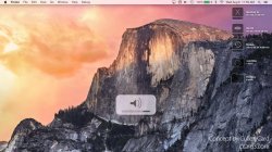
You can now show the full website url in Safari

They do listen!
EDIT: damn ccard3dev beat me to it
Really? If they'll listen to some feedback, perhaps they could be convinced to ease back on the "flat" look just a bit in certain key areas, namely the ICONIC "traffic light" window buttons. I'm not taking part in this beta, so I can't send feedback through those channels, but I encourage anyone who thinks they're just too lifeless looking to please suggest them to make the traffic light buttons to at least have a HINT of the famous AQUA "gel" look instead of just "filled circles of flat color" that look AWFUL, IMO.
I can stand the changes to the GUI I'm seeing for most icons, etc. They're just icons. But to me, the traffic light window buttons are ICONIC and they should not have made them so flat and cartoonish. They could dial it down a bit, but leave some recognition of the one thing that has been constant in OS X from day 1. At least they could offer an OPTION for normal fonts (we aren't all using Retina displays; I'm using external monitors on the desktop and my MBP is from 2008; I still need to be able to read the text).
I don't know if it's new in this beta, but something about the 'increase contrast' option looks damn sexy. Colors are darkened, icons are blackened and there are really nice outlines around everything. Much better-looking than the 'button shapes' option on iOS8.
I would take more pics, but for some reason system preferences panels aren't screenshotting for me.
View attachment 484264
View attachment 484265
It actually looks more like the original Macintosh GUI to me in some respects with the almost two color monochrome look. I'm not sure I'd call that sexy. Retro, perhaps. But then I was fine with the Mountain Lion GUI and I really don't see why they need to change it if it weren't for so many computer rags online constantly whining about "dated looks" and what not. When it's already PERFECT, why mess with it?
Still, I do like the concept of a "dark mode". But every time I've ever seen one implemented in a Linux theme and/or a browser, something throws it off (like non-dark web pages that then overwhelm the interface with all the brightness around it. In short, unless 3rd party software will follow suit with dark modes, it would be hard to keep a consistent look going. And if they can offer a "dark" option, why can't they offer an "Aqua" option for those of us that prefer the 10.4 look over Johnny 5.0?
I'm just not sure where people got the idea that flatter equals modern. We had flat UIs before -- in the 1980s. It was called DOS. It was terrible. There was a huge backlash against that flatness in the 90s and suddenly everything became pseudo-3D. This is just going back to flat not because it's new but because it's different.
I agree 100%. I think the problem is that a LOT of people on here weren't even born in the 1980s or just barely and don't remember the GUIs from back then. And it wasn't just Dos that was flat, but Windows 3.1 was largely flat and ugly as well, especially the alternate "theme" options that really made it look flat (true of Win98 also in alternate themes). Really, this sort of thing was pretty standard up until Windows XP came out. Ironically, OS9 in the '90s was much prettier, IMO despite still having many throw-back looks to earlier OS incarnations. But I really liked the "glyph" window decorations in OS9. I actually consider it a toss-up to whether I prefer those over the gel traffic buttons, but i definitely prefer them over the "flat lifeless" ones they have in the current betas.
I mean how the heck can just using a single color with no shading be considered "art" ? How much effort did it take to make the new traffic light buttons? NONE. A 3rd grader could do that in Photoshop. It's pretty difficult by comparison to create those beautiful "gel" look buttons. So why are they doing it? It's because Johnny Ive thinks Old is the new New. Everyone went to BEAUTIFUL GUIs in the 2000s (I even liked Windows7 Aero; it's pretty spiffy looking so it's NOT a case of me hating "new", but a case of me hating "flat") so he decided let's go back to the UGLY GUIs of the '80s and '90s.

I just don't get it. "Different" isn't always good. Even so, it's not quite as bad as those interfaces. Most of the new icons are fine looking, etc., but they shouldn't just have flat fill buttons. They look ridiculous. If they're going to replace them, use something new and exciting, not just flat fill crapola. I know if they replaced them entirely, people would have a crap fit, but perhaps that's what it takes to get people to get off their complacent butts and tell them how freaking ugly flat-fill buttons look! They've gone overboard on this "boring" look and now is the time to get them to tone it BACK a bit in some areas so they don't completely ruin the look of OS X.
The truly SAD part is we all knew it was coming. Once it showed up in iOS7, we figured it was only a matter of time before Johnny 5 got his grubbly little robot hands on OS X and it was like a sign of relief when Mavericks had very little of those elements in it. But most of us figured the next release would be Johnny Fracked up and...it is.
Yosemite is ugly as hell has to be the worst look and feel of all the OS
All flat and white on white are we printing all the window are we trying to save printer ink?
The icon are terrible the font is ugly.
I been a mac user since it came out. I sure will not be installing this on my computer. Unless I am force to.
Steve Job would never approve this.
Window looks better then this does now.
I never use windows but it look better now.
Are you trying to kill Apple off?
Perhaps I'm just stereotyping to some extent, but I somehow expected Tim Cook to have better eyes for art than this. I realize he isn't making the GUI, Johnny Ive and his team are, but you either have to be blind or really want different just for different's sake to APPROVE some of these GUI changes. They are really taking the press comments about "stale" too seriously. I want NEW FEATURES not a new "look". And if it's going to be a new look, it had better be a GOOD look, not some retro-1980s FLAT WORLD thing. God, I thought we had moved beyond MS-Dos menus and Classic Mac OS looks.
Your comment is the worst I've ever read all month. Your attitude SUCKS.
I'd LOVE to see you do a better job.
My brother's 9 year old daughter could do a better job and that is 100% the TRUTH. I'm no graphic artist, but even I would know that if I couldn't do a BETTER job than what already exists, THEN DON'T TOUCH IT.
With all the resolutions OS X has to support now, it would be nice if we finally got true resolution independence (for the GUI). But I doubt it'll ever happen, people have been asking for too long without Apple being interested.
Apple started pushing that direction back in 10.4 and somehow lost their way with 10.5 (I think it was called the iPhone and it diverted most of their attention away from the Mac Operating System pushing the envelope. They have never bothered with it ever since. The entire GUI should be vector based. Why don't they spend some of that big money on an actual high tech FEATURE like resolution independence instead of a "flat" makeover? Where is the latest OpenGL version? WTF don't they get back to the OPERATING SYSTEM itself instead of this cosmetic bullcrap? I'm not thrilled with Apple, but then Windows 8 is even fuglier so.... (they had it right with Windows7 Aero and made some of the same stupid decisions based around "mobile" popularity while ignoring desktop users like they don't even exist).
Hi All
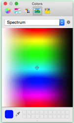
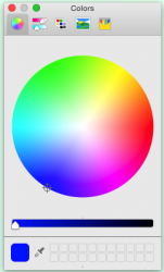
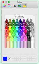
is it just me or does the colour-picker now look less refined in Yosemite?
i will use it all the time with the cad package i use so i will see it more than once a day. find it very bright to look at and the buttons along the top look a bit odd yellow crayon in a yellow case.
can live with most other changes.
Yeah, that CRAYON selector is RIGHT ON THE MONEY. I *KNEW* this GUI was designed by KIDS. I bet Johnny Ive's kids did all the work!

This IS the old dock. Set to dark mode and compare to (hidden) 2D-Dock mode in Lion. It's practically the same and has been used by many who were dissatisfied by the 3D-Look introduced in Lion.
Obviously, they were talking about the 3D dock (you even said yourself it was a "hidden" mode so it doesn't mean squat outside the horizontal placement mode). Do you really have to go to hidden features to make a point? That is NOT the dock from Lion because it was not meant to be used.
And the 3D dock was introduced in LEOPARD, not Lion. If you want to show the previous 2D dock, look at Tiger.

I don't think the complaints about Yosemite are just about the dock, however. It seems clear to me that Apple could avoid all these issues, by simply offering THEME Control, even if the only selections are previous versions of OS X. I think it would be pretty cool to be able to select 10.1, 10.2, etc. as a theme. In fact, I'm pretty sure it would get some rave reviews to be able to select retro-themeing as an option. I'd LOVE to have OS9 window decorations updated to OS X functionality. That glyph metal look was sweet. But Apple has NEVER offered OPTIONS since Steve Jobs came back. You'd think now that the guy is dead, they could go ahead and offer some choices, but alas, I think Steve chose Tim Cook as his replacement precisely because he's all or nothing just like Steve, but apparently can't tell "ugly" when he sees it.


