Become a MacRumors Supporter for $50/year with no ads, ability to filter front page stories, and private forums.
Try plugging in any pair of headphones with a remote control and spin up iTunes for a bit of disappointment :confused:

Thanks :apple:, That worked fine in DP4... way to break it...

Update to this. I have filed a bug report... heres to hoping for a quick fix on this one! :cool:
 
People are not buying macs because of their performance and capability. You can get a cheaper machine with better performance specs. People buy macs because of Apple's attention to detail and build quality. The shadows and the size of icons are small things that add up to a good or bad user experience.

Do not agree with you . But hat is your position to buy a PC like a jewellery :) If so - you can buy a better looked laptop for 3K euro then a macair. With gold and stones on the cover :)
 
Last edited:
Did anyone notice that safari has RSS reader Functionality now again built in?

Just click on an rss feed and go to your "Sent Links" Sidebar.

Thank. You. Exclamation mark. :D
 
Last edited:
Did anyone notice that safari has RSS reader Functionality now again built in?

Just click on an rss feed and go to your "Sent Links" Sidebar.

Thank. You. Exclamation mark. :D

There is "Share links " which in practice are rss reader
 
Text readability on retina-DPI screens could also use some adjustments!

I would have loved for Apple to introduce an iOS-style global scaling function for text with this release of OS X. It's too late now obviously, so we have to hope for it in 10.11

With all the resolutions OS X has to support now, it would be nice if we finally got true resolution independence (for the GUI). But I doubt it'll ever happen, people have been asking for too long without Apple being interested.
 
I don't know if it's new in this beta, but something about the 'increase contrast' option looks damn sexy. Colors are darkened, icons are blackened and there are really nice outlines around everything. Much better-looking than the 'button shapes' option on iOS8.

I would take more pics, but for some reason system preferences panels aren't screenshotting for me.

View attachment 484264
View attachment 484265

Nice catch, thanks! Looks really beautiful and turns off all transparency effects, I didn't liked so much before.
 
I hate these type of replies.

There are a lot of users being pushed away from OS X as they don't like the direction it's going and people like you seem to brush it off like it doesn't matter. The people moving away from OS X are not casual users. Like that guy said above, he had been a Mac users since the very start! Apple and Mac enthusiasts in general should not be so dismissive when people question Apple's direction.

----------


Jobs was a businessman & cared about money and pleasing the shareholders. With hardware, the vast majority of Apple's revenue comes from iOS devices. You can bet your life Jobs would have ensured OS X went hand-in-hand with iOS, probably even more so that it is now. I would say Apple are being very conservative with a lot of their ideas & new features. The iOS look & feel to OS X could have been a lot more forceful if he was still around.

Lies Lies Lies.

The mac installed userbase is bigger than ever. People never bought as many macs.

A few irrelevant forum users that chose the mac to be different and do not like change do not deserve to have a mac in the first place...

For each sad forum user that comes with the crap "steve would never allowed this" (this is a crime in itself) and then goes to say that the worst version of Windows ever is "da bezzzt", Apple gains many more Mac users.

Sounds good. I hope they all leave and never come back.

You might argue if Yosemite looks as great as it could look, but you can't argue that it has a lot of fantastic features and that it looks way "fresher" than Mavericks, and way better at everything than Win8.1.

It is the right direction. If someone doesn't like it, they should go on and use Windows. What's wrong with that?
 
Lies Lies Lies.

How can my opinion be a lie?

The mac installed userbase is bigger than ever. People never bought as many macs.

So you think like a mobile phone network operator such as T-Mobile or Vodafone. You don't actually care about looking after your existing paying customers, just as long as the new ones are still coming everything is rosy. What a terrible idea you have of business.

A few irrelevant forum users that chose the mac to be different and do not like change do not deserve to have a mac in the first place...

Did you actually say that? Oh yes you did.

For each sad forum user that comes with the crap "steve would never allowed this" (this is a crime in itself) and then goes to say that the worst version of Windows ever is "da bezzzt", Apple gains many more Mac users.

Sounds good. I hope they all leave and never come back.

I think we can see why Portugal is constantly on the brink of financial ruin.

You might argue if Yosemite looks as great as it could look, but you can't argue that it has a lot of fantastic features and that it looks way "fresher" than Mavericks, and way better at everything than Win8.1.

I didn't say I had a problem with 10.10's features. As for saying everything is better in OS X than Windows 8.1 - don't be silly. OS X lacks a hell of a lot of features that Windows has, but of course Windows lacks a lot of nice features OS X has. To say that one is "way better at everything" sounds like the comment of someone who has no concept of real world requirements & standards of a business. As much as I love my Mac it has absolutely no use for my actual job that pays the bills. It's strictly for home use. Of course everyone else's milage may vary.

It is the right direction. If someone doesn't like it, they should go on and use Windows. What's wrong with that?

I didn't say I disagreed with Apple's direction, but I do not like to see Apple neglect the faithful people who keep buying their products for 20+ years. What you are essentially saying is 'to hell with them' and that's simply not an attitude a company like Apple should have. I do believe Apple are trying to move away from the Professional market but at the same time they have to realise other people fully depend on OS X for their work and can't accept a lot of changes Apple are forcing on them with some features so of course they are going to be upset when they see software that doesn't meet their criteria.
 
I stopped reading your post when I saw the word "icons".

The guy said "Yosemite is ugly as hell has to be the worst look and feel of all the OS".

YOSEMITE, not bloody icons.

Well maybe you shouldn't stop reading posts before your brain processes what your eyes are telling it. He's talking about the user interface, and icons are a big part of a user interface, especially in OS X.
 
For what it’s worth, THIS is what OSX is now. You can choose to embrace it or to walk away. There’s very little middle ground.

People can hold any views they like, without needing to accept one of two predefined irrational extremes.
 
Today tab in Notification Center still shows Tornado Watch for anyone living in outside the U.S (At least as far as I know) Counts for Weather tab too.

I actually believe this is beginning to be accurate everywhere :p
 

Attachments

  • f43208d23f42a4fd5d3847823102a012.jpg
    f43208d23f42a4fd5d3847823102a012.jpg
    65.4 KB · Views: 162
Bring back the old dock

I feel users should have a choice in docks. Aqua is the least flexible GUI of all time. Even its swarmy cousin Linux can put on some nicer looks.

When Yosemite was unveiled no one talked about the dock but that is how something unpopular is handled in a CA clique.

Time to get real and give the user what they want. :cool:
 
transparency

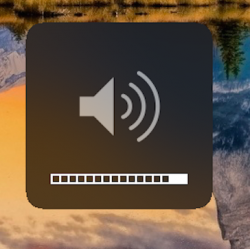
I don't get it. The volume and brightness overlays (!) are pretty much the only place where transparency makes sense, and there they have none? Or is it just not visible in the screenshot?

it's seem as Jony (Ive) said to itself: "I must get to every corner in the UI and change it!"
why? the only thing that was right in the first time was the UI of the Brightness and the Volume, they were with transparency, maybe... maybe they only needed to add the "blur". I hope they will change it back.
 
The volume/brightness control looks like a step backward. It would probably look a bit better with less rounded box though. The old one would suit Yosemite just fine. This seems like a change for the sake of change.

p/s: Again, what's with the new smilies? >.<
 
I don't get it. The volume and brightness overlays (!) are pretty much the only place where transparency makes sense, and there they have none? Or is it just not visible in the screenshot?

Actually, the dark mode volume/brightness HUD has translucency, just very very low. Same with the light mode HUD too, there is translucency but it's so low that you can't notice it. All tho dark mode has more translucency so I will stick with dark mode until DP6 fixes that issue and adds more translucency.

Down below you can see a comparison between dark mode and light mode. If you look close, they both have it, just so little.
 

Attachments

  • Screen Shot 2014-08-05 at 14.34.25.png
    Screen Shot 2014-08-05 at 14.34.25.png
    149.3 KB · Views: 95
  • Screen Shot 2014-08-05 at 14.42.07.png
    Screen Shot 2014-08-05 at 14.42.07.png
    213.3 KB · Views: 101
Last edited:
People are not buying macs because of their performance and capability. You can get a cheaper machine with better performance specs. People buy macs because of Apple's attention to detail and build quality. The shadows and the size of icons are small things that add up to a good or bad user experience.

I designed microprocessors for many years and owned a series of windows and Linux-based machines dating back to the original IBM PC. The reason I switched to Mac in 2007 was exactly because of their "capability." I wanted a Unix-based OS and a machine that wouldn't literally fall to pieces within a year. The last five windows laptops owned by me and my wife had an average lifespan of a year before pieces would literally fall off; the laptop hinges would break or go askew, thhe feet would fall off, the plastic cases would crack, the keyboards would lose keys or otherwise stop working; trackpads would break, etc. This included sonys, compaqs, hps, etc. My family now owns 5 macs dating back until 2007. They are all still completely functional, although we've retired the original to a closet as a backup. (The second oldest is now a web server and itunes server). To the extent "performance" includes the ability to, you know, perform, I'd say we stuck with macs because of "performance."

----------

You know you're an Apple fanboy when you're find with arbitrarily removing useful features.

No, I'm an engineer so I know nothing is arbitrary. There's a cost to every feature, both for the user and for the developers. Even for features that already exist. So removing a feature is inherently a choice between benefits and costs. And any such choice inherently benefits some people and disadvantages others.

I personally am not affected by the benefits of that gesture, so the cost of losing it didn't accrue to me. However the benefits of removing it probably did (presumably the developers were able to achieve some benefit in decreased complexity).
 
After upgrading to DP 5, I see app switching has become very sluggish. Whenever I switch apps (doesn't matter if it's via keyboard or by clicking a window), it takes good 5 - 10 seconds before the app becomes active. This happens every time. When that happens, I also see the spinning beachball.

Is anyone else seeing this? Curious.

Having the same problem. It's killing me.
 
Anybody notice whether they've gotten rid of that god-awful noise that plays by default whenever you use the volume buttons on the keyboard? I always disable that immediately on any Mac I'm going to be using.
 
Anybody notice whether they've gotten rid of that god-awful noise that plays by default whenever you use the volume buttons on the keyboard? I always disable that immediately on any Mac I'm going to be using.

It's still there, but they've changed it. They'll never remove it as it can be useful to many people, but it's nice to have the option to turn it off, which I personally do.
 
It's still there, but they've changed it. They'll never remove it as it can be useful to many people, but it's nice to have the option to turn it off, which I personally do.
Amen to that. Maybe what I'm mostly objecting to is that obnoxious "duck fart" sound they chose.

Also, if you didn't know, if you hit option and the volume key it takes you right to the Sound prefs. Also works for brightness (takes you to Displays) and Mission Control.
 
Bring back the old dock

This IS the old dock. Set to dark mode and compare to (hidden) 2D-Dock mode in Lion. It's practically the same and has been used by many who were dissatisfied by the 3D-Look introduced in Lion. Found a screenshot in 1 sec:

Lion-Tweaks-Dock.jpg
 
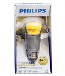
Why does the light bulb in the Energy Saver icon look like it's wearing a girdle?

Image

What type of light bulb is that supposed to be, anyway? What kind of light bulb glows yellow anymore? Come on, Apple! :/

It's really no big issue but it's designed like an LED light bulb. I've had one of these in my bedside lamp for over a year. And when it is turned on the light it emits looks like a regular soft white incandescent bulb. The yellow phosphorus on the bulb once lit up doesn't glow yellow.
 

Attachments

  • philips-dimmable-ambient-led-light-bulb3.jpg
    philips-dimmable-ambient-led-light-bulb3.jpg
    71.8 KB · Views: 128
Register on MacRumors! This sidebar will go away, and you'll see fewer ads.