Become a MacRumors Supporter for $50/year with no ads, ability to filter front page stories, and private forums.
I'm one of them. But it's usually to check flight status, make notes, check the calendar or weather or something along those lines. All of that functionality is probably going to end up in the Today view, making it a pretty obvious replacement for the dashboard in my usage patterns.

The Today view can't replace all the Dashboard use cases. For instance, on my Dashboard I have:

* Weather
* Stocks
* iStat Pro
* Dictionary
* World Clocks
* Astronomy Pic of the Day
* Calendar

iStat, Dictionary, APOD, and to an extent World Clocks can't be easily put into small widgets housed within a vertical stripe. iStat takes up half the page vertically, Dictionary's definitions would be cramped/scrolling, APOD is too wide, and having a large number of World Clocks would be unwieldy. I mean, yes, you could find solutions for all those, but they wouldn't result in great user experiences.

I hit F19 and instantly I have all that right in front of me. I have no interest in the Today View, as it's not even useful on iOS. Though that has more to do with the UX and design than the concept itself.
 
So the top scoring Spotlight hit is the least legible thing on the whole screen?

Jony Capslock scores again!
 
So the top scoring Spotlight hit is the least legible thing on the whole screen?

Jony Capslock scores again!

I would suspect that's a work-in-progress. No way that would survive the final release. If it does, I side with you, and will conclude that Apple interface designers are on crack.

----------

The Today view can't replace all the Dashboard use cases. For instance, on my Dashboard I have

Agreed. Dashboard is still very useful to me.
 
The Today view can't replace all the Dashboard use cases. For instance, on my Dashboard I have:

* Weather
* Stocks
* iStat Pro
* Dictionary
* World Clocks
* Astronomy Pic of the Day
* Calendar

iStat, Dictionary, APOD, and to an extent World Clocks can't be easily put into small widgets housed within a vertical stripe. iStat takes up half the page vertically, Dictionary's definitions would be cramped/scrolling, APOD is too wide, and having a large number of World Clocks would be unwieldy. I mean, yes, you could find solutions for all those, but they wouldn't result in great user experiences.

I hit F19 and instantly I have all that right in front of me. I have no interest in the Today View, as it's not even useful on iOS. Though that has more to do with the UX and design than the concept itself.

I see your point with istat pro, though half that widget has been really quite buggy since I updated to Mavericks, and I've just been using the activity monitor from spotlight ever since. But I think that world clocks and the dictionary would be just fine.

But like I said earlier, I'm just glad they give you the option to turn it off. Keeps everyone happy.
 
I hate the new smiling Finder icon. Looks far too childish.

Ditto, well, I don't hate it but I do dislike it.

I think what I dislike the most in the current one is the over-rounding of the smile illustration and the changes to the black outlines. I don't mind the color theme change as much as the iconic face being changed.

Edit: to clarify logo image
1. Black & white starting in system 7.6
2. Color starting in system 7.6
3. Aqua version as seen in 10.9
4. Fan-made version using Yosemite color theme but maintaining the original iconic features
5. Yosemite version

yosemite-finder-icon-greekiphone.png
 
Last edited:
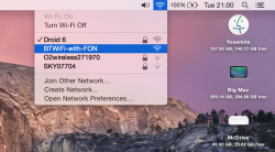
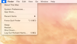
Is it my imagination, or is the system font that's used in the menus a bit crisper and sharper in DP7 vs. DP6?

It feels cleaner and sharper for some reason.....

Same I think?? I'm not so keen on the transparencies though - perhaps its me but they look a bit more see thru this time
 

Attachments

  • Screen Shot 2014-09-02 at 20.59.49.png
    Screen Shot 2014-09-02 at 20.59.49.png
    699.3 KB · Views: 220
Messages Typing bubble

Small graphical enhancement. When selected on a conversation, the typing bubbles are now light blue. Looks nice!
 
Register on MacRumors! This sidebar will go away, and you'll see fewer ads.