Got a tip for us?
Let us know
Become a MacRumors Supporter for $50/year with no ads, ability to filter front page stories, and private forums.
Apple Reveals 'Scale to Fit' Setting to Prevent a Mac App's Menu Bar Items From Being Hidden Under Notch
- Thread starter MacRumors
- Start date
- Sort by reaction score
You are using an out of date browser. It may not display this or other websites correctly.
You should upgrade or use an alternative browser.
You should upgrade or use an alternative browser.
The whole point of the setting is to bandaid the apps that aren’t updated.The whole point of the notch was to expand the screen to the edges of the laptop. Up in the corners.
But this setting shrinks the screen down and thus restores the giant bezels of yore.
The alternative would be, don’t use that app.
Yeah this is just like the geometry professors saying that the iPhone notch "cuts into the screen!". So if the screen were 100 feet tall with the .5 cm notch, it would still be "cutting into the screen", making routine tasks impossibleMy god…. you have a full 16" great display! Forget the notch, it´s outside!

Or...hire some actual engineers from Dell:
That should be a XPS-13, which would mean you are comparing apples with oranges:
Dell still manage to offer good webcam quality on the Dell XPS laptops? Sadly, the answer is no, and there’s a clear reason for that.
But to keep in line with the goal of InfinityEdge displays, it had to make that webcam small. In fact it’s minuscule, at just 2.25mm and 720p resolution.
But even as a regular webcam, it’s just not very good. Camera quality is dependent on many factors, and one of them is how much light the camera can take in. If you have an objectively tiny lens, there’s only so much light that can get into the camera, so you’re going to get much darker and noisier images. Dell touts some advanced image processing and a four-elements lens, but there’s only so much you can do with a camera this small.
Long time ago the MP arent 2x by default, iPhone suffer same scaling with iPhone Plus 3xThe video shows the entire screen shrinking at the same aspect ratio, bizarre. I would have expected the menubar to simply slide down the same number of pixels as the notch is tall, making it the same total aspect ratio as previous MBPs
This is going to be annoying for pixel critical work that designers (and artists, etc) do, as it's no longer a perfect 2x multiple PPI (for the default scale resolution, at least). Scaling the entire screen down a bit means you're no longer integer scaling the display.
Resolution is no longer multiple of 2 for apple. They think redenring double and downscaling to fit is good enough quality
Oh, suddenly the webcam is a distinctive feature of macbooks? The webcam which was sh*tty just two weeks earlier?That should be a XPS-13, which would mean you are comparing apples with oranges:
"Hey, let's create a problem where there was none and then try to solve it with some half baked measures and call it a win."
Which iPhone apps have menu bars, touch elements or info that is blocked by the notch on the iPhone. Hint: None.Yeah this is just like the geometry professors saying that the iPhone notch "cuts into the screen!". So if the screen were 100 feet tall with the .5 cm notch, it would still be "cutting into the screen", making routine tasks impossible
A better solution would be to not have a notch at all. It is unnecessary and a bad design choice.
Apple today shared a new support document that explains how users can ensure that an app's menu bar items do not appear hidden behind the notch, or the "camera housing" as Apple calls it, on the new 14-inch and 16-inch MacBook Pro models.
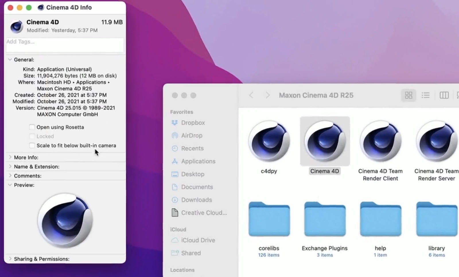
In the support document, Apple says users can turn on "scale to fit below built-in camera" for an app to adjust the active area of the display, ensuring that the app's menu bar items appear below the notch and are always visible.
Menu bar items appearing hidden behind the notch was demonstrated by Quinn Nelson, host of the YouTube channel Snazzy Labs.
To turn on "scale to fit below built-in camera" for an app on the new MacBook Pro models, open the Finder app and click on Applications in the sidebar. Then, right click on the desired app and select "Get Info." In the Info window that opens, check off the "scale to fit below built-in camera" box and the display will automatically adjust when the app is open.
The setting was demonstrated in a tweet by Joseph Angelo Todaro, a design advocate for Sketch.
Apple notes that developers can update their app to work better with the notch, in which case the "scale to fit below built-in camera" setting no longer appears.
Article Link: Apple Reveals 'Scale to Fit' Setting to Prevent a Mac App's Menu Bar Items From Being Hidden Under Notch

lmfao I love how the guy in the tweet even had the audacity to add music to this video, like it is a ground breaking feature.
Everyone would be happier if they could buy a camera-less MBP or simply have the camera on the forehead with the same bezels as the past generations instead of this half assed "feature".
Everyone would be happier if they could buy a camera-less MBP or simply have the camera on the forehead with the same bezels as the past generations instead of this half assed "feature".
Wow, yeah that implementation is...nasty!This really should be enabled by default. I love a lot about my new MBP, including the screen space gained by the taller screen, but the notch does get in the way, mostly because of menu bar apps like istat and app menus can get confused or lost under it, something anyone whose ever used a Mac could have foreseen.
Edit: just watched the video. Does the setting really just make the top bezel huge again rather than shrink the font and spacing of or abreviate menu items? Seriously? I just want to be able to make the menu items have a smaller font and tighter spacing to fit more up there, is that so hard?
To me the fact that the Notch has resulted in Apps to hide it, an actual Apple included software fix to remove it, items not scaling properly from the left or right of it, and I have seen 0 posts of a person posting an example of WHY this is a game changing change, just screams "this was clearly not a good or well thought out idea".
To me the fact that the Notch has resulted in Apps to hide it, an actual Apple included software fix to remove it, items not scaling properly from the left or right of it, and I have seen 0 posts of a person posting an example of WHY this is a game changing change, just screams "this was clearly not a good or well thought out idea".
The fix does not address menu bar icons on the right. A portion of menu bar icons on the right side are consistently hidden. And a lot of them you can't turn off to reduce the number and keep just critical ones there (app. developers seem to be menu icon happy these days, so many iunneccesary ones you can't tun off). Some apps have large left side menu items that extend into the notch too. I alone have many examples. Please don't be an apologist. The notch is fine. It's implementation and how it interacts with software that is stupid. Apple designed the notch to ignore apps apparently.
Last edited:
The notch is going to have to be removed or Apple completely redesigns how the menu bar works
Aesthetics aside, this isn't like the iPhone notch. Apple specifically tells you to not put anything the user might interact with outside the safe area. Apps that had UI along the top border simply added a padding to the top when the notch appeared
With MacOS, the menu bar is a very important UI element that now lives in the same area as the notch. An area that also turns completely "safe" when connected to an external monitor or in the vast majority of Mac out there
Some people will always complain about people complaining, and people will complain about them.Oh hush... this is me complaining about you complaning about people complaining. 🤣
Oh, suddenly the webcam is a distinctive feature of macbooks? The webcam which was sh*tty just two weeks earlier?
It's irrelevant whether it's "distinctive" or not: what is relevant is that Dell's engineers had to make big compromises on the camera's quality to fit it in such a thin bezels. Furthermore, the very same engineers resorted to larger bezels for models where they wanted to offer a higher quality camera.
So Dell's engineers, exactly like Apple's engineers, need to find the best compromise depending on what kind of camera and which form factor they want to deliver. For both, the answer is not always "compromise quality and make it fit on a very thin bezel".
There has to be some psychological reason why Apple does weird things sometimes. I can see how adding a big notch is something that can be reduced later and called an improvement. If they can do so on an iPad they can most certainly do so on a screen that is turning more and more into an iPad without a battery. The notch is huge on purpose so they can either improve it over time or add more components like something to measure your gestures if you are wearing Apple Glasses in front of it. Why have a touch screen on a Mac when you can have a sensor that will allow you to manipulate objects on screen by doing gestures in front of the screen? How hard is it to grab an icon and move it? You just pinch your fingers and move your hand to another location and drop it. No touch screen needed. Not something we actually need but Apple always has to come up with something they alone can patent so it would not surprise me if they went this way. It has the added bonus of essentially being a key logger since it would be constantly pointed down towards the keyboard. I'm sure they'll get plenty of backing to implement such a feature so I don't think its too far fetched.
The Notch is an abomination. I'd rather have no integrated camera at all. If I need to do a video call I always use my iPad anyway. For any kind of serious video work an external camera should be used. The very last thing I want on a laptop is a big, distracting blotch at the top of the screen. I'll keep using my 2015 MBP as long as I possibly can. And I shall pray that they don't put a freakin' notch on the new iMacs.
Here you can see how dilletant some Apple product managers are in pushing through innovations that now have to be taken into account device-specifically in the GUI of every software. Unprofessional.
The notch is fine.The fix does not address menu bar icons on the right. A portion of menu bar icons on the right side are consistently hidden. And a lot of them you can't turn off to reduce the number and keep just critical ones there (app. developers seem to be menu icon happy these days, so many iunneccesary ones you can't tun off). Some apps have large left side menu items that extend into the notch too. I alone have many examples. Please don't be an apologist. The notch is fine. It's implementation and how it interacts with software that is stupid. Apple designed the notch to ignore apps apparently.
Why?
Register on MacRumors! This sidebar will go away, and you'll see fewer ads.