Become a MacRumors Supporter for $50/year with no ads, ability to filter front page stories, and private forums.
You know, it doesn't take much thought to figure out how simply this works. None of your apps will go full screen into that area unless they've been designed to. The screen is 16:10 WITHOUT the notch space. Think of it this way: Apple made the screen larger, giving you an extra row - and then they took a piece of that row away. There's no rationalization to be had, at least so long as you start with the correct information.
Who said anything about using full screen? Is there a fullscreen mode where I can also access the dock, and chat apps at the same time as xcode is in "fullscreen"? Because that's not fullscreen anymore.

There's enough apps out there that use enough menubar space with menus, and I have enough icons on the right side, that sometimes my icons disappear due to the app's menus taking up too much space. The notch is just going to make it worse.
 
  • Like
Reactions: turbineseaplane
And most 'Professionals' are going to use an external monitor most of the time, so it negates the notch issue entirely. Most 'Professionals" are not working form a 14 or 16 inch laptop screen all day long. If anything they use the built in screen for a secondary display.
If I'm out in the field as a laptop dictates why wouldn't I be looking at a 14 or 16 inch screen all day? If I needed the horsepower to be "professional" why wouldn't I have a full fledged desktop?
 
I don't read a single thing amongst these quotes that is complimentary of the notch. Simply ways that it "might not be so bad" sort of thing.

You stated:

Here's how we know: when the leak came out a couple days before the announcement it was 100% mocked and ridiculed.

I posted a few samples that countered that; I didn't bother to read all 400+ posts, just a couple of pages. It's clear that some don't like it, others really don't care or took a wait and see attitude, or said they were OK with it:

I would be ok with this

I think I’d marginally fall on the side of being pro a notch.


Not complimentary is far from 100% mocked and ridiculed.

Compromises, which by their very nature explicitly mean that it isn't great. Oh, and one of the things stated as a hoped for downstream effect of the notch isn't even a thing.

Sure, but the entire design has compromises - price/performance, number of ports. If compromise means something is not great then no Apple product is great because compromises are ultimately made.

They chose to add HDMI instead of a 4th USB-C port that could support HDMI as well. Apple decided it was better to use the bezel space for the menu bar, than keep it unusable, so as to get a little more screen space.

Personally, the main reason I bought a new MBP and traded in an M1 Air is for the SD slot. But that design was a compromise as well.
 
I'm sorry but this isn't the "smart way"

Screenshot 2021-10-25 at 17.02.55.png


where the hell are the menu bar icons? macOS UI/UX team were gouging their eyes out when they heard the macbook hardware team say the next MBP is having a notch.
 
How would that work on a 13” MacBook Pro?

Or to say, Cinema 4D is violating Apple’s Human Interface guidelines:

it should look better when you adjust display scaling for 'more space' but yeah the padding on the new menu bar doesn't help as well.

I just went to compare and found a video of someone using the same app (different resolution) and Cinema 4D really got a lot of menus for their app holy hell.

Though Cinema 4D is a heavy app maybe they can justify having that much menu bar menus.
 

Attachments

  • Screenshot-2021-10-25-at-23-39-01.png
    Screenshot-2021-10-25-at-23-39-01.png
    159.8 KB · Views: 63
Apple Say” shut up and take what we give u… u guys are Bozoz… u dont know better”

Not a single Reason why the Notch has to be so big… A small simple hole would have done the job Apple ( from a Bozo User )
 
seems to me  just wanted to spice up the design a bit.
many computer experts alway "con" a laptop for lack of innovation or redesign.
and maybe  just wanted to separate this MBP from the others (bedside the newer ports)

meanwhile in still using the MacBook air from 2010 which a huge bezel i never noticed even now.
 
Once I learned that the notch area doesn’t impede on the actual 14.2" etc. of the screen and is instead EXTRA space to fit the menu bar in, I stopped caring about the notch entirely, not that I cared much anyway
Now just imagine if they made the screen another 7.4 pixels taller again, so that you could have the exact same screen realestate as you have now, but without the god awful, ugly, notch. Spin it all you like, it's an abomination, and I can't imagine Steve would have stood for it.
 
Who said anything about using full screen? Is there a fullscreen mode where I can also access the dock, and chat apps at the same time as xcode is in "fullscreen"? Because that's not fullscreen anymore.

There's enough apps out there that use enough menubar space with menus, and I have enough icons on the right side, that sometimes my icons disappear due to the app's menus taking up too much space. The notch is just going to make it worse.
Everything you've ever had is there as it always was. The menu bar is not locked into the top, you can have black space there and everything else underneath. This isn't a difficult concept.
 
If it's so great, then why didn't you put it in the 24" too? No, it's an ugly abomination. Just make the laptop a little bit taller again, so we can have that same screen real estate, but without this eye sore of a notch.
 
  • Like
Reactions: turbineseaplane
Now just imagine if they made the screen another 7.4 pixels taller again, so that you could have the exact same screen realestate as you have now, but without the god awful, ugly, notch. Spin it all you like, it's an abomination, and I can't imagine Steve would have stood for it.
Yet, that's exactly what they did...the screen is 16:10 without the notch and menu bar. I can't imagine you have any idea what Steve would have stood for.
 
Apple Say” shut up and take what we give u… u guys are Bozoz… u dont know better”

Not a single Reason why the Notch has to be so big… A small simple hole would have done the job Apple ( from a Bozo User )

Can you point to a 1080p camera in any other laptop that does it without using a bezel or puts it in some god awful space? Hole punch cameras in a laptop is probably never going to happen.
 
Not just Photoshop, but Capture One, MS Edge, Guitar Pro and many more all have menu options that go well beyond the midway point.

I'd like to know how this is handled too. Perhaps these apps will only be allowed to run in fullscreen mode, or they'll put a '...' menu option to the left of the notch!?

View attachment 1877644
We KNOW how it's handled. It was in the keynote even. The menu options will appear on either side of the notch, and if there's too many some of the menu bar utilities on the right will be hidden, just like they do already.
 
It still looks bloody awful no matter how they or anyone else tries to spin it. It’s an eyesore. Not everyone likes using dark mode to try and ‘hide’ it either.

When you have to resort to using workarounds via software to try and disguise a hardware design decision then that is bad design. End of story.

So what, exactly, is your solution? Bigger bezels? A protrusion on the top of the lid to house the camera? Just because some persnickety people get in a tizzy about it and decide they want to hide the notch doesn't mean it's a bad design decision. You'll never be able to satisfy 100% of your customers. End of story.
 
So what, exactly, is your solution? Bigger bezels? A protrusion on the top of the lid to house the camera? Just because some persnickety people get in a tizzy about it and decide they want to hide the notch doesn't mean it's a bad design decision. You'll never be able to satisfy 100% of your customers. End of story.
There is enough chin below to move the display down and prevent a notch. And spin it however you want, entering fullscreen takes a huge amount of pixels away from the screen. That is the truth that people try to sweet-talk around.
 
There is enough chin below to move the display down and prevent a notch. And spin it however you want, entering fullscreen takes a huge amount of pixels away from the screen. That is the truth that people try to sweet-talk around.

Nah, a large bezel a the top would not look good, especially with the thin bezels on the side. It would look upside down. And to describe the pixels to the left and right of the notch as a "huge amount" to lose when in full screen mode is quite the exaggeration. And according to the article, developers can have their apps utilize those pixels too in full-screen mode:

For example, when macOS apps are in full-screen mode, the system adds a black border to the top of the display, hiding the notch while not interfering with a user's content. Developers can choose to have their app's content shown on either side of the notch.
 
There is enough chin below to move the display down and prevent a notch. And spin it however you want, entering fullscreen takes a huge amount of pixels away from the screen. That is the truth that people try to sweet-talk around.
How is pointing out that fullscreen is exactly the same amount of pixels as you used to have "spinning it"?
 
What do you want to bet that they designed the notch to accommodate Face ID hardware, but supply chain constraints meant that wouldn’t be possible so they dropped in a regular camera?

I’m expecting a 2022 update with Face ID.
That may or may not be true. We’ll find out. It’s possible Rene Ritchie is right that Apple finds Face ID problematic on Macs due to Apple Pay authentication, but it’s also possible the lid is still too thin to fit Face ID sensors. After all, the iPad Pro and iPhones are significantly thicker than the Mac lid. That’s why we had to have a terrible 720p camera for all these years and why we still can’t get better than 1080p. We’d have to have a really CHONK lid to fit nice cameras.

As for the height of the notch, I’m betting the height was purely determined by the screen size plus the 16:10 aspect ratio. They found a screen that fit their needs and then marked off 16:10, making that the bottom of the notch. Everything else above it was camera space. The width may or may not be due to future Face ID. It’s quite possible they figured any smaller notch would look too much like that first notched Pixel Phone, which was ridiculed for a bathtub notch. Or who knows? Maybe a tear down will show stuff there that we couldn’t quite see.
 
People are just blind to their cognitive biases of current trends. Apple included.

Before, it was the thinness. Everything had to be thin. If your device was thicker than others, you were loosing the competition. Apple made great sacrifices with the MacBook to achieve industry-leading thinness, only to change everything back later on.

The thinness craze era was stupid. 2020 Apple knows it, but 2015 Apple didn't and had to learn it the hard way. Now the new MacBooks are probably the chunkiest laptops on the market (excluding gaming laptops).

It's the same exact narrative with the notch. Everyone, Apple included, is obsessed about bezels to the point of adding a physical obstacle in the middle of the screen to make the bezels seem smaller.

You can rationalize all you want: "it doesn't bother anyone", "you still have 16:10 underneath" or "it goes away in full screen". But what you should be asking yourself is this: are the couple millimeters of bezel so important to actually warrant a physical obstacle in the middle of the screen and to violate the uniformity of the screen area?

As a result of this sacrifice, which I argue didn't need to be done in the first place, we get ridiculous problems like: how does the mouse cursor behave around the notch? How do the menubar items align around the notch? How does the notch look like in screenshots? Or, how does the notch look like when sharing your screen?

In a few years time this will all seem laughable to us, I'm sure.
 
Last edited:


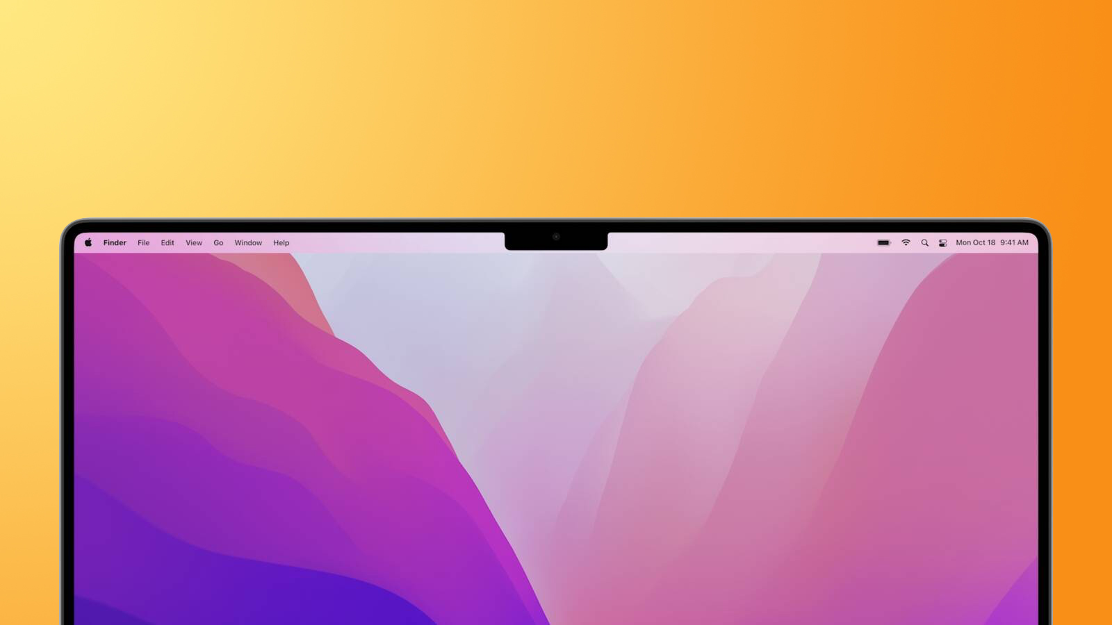
The notch on the newly redesigned MacBook Pro offers a "smart way" to give users more room for their content and allowed Apple to make the bezels thinner and provide more screen real estate to customers, an Apple official has said during a recent media interview.

macbook-pro-2021-notch-feature.jpg

The inclusion of a notch on the entirely revamped MacBook Pros was a surprise and was one of the few last-minute rumors that surfaced ahead of Apple's "Unleashed" event last week. As expected, some social media users have criticized Apple's design choice of adding a notch to the display.

Addressing the company's decision, Shruti Haldea, a manager for the Mac product line and one of the presenters of last week's Apple event, said during an interview on the Same Brain podcast that the notch is a "smart" solution for the Mac as it provides users more room for their content by moving the macOS menu bar out of the way.

Compared to previous iterations of the MacBook Pro design, the new 14-inch and 16-inch models do feature significantly smaller bezels. Apple says the bezels are 24% thinner than the previous generation on the left and right sides of the display, measuring only 3.5mm. On the top, thanks to the notch, the bezel is 60% thinner, also measuring at 3.5mm.

While the notch is noticeable at first, Apple is betting on some macOS software features, including dark mode, to help minimize how noticeable it is to some users in day-to-day use. For example, when macOS apps are in full-screen mode, the system adds a black border to the top of the display, hiding the notch while not interfering with a user's content. Developers can choose to have their app's content shown on either side of the notch.

The notch is one many changes to the new MacBook Pros. The new laptops feature an entirely redesigned chassis, additional ports such as HDMI and an SD card slot, MagSafe, a mini-LED display with ProMotion, and either the M1 Pro or M1 Max chips, which are the first Apple silicon chips designed for professional consumers.

Both the 14-inch and 16-inch MacBook Pro models became available for pre-order last week and will start arriving to customers on Tuesday, October 26. Both sizes can be configured with either the M1 Pro or M1 Max chips, giving users substantial performance gains compared to the M1 Apple silicon chip. Learn more about the new MacBook Pros using our detailed roundup.

Article Link: Apple Says Notch is a 'Smart Way' to Give Users More Space for Content on New MacBook Pros
Hii
 
Register on MacRumors! This sidebar will go away, and you'll see fewer ads.