The photos icon didnt change did it?
Got a tip for us?
Let us know
Become a MacRumors Supporter for $50/year with no ads, ability to filter front page stories, and private forums.
Apple Seeds iOS 7 Beta 5 to Developers
- Thread starter MacRumors
- Start date
- Sort by reaction score
You are using an out of date browser. It may not display this or other websites correctly.
You should upgrade or use an alternative browser.
You should upgrade or use an alternative browser.
picture of the screen? really?
Well, there is no way to make a screenshot when the slide to power off is being displayed...
White on white? Apple are you serious!
That will probably change before the GM.
picture of the screen? really?
REALLY?! You can't screen capture while slide to power off is showing, FYI.
The photos icon didnt change did it?
It's very slightly lighter in places, and there is less overlap.
The photos icon didnt change did it?
No that second one was a concept icon from a forum member of what they wanted to see as the photo icon.
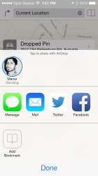
Not sure if this is new but Airdrop now has notification sounds you can change to your liking under Settings > Sounds View attachment 426942
Am I the only person on earth who hasn't been able to successfully update OTA on any of the iOS 7 betas? I always have to download the files and update through iTunes. I'm running an AT&T iPhone 5.
Yes, you are the only person on earth this is happening to
Seriously, I haven't had any issues with that. iPhone 5 on VZ.
I am experiencing the lack of unlock sound that others are getting, though.
Ewwww are they being serious with that inconsistent colored mess in the settings?
The iPhone 5C in neon colors is more than obvious now.
Dont like all those random bright colors. Makes it look cheap ... oh dear i turned into one if those whiny ppl
It's not inconsistent at all. They are color coded by related types of settings.
Is the "Nike + iPod" settings menu greyed out still for everyone else?
Cheers
nope mine allows me to turn mine on and use it
Yeah Im split on the new setting icons too. I like that control center options had very basic icons within general settings, but I can understand getting some color in there. Do not disturb for example has the same IOS 6 color scheme (if I recall).
I like the colored rounded recs. Makes the OS look less sparse and more polished. Though I know some flat design lovers probably hate seeing rounded recs.
They seem to be updating the UI very slowly to become more consistent with every beta. That way they can change the UI to deal with criticism, but not be seen to be back-tracking...
I was going to say the same. Adding to the consistent look.
iOS 7 b5 install screen is the same color as your iPhone color.
My phone's black but gave me a white screen. Am I in an inverted world?
iOS 7 b5 install screen is the same color as your iPhone color.
That's kind of a cool touch. I saw someone updating earlier who said their install screen was white -- I was rather disappointed when mine started installing b5 in the original scheme. Very clever, Apple.
Seems to be downloaded "Artist" artwork in the music player, grouping all songs for that artist. Songs has the album artwork next to it in the list.
They've fixed the new mail notification bug. The number of unread emails wasn't being reset in BETA4
Wish they'd fix or at least do something with the month view in Calendar. It looks awful now that it's all white. Also when you go in the grey dots blink a number of times like they're refreshing. Thought they show coloured dots per day to indicate what type of calendar entries you had that day. A grey dot says nothing especially when you have repeating items such as subscribed calendars of week number etc.
All in all definitely a lot smoother on the iPhone 4S
One thing when you minimise an app (press home button) did the screen always shrink back into the icon? The animation seems a lot better here.
And lastly I am surprised they haven't updated all of their own app icons. They seem to have updated the preinstalled icons but for example "Find my friends" , "Find my phone" , iTunes I and iBooks are still all the old format
Register on MacRumors! This sidebar will go away, and you'll see fewer ads.


