Become a MacRumors Supporter for $50/year with no ads, ability to filter front page stories, and private forums.
It's actually pretty questionable for SQA (Software Quality Assurance).

When 10.6 ships, people are going to get a DVD with the full monty. The DVD installer will need to upgrade a 10.5.x system to 10.6.

*None* of the 10.5.x -> 10.6 installer logic is being tested if Apple is shipping updates to the beta/release candidate.

A certain other major desktop OS vendor is also having an OS beta right now. In contrast, the other vendor is only shipping full DVD kits, and is only allowing updates from the previous released software (no updates from earlier beta/RC builds). Their justification is that the huge majority of customers will be upgrading from released software - so it has *no* SQA value to have people upgrade from earlier builds. If upgrading a beta build doesn't work - they don't care. If upgrading a released system doesn't work - they want to know.

You're not as smart as you think you are.

1. Software Update is a component of the system that needs exercising.

2. Every new beta tester is already testing the full upgrade at least once.

3. Full upgrades are much easier to control and test in-house, because most people install cleanly for those.
 
Hey all,

I'm using the latest build of SL on an aluminium macbook with a geforce 9400m etc.. and I have the slowest results in xbench graphics tests.

for cpu mesurements SL is faster than leopard,
but for the User Interface test in SL and the OPENGL tests I get a score HALF of what I used to get in leopard on the same machine... any thoughts on this??

Thanks,
John

All I can say is to ignore the benchmarks; they mean nothing in the grand scheme of things - the only thing that matter is how you find it when using it in real life scenarios rather than relying on synthetic benchmarking.
 
Hey all,

I'm using the latest build of SL on an aluminium macbook with a geforce 9400m etc.. and I have the slowest results in xbench graphics tests.

for cpu mesurements SL is faster than leopard,
but for the User Interface test in SL and the OPENGL tests I get a score HALF of what I used to get in leopard on the same machine... any thoughts on this??

Thanks,
John
Maybe cause your comparing a full OS to a beta...
 
I have found something new:

in iCal, you can now use Command + I or Command + option + I to display the details of an entry, if you use Command + option + I, you can use tab to jump from entry to entry, while the inspector window updates with the info from the selected entry.

this is new since SL.
 
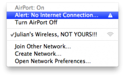
Weird, I'm getting this message yet I'm able to surf fine on my MacBook and my Mini's connected also.
 

Attachments

  • Screen shot 2009-07-15 at 10.29.35 AM.png
    Screen shot 2009-07-15 at 10.29.35 AM.png
    29.3 KB · Views: 843
Any word yet on improved Exchange support?

There were previous issues with:

-Applying photos to Exchange Contacts in Address Book

-Applying entries on your buddy list in iChat to Exchange Contacts would result in those Exchange Contacts "disappearing" from the Exchange list in Address Book and appearing as "On My Mac" contacts (even though the actual Exchange server retained the contact - attempting to add that contact back to the exchange list would result in duplicates on the server when viewed from other devices or web-interface)

-iCal events with any type of recurrence can be added to the Exchange server successfully, but instantly disappear from iCal and are not viewable unless from another device (or web interface)

-No ActiveSync support?
 
Hey all,

I'm using the latest build of SL on an aluminium macbook with a geforce 9400m etc.. and I have the slowest results in xbench graphics tests.

for cpu mesurements SL is faster than leopard,
but for the User Interface test in SL and the OPENGL tests I get a score HALF of what I used to get in leopard on the same machine... any thoughts on this??

Thanks,
John

5X in BILLY MAYS-
XBENCH IS TOo OLD FOR RELIABLE BENCHMARKING
 
Well, 411 killed my install somehow. Not sure how but it did. So this morning I reinstalled the original build and now it's feeding me seed updates one at a time. I guess you can't install all the way to the newest seed all at once for some reason. I have had to download each update one at a time. I'm only on the second update now and its still got a while to go! Then I have to decide whether I want to take a risk and try 411 again. :(

Fake Edit: Well, I'm going for it. I'm updating to 411 again after downloading and installing both 394 and 402 consecutively. These updates are huge. Wish they'd put them all in one update for us unlucky people who have had to reinstall.

Does anyone notice that deleting files from the desktop no longer fades the icon away as it used to in previous builds? I thought that was a nice change from Leopard, but now it just abruptly disappears!
Actually, that was in 402. Im using that right now and they just disappear.

But I actually prefer this because the fading took way too long for me. It would sit for literally a whole second after the sound effect before finally fading out. I actually found it annoying. So I'm glad it's back to disappearing at least until the delay is fixed.

At least the selection box fade is still there. :D That's the second thing I noticed when I installed 10.6 originally a month or so ago.

I want a level of customization equal to OS 9. I want to be able to change the highlight color for the menus and the title bar font.

I don't like how OS X has no real UI customization.
That's really all I ask for.

OS 9 and 8 had like two dozen really nice colors for highlighting that you could choose from. I always loved Crimson. (The deep red one) And I always changed my font to, well I forget the name now, but it was more round than Charcoal (Which was OS 9's default) and Chicago (Which was the default for everything starting from the original System 1.)

When OS X came out with just blue and graphite I waited each update for new colors. That's all I ask for. A red option. A green one maybe. With OS X's power they could easily do a hue adjustment on blue elements (Buttons that are glowing, scrollbars, the menu selections) with no impact to the system. Shame. I hate having to rely on third parties to make my OS have different colored highlights. I don't want a whole new theme. I find many third party themes uglier than crap. The really nice ones though are amazing and they usually just change things slightly. I want red! :(

And I want to use Century Gothic or something else in my menus!

System Profiler -> Software -> 64-bit Kernel and Extensions: (No)
Mine says NO too. :( How do you turn it on? Or is it something we have to wait for?
 
Hm.. the Quicktime interface has been redesigned. Not sure yet if i like it.

I'm hoping that doesn't became the general appearance. It's just too dark. On the other hand, I do like the buttons at the top.

OS 9 and 8 had like two dozen really nice colors for highlighting that you could choose from. I always loved Crimson. (The deep red one) And I always changed my font to, well I forget the name now, but it was more round than Charcoal (Which was OS 9's default) and Chicago (Which was the default for everything starting from the original System 1.)

Was it Techno?
 
Was it Techno?
It might have been. I'd have to install OS 9 onto one of my Macs to check because looking at Techno in Fontbook doesn't give me that same OS 9 UI feel.

Quicktime X's new control bar:
o8hpxe.jpg


Dock Grid Stack views now blur the background: (Looks really nice overlayed on windows)
5zmwro.jpg

Also note the spacing difference.

Dock Menus now have original font size and also blur background:
313lldl.jpg
 
I like the blur behind the menus and how they've become more translucent. It does say MS a bit, though.

Can someone take a picture comparing an earlier build of SL's and 10A411's menubar menus, i.e. the Apple menu? If you wouldn't mind could you also use the "Earth Horizon" background (or if you know something else that shows translucency better, use that)?

Thanks.
 
Is it me or does anybody else thinks 402 has the best look for the Dock Menu? 411 looks like W7 Menu, font is too ugly and too light.
 
I think that's wrong...

open a terminal windows and type 'echo $HOSTTYPE ; echo $MACHTYPE'

Not the same thing as kernel type. Those explains that you have a 64bit machine, not 64bit OS.

The best way is to use System Profiler>Software>64bit kernel and Extensions

or

type in terminal window, uname -v (look at the end, it should say i386 for 32bit)
 
I like the blur behind the menus and how they've become more translucent. It does say MS a bit, though.

Can someone take a picture comparing an earlier build of SL's and 10A411's menubar menus, i.e. the Apple menu? If you wouldn't mind could you also use the "Earth Horizon" background (or if you know something else that shows translucency better, use that)?

Thanks.
I would have if I had known earlier. I just reinstalled every single update one at a time this morning.

Sorry.

What exactly are you looking for?
 
I would have if I had known earlier. I just reinstalled every single update one at a time this morning.

Sorry.

What exactly are you looking for?

I'm looking to see if the menubar menus have changed transparency. With the changes to the Dock menus, I think there might be a change to the menubar menus.

Below is Leopard with the MR Forums thing behind it. I feel this shows transparency the best.
 

Attachments

  • Picture 2.png
    Picture 2.png
    37.9 KB · Views: 561
Dock Grid Stack views now blur the background: (Looks really nice overlayed on windows)
5zmwro.jpg

Also note the spacing difference.

Dock Menus now have original font size and also blur background:
313lldl.jpg

Definitely looked better without the blur in my opinion. and 402's contextual menus in the dock were way better. I'm excited to see which direction they go with the next build.
 
Back arrow change on grid windows

One other minor visual change that nobody else has mentioned AFAIK. The 'back' arrow, at the upper, left-hand corner of open grid windows, now just contains a left-pointing arrow, rather than the name of the folder that clicking the button will return the user to.

web.jpg


I think this is an improvement because the previously used buttons would only get so wide, and if the name of the folder didn't fit within the button, it looked pretty ugly.:cool:
 
One other minor visual change that nobody else has mentioned AFAIK. The 'back' arrow, at the upper, left-hand corner of open grid windows, now just contains a left-pointing arrow, rather than the name of the folder that clicking the button will return the user to.

I think this is an improvement because the previously used buttons would only get so wide, and if the name of the folder didn't fit within the button, it looked pretty ugly.:cool:

It it was longer and said "Back," it would be better, IMO.
 
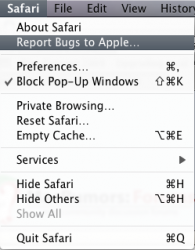
One thing that was really bugging me in all of the builds of Safari 4, up until now, is that I had to click in the main body of the Safari window, then into the address bar, before I could type in a URL. :mad:

Thankfully, that seems to have been fixed in this current build.:D

It it was longer and said "Back," it would be better, IMO.

Hmmm... Not sure I agree. I like the simple, minimalist look of the grid windows, and less text seems to fit better. However, I would be behind the idea of adding a tooltip for that button that read 'Show the previous folder'.
 
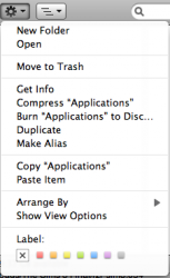
I just noticed this (it may have been changed in previous builds), but it seems the menu if you use the little gear button in finder instead of right clicking is smaller.
 

Attachments

  • Screen shot 2009-07-15 at 4.32.17 PM.png
    Screen shot 2009-07-15 at 4.32.17 PM.png
    36.2 KB · Views: 84
I just noticed this (it may have been changed in previous builds), but it seems the menu if you use the little gear button in finder instead of right clicking is smaller.

Good find. I wish all the menus would inherit that size of font... Always thought fonts are too small. Actually, it would be nice if they were variable depending on the size of your display... now that would be progressive!
 
Grid View would be PERFECT if they moved the "Open in Finder" icon from the bottom of the list view and made it a button at the top on the right side (Adjacent to the Back button next to the title) so I didn't have to SCROLL ALL THE WAY TO THE BOTTOM TO CLICK IT! It seems like that would be the most logical place to put it. WHY make it another icon in the view to click? It made sense when that view didn't have scrolling, but now it does scroll so put the button at the top in the "titlebar" area.
 
Register on MacRumors! This sidebar will go away, and you'll see fewer ads.