Become a MacRumors Supporter for $50/year with no ads, ability to filter front page stories, and private forums.

XTheLancerX

macrumors 68000
Aug 20, 2014
1,911
782
NY, USA
I'm starting to think jimmy rustling is indeed the goal here. I'll post if I see any actual persistent lag that wasn't there before.. :)
Yeah the only things I am concerned about being broken are spotlight and control center. Spotlight is far smoother than before on both my mini 2 and iPhone 6. That lag in the middle of the pull down is no longer there for either device and the keyboard pops up 100% smooth now on my mini 2. I'd hate for that to be broken. Control center is much better than before as of now, still not perfect may I add, but definitely a huge step in the right direction. Would hate to see that go as well. App switcher is better too but still needs work.
 
  • Like
Reactions: JonneyGee

Aston441

macrumors 68030
Sep 16, 2014
2,606
3,934
Am amazed that a compagny such has Apple, who has always goes the extra length to make sure their products looks good, prioritized a yellow screen over a dark mode???

I love nightshift and use it all the time, but at least the dark mode wouldn't affect picture and movies.. Just my two cents!


I suspect that "Dark Mode" will be the new hot theme of 2018 when Apple releases iOS X concurrent with OLED screens on all new devices, to save battery. Except then all devices will be "dark mode" all the time. Android and Windows will all be dark mode too about 6 months afterwards. Bright All White Screens will be so passe and so yesterday.

Then, four years after that, OMG flatness will be out, and 3D look will be in. We are drooling idiot consumers and will all fall for this BS.
 

iFanaddic

macrumors 6502a
Sep 24, 2008
818
241
Montréal, Canada
It's not the same thing.
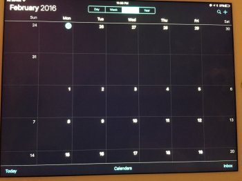
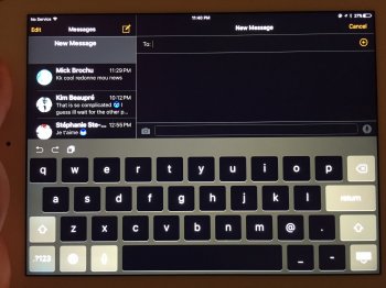
But same purpose. Both Nightshift and dark mode are both meant to reduce eye fatigue. I'm just saying dark mode will at least allow picture and movies to remain unaltered, Nightshift is only necessary because of all the white Apple insists on putting in iOS

Looks like ill have to keep inverting colors from the accessibility menu although that also ruins movies!! :(

image.jpeg image.jpeg
 
Last edited:

C DM

macrumors Sandy Bridge
Oct 17, 2011
51,390
19,458
But same purpose. Both Nightshift and dark mode are both meant to reduce eye fatigue. I'm just saying dark mode will at least allow picture and movies to remain unaltered, Nightshift is only necessary because of all the white Apple insists on putting in iOS

Looks like ill have to keep inverting colors from the accessibility menu although that also ruins movies!! :(

View attachment 612533 View attachment 612534
Blue light exists even with darker colors so even with a dark mode blue light reduction would still have its use.
 
  • Like
Reactions: mabaker

Alex Frolo

macrumors newbie
Jan 25, 2016
1
0
Unfortunately, the keyboard bug in Safari from beta 1 is still present. Just try to type any punctuation symbol in address/search bar and you'll see that keyboard is not switching back to letters automatically as it supposed to be.
 

T4R06

macrumors 65816
Oct 8, 2007
1,212
74
CT
What BT problem? I have BMW 2015 3 GT M sport and Mini Cooper sport 2016 without any issues on both.
 

macduke

macrumors G5
Jun 27, 2007
13,141
19,677
As someone who does a lot of UX testing as part of my job, I take issue with the placement of this control center icon. It's a setting, not a toggle. The bottom row is for actions that launch things, while the top is for settings toggles.

Apple just needs to bite the bullet and let us customize our control center toggles. I'd rather have toggles for low power mode, hotspot, and night shift up top. As an Apple Watch user I never turn off Bluetooth, and as someone who doesn't fly very often I don't find myself needing to activate airplane mode repeatedly. I mean seriously—control center is a main section near the top of the settings app, but only has two settings under it!

I hope that to build upon night shift mode in iOS X, they have a dark mode for the UI. It would be even better to have a toggle for it in Notification Center. I'd use something like that far more often than lock rotation. Let us customize!

Oh and another thing: why can't I tap on the 4K icon in the camera app to toggle between that and 1080p? There are certain videos I don't care about and others with my kid that I'd like archival footage. Digging deep into the settings each time is not ideal. Why can't 3D Touch be utilized for cool shortcuts like that? Hopefully they go deeper with it in iOS X.
 

iGeneo

macrumors demi-god
Jul 3, 2010
1,387
2,588
Didn't see it mentioned...

the "wallpaper" shortcut when using 3D touch on the settings button has been removed.
 

iTom17

macrumors 6502a
Aug 2, 2013
967
1,130
Eindhoven, the Netherlands
Didn't see it mentioned...

the "wallpaper" shortcut when using 3D touch on the settings button has been removed.
Saw that too. Quite disappointing to be honest. Not that I change the wallpaper that much, but it was nice to have it on the home screen. Kinda like with Android, where you can hold your finger at the home screen to change wallpaper. It's a nice addition. Hope it comes back in a later beta or so, but guess we'll have to wait for that to see. :p

Liking iOS 9.3 beta 2 so far. It runs buttery smooth on both my iPhone 6s and iPad mini 4. There's a noticeable difference. :)
 

Talukdar

macrumors member
Nov 9, 2015
44
4
It is a good new for all apple users. But I am not worried about it. Because I am not going to use this feature. Main reason is that it makes the screen color orange. I think it is better to use a screen protector like "ocushield" which provide same facilities and screen remain same.
 

petsounds

macrumors 65816
Jun 30, 2007
1,493
519
I don't like the new icon. Bring back the bedside lamp!

People most likely would've thought the lamp icon was another kind of flashlight mode. I think the new icon is quite great. The moon shape in the iris area also creates a look of drowsiness to the eye. I love the double-meaning of Night Shift as well. This feature gets some of the best branding Apple has done in a while.
 

Capric0rn

macrumors member
Sep 25, 2011
53
12
I don't like the new icon. Bring back the bedside lamp!

Screen-Shot-2016-01-21-at-14.11.32.png


ios-9.3-night-shift.jpg


Probably someone at Apple thought, users would be confused, because an actual bedside lamp doesn't filter blue light. So that's why we can't have nice things. :(

The icon design looks out of place in the lower portion of the Control Center to begin with imo. For consistency purposes the colors should be flipped, so that the moon is see-through, and the rest of the icon is black. The other icons in the lower portion are styled in this same way. I agree though, the bedside lamp icon looks a lot better!

Also, just noticed that the brightness adjustment bar is smaller than the volume adjustment bar o_O
 

DaveMcM76

macrumors 6502
Mar 13, 2012
439
397
Scottish Highlands
Guys, is any one of you having trouble dictating a reminder to Apple Watch (watch OS 2.1) and it not showing up on the iPhone (iOS 9.3 Public Beta 1 / DP 1.1) Reminders app, or giving some random garbage message?

This is listed as a known issue in the Apple Watch section on page 3 of the release notes...

"When paired with an iPhone running iOS 9.3, an Apple Watch running watchOS 2.1 will fail to send back Reminder responses to the phone."
Update: Sorry - missed that you are still on 9.3 Beta 1 and that quote is from the Beta 2 release notes but either way it implies issues with reminder functionality between watchOS 2.1 and iOS 9.3....

it is a beta for a reason...
 
Last edited:

JetLaw

Cancelled
Jan 21, 2009
246
750
Why, oh why, would Apple add NightShift to Control Center? It's not like this is a feature that users need to turn on and off on a regular basis.

Maybe I'm just getting old and crotchety, but it seems like I used to be on the same page with regard to changes that Apple made, and I won't be so cocky as to say that Apple is objectively "wrong" about this, but I can certainly say that it seems like a laughably poor choice to me.

This is a control center button that I will never use, and as a result of it being there all the other buttons that I DO use are now smaller.

Come on, Apple. Go back to being really thoughtful and take this out before this update ships, or at least give your customers some more control over iOS.
 
Register on MacRumors! This sidebar will go away, and you'll see fewer ads.