Got a tip for us?
Let us know
Become a MacRumors Supporter for $50/year with no ads, ability to filter front page stories, and private forums.
Apple Seeds Second iOS 9.3 Beta to Developers With Night Shift Toggle in Control Center
- Thread starter MacRumors
- Start date
- Sort by reaction score
You are using an out of date browser. It may not display this or other websites correctly.
You should upgrade or use an alternative browser.
You should upgrade or use an alternative browser.
It's similar to DND which has been in CC since the beginning.Why, oh why, would Apple add NightShift to Control Center? It's not like this is a feature that users need to turn on and off on a regular basis.
Maybe I'm just getting old and crotchety, but it seems like I used to be on the same page with regard to changes that Apple made, and I won't be so cocky as to say that Apple is objectively "wrong" about this, but I can certainly say that it seems like a laughably poor choice to me.
This is a control center button that I will never use, and as a result of it being there all the other buttons that I DO use are now smaller.
Come on, Apple. Go back to being really thoughtful and take this out before this update ships, or at least give your customers some more control over iOS.
At the same time there's the the DND icon which also uses the crescent moon and makes it somewhat strange to have two icons that use that. On top of the OS control appearing at the bottom of CC while all the other controls are appearing at the top.People most likely would've thought the lamp icon was another kind of flashlight mode. I think the new icon is quite great. The moon shape in the iris area also creates a look of drowsiness to the eye. I love the double-meaning of Night Shift as well. This feature gets some of the best branding Apple has done in a while.
It's gone on my 6s+Still present on my 6S Plus... unless you mean something else
View attachment 612561
Why, oh why, would Apple add NightShift to Control Center? It's not like this is a feature that users need to turn on and off on a regular basis.
Maybe I'm just getting old and crotchety, but it seems like I used to be on the same page with regard to changes that Apple made, and I won't be so cocky as to say that Apple is objectively "wrong" about this, but I can certainly say that it seems like a laughably poor choice to me.
This is a control center button that I will never use, and as a result of it being there all the other buttons that I DO use are now smaller.
Come on, Apple. Go back to being really thoughtful and take this out before this update ships, or at least give your customers some more control over iOS.
I never use DND but use personal hotspot all the time. I'm sure there are lots of people who never use personal hotspot but use something else like cellular data toggle. This is why Apple needs to allow user configuration of control center.
At the same time there's the the DND icon which also uses the crescent moon and makes it somewhat strange to have two icons that use that. On top of the OS control appearing at the bottom of CC while all the other controls are appearing at the top.
Seems to me it was placed there because they didn't have room to add another icon on the top (at least not on iPhone). I wonder how many people are going to update their software and think ooh that shortcut is placed in the wrong spot. My guess is not many. If Apple makes control center customizable are they going to restrict what can go in the top row vs the bottom row to fit some definition of "system setting" vs something else? Flashlight isn't a system setting but it isn't an 'app' either. So in theory it doesn't fit on either row.

So can anybody tell me why this icon is in the (bottom) 'Apps' area while it's clearly a (top) 'settings toggle'? I find this quite confusing since it doesn't start anything and it's just like turning on/off wifi... Also don't like the extra question regarding when it should be disabled, this is also not done with 'do not disturb'...
What problem are you referring to?Hopefully they fix the Bluetooth car problem. Annoying as hell...
My comments from https://forums.macrumors.com/thread...n-control-center.1952691/page-3#post-22503460 would seem to apply here as well.I never use DND but use personal hotspot all the time. I'm sure there are lots of people who never use personal hotspot but use something else like cellular data toggle. This is why Apple needs to allow user configuration of control center.
Seems to me it was placed there because they didn't have room to add another icon on the top (at least not on iPhone). I wonder how many people are going to update their software and think ooh that shortcut is placed in the wrong spot. My guess is not many. If Apple makes control center customizable are they going to restrict what can go in the top row vs the bottom row to fit some definition of "system setting" vs something else? Flashlight isn't a system setting but it isn't an 'app' either. So in theory it doesn't fit on either row.
That said, I get the spacing part of it and that most won't really care much, but it doesn't make it less of a UX inconsistency (not a big issue or anything like that) nonetheless.
Last edited:
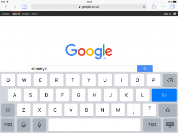
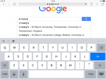
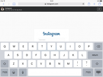
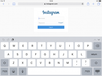
Well if anyone from apple is looking ive got nowhere with reporting an issue over the last three 9 versions. If you have shortcuts disabled on keyboard and visit say google search the page does not scroll up properly. Similar issue with instagram and logging in. Shortcuts 'enabled' the page scrolls up correctly.
Attachments
What problem are you referring to?
I had a problem on iOS 9.3 beta 1 with my iPhone 6 Plus where the call would end if I pressed the power button while on a call through my bluetooth headset. I do lots of con calls and I always turn the screen off after connecting to save battery but with the lastest beta that was ending the call.
Is this gone in beta 2 or is it still present. I would like to go to ios9.3 but need my calls to not end with power button.
According to a tweet from Mark Gurman, customizable control center was in testing with 9.3. I wouldn't be surprised if we see it as a feature for iOS 10.
That would certainly be nice. I know it seems nit-picky, but it sucks having to get nervous every time an update is about to come out for fear that Apple is going to hard-code an interface change that would be user-configurable on every other operating system on the planet.
[doublepost=1453830012][/doublepost]
I never use DND but use personal hotspot all the time. I'm sure there are lots of people who never use personal hotspot but use something else like cellular data toggle. This is why Apple needs to allow user configuration of control center.
Seems to me it was placed there because they didn't have room to add another icon on the top (at least not on iPhone). I wonder how many people are going to update their software and think ooh that shortcut is placed in the wrong spot. My guess is not many. If Apple makes control center customizable are they going to restrict what can go in the top row vs the bottom row to fit some definition of "system setting" vs something else? Flashlight isn't a system setting but it isn't an 'app' either. So in theory it doesn't fit on either row.
I agree with your sentiments. The hard-coded Control Center feels like buying a house where the kitchen cabinets come filled with the dishes and silverware from the previous owner without any ability to arrange things the way I want.
Looks like only the new Night Shift option is new there.Looks like some common Accessibility options made their way to the Display & Brightness section in Settings...
View attachment 612609
Go back a few years and the whole idea of contro center would have been unthinkable. So I take what I can get and hope that over time more and more things will open up.That would certainly be nice. I know it seems nit-picky, but it sucks having to get nervous every time an update is about to come out for fear that Apple is going to hard-code an interface change that would be user-configurable on every other operating system on the planet.
[doublepost=1453830012][/doublepost]
I agree with your sentiments. The hard-coded Control Center feels like buying a house where the kitchen cabinets come filled with the dishes and silverware from the previous owner without any ability to arrange things the way I want.
I never had that Text Size selection there in this menu (even the first 9.3 beta) - it was always under AccessibilityLooks like only the new Night Shift option is new there.
I don't know about others, but I personally wouldn't want my iOS device making itself color inaccurate on purpose (yeah who needs blues?). I also work nights a lot and I sure as hell don't need something encouraging me to go to sleep even before I get to work. This better just be an OPTION.
Odd, I have it there now with iOS 9.2.1 and recall it being there in earlier versions of iOS 9.I never had that Text Size selection there in this menu (even the first 9.3 beta) - it was always under Accessibility
[doublepost=1453836370][/doublepost]
Clearly it's an option, not sure what would suggest otherwise. It's there to help those who might use their devices shortly before bed and perhaps while in bed to reduce blue light that might affect their sleep. It doesn't encourage sleep it just removes some things that could interfere with good sleep for people.I don't know about others, but I personally wouldn't want my iOS device making itself color inaccurate on purpose (yeah who needs blues?). I also work nights a lot and I sure as hell don't need something encouraging me to go to sleep even before I get to work. This better just be an OPTION.
Why do you want cellular toggle? What's your purpose? You can always hit the airplane mode.Come on Apple, for God's sake add a cellular data toggle in control centre, or at least in the settings 3D touch shortcuts...
Hopefully they fix the Bluetooth car problem. Annoying as hell...
Hey, I had the same issue. When you locked the phone the call was terminate. Is it fix with the beta 2?
Would you able to let me know?
thank you
I hope iOS X allows customizing quick actions. After all, they're quick actions, right? We should be able to configure them to do the quick actions we use the most. A third party dev could present a list of available actions, and the settings app would have a quick actions section that queries those lists with each app listed—much like we have today for other things like privacy settings, cellular and battery usage, etc. Tap on an app and see the current quick actions. Use a UI similar to editing widgets in notification center. Put a cap on how many actions can be listed at a given time, along with the ability to turn it off completely. Done.
Register on MacRumors! This sidebar will go away, and you'll see fewer ads.