Why is that video full screen like that? That is not how any video I play looks by default. They all play within the content area. You only see it like that if you zoom the video in. When you do that, you are hiding the top and bottom of the video. If you want it to look like that, its fine but of course it’s going to overlap the island.How is that going to work here?
Got a tip for us?
Let us know
Become a MacRumors Supporter for $50/year with no ads, ability to filter front page stories, and private forums.
Apple Unveils iPhone 14 Pro With Dynamic Island, Always-On Display, 48MP Camera, and More
- Thread starter MacRumors
- Start date
- Sort by reaction score
You are using an out of date browser. It may not display this or other websites correctly.
You should upgrade or use an alternative browser.
You should upgrade or use an alternative browser.
Ask Apple, it’s their video!Why is that video full screen like that? That is not how any video I play looks by default. They all play within the content area. You only see it like that if you zoom the video in. When you do that, you are hiding the top and bottom of the video. If you want it to look like that, its fine but of course it’s going to overlap the island.
But keeping it inside the “pill” is going to make the screen just that much smaller. The pill goes way further into the screen than the notch did. Great usage of that 6.7 inch screen.
Thank diversity hire for the world's lack of talentDynamic Island lol who names this ****…

For what? The cut out has been around in android phones for 5 years. Apple is 5 years late. Who is copying who 🤦♀️Android Manufacturers, start your Photocopiers.
Well, that was needlessly racist…Thank diversity hire for the world's lack of talent
If that triggers you then that just shows its true. Nothing racist about speaking FACTS. When you hire based on politics rather than talent you will get exactly the results of your poor decision makingWell, that was needlessly racist…
If that triggers you then that just shows its true. Nothing racist about speaking FACTS. When you hire based on politics rather than talent you will get exactly the results of your poor decision making
Doesn’t trigger me. Clearly it’s ******** designed to do just that.
Holy smokes! The euro price increased by €200 for the pro max model!
Remember all those anti-trust lawsuits & fines out of Europe?
yeah...
Brazil better watch it next year too...
/s
While I wouldn’t go that far, the coolness factor can’t be denied and will make 13 Pro owners who were steadfast about waiting until the 15 or 16 Pro think twice about that decision. It gives the iPhone a change that will make others know you have something new similar to the way people knew when they saw my X years ago.
Not everybody shares your view on whether it looks cool though. It’s now an island notch that’s more intrusive in the screen and for me the notch looks way better. Let’s not forget the iPhone 14 still has the same notch as the 13 Pro so it’s hardly out of date. This appears to be a classic example of because something is new, it has to be thought of as better because there’s been some cool video marketing that’s got some people convinced.
Great improvements. Camera seems to be very good. Have to see how the Purple looks like in real lighting conditions. Also hope the Gold is brighter this year.
Even when you don't need this iPhone or new phone in general, Apple will make you want it.
I don’t think so mate, not with the huge price increase in the UK and Europe across the range. In fact it’ll be having people questioning whether to upgrade at all and I am definitely one of them.
I’m annoyed by the lack of sim — important for travel since esim is mostly data only which makes it hard to make local calls
New colors are lame I want a blue phone
I’ll still buy one since my 11 is barely usable these days but not a slam dunk like I was hoping.
New colors are lame I want a blue phone
I’ll still buy one since my 11 is barely usable these days but not a slam dunk like I was hoping.
Why does only the 14 get the new "Photonic Engine" and Action Mode even though the 13 Pro has the exact same wide sensor and SoC?
Photonic Engine is nothing more than a software tweak in the pipeline to use Deep Fusion (3 year old algorithm!) earlier than before. Wow, requires so much power.
Right, artificial differentiation and making people buy the 14 instead.
Photonic Engine is nothing more than a software tweak in the pipeline to use Deep Fusion (3 year old algorithm!) earlier than before. Wow, requires so much power.
Right, artificial differentiation and making people buy the 14 instead.
Same place as the 13 series, but it looks like is slightly smaller and longer?:Where is the ear speaker on the screen?
This obsession for notches that Apple has... it goes against typical Apple designs that are meant to look beautiful and functional.
Apple exec in 2021: "Boss, everyone hates the notch, but I have a couple of ideas to really ramp up the annoyance- let's put the evil thing on MacBooks for no reason other than to annoy people..."
Tim Cook: "But with no FaceID, right?"
Exec: "Of course, no FaceID and still a ****** webcam! They'll despise it! And secondly, let's make the iPhone Pro notch even more intrusive, and let's trick the dopier customers into thinking it's actually a selling point!"
Tim Cook: "Brilliant! We nailed it again!"
Hate the notch or pill cutout on the iPhone all you want, but the Dynamic Island on the 14 Pro is ****in awesome. Finally, Apple has decided to take a risk and innovate and I would say they nailed it.This obsession for notches that Apple has... it goes against typical Apple designs that are meant to look beautiful and functional.
Apple exec in 2021: "Boss, everyone hates the notch, but I have a couple of ideas to really ramp up the annoyance- let's put the evil thing on MacBooks for no reason other than to annoy people..."
Tim Cook: "But with no FaceID, right?"
Exec: "Of course, no FaceID and still a ****** webcam! They'll despise it! And secondly, let's make the iPhone Pro notch even more intrusive, and let's trick the dopier customers into thinking it's actually a selling point!"
Tim Cook: "Brilliant! We nailed it again!"
But I do agree, the notch on MacBooks is literally so stupid without any sort of special hardware inside.
Hate the notch or pill cutout on the iPhone all you want, but the Dynamic Island on the 14 Pro is ****in awesome. Finally, Apple has decided to take a risk and innovate and I would say they nailed it.
But I do agree, the notch on MacBooks is literally so stupid without any sort of special hardware inside.
It’s very difficult to agree it looks ‘awesome’ when you think it’s doesn’t and it just a notch, lowered, and obstructing more of the screen though.
Ok, Apple still shrinked the cutout and managed to make a new, interactive iOS experience out of it that's useful and innovative using that gained space. I can definitely see this being very nice for some multitasking.It’s very difficult to agree it looks ‘awesome’ when you think it’s doesn’t and it just a notch, lowered, and obstructing more of the screen though.
It really is a cool and clever software fudge, and I commend those that created it- that doesn't disguise the fact it's covering up a hardware defect that the competition don't struggle with. What other premium phones waste so much screen real estate with their cutouts or notches?Hate the notch or pill cutout on the iPhone all you want, but the Dynamic Island on the 14 Pro is ****in awesome. Finally, Apple has decided to take a risk and innovate and I would say they nailed it.
But I do agree, the notch on MacBooks is literally so stupid without any sort of special hardware inside.
Pardon? Gained space?? You mean the bit above that cutout that is used for absolutely nothing?Ok, Apple still shrinked the cutout and managed to make a new, interactive iOS experience out of it that's useful and innovative using that gained space. I can definitely see this being very nice for some multitasking.
Does the competition have to deal with 3D facial scanning sensors next to the camera? No, they don't.It really is a cool and clever software fudge, and I commend those that created it- that doesn't disguise the fact it's covering up a hardware defect that the competition don't struggle with. What other premium phones waste so much screen real estate with their cutouts or notches?
They only have holepunches, because they use the plain old garbage facial recognition with the front camera.
I seriously don't get why you are complaining about this. You wanted the notch gone, now it's no more and the cutout is actually very useful now and is a new way to interact with iOS.
Then you say that the notch is better, because the Dynamic Island is a gimmick or something and the pill cutout is somehow worse?
Get a grip.
Then you say that the notch is better, because the Dynamic Island is a gimmick or something and the pill cutout is somehow worse?
Get a grip.
Some thoughts and facts:
The dynamic island (Samsung's jargon includes "dynamic") uses your display to show animations around the large pill cut-out. There are several ways to view notifications/widgets/phone call answering etc. already on the iPhone so that's nothing exciting nor amazing to discuss. I see people calling that part of this so-called upgrade as brilliant when it's not at all. No way is a new way of seeing such basic smartphone features w/ prettier animations around a large pill cut-out is seen as a significant upgrade.
Oh for the large number of Apple Watch users including myself, will you really look at your notifications/answer phone calls etc on your iPhone when your watch will do this just fine so it's truly a waste for this large sector of Apple device users?
By the way, the island reminds me of the touch bar on the Macbook laptop (did anyone use it? Nope!) and it is similar to the LG V20 smartphone touch bar (released before even the MacBooks got this useless feature) from many years ago according to phone lifespans; modernized with additional notifications. If notifications/call functions/extending your fingers to the top of your long display are amazing features, we really are not paying attention to what's already normal features on smartphones.
Take away the bells and whistles and see this as for what it really is, this was met to make people think this is a new iPhone.
This phone is really just a camera upgrade (cameras have been great past few years) especially with the lack of USB-C. Also, I'm ready for Apple to make slimmer more modernized iPhones; to even go thicker with the brick sized pro max is unthinkable and they did!!!
Apple needs to think of a way to get rid of the stovetop back camera design too since it looks stale. Also, the entire body of the iPhone needs a makeover. Will this body remain for a decade?
Pros of iPhone: camera (to some) and purple new color (why?)
Also, the watch ultra is just a money grab ( "Ultra" is typically Samsung jargon as well). It really looks like they just have no innovative ideas remaining. Hmm....
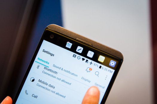
LG V20 pic is attached for reference....smh
The dynamic island (Samsung's jargon includes "dynamic") uses your display to show animations around the large pill cut-out. There are several ways to view notifications/widgets/phone call answering etc. already on the iPhone so that's nothing exciting nor amazing to discuss. I see people calling that part of this so-called upgrade as brilliant when it's not at all. No way is a new way of seeing such basic smartphone features w/ prettier animations around a large pill cut-out is seen as a significant upgrade.
Oh for the large number of Apple Watch users including myself, will you really look at your notifications/answer phone calls etc on your iPhone when your watch will do this just fine so it's truly a waste for this large sector of Apple device users?
By the way, the island reminds me of the touch bar on the Macbook laptop (did anyone use it? Nope!) and it is similar to the LG V20 smartphone touch bar (released before even the MacBooks got this useless feature) from many years ago according to phone lifespans; modernized with additional notifications. If notifications/call functions/extending your fingers to the top of your long display are amazing features, we really are not paying attention to what's already normal features on smartphones.
Take away the bells and whistles and see this as for what it really is, this was met to make people think this is a new iPhone.
This phone is really just a camera upgrade (cameras have been great past few years) especially with the lack of USB-C. Also, I'm ready for Apple to make slimmer more modernized iPhones; to even go thicker with the brick sized pro max is unthinkable and they did!!!
Apple needs to think of a way to get rid of the stovetop back camera design too since it looks stale. Also, the entire body of the iPhone needs a makeover. Will this body remain for a decade?
Pros of iPhone: camera (to some) and purple new color (why?)
Also, the watch ultra is just a money grab ( "Ultra" is typically Samsung jargon as well). It really looks like they just have no innovative ideas remaining. Hmm....
LG V20 pic is attached for reference....smh
Attachments
Last edited:
Register on MacRumors! This sidebar will go away, and you'll see fewer ads.