Become a MacRumors Supporter for $50/year with no ads, ability to filter front page stories, and private forums.
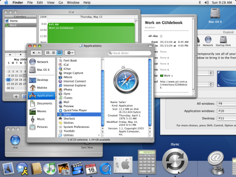
I wonder how many of Apple's UI designers are actually old enough to have seen Tiger.
IMHO it was the best UI/Apple OS ever - metal+aqua
 

Attachments

  • 2014-04-22-panther.png
    2014-04-22-panther.png
    488.4 KB · Views: 78
Am I the only one thinking solid colors with fewer translucent elements would actually be a better design choice here. I kinda don’t think this design is the future for desktop OS(s). It just feels outdated tbh. And more focus on functionality over design. We really need that.
 
  • Like
Reactions: GlassFingers
Am I losing my vision or is the once circular trash bin in the dock now the same as windows recycle bin. 🤦🏻‍♂️
yes, it resembles windows 11's, but with Windows 98's grayscale, and I believe, opacity. Since it's a folder, it doesn't tint as other apps, so it will stand out in the dock
 
I didn't expect them to add the phone app. I'm glad they did.
That is a nice addition. It was always awkward relying on FaceTime to answer calls from my iPhone on Mac. I am looking forward to the consistency in how we use the same apps across devices.

Transparent menu bar …here we go again. 👎
I wonder how the font will handle changing desktop backgrounds? I have mine to rotate through Apple's "curated" set . At least for now the menu bar font is always consistently the same color...

Honestly - with all of these new features the past two or three gets, MacBooks are quickly becoming a larger form factor way to use your phone. iPads always were, but interesting Macs are following
I welcome this. It is nice to view/reply to notifications, messages, phone calls, etc. from Mac when I am already using it than to constantly switch between Mac and iPhone.
 
This looks awful. Did they actually focus test any of this? Faded out and transparent monochromatic app icons are harder to see and recognize instantly. This is right up there with making only text fonts smaller and thinner and grey against white rather than heavier black text against white. They reduced contrast is harder on the eyes.

This doesn’t look at all inspiring. I don’t want this on my devices.
 
Also really like the idea of putting the Control Center stuff from iOS into the sidebar. I could see that making my life easier, depending on the particulars.
I don't think its in the sidebar, it looks like its in the same place as the current control center.
 
I like that macOS Tahoe has its roots in 4.3BSD Tahoe.

First versions of NextSTEP were built upon 4.3BSD Tahoe! Maybe we can get macOS Reno next?
 
Also is it me or did we barely get any new real features? I feel like this year aside from the new design was pretty weak in terms of features in macOS and iOS.
Posts like yours drive me insane. We get an os that's light on the fancy-shmancy but has plenty of under the hood/stability improvements we get comments like yours - "Where are the new features?" and when we get an os with lots of new features we hear "But I want stability improvements"

Apple can't win to save its life.....
 
I think I’m just getting old cause these announcements are just not as exciting as they used to be
It's because nothing is surprising anymore. All the leaks make it to where everything is none before announcement. Gone are the days of "One more thing..."
 
I'm surprised no one has brought up the new sidebar design that sort of floats over the window and for some reason has the window controls embedded in it. I... don't like it. I always liked the subtle vibrancy effect on sidebars from Yosemite through Sequoia.
View attachment 2517691
Yes this is quite ugly! It feels like it’s blocking the view of something
 
The new UI is just awful. Try reading the text underneath "Energy Mode"... you have to squint to read it because of the translucency behind it.

f-0b9a4edd4d60d52371c0102263250d05db2d4b3f.jpg
I predict that the default level of translucency will be dialled back by the first public beta to more like frosted glass.
 
If they could just fix the bug that duplicates the desktop picture from the main screen onto the secondary one, instead of setting each with its own photo like I selected, I’d be happy. Probably too much to ask for.
 
Register on MacRumors! This sidebar will go away, and you'll see fewer ads.