I think I'm in the minority who loved all new macOS icons and this icon trend. Would love to see them on iOS/iPadOS too but they may put a difference on icons between systems as a rule, so I can understand that
Got a tip for us?
Let us know
Become a MacRumors Supporter for $50/year with no ads, ability to filter front page stories, and private forums.
Apple Updates iWork, iMovie, and GarageBand With Refreshed Icons and Designs for macOS Big Sur
- Thread starter MacRumors
- Start date
- Sort by reaction score
You are using an out of date browser. It may not display this or other websites correctly.
You should upgrade or use an alternative browser.
You should upgrade or use an alternative browser.

I really don’t mind the icons. I am more concerned about the quality of the apps and how well said apps integrate with my needs.
Oh man, they are ugly! I hate that everything is forced into a squircle now.
Anyone know if I can update and then still open documents made on these newer versions on older versions?
WOW, why did they decide to do this horrible translucent background around the document when zoomed out?
I don’t need to see anything beyond what I’m working on! 🤯🤯🤯
And this crazy ORANGE color in the menus??? My eyes constantly keep running away from my text to the menus. OMG WTH, it’s soooo distracting!!! 😱🤦♂️🤷♂️
Strange, mine doesn't look like this at all in Big Sur. The background is a simple grey color and the highlights are blue like before. Did you do a clean install?
EDIT: I had to update the Pages app. The highlights are now indeed orange (which I don't think is particularly distracting) but the background remained normal grey (not translucent).
Last edited:
Agree! It's not even that they are shaped like iOS icons now (which I do not like personally) but some of them are just plain bad. The shadows on Messages and FaceTime are horrible, others like iWork are just super lazy. The worst thing is, most of them look significantly better in their iOS iterations (compare iWork icons, Logic Pro X vs Logic Remote etc.)I love the overall look of Big Sur but those icons are butt.
Other than that, amazing design!
It's a shame Jony Ive is still alive. If he were dead, he'd be rolling over in his grave at the ugly marriage of the worst parts of minimalism and skeuomorphism, and the best parts of neither. Honestly, either direction would have been better.
It's possible to run a team remotely and get things done right. This is just lack of leadership.Another “workin’ from home” situation.😐
This is caused by the new “Multicolor” option in System Prefs / General. Just pick any fix color instead.And this crazy ORANGE color in the menus??? My eyes constantly keep running away from my text to the menus. OMG WTH, it’s soooo distracting!!! 😱🤦♂️🤷♂️
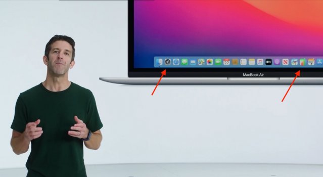
They planned better icons for those apps but then dumbed it down. Probably the icons were too good for Big Sur. Also notice the Launchpad icon.
Attachments
Last edited:
As Rosan, Rosannadana (oblique reference to SNL in the early days) used to say "never mind"I doubt it’s even changed, just seems to be for Apple Silicon. Of course, this DOES mean the next version that actually has new features won’t work on Catalina either.
UPDATE: I take it back. The ACTUAL release notes you link to from within the app has a good bunch of changes I’m sure anyone would love.
These comments are totally hilarious. the snowflakes and haters have been saying how bad Catalina is (not my experience) for so long and now they refuse to upgrade to Big Sur (which is awesome), I guess they are secret Catalina lovers. who knew?The iWork updates work nicely on catalina but the new GarageBand can’t be installed on Catalina.. Like seriously, wtf?
I just updated, the icons look fine, they are icons (so who really cares?).I just love the posts of "Those icons suck" "They are the worst crap ever". Only because it's Apple would anyone say such crap. Those icons are beautiful. And if the icons hurt your eyes so bad then there's always Windows 10's super amazing, super beautiful and super innovative UI if you can't handle it.
I personally love Catalina and don't plan on updating to Big Sur anytime soon, its a bummer the new garageband isn't supported on CatalinaThese comments are totally hilarious. the snowflakes and haters have been saying how bad Catalina is (not my experience) for so long and now they refuse to upgrade to Big Sur (which is awesome), I guess they are secret Catalina lovers. who knew?
I just don't understand why they didn't use the same icons, or slightly different versions, than the iOS icons for these apps. I thought they were aiming to merge the aesthetics of both OSes.
Did Apple fire all the graphic designers?
These icons look like they're from Word 98 clipart. Apart from just being ugly, with their exaggerated shadows and contours, they're too busy! A good icon doesn't need both a pen and a quote mark to signal that you can write!
These icons look like they're from Word 98 clipart. Apart from just being ugly, with their exaggerated shadows and contours, they're too busy! A good icon doesn't need both a pen and a quote mark to signal that you can write!
am I the only one who can’t stand skeuomorphism and thinks half of Big Sur looks like absolute garbage??
this isn't even about skeuomorphism, just badly drawn images.
Those with some graphic design sensibility care. You do know that it's possible for people to be bothered about different things, right? Believe it or not the universe isn't built on just your perspective.I just updated, the icons look fine, they are icons (so who really cares?).
Logic can be updated on Catalina too.I get that but if that was truly the case then iMovie wouldn't be compatible with Catalina as well and we know that it is as i just updated iMovie on Catalina
It will be more than a little distracting that my standby Catalina system (2012 vintage so it is not possible to upgrade to Big Sur at least officially) will be constantly notifying me about app updates that I will be permanently unable to install.These comments are totally hilarious. the snowflakes and haters have been saying how bad Catalina is (not my experience) for so long and now they refuse to upgrade to Big Sur (which is awesome), I guess they are secret Catalina lovers. who knew?
I would have hoped that the App Store would be intelligent enough to filter out any updates which are not available for the current OS; to my recollection its iOS counterpart has always seemed to behave that way.
Register on MacRumors! This sidebar will go away, and you'll see fewer ads.