Made in Microsoft PowerPointIllustrator was not used - this was all clip art.
Got a tip for us?
Let us know
Become a MacRumors Supporter for $50/year with no ads, ability to filter front page stories, and private forums.
Apple's Former Design Chief Jony Ive Designs Emblem for Coronation of King Charles III
- Thread starter MacRumors
- Start date
- Sort by reaction score
You are using an out of date browser. It may not display this or other websites correctly.
You should upgrade or use an alternative browser.
You should upgrade or use an alternative browser.
Almost time for another fortnight of slack-jawed nonce-worship!
Last edited:

Spot onYou can tell it's a Jony Ive design because it's got no upgradability and probably not enough Thunderbolt ports.
Honestly this is quite good and considering His Majesty's penchant for minimalism, quite appropriate
Not surprised at all the junk in this thread, but I am surprised no one pointed out the symbolism in Ive’s design. Each country in the UK is represented by a flower: rose for England, shamrock for Northern Ireland, thistle for Scotland, daffodil for Wales. I think it’s a nice incorporation of these symbols into a unifying logo.
And, as to also be expected, a comment from someone who could have chosen to ignore the comments found to be "juvenile" but chose not to....What an honor for Ive! Good on him! It's a beautiful design.
As an aside, and expected, this story has spawned the typical race-to-the-bottom inane juvenile comments.
Lol. Ive talk out of his ass so much. For the amount he was paid for this, you'd expect better.
You are the real hero! I always thought designing with symmetry is great way to cut your work in half.Well, apart from how well the emblem suits the purpose, being it very classical and not a hint at modernity at all. We'll leave that to subjectivity. But Sir Ive missed one small detail in the vector-drawing.
Can't have that! They're better than everyone else, don't you see? LOL.And, as to also be expected, a comment from someone who could have chosen to ignore the comments found to be "juvenile" but chose not to....
Nah we have stuff too but absolutely nothing that compares to that nonsense…crowns, scepters, (scepters lol!) carriages etc it’s the ultimate dress up. Btw Amazon sells a wide variety of scepters.We basically do we just dont use those terms. The powerful live by different rules than the rest of us.
His Majesty….I’m sorry but that’s just super funny.Honestly this is quite good and considering His Majesty's penchant for minimalism, quite appropriate
Former Apple design chief Sir Jony Ive's latest project, the official emblem of the coronation of King Charles III, has been unveiled by Buckingham Palace.
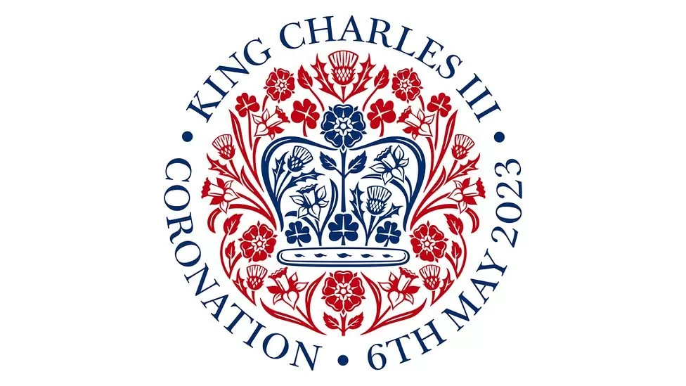
The image depicts flowers forming the shape of St. Edward's crown, which will be used during the coronation. Ive chose roses, thistles, daffodils, and shamrocks because they are icons from across the United Kingdom. He attempted to convey the "optimism of spring" and the King's love of nature.
Ive was Apple's chief design officer from 1997 until 2019, when he departed to found LoveFrom with fellow Apple designer Marc Newson. In 2021, LoveFrom designed the "Terra Carta Seal," a special award for King Charles, who served as Prince of Wales at the time, to bestow upon companies that are leaders in creating sustainable markets.
When Ive left Apple, Apple signed a multiyear contract with him that was valued at more than $100 million. Under the terms, Apple was LoveFrom's primary client, but the deal came to an end last year. Ive has said that his design process at LoveFrom is the same as it was at Apple.
Ive's logo is set to be used for events over the coronation long weekend in the United Kingdom and the Commonwealth in May.
Article Link: Apple's Former Design Chief Jony Ive Designs Emblem for Coronation of King Charles III

...
huh...
...
All-righty then.
...
Seems British enough. It's fine. Question is, will Charles live that long?
That is absolutely hilarious. In design school, I remember my professors opening up our vectors in class and ripping us for mistakes like this, lol.
Well, apart from how well the emblem suits the purpose, being it very classical and not a hint at modernity at all. We'll leave that to subjectivity. But Sir Ive missed one small detail in the vector-drawing.
That is absolutely hilarious. In design school, I remember my professors opening up our vectors in class and ripping us for mistakes like this, lol.
The UK royals are scrutinised, you only need to read the uk press to see thatYou are welcome to criticize use of the USSS. All funds (our money) spent by governments are open to criticism.
Apparently the royal family is worth $24B in terms of tourism, other economic benefits and soft diplomacy (source Forbes)
I’d take that
Since he’s a minimalist are hats now optional at the coronation? How about the horses? Do they get a break? Give the horses the day off and have him come in on a Segway. He could be down the street in no time.
Right, there is nothing minimalist about British royalty. Everything is over the top with them.Since he’s a minimalist are hats now optional at the coronation? How about the horses? Do they get a break? Give the horses the day off and have him come in on a Segway. He could be down the street in no time.
Playing the March in May??? 🤔Too bad it's not the Fourth of May - they could play the Imperial March. 😆
I knew this already, but didn't want to brag about it.Not surprised at all the junk in this thread, but I am surprised no one pointed out the symbolism in Ive’s design. Each country in the UK is represented by a flower: rose for England, shamrock for Northern Ireland, thistle for Scotland, daffodil for Wales. I think it’s a nice incorporation of these symbols into a unifying logo.
Yes he did... a real King.Freddie Mercury actually studied Graphic Design.

I find it quite busy. Seven thistle icons? But then it's the same, somewhat overwrought, approach as the Environmental Award of a year or two ago, so at least Ive is consistent.From typography to iconography to color palette, it’s seems very fitting of the client/scenario. Approved.
I can't tell you how many files (usually logos) I get from clients that have things like this. Again, unless we are plotting vinyl, I don't worry about, just happy to get a vector file and not a 72dpi .png that is 1" tall.Seems British enough. It's fine. Question is, will Charles live that long?
That is absolutely hilarious. In design school, I remember my professors opening up our vectors in class and ripping us for mistakes like this, lol.
Weirdly enough the ‘high-res’ vector files are way bigger than the ‘lowres’ vectors. Probably because they were used to produce bitmap version. But still unnecessary since vector is scalable without losing quality as we all know…I can't tell you how many files (usually logos) I get from clients that have things like this. Again, unless we are plotting vinyl, I don't worry about, just happy to get a vector file and not a 72dpi .png that is 1" tall.
Register on MacRumors! This sidebar will go away, and you'll see fewer ads.