Become a MacRumors Supporter for $50/year with no ads, ability to filter front page stories, and private forums.
"Give us smaller bezels!"

"But we need space for the camera"

"SMALLER. BEZELS"

"fine, here. We kept a small notch the camera"

"WAAAAAAA....."
That's why I still use my 2020 iPhone SE. My life is notch-less.
 
The Magic Mouse is an example of something that looks like poor design, but honestly isn't.

1. You can't use it while charging, which is by design. That should be obvious.
2. It's supposed to be a wireless mouse, and leaving it plugged in all the time is what most people would do. So ergonomically, forcing people to unplug it to use it is the intended use case.
3. Leaving the mouse plugged in all the time would also have implications for the battery; constant charging would be bad for it. Letting it drain while plugged in would be confusing.

Should Apple have made a charging dock or something similar? Probably. But making it impossible to use while charging is exactly what was intended, and it was executed quite well. And I've never met anyone who has one that cared one lick about it.
Some downvotes here, but I think you're basically correct. Wireless mice weren't nearly as mainstream when this was invented as they are now, and Apple didn't want people to simply leave them plugged in (and, worse, photograph their setup that way). This choice prevents them from doing that. It's heavy-handed design to be sure, but it probably wasn't an oversight.
 
Because a couple of people actually liked the touch bar.
More than a couple. I think the problem with the Touch Bar wasn't the design (which in theory lets that row be anything the user wants it to be (except for users who touch-type function keys)), but rather the lack of an intuitive way to customize it for its intended purpose. Those of us who spent some time exploring third-party solutions could really maximize the Touch Bar's potential.
 
The part about the charging port on the MagicMouse 2. Big whoop! I charge mine up with no issues. How do I do that the Universe may ask. Oh gee, before I go to bed and I am done with all of my devices, mostly MacBook Pro M1, and then, gasp! Before I go get under the covers I actually plug in a lightening cable cable to it and bam!!!! I wake up and the mouse is charged.
Seriously though what is the big deal. Maybe if there is a MagicMouse 3 then maybe they can add wireless charging to it as well.
 
The whole 2016 MBP package should be there...a total failure.
I think the Touch Bar would have been more accepted had more 3rd party software had supported it. Our daughter has a 2018 MacBook Pro with TB and now her being almost 20 so she does a lot of college work and stuff but she thinks the TB is the bees knees. Especially when she would be texting and could get to the emoticons really easy.
 
I have always been a fan of the Logitech Marble Mouse. No need for extra desk space to move around. Ambidextrous. Allows for fast movement across large high dpi displays and yet you can make small precise movements as well. My only complaint is driver support for the scroll buttons has been hit or miss over the years.
And the new driver they forced on AS Mac users no longer allows the scroll buttons to scroll up and down. They can do left to right (?WTF?) and just about anything else. But not up/down unless I missed something.
And I can’t zoom in and out in Archicad anymore either. Not sure why.
 
I simply don't understand the issue with the Apple TV remote. It was perfect. Lightweight, tactile, responsive. You knew as soon as you picked it up how you were holding it without looking. It allowed for seamless navigation as you moved through content. Most people are still on their initial charge that came with the remote, or they charged it once and forgot they did that.

Anyone that struggled with the Apple TV remote would fry their brain using their TVs included remote.

Now the Apple TV remote app. That was awful.
 
  • Like
Reactions: macsound1
Some downvotes here, but I think you're basically correct. Wireless mice weren't nearly as mainstream when this was invented as they are now, and Apple didn't want people to simply leave them plugged in (and, worse, photograph their setup that way). This choice prevents them from doing that. It's heavy-handed design to be sure, but it probably wasn't an oversight.
The industry really hasn't solved the cable problem. Sure, batteries last longer, and there are qi solutions (though those are rare). The real issue is, I have to have cable at my desk, and if it isn't plugged into something it will likely fall off the back of the desk or be in the way. Might as well leave it plugged into something.
 
I'm using my 2012 right now, with no plans to replace it. 16GB RAM isn't great, but I've got 4TB of internal SSD, and just put a new battery in it a few months ago.

The notch is a dealbreaker on the 2021.
I was of your mind but finally gave in, even after buying a new battery 4 months ago. I am very glad I did.

The lack of fan noise is worth it alone, but 3x speed increase for rendering and being able to do live walkthroughs without stuttering is also very nice.

The notch doesn’t matter to me as I use it mostly with a monitor where the Retina display is a second monitor. Yet I still have an iPhone 8+ because of the notch and faceID. And the MBP having touch ID rocks.

I had a 2TB SSD in my 2012, but really explored what I was filling it with and realized 1TB was plenty since I wouldn’t need my VMs anymore and i could move done things off that I never use.

I was dead set on 32GB until I read so many reviews showing 16GB was going to be fine and it’s the truth. I always have 3-4GB free no matter how hard I push it for my workflow.
 
I simply don't understand the issue with the Apple TV remote. It was perfect. Lightweight, tactile, responsive. You knew as soon as you picked it up how you were holding it without looking. It allowed for seamless navigation as you moved through content. Most people are still on their initial charge that came with the remote, or they charged it once and forgot they did that.

Anyone that struggled with the Apple TV remote would fry their brain using their TVs included remote.

Now the Apple TV remote app. That was awful.
Except when it’s upside down. Doh.

But I just program the AppleTV to respond to a JVC VCR remote instruction set that is in my Dish remote and control the Apple TV that way. And it doesn’t click and wake my wife like the siri remote.

Once in a blue moon I need the siri remote to do something Apple refuses to map to other remotes.
 
  • Like
Reactions: ericwn


Apple has always emphasized the depth of thought that goes into the design of its products. In the foreword to Designed by Apple in California, a photo book released by the company in 2016, Jony Ive explains how the company strives "to define objects that appear effortless" and "so simple, coherent and inevitable that there could be no rational alternative."

Questionable-Design-Decisions.jpg

But every once in a while even Apple gets it wrong, and a tech company's coherent rationale for the way a product should be designed can translate into end-user irritation, or even a customer's personal hell. Here we take a look back at a handful of Apple's most questionable design decisions in recent memory. See if you agree, and let us know in the comments of any other Apple products that you think didn't live up to their billing.
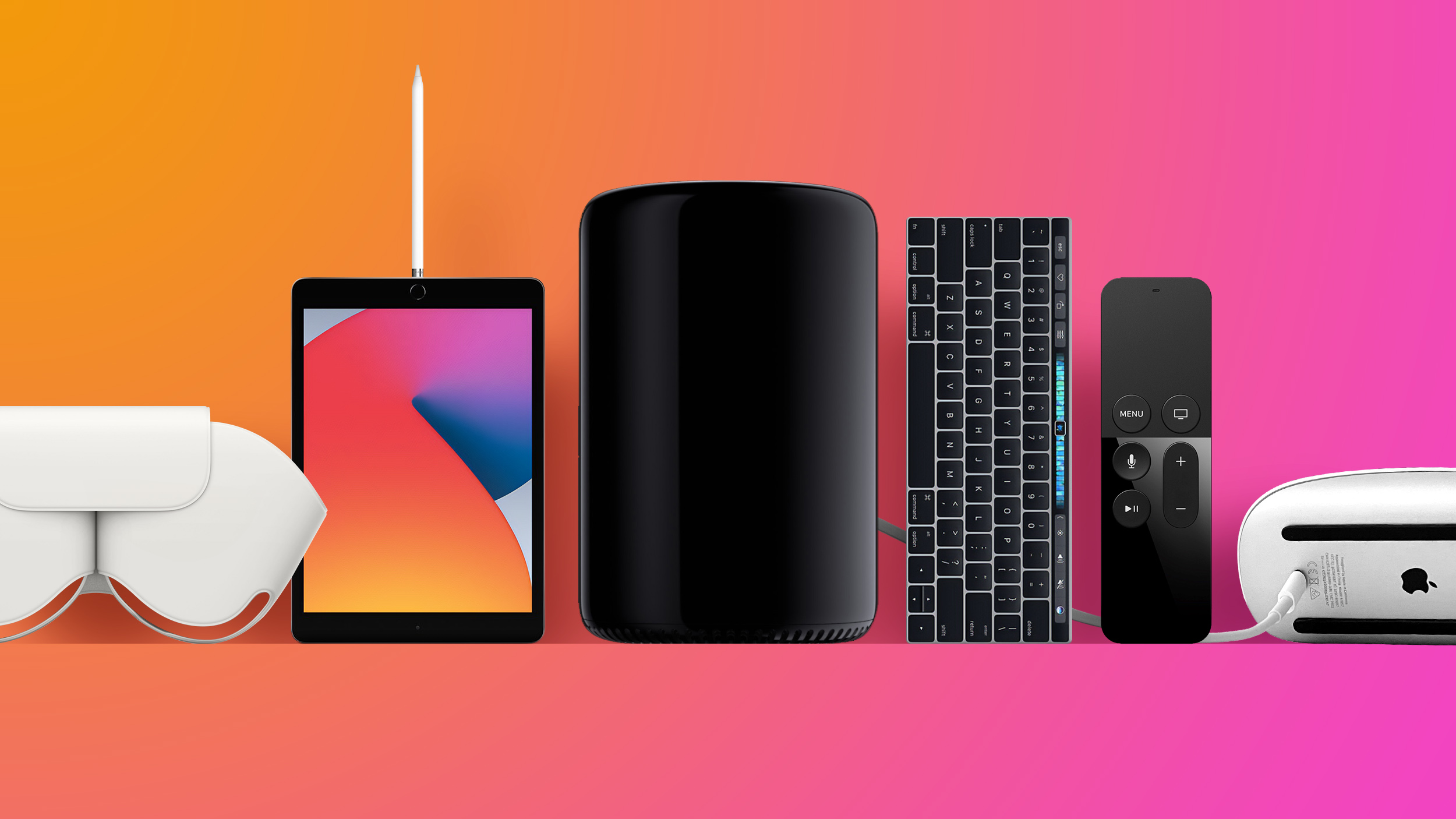
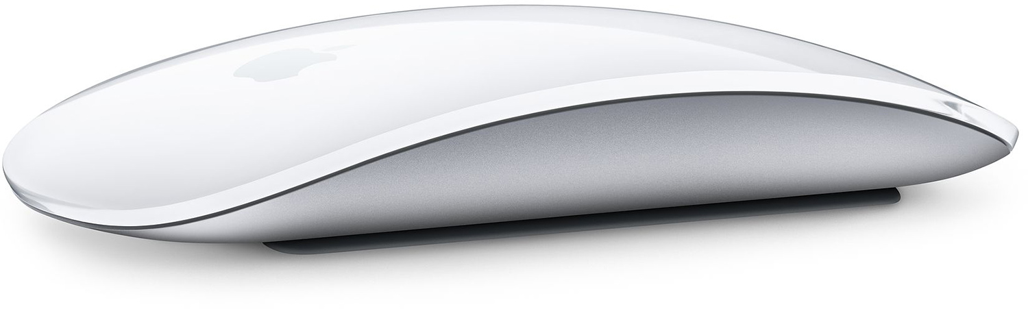
1. Magic Mouse 2

magicmouse2-1.jpg

Announced way back in 2015, the Magic Mouse 2 was heralded at its launch as yet another Apple innovation, due to its touch-sensitive surface that can recognize swipes and gestures as well as clicks. On the face of it, the sleek curves and glossy, seamless top surface of Apple's mouse makes it come across as a paragon of Apple design, until you come to charge it.


In an oft-queried decision, Apple opted to put the charging port on the underside of the Magic Mouse 2, suggesting to many that it had sacrificed usability for design. Arguably, Apple could have located the port on the front edge of the mouse, like most other wired and wireless mice, which would have allowed users to charge it while using it at the same time. But no.

In April 2021, six years later, Apple announced the latest iMac, which boasts various neat functional design tweaks over its predecessors, like the Ethernet port in the charging brick, for instance. The Magic Mouse 2 comes included with the new iMacs and even sports several colors to match the all-in-one machines, but Apple still expects users to flip over their mouse and plug in a Lightning cable, which makes it not only unusable but also slightly pathetic-looking.


Apple's Magic Mouse 2 originally went on sale in the United States for $79 and that's the same price you'll pay for it today.

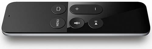
2. Apple/Siri Remote (2015-2021)

Siri-Remote.jpg

It's hard to downplay the amount of venom that's been aimed at the original Siri Remote since Apple first included it with the Apple TV in 2015, and if you never got to use the thing, that might seem a bit harsh.

After all, it had a clickable touchpad at the top that responded to swipes and gestures for navigating tvOS, and two uncomplicated columns of buttons clearly positioned below for controlling media playback. It even had an accelerometer and doubled as a game controller.

All good, you might think. But in practice, most users agreed it was an absolute clanger and an ergonomic disaster. The consensus was that Apple's Remote design was too small and too thin, which meant when it wasn't making your hands look worryingly huge it had got lost down the back of the sofa or between the cushions.

Then there was its non-intuitive button layout, which could be gauged best by the level of frustration that attended mistakenly pressing the Siri button to get back to the menu. Even now, few will have forgotten the very high sensitivity of the glass touchpad that sometimes made onscreen navigation a bit like watching Olympic curling.


All of this of course assumed you hadn't been holding it backwards, which almost every user did on at least a weekly basis. Thanks to its uncompromising symmetry, one end of the remote was practically indistinguishable from the other in low light. Not only that, the Remote only came in black and had no backlighting to speak of, as though Apple had intentionally set out to make locating it in the dark some kind of twilight challenge.

In a move that likely saddened no-one, Apple banished the Siri Remote to the annals of tech history in 2021 when it unveiled the latest Apple TV 4K and a much-improved, all-new Siri Remote with a new clickpad interface offering five-way navigation.

3. Apple Pencil (1st Gen)

applepencil1.jpg


Another device that falls into the goofy-looking-when-charging category is the first-generation Apple Pencil, which was released in 2015, the same year as the Magic Mouse 2. Apple built a male Lightning connector under the cap that allows it to be plugged into an iPad for power, which sort of makes sense if you think about it.

In most situations when the Apple Pencil runs out of power, there's an iPad right there to plug it into, and to be fair, it charges pretty fast, offering around 30 minutes of usage after being plugged in for only 15 seconds. In that sense, it just works. But there's no getting around the fact that also just looks weird.


This could arguably be a case of Apple choosing function over form, but it doesn't appear to have taken into account the potential damage that could be inflicted on both devices if you accidentally wack the pencil on something when it's plugged in. How many iPad Lightning ports have been killed as a result remains unknown.

When the Apple Pencil is plugged in and charging, you obviously can't charge your iPad (unless you plug the pencil into an iPhone, say) and unless you're using the iPad in landscape orientation, it makes using your tablet awkward. In other words, you can't charge the pencil and the tablet at the same time.


Apple still sells the first-generation Apple Pencil for $99, but thankfully it adopted magnetic charging for the second-generation version, thus restoring a partial sense of harmony to the iPad lineup.

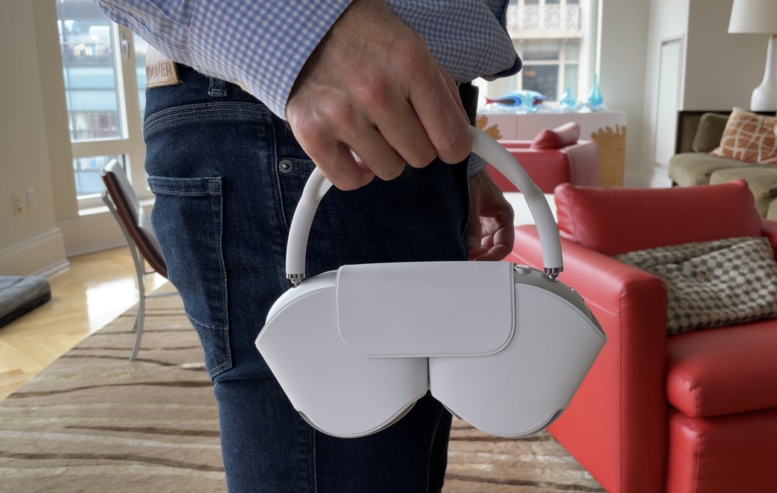
4. AirPods Max Smart Case

airpods-max-smart-case-hands-on.jpg


When Apple unveiled its $599 high-end AirPods Max over-ear headphones in 2021, there was as much online chatter about Apple's included Smart Case as the headphones themselves.

Apple says the case is designed to put the AirPods Max into an "ultra-low power state that helps to preserve battery charge when not in use." Granted, that's useful when your headphones don't come with a proper off switch, but it's the odd look of the case that seems to trigger unusual associations in the mind.


The Smart Case quickly birthed an avalanche of memes, which have irreverently compared it to all sorts of things, from handbags to lingerie, and even body parts. Bra comparisons aside though, most would agree that Apple seems to have de-prioritised the practicalities of travel in its pursuit of iconic fashion. Nilay Patel, writing for The Verge:
You'd think that a case that comes with a pair of premium headphones provides them with protection when tossed into a backpack, but when it comes to Apple's Smart Case, many users would urge you to think again. The lack of coverage offered by the case material leaves the headphone's metal so prone to scratches that you'd be forgiven for erring on the side of caution and carrying them in your hand instead for everyone to see. And maybe that's the point.

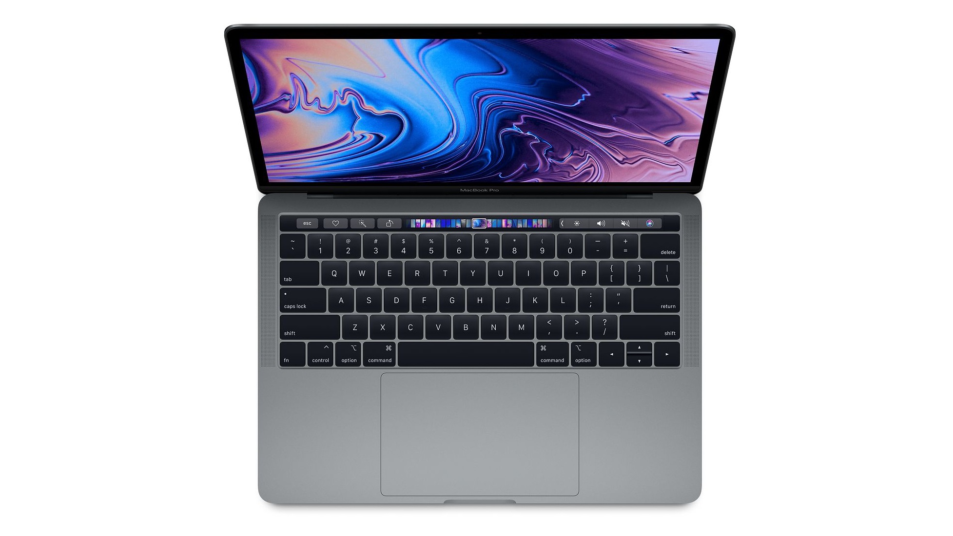
5. Butterfly Keyboard (2015-2019)

macbook-pro-butterfly-keyboard.jpg

Apple in 2015 and 2016 introduced updated keyboards for its pared-down MacBook and MacBook Pro machines, debuting new butterfly keys with home switches beneath each key that minimized thickness without losing that satisfying press under the fingers. Sadly, it wasn't long before Apple's butterfly keyboard was called out as one of the company's worst design decisions thanks to their rage-inducing penchant for failure.

All butterfly keyboards in MacBook Pro, MacBook, and MacBook Air models introduced between 2016 and 2019 (and 2015 in the case of the MacBook) had butterfly keys that simply couldn't stand the test of time. The mechanism was so delicate and fragile that the tiniest piece of grit could break a key. What made things worse was Apple's laptop construction, which meant replacing that single borked key required taking your MacBook to an Apple repair center where the entire machine had to be completely disassembled.


In 2016, instead of replacing the keyboard wholesale, Apple introduced a second-generation version, suggesting the issues had been fixed. However, broken keys continued to be reported, much to Apple's chagrin. Rather than admitting defeat, however, Apple continued to beat its favorite dead horse by tweaking the butterfly mechanism in successive machines released in 2018 and 2019. But the complaints didn't go away.

In May 2018, a spate of class action lawsuits were brought against Apple on behalf of users who had been affected by broken butterfly keys and were angry that Apple had refused to honor its warranty obligations and fix the keyboards for free.

A month later, Apple implicitly acknowledged the issues when it launched an "extended keyboard service program," for MacBooks equipped with butterfly keys, and in May 2019, the program was expanded to encompass all MacBook models equipped with a butterfly keyboard, although an outright admission that it had put its faith in a bad design was never forthcoming.


In a notable swipe at Apple for its refusal to accept its design was intrinsically flawed, the Wall Street Journal's Joanna Stern published an editorial typed up on one of the defective keyboards, but without corrections. The article went mainstream, publicly embarrassing Apple.

We'll likely never know how widespread the keyboard problems were, but we do know Mac users breathed a collective sigh of relief when Apple unveiled the 2019 16-inch MacBook Pro with a redesigned "Magic" keyboard with a scissor switch mechanism featuring 1mm of travel, an inverted "T" arrangement for the arrow keys, and a physical Escape key next to the Touch Bar.

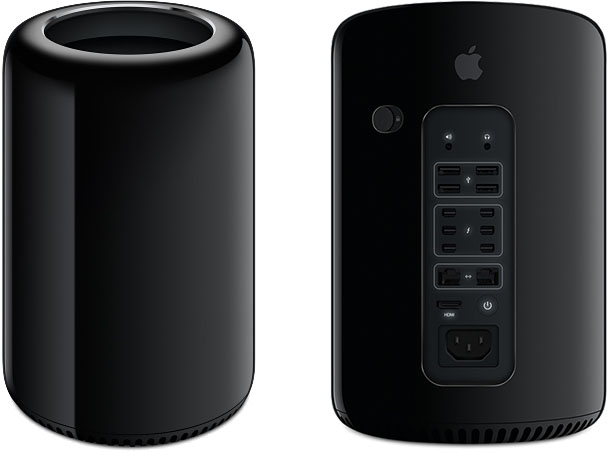
6. Mac Pro (2013-2019)

2013-mac-pro.jpg

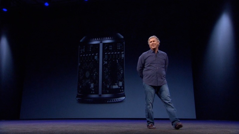
"Can't innovate, my ass," remarked Apple's Phil Schiller during the announcement of the redesigned Mac Pro in 2013. It was a moment of on-stage hubris that would go down in Apple lore, on par with Steve Jobs' "You're holding it wrong" in the face of iPhone 4 antenna issues. Schiller's snipe was directed not at the audience in attendance, but at armchair critics who pointed at the existing Mac Pro's lack of upgrades and claimed Apple had largely abandoned its pro user base and was out of ideas.

Apple believed its radical vision for the future of the pro desktop proved the naysayers wrong. Indeed, despite its relatively niche market compared to the appeal of its other smash-hit products, Apple was showing it had gone to great engineering lengths to innovate. And innovate it had. Apple said its new Mac Pro offered twice the overall performance of the previous generation while taking up less than one-eighth of the volume, thanks to its unified thermal core. Everything inside was cooled by one large fan at the top, which could spin more slowly than smaller fans and keep the Mac quiet under heavy load.

schiller_mac_pro.jpg

Phil Schiller unveiling the redesigned Mac Pro in 2013

Intel Xeon processors were twinned with dual AMD FirePro workstation GPUs, enabling the machine to deliver seven teraflops of computing power. But while the powerful hardware and the black aluminum cylinder that housed it all was unmistakably Apple-esque in its ambitions, there were notable concerns. Everything was cleverly designed to improve thermal dissipation, but that meant expansion had to be served externally by Thunderbolt 2 ports.

Most creative pros couldn't overlook its lack of internal slots to upgrade graphics cards and add more memory. Even Apple seemed unsure how to update its internals – as recently as 2019, it was possible to buy a trashcan Mac Pro from Apple without hardly an update in the six years since its release.


Apple was all too aware of the criticism its Mac Pro redesign had attracted, and ended up doing something out of character. The famously secretive company hardly ever reveals its plans for new products, but felt it had to assuage growing concerns from the Mac's pro base that the company had lost its way.

At a meeting with reporters in 2017, Apple executives apologized and admitted the 2013 Mac Pro model had been a mistake, having been designed into a thermal corner. To rectify the situation, Apple promised a new modular Mac Pro system more akin to its traditional "cheese grater" tower design, a new external display, and a new iMac Pro model for professional users. This time Apple did deliver on its promises, and the "trashcan" Mac Pro was laid to rest in 2019.

Article Link: Apple's Most Questionable Design Decisions in Recent Memory

Over the years, Apple has made "thin and light" a mantra. On their line of laptop computers, for example, they started removing ports in order to reduce the thickness of the machines. They did this until there was a scarcity of ports, and the usability of the machines was affected. This was until the pandemic set in, and it became clear that computers are still hugely important, they have not been eclipsed by mobile devices at all, they are tremendously useful for working outside the office.

I would say that one of the biggest design blunders that Apple has made concerning its line of laptops is to remove the Ethernet port. Some may question this and say that laptops have built-in WiFi and this negates the need for physical connections, but I would disagree. Using adapters for Ethernet connections is very awkward and unstable. I bought a 17" MacBook Pro in 2010 that had an Ethernet port that I used to plug the cable directly into my router. This provided a very fast and stable connection; the Ethernet connector has a nice latch on it that holds the cable firmly in place when connected to my laptop.

Two years later, I got a Mid-2012 15" Retina MacBook Pro, and it did not have an Ethernet port. I still have this laptop and I use a Thunderbolt to Ethernet adapter. This does not work well, since the Thunderbolt connector frequently wiggles loose when I move my laptop on my desk, and the connection to my router breaks. I appreciate the much faster gigabit speeds that I get from a wired connection, but I very much dislike having to use an adapter for Ethernet. I want Apple to return the physical Ethernet port to their laptops. I use my laptop as a desktop replacement and when I am working at my desk, I strongly prefer a wired connection to the network and the Internet.
 
Mac Pro "R2D2" / trashcan is a brilliant design, if you are not looking to expand (other than RAM or HD). Maybe the name should not be Pro - but that is all about expectations and does not degrade the genius of the design. As for painting into a thermal corner, the machine clearly has better thermal properties than an iMac, for instance, and no-one talks of the iMac or iMac Pro being painted into a thermal corner. I am still using my Mac Pro R2D2 which has worked flawlessly for more than 7 years now! Amazing machine with amazing build quality.
 
The MacBook Pro notch should be right up there as well, it's absolutely hideous.
I totally agree with you! The reason that the iPhone has a notch is because it features FaceID, a new and innovative way to unlock the phone. The extra equipment needed to make FaceID work is buried within the notch. The MacBook Pro does not have FaceID, so there is really no need for a notch. It just takes up screen real estate, and sticks out like an eyesore. Apple should either build FaceID into the MacBook Pro notch, or they should come out with a behind-the-screen camera system for it.
 
  • Like
Reactions: Oberhorst
I suppose the awful user interface of Pages is too old to be in this article.
What’s your problem with Pages’ UI? I personally think whoever designed it deserves an award. Now I shudder every time I have to fire up Word to double-check the docx export formatting in something I’m sending off.

I *am* annoyed at the lack of format stability between versions of Pages since iWork ‘09, and there are some weird formatting issues you can run into with stuff like APA style, but I stay for the UI.
 
  • Like
Reactions: macsound1
Apple has a long history of products which they think we want. Occasionally they are great decisions but many times they are not. This started with the original Macintosh with the tiny screen and no hard disk. More recently, the home pod is an uncontrollable speaker that costs 10 times what it should. The pencil charging in the iPad Pro. The Apple TV remotes. The iCloud that sticks 200gb of mysterious files on your hard disk and lack of ability to control it. You have too many photos, and the only option is to delete them all within 30 days. Everything is less and less obvious and intuitive. You talk to the Apple geniuses, and there is an increasingly long and obtuse list of things to do to handle various situations.
 
Except when it’s upside down. Doh.

But I just program the AppleTV to respond to a JVC VCR remote instruction set that is in my Dish remote and control the Apple TV that way. And it doesn’t click and wake my wife like the siri remote.

Once in a blue moon I need the siri remote to do something Apple refuses to map to other remotes.
You can feel if the buttons are face-up and if the IR is facing towards the TV. So, what do you mean by upside down? Do you mean to say you have issues using it when you are upside down? I don't see how that would change anything.
 
What about all those iMacs? They're missing on this list.

- USB ports are on the back. The user has to awkwardly plug in a USB stick on the back or buy an adapter.
- Ergonomics: The iMac's display is not height-adjustable and thus cannot be set to an optimal height.
- Ergonomics: The display of the iMac is reflective (glossy).
- The iMac usually doesn't have a good cooling system due to its design. Current: Compare the iMac m1 with the mac Mini. Mac Mini cooling is better (cooler and quieter).
- The iMac is an all-in-one computer: This is a problem in itself. If one part is defective or outdated, it affects the entire iMac.
- and so on.
How is an iMac being an all-in-one poor design? Along with some Microsoft lawsuit money, that design was the one that literally saved the company in the late 90’s. An iMac G4 is famously displayed at the Museum of Modern Art. An all-in-one might be the wrong set of trade-offs for *you*, but for most people who don’t tend to upgrade their machines piecemeal it has a lot of advantages.

Also, while we’re defending the iMac’s honour here: I know some people complain about the USB ports on the back, but would you really want an iMac with front-facing USB ports? It would look terrible! With the current design they could put one on the side maybe, but with the old 2013-2020 tapered edge design that was out of the question. Regardless, I’ll take the half-second of annoyed fumbling every two weeks over a permanently disfigured front any day of the week, or just buy a $20 hub.

The lack of height adjustment is a pain, but would be hard to pull off properly given the weight of these things. I have an Elevation Labs stand for my 27” and it boosts the height nicely.
I admit that I hate the iMac all-in-one design as well, but mostly because I am still bitter about how targeted display mode was advertised.

But, if you like the all-in-one, I say point one USB port down and one up towards the ceiling. If you want to add more USB ports put them on the bottom.

I have nothing against the stands so long as VESA remains supported.
 
i never understood what the issue is with charging the mouse. It’s such a drama queen complaint. I charge it once every 3-4 months over night. It’s never been lower than 35% charge even under heavy use. Why would I want to charge it while I’m using it anyway? It’s completely ridiculous.
 
I totally agree with you! The reason that the iPhone has a notch is because it features FaceID, a new and innovative way to unlock the phone. The extra equipment needed to make FaceID work is buried within the notch. The MacBook Pro does not have FaceID, so there is really no need for a notch. It just takes up screen real estate, and sticks out like an eyesore. Apple should either build FaceID into the MacBook Pro notch, or they should come out with a behind-the-screen camera system for it.
They didn't take up any screen real estate. They added more screen around the camera.
Imagine they never got rid of the home button on the iPhone but instead added screen around it.
That's what they did on the MBP.
 
Register on MacRumors! This sidebar will go away, and you'll see fewer ads.