Become a MacRumors Supporter for $50/year with no ads, ability to filter front page stories, and private forums.
Think the iTunes app icon just behind the apple sign is blended in with the app store icon.

The safari icon matches the logo just on bottom right behind the apple sign (below the green band which could be phone or messages)

The icon on the far right looks like stocks.
 
I do seriously hope apple isnt just ging to go on and on about the very small increase in screen size and how hard it was . I dont care, if they screwed up when they originaly designed iOS or for whatever other reason this was hard: I dont care, I am in for a new phone and if there isnt anything else besides the increase to 4" its probably not going to be an iphone 5 .
 
I do seriously hope apple isnt just ging to go on and on about the very small increase in screen size and how hard it was . I dont care, if they screwed up when they originaly designed iOS or for whatever other reason this was hard: I dont care, I am in for a new phone and if there isnt anything else besides the increase to 4" its probably not going to be an iphone 5 .
Totally agree ! Actually I would prefer same screen as 4S but smaller device. Remove spaces at top and bottom. Put the home button to the right or left.
 
Safari?
 

Attachments

  • finalyerba.jpg
    finalyerba.jpg
    126.6 KB · Views: 171
Could also herald more colours for the iPhone... like for iPod Nano which might also be replaced; and wasn't there an announcement/leak somewhere suggesting the whole iOS range would be available in multi-colours?
 
Cant wait till Apple claim they patented the larger screen size and try and sue the world because everyone is a copy cat.
 
Can someone please do 4th dimension render of the picture? Try nullifying for negative space and tell us what you see..
 
i seriously really love Apple's communication, either for announcing the event with the 5 in the shadow of the 12 or their banner at Yerba Buena

no other company can match that

brilliant

marketing is excellent, communication is excellent, keynotes are nicely executed, products are most of the time fantastic when not encountering issues

now if they can improve internal human resources and retail store management, that would be great
 
* Spoiler Alert *

I wonder if I saw it myself. It's very obvious now, since it's on the Macrumors headline. We'll never know..
 
Stocks App

The Stocks app on the iPhone could really do with an update and there is a bug in iOS 6 where if you ask Siri on the iPad to open Stocks... she does! Even if it is the iPhone App now, it may mean we will see a stocks app for the iPad with iOS 6!

Pertaining to the Yerba Buena images, people have said that the middle icon could be stocks, and I think the red at the bottom could be a redesigned icon that shows red where stocks don't do so well...

At least, thats what I can deduce...:)
 
Here's a theory on why the icons are upside-down, and a possible counter-argument against the stretched icons being related to a taller iPhone:

It's for the Flyover feature in iOS 6. They'll have an aerial shot of the building where the side of the building will be viewed from above, and it will look correct (not stretched) from that angle.

Another theory is that the guy hanging the wallpaper on the windows hung some of it upside-down.

Yeah I was about to chime in with that - if the icons are upside down and they want to promote the new iOS maps rather than google maps then a high enough photo from the right angle would give you an unstretched picture of the icons.
 
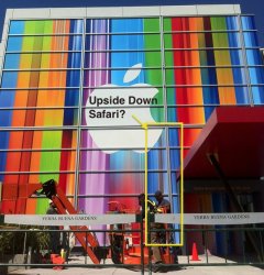
It is not random. I assure you that professional designers spend a great deal of time iterating over the various aspects of their design. Designers think about the various ways they can convey the message through visual imagery. They write down different words relating to what they are trying to say through the design. They think about the interactions between the different words. They do research on similar successful design. They develop dozens of thumbnail sketches and rough comps of around 5-10 good ideas. These are whittled down, sometimes combined, sometimes entirely new stuff is added through team collaboration. Once you settle on a concept it's all about tweaking it until it's aesthetically where you need it to be while maintaining a clarity of message and brand identity. In this case, the message was meant to be hidden and subtle, while adhering to the somewhat playful, creative image that has defined Apple for years (look at past event decor). It was probably a joy for the designers to implement this idea knowing that they were hiding the icons in plain sight. And as a testament to their work, it went largely unnoticed online for nearly a day—which is quite a long time in this day and age of instant communication.

I hope I have answered your question. While my answer might not be 100% accurate to the process used at Apple, this is an abbreviated explanation of process based on my experience as a designer. Though sometimes things just come to us—the final output is often far from our first "random" thought once it is iterated and developed into a fully-coherent concept. But is any though truly random? Our very thought patterns have been guided by our experience and interaction with the world around us since birth. But I'll leave that debate to the philosophers in the crowd.

While you are probably right, I couldn't shake the feeling that you sound exactly like Patrick Bateman. It's probably just me, but it scared and amused me :)
 
Apple's Yerba Buena Decoration Shows Stretched iOS Icons, Possibly Hinting at Taller iPhone 5

Every keynote, year after year, Mac Rumours say the same old "possibly hints at... blah blah"
and each and every time after the keynote is finished you realise that it has zilch to do with anything.
 
Register on MacRumors! This sidebar will go away, and you'll see fewer ads.