Got a tip for us?
Let us know
Become a MacRumors Supporter for $50/year with no ads, ability to filter front page stories, and private forums.
Apple's Yerba Buena Decoration Shows Stretched iOS Icons, Possibly Hinting at Taller iPhone 5
- Thread starter MacRumors
- Start date
- Sort by reaction score
You are using an out of date browser. It may not display this or other websites correctly.
You should upgrade or use an alternative browser.
You should upgrade or use an alternative browser.
Every keynote, year after year, Mac Rumours say the same old "possibly hints at... blah blah"
and each and every time after the keynote is finished you realise that it has zilch to do with anything.
so true

Sneaky Apple! now if only the iPhone 5 parts we've been looking at for months were just part of a massive prank Apple put out!!! That'd be cool!
Anyway, just did the other way around, grabbed the original icons, stretched, and motion blur 90°, looks pretty familiar indeed.
Anyway, just did the other way around, grabbed the original icons, stretched, and motion blur 90°, looks pretty familiar indeed.
Attachments
my take
hmm, so when everybody else can randomly utter nonsense, I dont want to feel left out
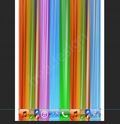
think of the icons being on a slot machine photographed with a long exposure.
from left to right:
1) itunes, agreed, on top merging into a green one (messages or phone)
2) GC, agreed (it is upside down, not sure why)
3) iTMS agreed, on top merging into a blue one (app store?)
4) blue on top; from e.g. stocks, red below (top from calendar app)
5) green on top (messages or phone) and safari below (very weird, the safari icon is neither right nor upside down, but mirrored having the red arrow point o the left)
6, 7 and 8) all agreed
cheers
i.
I can see more than just three icons
hmm, so when everybody else can randomly utter nonsense, I dont want to feel left out
think of the icons being on a slot machine photographed with a long exposure.
from left to right:
1) itunes, agreed, on top merging into a green one (messages or phone)
2) GC, agreed (it is upside down, not sure why)
3) iTMS agreed, on top merging into a blue one (app store?)
4) blue on top; from e.g. stocks, red below (top from calendar app)
5) green on top (messages or phone) and safari below (very weird, the safari icon is neither right nor upside down, but mirrored having the red arrow point o the left)
6, 7 and 8) all agreed
cheers
i.
The colors are an homage to the original Apple rainbow logo. The stretch effect a foreshadow of the future taller screen. Past (Steve Jobs) and Present (iPhone 5, Steve's last project) together.
Apple loves to allude to upcoming products graphically. Even this yers's event for 9/12 shows a 12 that is casting a shadow of a 5.
Apple loves to allude to upcoming products graphically. Even this yers's event for 9/12 shows a 12 that is casting a shadow of a 5.
Is the right answer. It's a tromp l'oeil feature that I've seen used at congresses before with signage. Very cool but you literally need to be there to appreciate it.If you're standing right against the facade of the building and look up, I imagine the icons will look right. Maybe that's all Apple was really going for when they made the banner.
I see it, just don't get it. You can stretch out cookie dough to make 10 cookies or 100. It's still the same amount of dough, but the more you make the thinner the cookie. If the point of a 4" screen is to give uses actual additional space the banner portrays the opposite - like when you play a 4:3 movie on a 16:9 screen in stretch mode. (Typically, not seen as a good thing)
I think the banner represents something else -- less obvious than the obvious 4" phone we've already seen & know about.
Apple needs to just kill the stocks app...weather too. There are way too many better 3rd party apps of those types now so Apple's serve no purpose except to clutter out screens.
I think the banner represents something else -- less obvious than the obvious 4" phone we've already seen & know about.
The Stocks app on the iPhone could really do with an update and there is a bug in iOS 6 where if you ask Siri on the iPad to open Stocks... she does! Even if it is the iPhone App now, it may mean we will see a stocks app for the iPad with iOS 6!
Apple needs to just kill the stocks app...weather too. There are way too many better 3rd party apps of those types now so Apple's serve no purpose except to clutter out screens.
Sneaky Apple! now if only the iPhone 5 parts we've been looking at for months were just part of a massive prank Apple put out!!! That'd be cool!
Anyway, just did the other way around, grabbed the original icons, stretched, and motion blur 90°, looks pretty familiar indeed.
Awesome work!
I wonder, too, whether the number of icons is a nod to how many visible icons there'll be on the stretched screen? Eight as opposed to five? Would that be possible, given the rumoured spec of the screen?
Also, if the icons are horizontal, could this mean that Apple will finally be allowing a horizontal home screen in iOS6?
Just some thoughts anyway...
KG
2 Music icons = 2 new redesigned iPods (ie iPod nano and iPod touch)
1 Phone icon = 1 new redesigned iPhone (ie the iPhone 5)
2 Game Center icons = 2 new third party games will be showcased demonstrating the all new A6? chip
iTunes and App Store? (instead of stock) icons indicating redesigned stores for iOS6
Not sure about the Safari logo? Maybe a better web viewing experience with the larger screen?? New features?
I see it, just don't get it. You can stretch out cookie dough to make 10 cookies or 100. It's still the same amount of dough, but the more you make the thinner the cookie. If the point of a 4" screen is to give uses actual additional space the banner portrays the opposite - like when you play a 4:3 movie on a 16:9 screen in stretch mode. (Typically, not seen as a good thing)
You're being WAY too literal with this. It's a visual metaphor, not a graphical diagram that's intended to precisely outline anything in an exact way.
Apple needs to just kill the stocks app...weather too. There are way too many better 3rd party apps of those types now so Apple's serve no purpose except to clutter out screens.
Agreed, Stock Touch is amazing! But if they do keep it as a stock app in iOS 6, it would be better to make it more up-to-date... maybe even competitive...
Actually, this kind of bugs me:
Do you really find that simple design "very clever"?
You guys are seriously extremely easy to impress. I mean, I'm on a board about mac rumors, so expect a certain amount of fanboyism, but do you really look at the simplest design of all time and think "Boom. Apple did it again. Again."? I just can't believe this.
Actually, this kind of bugs me:
Do you really find that simple design "very clever"?
You guys are seriously extremely easy to impress. I mean, I'm on a board about mac rumors, so expect a certain amount of fanboyism, but do you really look at the simplest design of all time and think "Boom. Apple did it again. Again."? I just can't believe this.
Yet, you took the time to post something about it. So objective complete apple.
I have been running the picture of the front facade through my algorithmic decoding program. After mixing the actual picture with the front cover picture of steve jobs book-wrap (of steve), and inverting the colours by an algorithm based on Steve Wozniacks birthsday I end up with this picture!

Of course, it could be due to pure randomness...
Of course, it could be due to pure randomness...
FunnyI just assumed that these were stretched app icons from the start. Guess I should have said something earlier. It seemed fairly obvious to me, but I have a background in visual communication and design. I didn't think to pop it into PS, however. Nice find guys. Kind of funny how people still can't see iteven in the edited version.
It would be great if Apple brought out the new iPhone, but the UI was just stretched vertically so that everything, such as icons, are elongated. They could pretend like everything is normal and it's the best thing ever to give all of us (especially designers) heart attacks.
Yeah, sure u saw it. Wink:wink
And why would "designers" be especially shocked when seeing a broken, distorted display? I'm not a designer and I would be shocked as well.
Register on MacRumors! This sidebar will go away, and you'll see fewer ads.