Become a MacRumors Supporter for $50/year with no ads, ability to filter front page stories, and private forums.

MacRumors

macrumors bot
Original poster
Apr 12, 2001
69,033
40,076


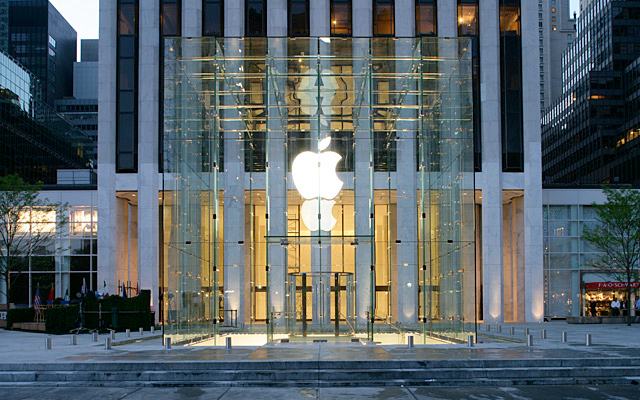
Yesterday Apple revealed the changes it is making to the iconic Fifth Avenue Cube in a drawing on the side of the temporary construction barriers. The multi-million dollar upgrade will reduce the number of glass panes from 90 to 15 by using larger, seamless pieces of glass, and will give the cube a much cleaner, more streamlined look:


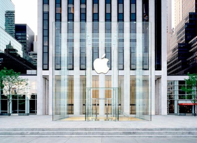
The above rendering of the new cube, provided to Gothamist by Apple, shows what the improved structure will look like. Compare the simplified glass structure in the rendering above to the much more complicated glass in the old cube:


The tall, huge pieces of glass bring to mind the glass frontages in newer Apple Stores like the Pudong location in Shanghai or the Upper West Side location in Manhattan. IFOAppleStore has additional details about the new glass technology behind the building.

The upgraded cube is scheduled for completion this November.

Article Link: Before and After Pictures of Apple's Fifth Avenue Cube Redesign
 
There really are not many retailers, if any, that make such an effort when designing their stores. This cube is simple, yet amazing. I guess that's Apple's style for everything they do.
 
I think it looked fine and was cutting-edge in the first place. It had only been up for less than 5 years, and they are already re-doing it. Apple just has too much money to throw around right now on this chicken gibberish.
 
The cube is slowly disappearing into the background!

All stores should be like this.
 
Whenever pitching before/after graphics, always show the new in bright sunlight, with perfectly clean, sanitized surroundings, and show the existing structure on a dark evening, on an overcast, rainy day with cluttered surroundings.

Looks good.
 
I find the old one to be more architecturally interesting. They should have considered changing only the center panels on each side so that the Apple Logo was not interrupted by the lines and left all the other smaller panes.
 
Hate to say it, but I kinda prefer the old design. The seams and so on made it look more interesting and industrial-looking. However, the new one looks pretty good too, so we'll see what the final product is like. :D
 
Wirelessly posted (Mozilla/5.0 (iPhone; U; CPU iPhone OS 4_3_3 like Mac OS X; en-us) AppleWebKit/533.17.9 (KHTML, like Gecko) Version/5.0.2 Mobile/8J2 Safari/6533.18.5)

I like the older one better. I wonder how much the pieces will sell for on eBay. Remember that one step that got sold some time ago..
 
I've never been to that particular Apple store, I was wondering if the entrance is just a spiral staircase in the center of the cube? Aren't they required handicap access? Is there an elevator?

Thanks in advance for the information. :)
 
I've never been to that particular Apple store, I was wondering if the entrance is just a spiral staircase in the center of the cube? Aren't they required handicap access? Is there an elevator?

Thanks in advance for the information. :)

There is an elevator in the center of the staircase.
 
I've never been to that particular Apple store, I was wondering if the entrance is just a spiral staircase in the center of the cube? Aren't they required handicap access? Is there an elevator?

Thanks in advance for the information. :)

yep, there is an elevator in the center. You are looking at it.

 
Register on MacRumors! This sidebar will go away, and you'll see fewer ads.