Become a MacRumors Supporter for $50/year with no ads, ability to filter front page stories, and private forums.
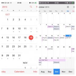
For me the biggest issue is not being able to see the month at a glance and see the days with "X" amount of dots in them.

Now when I go to the month view I see a single dot. This doesn't tell me how many events I have for the day, let alone give me a sneak peak at what those events are.

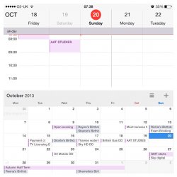
I actually find myself hitting the search function from within the app so that I can see a list of all the items for that day.

The calendar app I think they messed up. If you look at the native app on google that allows you view the month and or day. This is how I do it in outlook and I wish I could do it in the native calendar app.

Granted I know we are limited by screen real estate but this still bugs me. If you look at the calendar app on the iPad this is how I like to see it.

Yep, a month full of dots. Make sure you fill this in :cool: http://www.apple.com/feedback/iphone.html
 
In iOS6 and earlier, you were able to set up a meeting (calling it what the meeting is, i.e. Interview with Sally) AND invite people to it using the Invitee in the Calendar app. The app would set the appointment up correctly in the Calendar and also notify the Invitee that this meeting is happening. I used this to notify my secretary that I set up an appointment on my own, independent of her scheduling capabilities. Now, this procedure no longer works. It shows her as my meeting in Notification Center rather than the Interview. Using Notification Center allows us to quickly look at the day without having to actually go to the calendar to see the appointment. Frustrating...

But, I guess I may be a small sample of users who actually use the Invitee.

Wow! Just took a look at my Notification Center and I see the actual meetings I have set up! What the **** is going on around here????

I can still use the invite with out a problem. With both my work, gmail and outlook.com address. When it goes out the user will either see the email with the meeting attached or if they are on the phone they will see the email and a notice in the inbox of the calendar that they have a request pending.

This still works fine for me.

----------

Yep, a month full of dots. Make sure you fill this in :cool: http://www.apple.com/feedback/iphone.html

Yup, some of the items in my calendar are reminders or items that will show me busy or not busy. Hence the dots only bug me lol.....
 
Interesting, a lot of people seem to be complaining but no one can answer why it sucks or what they hate?

I love the aesthetics in the new calendar, and my only complaint would be losing the month view with list of events below. But I use fantastical quite a bit so it doesn't bother me much.

It sucks because they removed the daily overview in the month view. This overview of the entire month with red dots under every single day is completely useless. Also they removed the useful calendar integration in the notification center where it told you what events are up on the upcoming day, but now it just tells you THAT there are events but not what they're about. You can't even jump straight intro the calendar app from there. I hate how it just shows me the next 6 hours when I lay in bed at night and want to quickly get an overview of my upcoming day.."oh great, a big empty timeline during the next 6 hours of night, so cool, thanks Johnny!"
 
oqle.png


This is a screen shot of my note 3.
It is the best mobile calendar I have had. Apple should learn from this.
 
oqle.png


This is a screen shot of my note 3.
It is the best mobile calendar I have had. Apple should learn from this.

That text break up would annoy me to no end. It has no rhyme or reason and looks like it was designed by someone that doesn't know how to read . Why would they just break one letter off and put it on the next line like they did with Election Day so it reads "Electio" on one line and then "n day" on the next when there appears to be plenty of room for the n on the previous line making it an actually readable and easily decipherable event. Looks to be an epic fail to me.
 
This is a screen shot of my note 3.
It is the best mobile calendar I have had. Apple should learn from this.

No, that's not the best. It's just as bad in the opposite way. We are used to something much better than this.. in an iOS 6.
 
Umm, that screenshot from the Note is painful.

But I dislike the calendar update. Aesthetically, it's pretty plain looking in my opinion. As for function, I agree with the complaints regarding the removal of the preview pane from the month view. I used this often, and the replacement is not terribly useful and requires additional steps. I also don't like that months all run together now and are scrolled through vertically. There's no pause in the scrolling, so it requires more work/attention to move to the next full month. And the bit about having an 'event' the next day in the notification center, without saying what it is? Why?
 
iOS7 calendar app should be like Readdle's sleek and intuitive design with great look n feel for iOS 7
 

Attachments

  • image.jpg
    image.jpg
    311.9 KB · Views: 153
No question Calendar in ioS 7 sucks!! I have complained about 10 times to Apple but me alone will not do anything. Anyone and everyone lets flood Apple with messages on upgrading back to the ios 6 Calendar.

http://www.apple.com/feedback/iphone.html

I suggest to everyone that receives a survey email from Apple to complain about whatever bothers you about an iPhone or iOS. I just took the survey and I get the impression that Apple already knows about the problems. Keep complaining.
 
I'm pretty adjusted to the iOS 7 calendar and really like it.

My calendar during the work week is full so preview panes aren't too helpful. I use the magnifying glass constantly and scroll though my day and even several days forward and past for meetings. It's very useful.

The vast majority of meetings are generated from someone's desktop usually because it's easier due to the number of people, attaching documents, and meeting room reservations aren't integrated. But the events are pushed to our calendars where it's so convenient to accept or decline and set alerts.

I've read people complaining about words like "November 5th", "tomorrow at 2:30 pm" in texts and emails being hypertext links. I find this feature very convenient. If I see a date/time in a text or email exchange I find it very convenient to tap and add it to the calendar with a reminder or even set a small ad hoc meeting at someone's desk or a common unreservable cut out room. If the calendar event was created from a hypertext embedded in an email the calendar event even has a link back to the original document which is very convenient to review the doc that caused the meet. I don't know if that's actually a new iOS 7 feature but I use it often.

I find the calendar really helpful for my medium to very high usage needs. There's probably a few features that might help me even more but I'm satisfied now that I've used it a while and adjusted some habits. This version of the calendar is far from "useless".
 
The calendar app is the thing I hate most about iOS 7. Was going to get Fantastical (recently got it for Mac and love it) but Fantastical 2 is just around the corner as a separate purchase so please hurry and bring it out!
 
really dont miss the old calendar. the new one is just much cleaner and less cluttered. does me fine for work and personal life.
 
It would be nice if they simple added an option to use a preview pane on month view. Using the search button is a workaround, but it's not the same. I will probably just find a different app that works better.
 
iOS7 calendar app should be like Readdle's sleek and intuitive design with great look n feel for iOS 7

This is a perfect example of WHY they changed it on the iPhone (note that the larger screen on the iPad does show previews).

You can't even see the previews it is showing on your other example...really? Single word previews?
 
This is a perfect example of WHY they changed it on the iPhone (note that the larger screen on the iPad does show previews).

You can't even see the previews it is showing on your other example...really? Single word previews?

Agreed the one word previews carry such little info they are pointless and look very sloppy. If Apple had implemented such a thing people would then be moaning about that.
 
Why don't you click on the magnifying glass at the top and it lists all the entries you have that you can scroll through...
 
Why don't you click on the magnifying glass at the top and it lists all the entries you have that you can scroll through...
By far not a convenient way of doing various things that used to be very simple, like (for example) going through and looking through all Fridays over the next few moths to see what your availability is like and if a particular time is free on all of them.
 
This is a perfect example of WHY they changed it on the iPhone (note that the larger screen on the iPad does show previews).

You can't even see the previews it is showing on your other example...really? Single word previews?

I still find it better than just dots at least it's indicate some part of the reminders. Also in landscape mode the app works pretty clean and flawless comparing with default calendar. Pic attached.
 

Attachments

  • image.jpg
    image.jpg
    348.9 KB · Views: 118
My advise: Try CalenGoo

After reading this thread, being a rather heavy user of calendar and planner, I will suggest the dissatisfied with the native Calendar app to try CalenGoo. It's very flexible, and can be set in very many ways. I have used CalenGoo as my only calendar app for some years and I really impressed and satisfied. (I have no economic or other involvement concerning this app, but just want to share my very happy experience with it. I have, however, had good experience with some limited contact with the developer, who has been open-minded about suggestions and also provided very useful support when needed on some occasions.)
 
Last edited:
Register on MacRumors! This sidebar will go away, and you'll see fewer ads.