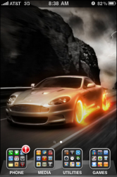
Found this picture online, this is a pretty cool way to use folders for those that like a clean, neat looking interface. Just arrange all your apps into 4 folders on the dock. Of course most people can't fit all their apps into 4 folders but I guess this can clean up the home page at least. That also gives you a chance to fully see the wallpaper.
Got a tip for us?
Let us know
Become a MacRumors Supporter for $50/year with no ads, ability to filter front page stories, and private forums.
Cool use for folders in 4.0
- Thread starter bigjnyc
- Start date
- Sort by reaction score
You are using an out of date browser. It may not display this or other websites correctly.
You should upgrade or use an alternative browser.
You should upgrade or use an alternative browser.
I tried this earlier but undid it pretty fast. I don't like the extra steps involved in opening apps. But yeah, it looks good.
Ha ha...I predict that pretty much EVERYONE will spend a day with 1 page full of 20 folders.
Then they'll realize that two taps to get to the phone or e-mail isn't really a great idea and they'll give up. I'm sure there will be a ton of threads about that exact thing happening.
I plan on leaving my dock and page 1 exactly like they are now. If something is there it's because I use it a lot. Why would I want to make it harder to get to?
But on page 2 and up, yeah, I'll probably use folders a lot...maybe even similar to what the OP has done where page 2 and 3 will be 4 folders each and I'll have a cool background.
I tried this earlier but undid it pretty fast. I don't like the extra steps involved in opening apps. But yeah, it looks good.
Thats a good point I didnt think about that, This is not mine I just found it online as I dont have 4.0.... but now that you mention it, that would be cumbersome to have to first click on the folder then click on the app just get to your phone. Does look nice and clean though.
The optimum would seem to be two pages. The home page gets very common apps and folders. A second page gets more common apps. Everything else goes in folders on the home page. Most people will want phone, browser, and mail on the dock. Contacts seems unnecessary since that's accessible from Phone. And iPad has no Phone. So, you might want a couple of folders on the dock.
Swipe right gets you the search page. Swipe left gets you a second page. A third page seems superfluous, requiring more gestures than the folders.
Of course, you can still use the "dots" to access additional pages. IF you remember which page is which. And IF you can hit those tiny little dots.
Swipe right gets you the search page. Swipe left gets you a second page. A third page seems superfluous, requiring more gestures than the folders.
Of course, you can still use the "dots" to access additional pages. IF you remember which page is which. And IF you can hit those tiny little dots.

Found this picture online, this is a pretty cool way to use folders for those that like a clean, neat looking interface. Just arrange all your apps into 4 folders on the dock. Of course most people can't fit all their apps into 4 folders but I guess this can clean up the home page at least. That also gives you a chance to fully see the wallpaper.
Me like, but I would only have 1 folder down in the dock. Less clutter and more quick access to some apps.
I actually did this using Categories through Cydia and it lasted only a few hours before I got sick of it. Although from the keynote Folders on a 3GS looks ten times quicker at loading than Categories was on my 3G, as other posters have stated it's just creating more clicks to do simple tasks which in the end is against why I got an iPhone in the first place.
It looks good, but no substance to the process after a day. Nice wallpaper though...
It looks good, but no substance to the process after a day. Nice wallpaper though...
Will we be able to secure folders with a passcode?
Sounds like another great feature that Apple would intentionally leave out.
Will we be able to secure folders with a passcode?
why? we already can secure the phone with a passcode. if someone stole your phone, theyd hafta get past that one anyway
Not at present. Cool idea though.Will we be able to secure folders with a passcode?
Why ANYONE cares about folders or the order of their icons after the first page when we all have spotlight to quickly launch apps is beyond me. Have fun digging through your folders everyone.
Why ANYONE cares about folders or the order of their icons after the first page when we all have spotlight to quickly launch apps is beyond me. Have fun digging through your folders everyone.
have fun typing the name of the app you can sorta remember and then end up flipping through 8 pages to find that you already deleted it because it was only the lite version so you only got 3 levels
have fun typing the name of the app you can sorta remember and then end up flipping through 8 pages to find that you already deleted it because it was only the lite version so you only got 3 levels
I remember the apps I have and I'd much rather type the first couple letters than scroll through pages. I'm not saying it's not helpful for other people, but I don't see the use for it. I really think that using spotlight is far faster and more effective. The problem is that since spotlight wasn't included since the beginning people don't want to change their habits since they got used to searching and organizing all the apps. Spotlight is far more time efficient.
I will probably do about what I do now with Categories: keep my home page for the most frequently used apps and put most other things in folders on the second page.
But you did. And you shouted it.
I'm not saying it's not helpful for other people, but I don't see the use for it.
But you did. And you shouted it.
Why ANYONE cares about folders or the order of their icons after the first page when we all have spotlight to quickly launch apps is beyond me. Have fun digging through your folders everyone.
I like the idea of folders to categorize my apps. As for the first post, it looks great, but like others have already said it adds another step to doing things which I don't like.
But you did. And you shouted it.
I meant to say that I don't see why anyone would need them, not that folders shouldn't have been included. People do things I don't understand all the time, but that doesn't mean their needs shouldn't be catered to, even though I disagree with them.
I like the idea of folders to categorize my apps. As for the first post, it looks great, but like others have already said it adds another step to doing things which I don't like.
But my view is that, past the first page (maybe two) at least, folders add steps to in comparison to just spotlighting something.
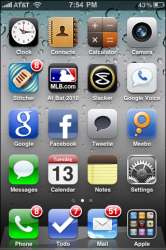
Though I have other folders, i like it like this. I have my most used on page 1 with the phone, todo, and mail apps in dock and an "Apple" folder (stupid name, I know) that has most of the apple apps, Safari, iPod Google Maps, Photos, iTunes, App Store, etc) available for easy access on any page.
Also made a bunch of other folders but not sure how many will stick.
Also made a bunch of other folders but not sure how many will stick.
Attachments
I meant to say that I don't see why anyone would need them, not that folders shouldn't have been included. People do things I don't understand all the time, but that doesn't mean their needs shouldn't be catered to, even though I disagree with them.
if people didnt need them, why would they be included? and if people don't need them, then there are no needs to cater to
I meant to say that I don't see why anyone would need them, not that folders shouldn't have been included. People do things I don't understand all the time, but that doesn't mean their needs shouldn't be catered to, even though I disagree with them.
So, just because Apple includes something that you don't use means that they are catering to other people?
Though I have other folders, i like it like this. I have my most used on page 1 with the phone, todo, and mail apps in dock and an "Apple" folder (stupid name, I know) that has most of the apple apps, Safari, iPod Google Maps, Photos, iTunes, App Store, etc) available for easy access on any page.
Also made a bunch of other folders but not sure how many will stick.
the "apple" folder you made is similar to what I'm thinking about doing; i'm going to put the included apps i use the most in one folder right on the dock
if people didnt need them, why would they be included? and if people don't need them, then there are no needs to cater to
People want folders. That is a "want" that Apple is striving to meet in this instance even though it's my position that someone who is using their iPhone in the most time-saving and efficient way wouldn't need them.
Register on MacRumors! This sidebar will go away, and you'll see fewer ads.