Become a MacRumors Supporter for $50/year with no ads, ability to filter front page stories, and private forums.
I hate it when people claim there are no manuals...
First place I send people with new iOS gadgets

http://support.apple.com/manuals/iphone/
http://support.apple.com/iphone/
Bookmarks, last one, User Guide

Sorry they are not printed on paper.

Re-read what I wrote. I never made the claim there were no manuals. I said there is no instructions "included." There should be a quick set up manual, tutorial, or quick set up either included printed, pre-installed on the phone, or available separately for those that are not too familiar with technology. This would of aided several individuals, especially those not familiar with technology, on how things work. Many apps, for example snapseed, include instruction screens for new customers.

Telling people, who are not techno-savy, to go to a web address is a lazy response. Things should be simpler than that.
 
What does Flat design mean?

It's a vague term that means a modern interpretation of Swiss Design, the child of bauhaus design.

Unfortunately, if 'flat' design is not executed correctly (win8), then it can be counterintuitive as an User Interface element.

The good thing is that Apple wont release something that they're excited about. That level of polish is what sets them apart from the competition.
 
Yes please. It sounds like I'll finally want to ditch my jailbreak and UI mods to go back to stock iOS when v.7 drops. Thanks Johnny :apple:
 
My number one peeve with iOS 6 UI is that the banner changes color in certain Apple apps. It makes no sense. Previously a change in the banner color was only used to notify you of when something was going on that you needed to be aware of (e.g.: WiFi Hotspot or Screen Sharing or "In a Call").

iOS 6 added "Navigation" banner change which made sense so you could quickly return to Navigation by tapping it.

But what was up with the alternate banner color in the Mail or Settings apps?

I actually hope iOS 7 adds a "Photo Stream" mode (with appropriate banner color change to notify you) so that you can set the camera to send every photo you snap to one or more photo streams. The banner would be there to let you know that you were sharing everything you took a picture of.

But I really want the other Apple apps to leave my banner alone unless they have something to tell me through the color change.
 
Am I the only one who prefers the old design?

Not at all. I actually had to sit and decipher which one people were lauding as better (since I don't use podcasts). The old is much better! I actually think it is a nice balance between flat and not. I can see what people are saying about the Calendar app, but I don't think going to the opposite extreme for the entire OS is the answer.
 
It's a vague term that means a modern interpretation of Swiss Design, the child of bauhaus design.

Unfortunately, if 'flat' design is not executed correctly (win8), then it can be counterintuitive as an User Interface element.

The good thing is that Apple wont release something that they're excited about. That level of polish is what sets them apart from the competition.

Thanks!
 
I remember a while back Coke decided to bring out the "NEW Coke". It was flat and did not last more then 6 months. I hope this is not that flat! ;)

Actually New Coke continued to be sold in certain regional markets under the name "Coke II" all the way up until 2002.
 
Interesting. We've been able to do this kind of UI change for years with a jailbreak.
 
Re-read what I wrote. I never made the claim there were no manuals. I said there is no instructions "included." There should be a quick set up manual, tutorial, or quick set up either included printed, pre-installed on the phone, or available separately for those that are not too familiar with technology. This would of aided several individuals, especially those not familiar with technology, on how things work. Many apps, for example snapseed, include instruction screens for new customers.

Telling people, who are not techno-savy, to go to a web address is a lazy response. Things should be simpler than that.

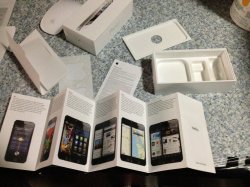
http://manuals.info.apple.com/en_US/iphone_5_finger_tips_guide.pdf
That is included in EVERY iPhone box.
 

Attachments

  • IMG_0042.jpg
    IMG_0042.jpg
    2.4 MB · Views: 129
My dad, who is 68, recently purchased an iPhone and I received about a dozen calls within the first five minutes on how to use the phone.

For starters, there is no instruction manual of sorts included with the iPhone and so you have to rely upon "ease of use" to use it. Unfortunately, many of the things my father was looking for was buried deep within the iOS.

Hmmm... My 82 year old mother got an iPhone last year. She has had a few questions mostly regarding iCloud. She didn't have any problems using the phone, buying apps, even Text Messaging! In fact, I could give anecdotal story after story about how easy the iPhone is to figure out. (People have apparently forgotten that phones used to be exceedingly difficult to use for simple things.)

And regarding manuals - does anything come with an extensive paperbound manual anymore? ( I know some things do, but not generally )
 
I would much prefer a focus on adding new deep functionality that brought back the vast software and media libraries that used to be useable prior to Apple making so much obsolete by abandoning Classic, PPC, 68K, etc. There is a tremendous amount of great software that has never been recreated for Intel OSX. With such powerful hardware Apple should be emulating or transcompiling so we can continue to use our existing tools. That would get me and many others to upgrade machines that stay stuck in the past. That would get more hardware and OS sales for Apple.

While they're at it iOS and OSX should become interchangeable where the hardware is powerful enough (most cases).
 
But that just sounds like a rip-off of Windows Phone 7/8.

I like some gloss and shine in an interface anyway.

But wait a minute -- there is a significant cohort here that says the existing iOS is tired and boring.

Do you believe that iOS 6 is tired and boring?
 
It will be very much in keeping with Apple if they release a flat mobile OS, just like Windows and Android and everyone else these days, but then claim they have invented a new level of flatness that is superior to everyone else's flatness.

Apple will then patent flatness and sue everyone else for flat UI.

Honestly if Apple wants to be revolutionary bring back glass buttons and at least look different than all their competition.

Geeze, if this is Apple's idea of innovation, to duplicate other people's design trends now, its game over.

Cool "Apple is doomed" story bro...
 
I will wait to judge until it comes out.

One thing is for certain though. If all we are getting is massive aesthetic changes, it's hard to argue that people aren't listening to consumers, even if we are the vocal minority, as some here like to claim.
 
I think that quite a few people on here don't actually understand what flat design is exactly. Not to mention it's not copying anything from Windows 8 or Google. It's a well known type of design that's not restricted to the major players such as Microsoft and Google.

http://pinterest.com/warmarc/flat-ui-design/

Is a good example of some gorgeous flat design in apps.

I think iOS going flat design is really going to bring some life into it and will probably be a simple way of really updating the UI into a new era of iOS. I'm excited!

EDIT:

And the podcast app isn't flat UI in the slightest :)

Exactly what I'm afraid of... I find those designs boring and cold... But that's just me... You can't win them all...:apple:
 
DO NOT LIKE!!!!

Maybe remove leather textures... But don't remove the design. Windows 8 looks like it was made by a 3 year old in ms paint.
 
Register on MacRumors! This sidebar will go away, and you'll see fewer ads.