Become a MacRumors Supporter for $50/year with no ads, ability to filter front page stories, and private forums.

Do you like Liquid Glass on Mac?

  • Yes

  • Meh…

  • No


Results are only viewable after voting.
Apple needs big changes at the top. Apple needs people who are hungry and motivated and extremely passionate themselves about Apple products and use them every day. They need a new jobs and have to stop being afraid to upset any group. Be bold. Believe in something and go for it. Apple used to be about bring products that helped change people s lives for the better using tech. They need to focus on their old core mission.

The really sad part is how many are cheerleading financial results, as the actual core values and competencies that built the reputation get eroded away entirely in the process of fully financially "optimizing" what the company was and now is.

Apple is getting fully "Cooked" by Tim
 
I even enjoyed the very early MS Office for Mac icons.

This shows how much they've all been cut down to bleh / boring 🥱

It's so dull to have everything be "en-squircled"

office-icons-through-the-years-2k8-was-the-fa-phase-btw-v0-gwehw45pfjyc1.png
Those 2001 Office icons are bringing me back to the very exciting and brand new OS X days! What an era. I still have a huge, beautiful (and fun) Mac icon collection that I refuse to let go of, along with all those quirky fun apps that no longer run. Don't even get me started on the fall of AfterDark Screensavers, I had them all.

I used those 2011 Office icons (my favorites) for as long as I could. After every update I'd change them (and many others) back again, until they started to stand out among all the other apps as changing all dock icons became a chore since updates are so frequent these days.

The irony of living in an age where Macs have the best CPUs, displays and so on, yet the industry went back to boring, lazy graphics, icons and GUIs, even if they are higher resolution, as if we're running Trident or ATI Rage graphics cards from 1995.

Some may suggest that nostalgia for this era and style is why we don't like Tahoe, but what we are really lamenting is the end of an era when icons and interfaces were polished works of art, so we're not living in the past, we're annoyed that we have amazing technology that could have handled the natural evolution of beautiful GUIs, yet somehow we reverted.
 
Last edited:
Those 2001 Office icons are bringing me back to the very exciting and brand new OS X days! What an era. I still have a huge, beautiful (and fun) Mac icon collection that I refuse to let go of, along with all those quirky fun apps that no longer run. Don't even get me started on the fall of AfterDark Screensavers, I had them all.

I used those 2011 Office icons (my favorites) for as long as I could. After every update I'd change them (and many others) back again, until they started to stand out among all the other apps as changing all dock icons became a chore since updates are so frequent these days.

The irony of living in an age where Macs have the best CPUs, displays and so on, yet the industry went back to boring, lazy graphics, icons and GUIs, even if they are higher resolution, as if we're running Trident or ATI Rage graphics cards from 1995.

Some may suggest that nostalgia for this era and style is why we don't like Tahoe, but what we are really lamenting is the end of an era when icons and interfaces were polished works of art, so we're not living in the past, we're annoyed that we have amazing technology that could have handled the natural evolution of beautiful GUIs, yet somehow we reverted.
Perfectly said.

Last paragraph nails it!

I completely agree.
 
The really sad part is how many are cheerleading financial results, as the actual core values and competencies that built the reputation get eroded away entirely in the process of fully financially "optimizing" what the company was and now is.

Apple is getting fully "Cooked" by Tim
These practices will catch up to them before too long. It may be ok in the short term to rush poorly made products out the door and skimp on quality costs here and there, but then trust and goodwill are lost.
 
Speaking of Tahoe bugs and SSDs.... Ever since upgrading to 26, my external Thunderbolt NVMe SSDs keep randomly disconnecting. Great stuff.
Waaaait, that’s Tahoe? I thought my (HDD) drive was failing*… it has never disappeared before. I had to restart for it to appear again, Disk Utility didn’t see it.

*it might well be failing :/
 
Waaaait, that’s Tahoe? I thought my (HDD) drive was failing*… it has never disappeared before. I had to restart for it to appear again, Disk Utility didn’t see it.

Yep, that's Tahoe. Apparently, they made energy management more "efficient" (read: more aggressive), leading to disks getting ejected. From what I read...

My SSDs are fairly new, and it happens to two different SSDs, so I can pretty much rule out any hardware issues. And the fact that this never happened before and only started exactly after updating to Tahoe is probably no coincidence.
 
Either I'm finally getting used to it or Apple has managed to tweak Liquid Glass in the latest Tahoe betas to the point where it works a lot better for me now...
 
Yep, that's Tahoe. Apparently, they made energy management more "efficient" (read: more aggressive), leading to disks getting ejected. From what I read...

My SSDs are fairly new, and it happens to two different SSDs, so I can pretty much rule out any hardware issues. And the fact that this never happened before and only started exactly after updating to Tahoe is probably no coincidence.
I've been having the same problem–consistently, but it's been happening to me since Sequoia. I think I read somewhere that this was a known issue, but I could be wrong. I figured I'd come to Tahoe's defense for once. :p
 
  • Haha
Reactions: Comfortably Numb
Either I'm finally getting used to it or Apple has managed to tweak Liquid Glass in the latest Tahoe betas to the point where it works a lot better for me now...
I haven't had the time or courage to download the new betas, what changes are sitting better with you?
 
  • Like
Reactions: kkclstuff
I haven't had the time or courage to download the new betas, what changes are sitting better with you?

Appearance wise, I notice in dark mode the outline for menus are more pronounced, which I like.

Light mode is still unreadable to my eyes without "reduce transparency" (enabling which has its own issues). I'm running a Dell U2723QE (4K 27") Ultra sharp monitor at "like 1080p". Thank goodness for dark mode.

I think speed and stability have improved? Fewer instances of beach ball.

Honestly, if you're already on Tahoe, you may as well get on beta. Can't be worse.
 

Attachments

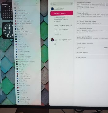
  • 20251010_113431.jpg
    20251010_113431.jpg
    375.4 KB · Views: 42
I even enjoyed the very early MS Office for Mac icons.

This shows how much they've all been cut down to bleh / boring 🥱

It's so dull to have everything be "en-squircled"

office-icons-through-the-years-2k8-was-the-fa-phase-btw-v0-gwehw45pfjyc1.png

I haven't thought about those original Office icons in AGES. Man, every day we drift farther from the light of god (also, somehow, every once and a while Microsoft design finds a truffle like these icons, their current emojis, or those Whistler beta window deco, in mounds and mounds of dirt).

It's not only boring to have every icon be a square, it's harder to parse different icons. We use color and shape to distinguish things, and depending on what options you tick in Tahoe you lose at least one, and maybe both.

Those 2001 Office icons are bringing me back to the very exciting and brand new OS X days! What an era. I still have a huge, beautiful (and fun) Mac icon collection that I refuse to let go of, along with all those quirky fun apps that no longer run. Don't even get me started on the fall of AfterDark Screensavers, I had them all.

I used those 2011 Office icons (my favorites) for as long as I could. After every update I'd change them (and many others) back again, until they started to stand out among all the other apps as changing all dock icons became a chore since updates are so frequent these days.

The irony of living in an age where Macs have the best CPUs, displays and so on, yet the industry went back to boring, lazy graphics, icons and GUIs, even if they are higher resolution, as if we're running Trident or ATI Rage graphics cards from 1995.

Some may suggest that nostalgia for this era and style is why we don't like Tahoe, but what we are really lamenting is the end of an era when icons and interfaces were polished works of art, so we're not living in the past, we're annoyed that we have amazing technology that could have handled the natural evolution of beautiful GUIs, yet somehow we reverted.

Couldn't have said it better myself. OSX was filled with great icons, Microsoft and other companies competed with indie devs to make colorful, intriguing, and easily parsable icons. We could change icons easily. Iconfactory made awesome icons we could bring into the OS, that duck-iconed messanger app let you choose different ducks for icons! People made great versions of it!

And now we have Tahoe. Truly the operating system we deserve in these times.
 
I haven't thought about those original Office icons in AGES. Man, every day we drift farther from the light of god (also, somehow, every once and a while Microsoft design finds a truffle like these icons, their current emojis, or those Whistler beta window deco, in mounds and mounds of dirt).

It's not only boring to have every icon be a square, it's harder to parse different icons. We use color and shape to distinguish things, and depending on what options you tick in Tahoe you lose at least one, and maybe both.


Couldn't have said it better myself. OSX was filled with great icons, Microsoft and other companies competed with indie devs to make colorful, intriguing, and easily parsable icons. We could change icons easily. Iconfactory made awesome icons we could bring into the OS, that duck-iconed messanger app let you choose different ducks for icons! People made great versions of it!

And now we have Tahoe. Truly the operating system we deserve in these times.
Iconfactory was the benchmark for sure. Adium still exists. :cool:
 
The updated Office just got pushed to my Mac and Apple really created this window corner purgatory.

Not only is there a discrepancy between new and old style windows, it also paved the way for third-party developers - which Microsoft is probably one of the worst of - to do whatever. They came up with window corner radiuses that don’t really match anything. Because, why not?

The Outlook and Teams main windows now - sort of - use the corner radiuses you see on the Finder sidebar (not really meant for the outside border of windows I think?). Word and PowerPoint use something in-between the new and old style. And of course the window control buttons are all over the place alignment-wise.

I honestly feel this shouldn’t even be possible when coding an app without jumping through so many hoops it just doesn’t make it worth while. But here we are:

CP4R8Bl.png

:
 
Last edited:
The updated Office just got pushed to my Mac and Apple really created this window corner purgatory.

Not only is there a discrepancy between new and old style windows, it also paved the way for third-party developers - which Microsoft is probably one of the worst of - to do whatever. They came up with window corner radiuses that don’t match anything. Because, why not?

The Outlook and Teams main windows now use the corner radiuses you see on the Finder sidebar (not really meant for the outside border of windows I think?). Word and PowerPoint use something in-between the new and old style. And of course the window control buttons are all over the place alignment-wise.

Lovely precedent Apple created here.
I’ve just downloaded this too. It look ridiculous.
 
  • Like
Reactions: Sowelu
Register on MacRumors! This sidebar will go away, and you'll see fewer ads.