Become a MacRumors Supporter for $50/year with no ads, ability to filter front page stories, and private forums.

Do you like Liquid Glass on Mac?

  • Yes

  • Meh…

  • No


Results are only viewable after voting.
Damn, ok I didn't realise one could so passionate about dialogue alignment but I see your point.

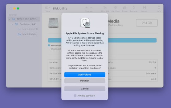
Personally, I don't like the Tahoe vertical dialogue box with the left justification. I'd prefer the pre-Big Sur dialogue box, or the centre-aligned vertical dialogue box.

I guess we're both partially dissatisfied now?
 
I’m not a fan of everything being left-justified on the vertical dialogue box either. If they aren’t going to change it back to pre-Big Sur, couldn’t they have left the icon and title centered, but have the rest of the text left-justified? You know…like a paper report where the title is centered and the body of the report is left-justified.
 
  • Like
Reactions: Sowelu and thebart
Personally, I don't like the Tahoe vertical dialogue box with the left justification. I'd prefer the pre-Big Sur dialogue box, or the centre-aligned vertical dialogue box.
Honestly, I think you'll get used to it and learn to appreciate the new look. It's so much easier to read now. Can't believe they thought this was a good idea:

Big-Sur-alert-2.jpg
 
Last edited:
  • Like
Reactions: zevrix and AAPLGeek
What's the consensus with these menus? I just think they look absolutely ridiculous with some items having icons, others not.
In principle, I think it's a good idea (although a setting to toggle on/off would be great for those who dislike it). But I have two issues with it: (1) the inconsistency and misalignment when some items don't have icons--it's especially visible in your first screenshot in the lower items, and (2) the space isn't large enough for some of the more detailed icons to be easily legible at default resolution scaling. It works better on iOS/iPadOS where the icons are larger since it has to work with touch targets instead of a mouse pointer. For example, the zoom options have icons that all look the same when quickly glancing since they're all magnifying glasses with a tiny symbol inside to differentiate, but the icons are small enough that the outside shape dominates recognition.
 
  • Like
Reactions: unsui_grep
I hope I'm correct in thinking Apple has included these to assist those with reading impairments because, honestly, it's a waste of space having only some commands visualised.
Apple probably included them because iOS has them and their goal is unification across platforms.

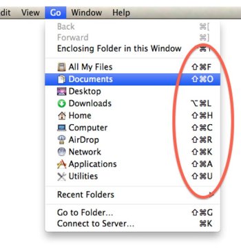
Also about the menu text not being aligned between subsections with and without symbols: That's been the case since forever. Dating back as far as Mac OS X Leopard and most likely way earlier than that (see attached screenshot). Menu’s from Finder and Safari already had folder icons in them which looked exactly the same as they do now. Text of menu subsections with icons never aligned with subsections that are completely without symbols. Were you complaining about it then too? Probably not.

These symbols are probably still very much a work in progress. I expect the set to be expanded to more menu entries in future versions.
 

Attachments

  • FinderGoMenuHotkeys-1467733349.png.jpeg
    FinderGoMenuHotkeys-1467733349.png.jpeg
    50.5 KB · Views: 57
Last edited:
It's not liquid glass that I have a problem with, it's the whole interface design:

  • Margins are too small around UI elements like buttons or traffic lights
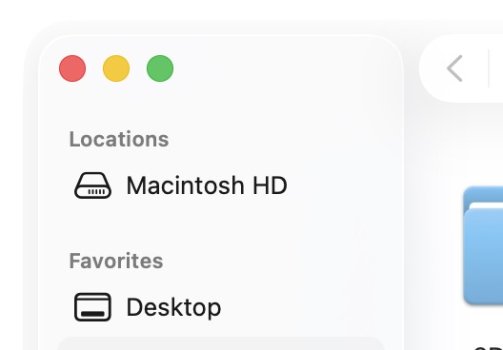
  • Margins of the traffic lights don't align with the text elements in the left side panel in Finder
  • Elements that seem to be "floating" aren't actually floating, such as the top buttons in Finder or the top buttons in Safari. They seem to cast a shadow below but that would only make sense if they were floating on top of content. Instead, they're floating on top of a grey uniform background, so there's no point in them having a shadow or an outline.
  • Pills in pills in pills. What the hell. Why are Safari tabs pill shaped? Why are they also within a long pill shaped grey bar? Why do they have straight vertical dividers between them when inactive, then gain a pill shaped outline when active? Why the inconsistency?
  • Why are buttons in pill shaped groups? Why are the buttons themselves slightly pill shaped within pill shaped groups instead of being circles?
  • Why do menus change color when going into sub-menus? I don't even understand what's going on, they just "change" but it's not like they become more or less prominent, it just seems like a bug. Maybe it is.
  • Why do left side panels in the Finder have their own outline, making it look like the finder has a double outline but only on the left side?
    • The traffic lights look like they belong to the left side panel, not the entire window. I know it's going to close the whole window but it looks like it only refers to the left side panel because it has its own outline, and the traffic lights are within the outline.
    • The left hand panels look like they're floating above content, but there's no content behind them, the content is actually on the right side. Why make it look like floating UI elements when they're not actually on top of content?
  • Where's the actual liquid glass?I actually like the idea of transparency, but everything is just an opaque white/black/grey rounded rectangle with hardly any transparency. This is pretty much how it looked in Sequoya, just with less clutter. If anything, this is not more glassy than the previous OS-es.
    • This is just flat design with blurry transparency and badly tuned ultra soft drop shadows and extra rounded borders around everything for no reason. It's like someone took flat design and thought "Let's add drop shadows to make the flatness stand out more!"
    • The liquid glass is limited to the dock background and the widgets. That's it. And it doesn't look like glass, it looks like a cheap blurry transparency with some white added in for good measure. It's pretty much what transparency in UI has always been: not brave enough to actually be transparent due to legibility, so they added a frosted blurry effect, but that wasn't enough, so they added a white color to tone down the vividness of the background. Oh but now why call it glass then? Why not call it "cheap matte plastic", which is what it actually looks like?
So yeah I don't like it. Same problems on iOS: it's inconsistent, ugly, and not even very different from what we had before. It's just an undecided, inconsistent and weird version of flat design.Screenshot 2025-10-08 at 11.25.10.jpg


Screenshot 2025-10-08 at 11.25.00.jpg


Screenshot 2025-10-08 at 11.25.41.jpg
 
It's not liquid glass that I have a problem with, it's the whole interface design:

  • Margins are too small around UI elements like buttons or traffic lights
  • Margins of the traffic lights don't align with the text elements in the left side panel in Finder
  • Elements that seem to be "floating" aren't actually floating, such as the top buttons in Finder or the top buttons in Safari. They seem to cast a shadow below but that would only make sense if they were floating on top of content. Instead, they're floating on top of a grey uniform background, so there's no point in them having a shadow or an outline.
  • Pills in pills in pills. What the hell. Why are Safari tabs pill shaped? Why are they also within a long pill shaped grey bar? Why do they have straight vertical dividers between them when inactive, then gain a pill shaped outline when active? Why the inconsistency?
  • Why are buttons in pill shaped groups? Why are the buttons themselves slightly pill shaped within pill shaped groups instead of being circles?
  • Why do menus change color when going into sub-menus? I don't even understand what's going on, they just "change" but it's not like they become more or less prominent, it just seems like a bug. Maybe it is.
  • Why do left side panels in the Finder have their own outline, making it look like the finder has a double outline but only on the left side?
    • The traffic lights look like they belong to the left side panel, not the entire window. I know it's going to close the whole window but it looks like it only refers to the left side panel because it has its own outline, and the traffic lights are within the outline.
    • The left hand panels look like they're floating above content, but there's no content behind them, the content is actually on the right side. Why make it look like floating UI elements when they're not actually on top of content?
  • Where's the actual liquid glass?I actually like the idea of transparency, but everything is just an opaque white/black/grey rounded rectangle with hardly any transparency. This is pretty much how it looked in Sequoya, just with less clutter. If anything, this is not more glassy than the previous OS-es.
    • This is just flat design with blurry transparency and badly tuned ultra soft drop shadows and extra rounded borders around everything for no reason. It's like someone took flat design and thought "Let's add drop shadows to make the flatness stand out more!"
    • The liquid glass is limited to the dock background and the widgets. That's it. And it doesn't look like glass, it looks like a cheap blurry transparency with some white added in for good measure. It's pretty much what transparency in UI has always been: not brave enough to actually be transparent due to legibility, so they added a frosted blurry effect, but that wasn't enough, so they added a white color to tone down the vividness of the background. Oh but now why call it glass then? Why not call it "cheap matte plastic", which is what it actually looks like?
So yeah I don't like it. Same problems on iOS: it's inconsistent, ugly, and not even very different from what we had before. It's just an undecided, inconsistent and weird version of flat design.View attachment 2565275


View attachment 2565276


View attachment 2565277
The pills and capsules are out of control. Safari tabs are possibly the worst offender. So distracting and such a waste of space.
 
Apple probably included them because iOS has them and their goal is unification across platforms.

Also about the menu text not being aligned between subsections with and without symbols: That's been the case since forever. Dating back as far as Mac OS X Leopard and most likely way earlier than that (see attached screenshot). Menu’s from Finder and Safari already had folder icons in them which looked exactly the same as they do now. Text of menu subsections with icons never aligned with subsections that are completely without symbols. Were you complaining about it then too? Probably not.

These symbols are probably still very much a work in progress. I expect the set to be expanded to more menu entries in future versions.

findergomenuhotkeys-1467733349-png-jpeg.2565290


Look at that beautiful, crystal clear, contrast and legibility!

LOVE IT!
 
Last edited:
View attachment 2565598

Some of my favourite Mac icons, from Adobe CS2. Absolute works of art on their own right. I just can’t believe we’ve gone from this to the thoughtless, sterile icons that are in Tahoe.

I even enjoyed the very early MS Office for Mac icons.

This shows how much they've all been cut down to bleh / boring 🥱

It's so dull to have everything be "en-squircled"

office-icons-through-the-years-2k8-was-the-fa-phase-btw-v0-gwehw45pfjyc1.png
 
The latest version of Scrivener has an "improved" icon which, thanks to a thin border around the image causing an optical illusion, looks slightly smaller than all the other icons in my Dock. It makes me wonder whether the designer has the app docked in the first place.
 
  • Sad
Reactions: turbineseaplane
I even enjoyed the very early MS Office for Mac icons.

This shows how much they've all been cut down to bleh / boring 🥱

It's so dull to have everything be "en-squircled"

office-icons-through-the-years-2k8-was-the-fa-phase-btw-v0-gwehw45pfjyc1.png
I completely agree. MacOS has gotten flatter and uglier over time. To me the 2001 icons look like Liquid Glass and the new Liquid Glass looks nowhere near as good.

My complaints with the new Liquid Glass is not enough Liquid Glass. I would love a return to icons from 2001 or earlier just twist the design a little. They could have made Liquid Glass look even more 3d than the original and doubled down on the original Liquid Glass design with some changes to make it look modern.

What we have now is like someone who said lets bring back Liquid Glass but never saw Liquid Glass in real use like in tiger or earlier. Whoever is designing Apple's UI I expect to have used very version of MacOS in existence simply to know the natural evolution of design over the years. It would also give the designers context needed to create a new Liquid Glass. I feel like the designers created it with little context of past version of MacOS.

I like the idea of conformity ion design language and making all the OS for all devices looking similar is a good thing but the homogenization process has also had a detrimental effect on each OS. Individuality used to be the cornerstone of Apple. Now it seems group think has replaced a strong leader with a strong vision. We are witnessing the changing of the guard as Apple will be replacing Tim Cook in the near future. Is there another person with the vision of Jobbs? If you remove the individuality and creativity that defined Apple and replace it with a committee you get really bad results. I think the problems with hardware QC, new direction in AI, all OS, and hardware seems to be at a standstill there are several examples of this in recent history like AI.

I don't say any of this to say Apple is doomed or the software is doomed but to say we are in a transition behind the scenes and at a fulcrum point in technology in general which Apple wasn't really prepared. Apple used to be at the forefront of any disruptive technology and the fact they seem to be catching up is illustrative of the point I am making.

Apple needs big changes at the top. Apple needs people who are hungry and motivated and extremely passionate themselves about Apple products and use them every day. They need a new jobs and have to stop being afraid to upset any group. Be bold. Believe in something and go for it. Apple used to be about bring products that helped change people s lives for the better using tech. They need to focus on their old core mission.
 
The latest version of Scrivener has an "improved" icon which, thanks to a thin border around the image causing an optical illusion, looks slightly smaller than all the other icons in my Dock. It makes me wonder whether the designer has the app docked in the first place.
The GarageBand app on MacOS has the same problem. It looks absolutely tiny compared to Logic Pro or any other Apple app icon.


icons.png
 
  • Like
Reactions: !!!
The GarageBand app on MacOS has the same problem. It looks absolutely tiny compared to Logic Pro or any other Apple app icon.


View attachment 2565657

They've not even made a new LG compliant version of the ICON for GarageBand?

That one shown there is trapped in "squircle jail" as John Siracusa would say.

(A dev who hasn't updated the icon gets this treatment on their App icon... but this is from Apple!!)
 
Other than this, I mostly agree.
Yeah, I might be completely wrong on this point.

What makes Apple special is how each device is customized for its purpose and Apple has for most of its history kept to this individual philosophy. Each device is purpose based to solve a problem ideally.

So I get the fact people want their Mac to be different than their phone or tablet. I guess I just meant a certain amount of shared design language is a good thing.
 
This should be an Accessibility option; a toggle in Settings to turn them on or off.

That was my first feedback note after upgrading. The purpose of the symbols is seemingly to aid, not to provide information that isn't already there. And rendering them in the same colour as the text has the secondary effect of cluttering everything (like I think the outlined sidebar panels and buttons already did).

Three weeks in, beholding and using this still feels somewhat stressful, not really enjoyable. (Let alone the promised "delightful.") I've never found myself thinking anything remotely like this for a Mac system update.
 
  • Like
Reactions: unsui_grep
They've not even made a new LG compliant version of the ICON for GarageBand?
On iOS, the iWork suite is not updated but the document picker is Liquid Glass, even though the icon and document viewer/editor aren’t. It’s baffling that you can get both the new and old keyboard in the same app depending on which view you’re in.
 
I ran
Code:
defaults read -g com.apple.SwiftUI.DisableSolarium
and verified that it had set that to 1.
I just updated to 26.1 beta 2. So I think maybe Apple already "fixed" it.
In SolidGlass Read Me file:
"For macOS BETA users
Disabling Liquid Glass isn't working in newer versions of macOS Tahoe beta. We don't know if this is a glitch caused by a system malfunction (which is quite possible), Apple changing how the disabling command works, or removing it completely. We'll just have to wait for the stable version to be released."
https://github.com/rafaelSwi/SolidGlass?tab=readme-ov-file#for-macos-beta-users
 
  • Like
Reactions: kkclstuff
Apple needs big changes at the top. Apple needs people who are hungry and motivated and extremely passionate themselves about Apple products and use them every day. They need a new jobs and have to stop being afraid to upset any group. Be bold. Believe in something and go for it. Apple used to be about bring products that helped change people s lives for the better using tech. They need to focus on their old core mission.
Couldn’t have said it better.
 
Register on MacRumors! This sidebar will go away, and you'll see fewer ads.