Absolutely genius and makes this iPhone an essential upgrade. Apple is innovative again!
Got a tip for us?
Let us know
Become a MacRumors Supporter for $50/year with no ads, ability to filter front page stories, and private forums.
Dynamic Island: First Look at iPhone 14 Pro's New Pill-Shaped Cutout
- Thread starter MacRumors
- Start date
- Sort by reaction score
You are using an out of date browser. It may not display this or other websites correctly.
You should upgrade or use an alternative browser.
You should upgrade or use an alternative browser.

All true however you certainly will notice the pill when in full screen. I feel a dynamic notch would’ve been better. Especially since we’re used to the statusbar already.They basically took this annoying cut out that blocks out part of the display and gave it a personality using a magicians slight of hand. To your brain, they are hiding the pill in plain sight by moving it around, resizing it, putting some screen real estate between the components, making it touch interactive. It now truly is a feature instead of a dead zone. your brain will no longer see a pill, but a tool. your eyes will gravitate towards it regularly to see what it is telling you. If they took it away you would miss it it. It wont take a geek to fall in love with this feature if they make it useful enough. This is one of the most Steve Jobs like moments I've seen from Apple since his passing. PURE GENIUS!
I wouldn't mind a dynamic notch but I think apple would have to make the notch area touch sensitive to get similar interactions. Not impossible but it seems they decided to focus on the pill area. Interestingly, the area above the pill vacated by the notch must now be touch sensitive. I imagine applications won't make much use of though games might be able to?All true however you certainly will notice the pill when in full screen. I feel a dynamic notch would’ve been better. Especially since we’re used to the statusbar already.
Excuse my ignorance (haven't had an iPhone in a while) but how did minimising an app, let's say the Music app, work on the previous models? Did it just go in the notification area? As in you swipe down from the corner and from there you have access to the controls for the Music player?
There wasn't really a minimization concept on iPhone before this. Just home screen and app switching. Yes there are permanent widgets accessible from control center by swiping down from the right side corner. But having an active live notification area permanently on the screen is potentially really useful in certain use cases. Live content from Uber/lyft/maps/timers is going to be really helpful.Excuse my ignorance (haven't had an iPhone in a while) but how did minimising an app, let's say the Music app, work on the previous models? Did it just go in the notification area? As in you swipe down from the corner and from there you have access to the controls for the Music player?
That's true for non-wide aspect movies. For those with wide enough aspect (approx 20:9) you're either cutting off a bit of the the sides or it fits the screen perfectly but the pill is obscuring some content just as the notch does today.You shoudln't watch a movie like that because it crops off the top and bottom. You probably don't see the cutout when watching the movie normally.
There is no reason they could not bring this to all notched models. Look at each and every example. The space taken up by the notch is also dead space in those on-screen controls. It may not look quite as cool but it would work exactly the same way. Especially with the "smaller" (narrower but taller) notch on the 13. Why make it narrower if not to enable this feature?
Wow, am I reading this correctly? Macrumors posters overwhelming POSITIVE about an Apple feature? Insane!
Just because it's literally the only thing that wasn't completely leaked ahead of time.
Consider me here to balance out the positivity by saying that this did not have to be exclusive, this is just UI flash making the best of a hardware element they are stuck with. Not saying it's not a good idea, just saying they should have this on all notched iPhones.
Look we’re hiding the ugly pill under a dumb ass box. Wow people are mystified. Keeping my 12 Pro max……. Guess I’ll wait till the 15 or just buy android.
Apple today introduced the iPhone 14 Pro and iPhone 14 Pro Max with a new pill-shaped notch called the "Dynamic Island," which Apple says provides "a rich and delightful new way to interact with activities, alerts, and notifications" on the devices.
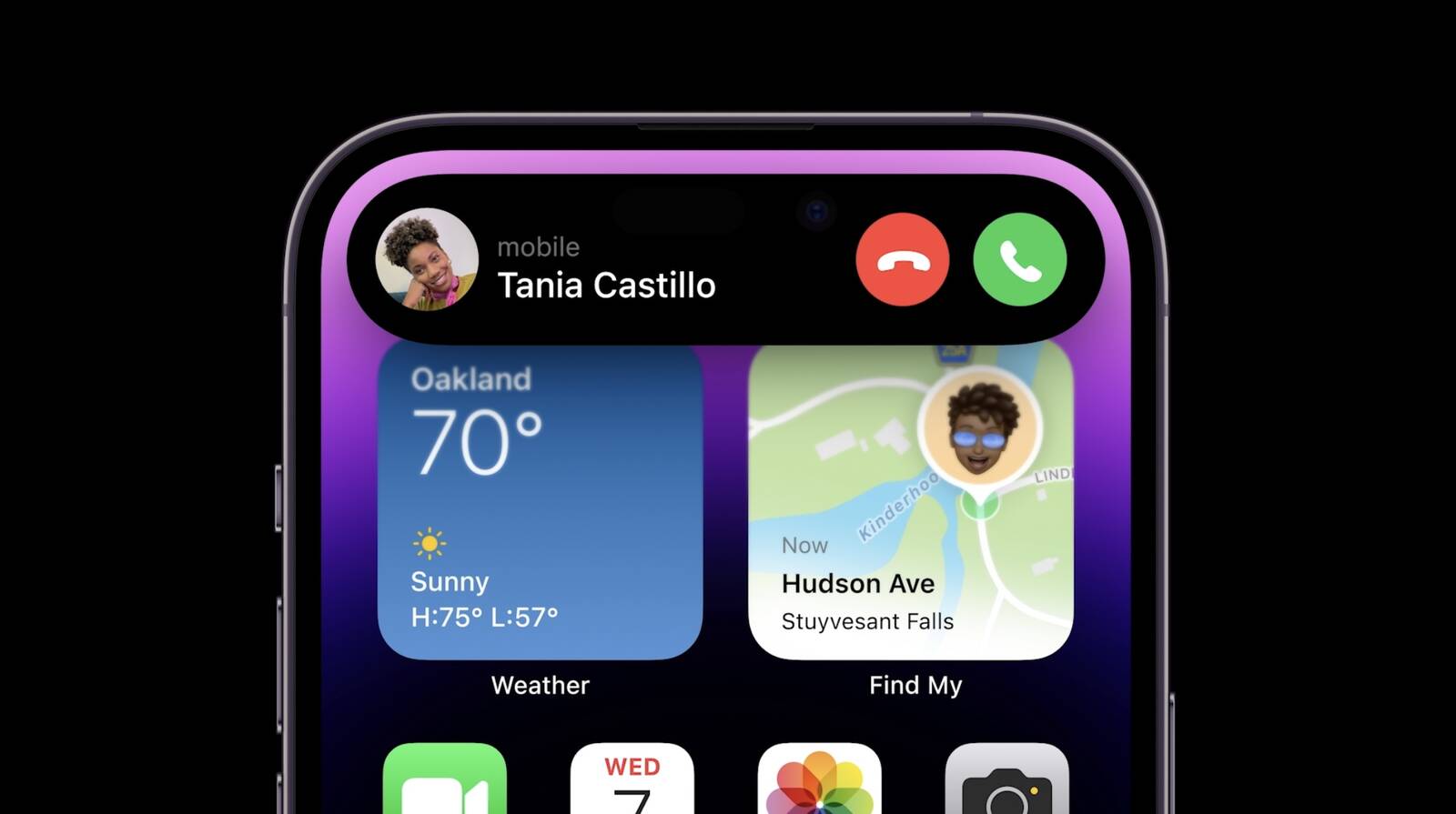
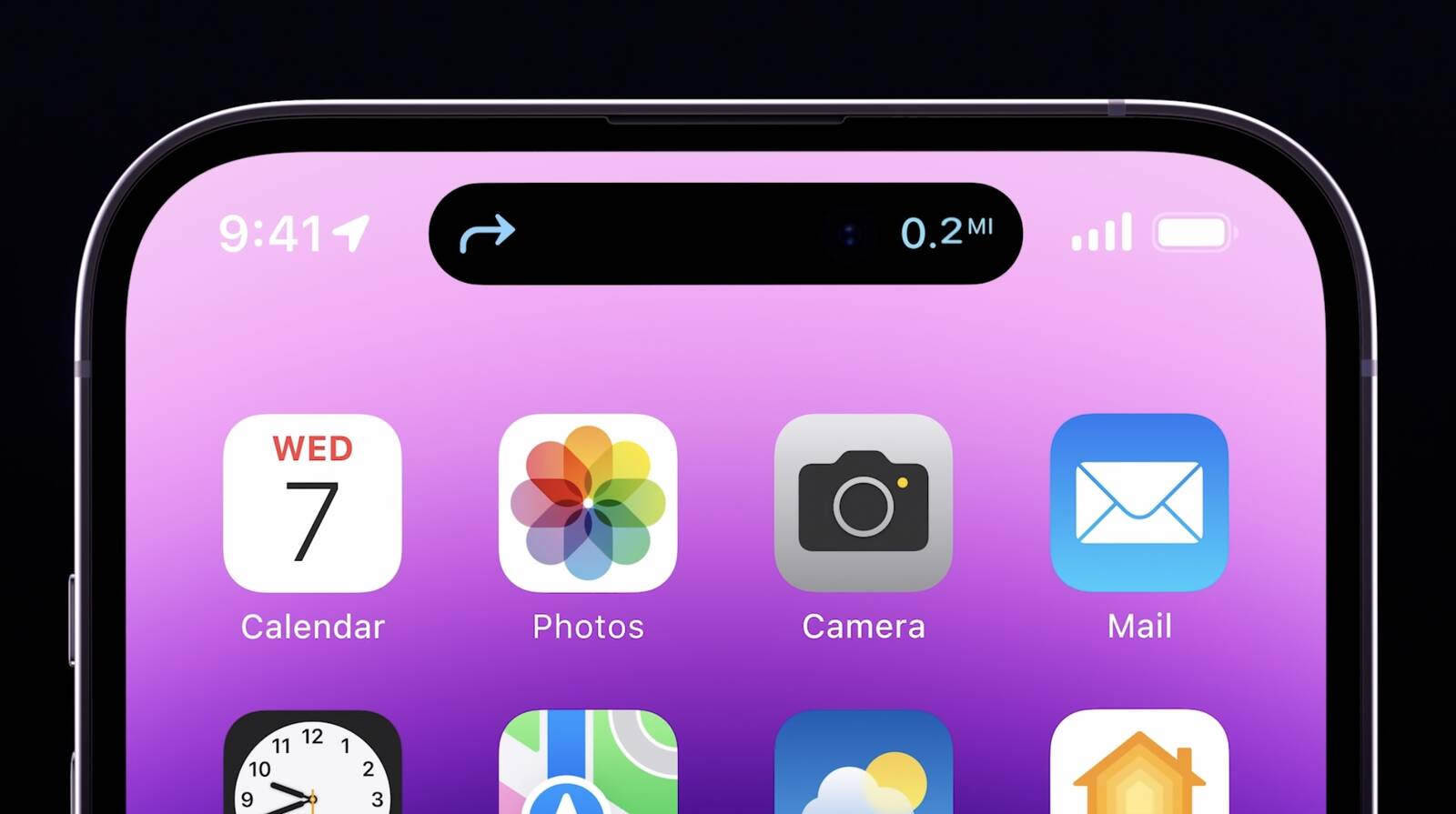
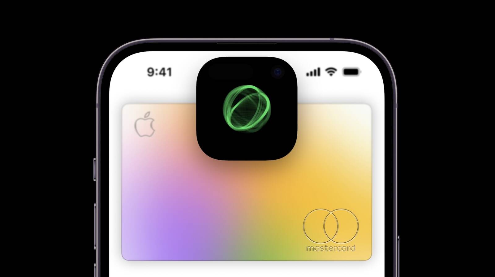
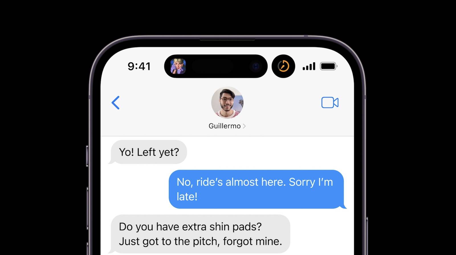
With a combination of hardware and software, the Dynamic Island can morph into different shapes and sizes for things such as incoming phone calls, alerts, notifications, Face ID authentication, timers, turn-by-turn navigation, and more. The pill-shaped cutout takes up less space than the traditional notch did on the iPhone 13 Pro models.
"Ongoing background activities like Maps, Music, or a timer remain visible and interactive, and third-party apps in iOS 16 that provide information like sports scores and ride-sharing with Live Activities can take advantage of the Dynamic Island," says Apple.
We'll have plenty of in-depth coverage of the new Dynamic Island in the days to come. In the meantime, here is a gallery of what it looks like.
Twitter users Charles Patterson and Armando Tinoco also shared some footage of the Dynamic Island in action from the Apple Event.
The standard iPhone 14 and iPhone 14 Plus models still have the same notch as iPhone 13 models, so they do not offer any of this new functionality. Rumors suggest Apple will expand the Dynamic Island to all iPhone 15 models next year.
All four iPhone 14 models can be ordered starting September 9 and launch September 16.
Article Link: Here's a First Look at iPhone 14 Pro's New Dynamic Island Notch

I don’t think it will. This might be the most lack luster update since the 4sYes dynamic island will make this sell millions!
But I was reliably informed they were absolutely going to use the pill-and-dot as the "i" in an "iPhone" name on the screen. I'm so disappointed!Unexpectedly sexy. Damn, I had counted on not wanting to buy this one.
Seriously, though, what they've done here seems a pretty awesome way to lampshade having to have a hole in the screen - make it kind of invisible by making it useful, rather than a distraction. Still a pain when watching videos full-screen, but otherwise quite nice.
Look we’re hiding the ugly pill under a dumb ass box. Wow people are mystified. Keeping my 12 Pro max……. Guess I’ll wait till the 15 or just buy android.
It's a hot take but gotta say it's one I have as well.
Only if Apple also made the notch area touch sensitive. To my knowledge it's not now so the touch to expand feature won't work.There is no reason they could not bring this to all notched models. Look at each and every example. The space taken up by the notch is also dead space in those on-screen controls. It may not look quite as cool but it would work exactly the same way.
Apple's going to sell a lot of iPhone 14 Pro's anyways but how many can be attributed to Dynamic Island will not be easy to ascertain so it's kind of moot.I don’t think it will. This might be the most lack luster update since the 4s
Only if Apple also made the notch area touch sensitive. To my knowledge it's not now so the touch to expand feature won't work.
OK that might actually be a good point. But still I believe the icons are the only touch area, because the rest is all camera. Even if you can touch it I'm not sure one wants to be pressing their dirty fingerprint into the camera all the time. Could still be done on traditional notches.
I was NOT going to upgrade my 13 Pro Max.
I am now.
Two words: DYNAMIC ISLAND.
UGH. %$#! Apple.
I am now.
Two words: DYNAMIC ISLAND.
UGH. %$#! Apple.
This is a genius solution to a challenge. I’m obsessed.
Terrible name though. Feel like it should’ve been called something more friendly like “magic bubble”.
Terrible name though. Feel like it should’ve been called something more friendly like “magic bubble”.
It’s not a notch though. It’s a hole in the screen. The animations are just window dressing to distract you from it being there.
Register on MacRumors! This sidebar will go away, and you'll see fewer ads.