Got a tip for us?
Let us know
Become a MacRumors Supporter for $50/year with no ads, ability to filter front page stories, and private forums.
Embracing the Notch: How Are You Adapting to the Most Controversial iPhone X Design Decision?
- Thread starter MacRumors
- Start date
- Sort by reaction score
You are using an out of date browser. It may not display this or other websites correctly.
You should upgrade or use an alternative browser.
You should upgrade or use an alternative browser.
I've got a new TV for many of the people in this thread... I let Jony Ive describe it:
"Simplicity is not the absence of clutter; that's a consequence of simplicity. Simplicity is somehow essentially describing the purpose and place of an object and product. The absence of clutter is just a clutter-free product. That's not simple."

"You have to deeply understand the essence of a product in order to be able to get rid of the parts that are not essential."
Beautiful.
"Simplicity is not the absence of clutter; that's a consequence of simplicity. Simplicity is somehow essentially describing the purpose and place of an object and product. The absence of clutter is just a clutter-free product. That's not simple."
"You have to deeply understand the essence of a product in order to be able to get rid of the parts that are not essential."
Beautiful.
Both the notch and the bezel appear to anticipate a forthcoming iOS redesign. Remember, iOS has up until now been designed for iPhones with a rectangular screen and 90° angled corners. It was adapted for the iPhone X but the first purposeful iOS design specifically designed for the iPhone X will arrive in iOS 12.
I think we'll see more of the card style UI. There's a hint of this in the Music app:
View attachment 735733 View attachment 735735
Notice how the black bezel and the notch are indistinguishable from the black iOS background. The OLED screen allows for this.
Here are the actual screen boundaries:
View attachment 735734
The black bezel is there for a reason. It's meant to frame the UI without wasting any actual screen space. UI elements will fill the entire actual screen right up to the edge of the OLED with the black bezel serving as a buffer that looks no different than the black elements on the screen. It's the only time the choice to include any bezel makes sense and is appreciated.
Apple Watch takes this approach. I think that the Watch is a really good insight into how Apple are thinking about future computers and technology which gives us an idea of where things are headed.
Owning an iPhone X, the is the most excited for an iOS update that I've been since iOS 7.
IMO, this is the way the notch should be utilized all the time. Only as a blacked out status bar for the OS but never as active display area.
I don't see much sense in embracing the notch by third party apps because the X is currently the only device requiring devs to adapt to it. This adds unnecessary fragmentation and since the notch is most likely to disappear in future versions of the iPhone, we'll have to 'disgrace the notch' eventually.
The notch isn't a big deal for me but nevertheless I think it was not the best design choice. I would have gone for a slim bezel to keep a rectangular display area, but that is just me.
Can't help thinking if Samsung released a notched phone, Samsung would be receiving huge criticism. There's a complete double standard here among the comments supporting the notch.
Personally the notch is as disgusting as the protruding camera. Completely unthoughtful design compromises. The upside is for the most part the protruding camera isn't in your face 24/7.
Apple makes how many billon each year? Apple could have done much better than this awful compromise.
Personally the notch is as disgusting as the protruding camera. Completely unthoughtful design compromises. The upside is for the most part the protruding camera isn't in your face 24/7.
Apple makes how many billon each year? Apple could have done much better than this awful compromise.
how about something like this:
View attachment 735842
(to me, i'd still prefer the current X over that version)
More like this.
I absolutely hated the notch but that was before I got the phone. It only took about an hour of using the phone before it no longer bothered me. Matter of fact I don't even realize it is there any longer. Absolutely overblown by people including me.
Can't help thinking if Samsung released a notched phone, Samsung would be receiving huge criticism. There's a complete double standard here among the comments supporting the notch.
Personally the notch is as disgusting as the protruding camera. Completely unthoughtful design compromises. The upside is for the most part the protruding camera isn't in your face 24/7.
Apple makes how many billon each year? Apple could have done much better than this awful compromise.
Oh I remember when LG came out with the G6 and Samsung the S8 the rounded corners on the screen were criticised around here. People said Apple would never round the corners of a screen. Well Apple took it a step further and added a notch to those rounded corners.
It's probably unwise to criticise a design from Samsung or LG because it's likely Apple will copy it.
Personally the notch is as disgusting as the protruding camera.
Oh good, in that case it won't bother me at all.
Exactly. Worth quoting so it’s listed again.The notch is a non-issue if you actually own the phone and apparently a huge issue for those who don’t or the media that needs to generate clicks.
Without question, Apple’s best handheld to date.
The 'notch' is so overblown it's ridiculous. Imagine if the notch went all the way across the top, it would be a bezel. Think of the notch like a full bezel with more room. Jeez, this is the dumbest discussion so far about any iphone.
This. Its mind blowing how a major positive - drastically increasing the percentage of the phone's front surface that is occupied by usable screen - can be perceived by so many as a negative - the remaining surface that isn't screen is now a big issue.
This isn't even glass half empty vs. glass half full. This is "Sure, ok, yeah, the glass is full, but technically you could have squeezed another few drops in. No tip for you!".
Non-issue. If it bothered me THAT much, I wouldn't have bought it.
Embrace the notch.
Could not have said it any better myself. If it was such an issue for me, I would not have bought the X. I have embraced the notch.
That comparison works if you only watch video in full screen (zoomed in) rather than the standard aspect ratio. I never watch videos zoomed in on my devices even if it results in letter boxing on the top and bottom.I've got a new TV for many of the people in this thread... I let Jony Ive describe it:
"Simplicity is not the absence of clutter; that's a consequence of simplicity. Simplicity is somehow essentially describing the purpose and place of an object and product. The absence of clutter is just a clutter-free product. That's not simple."
"You have to deeply understand the essence of a product in order to be able to get rid of the parts that are not essential."
Beautiful.
Please...To be more specific, I hate the fully round edges of the notch. It creates a really awkward space on either side. I could have put up with it if the edges were basically at 90 degrees with a slightly rounded corner.
[doublepost=1510751149][/doublepost]
No, because I hate the notch. I am not using language that is too complicated for you, am I?
But it seems the only people who have a problem with it are the ones who don't own it. For those of us that do, it's a non-issue.
Must say it's really a non issue, I noticed it once the day I got my X and since then not really something that ever comes to mind or causes an issue. My only complaint so far is the bottom left corner...IF you are viewing a video and try to slide/scrub...it thinks you are grabbing the corner and trying to move into another app. Sort of annoying on videos not in landscape.
For me, the most controversial design decision is the removal of Touch ID.
We see how Face ID is problematic in many cases. Touch ID has none of those issues. I want an iPhone X with both Face ID and Touch ID.
This really sounds like you don't own the X... I suppose I can only speak for myself but have had a MUCH improved experience with FaceID over TouchID. I often lift my phone to look at it for no apparent reason but I think subconsciously I just want to see it work again.
TouchID, I'm lifting my phone holding it in an orientation to put the proper finger on it and looking at the screen watching either the virtual thumbprint fill in or waiting for it to shake it off and try again. So I'm looking at my screen already to verify that I'm in. I would put my code in at a rate of ~20% of the time and that's after 3 fingerprint fails.
FaceID, I'm lifting my phone always one-handed in a manner toward my face. I can see at the top of the screen when it's unlocked and can swipe up or preemptively swipe up and wait for the facial recognition. The beauty of this is that the facial recognition takes less time than even a single fingerprint. I've had to go to the code only a handful of times in the weeks I've had the X compared to a minimum of once a day with touchID.
For me, FaceID wins so many times over, but this thread is about the notch. The notch is a mole-hill. We all know what some like to do with mole-hills...
what if you could cut into the bezel of your display and make a little area to park your dock icons (for example)..I've got a new TV for many of the people in this thread... I let Jony Ive describe it:
"Simplicity is not the absence of clutter; that's a consequence of simplicity. Simplicity is somehow essentially describing the purpose and place of an object and product. The absence of clutter is just a clutter-free product. That's not simple."
"You have to deeply understand the essence of a product in order to be able to get rid of the parts that are not essential."
Beautiful.
would you ?
(i would)
The notch is a non-issue if you actually own the phone and apparently a huge issue for those who don’t or the media that needs to generate clicks.
It's a huge issue for those who haven't bought the phone because of the notch too, which includes me. I've tested the phone and it annoys the F out of me.
That comparison works if you only watch video in full screen (zoomed in) rather than the standard aspect ratio. I never watch videos zoomed in on my devices even if it results in letter boxing on the top and bottom.
Apologies...

I have an iPhone SE for that...
What notch?
Oh right yeah.
Barely notice it.
EXACTLY how I was going to respond.
Really, cut into the display and park icons? Hmm. Unless I'm not understanding, doesn't sound too elegant.what if you could cut into the bezel of your display and make a little area to park your dock icons (for example)..
would you ?
(i would)


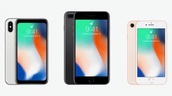
The "notch," or sensor housing on the iPhone X is the single most polarizing design decision Apple made when creating its new flagship smartphone. Some people hate the way the notch eats into the display, while others appreciate that extra bit of visible space.
Love it or hate it, the notch is here to stay until Apple finds a better way to integrate the TrueDepth camera system into its iPhone lineup. Luckily, while the notch can be disturbing at first, most people find it's easy to become accustomed to. In the video below, we explore the notch, how it affects day to day iPhone X usage, how apps are compensating, and some ways to hide it.
Subscribe to the MacRumors YouTube channel for more videos.
Prior to the iPhone X's launch, the notch sparked a lot of discussion, much of it negative, but hate for the notch has died down as people have become used to Apple's design choice.
Apple's official policy is that developers and users should embrace the notch, and as apps have implemented designs that work around it, it's blended into the background and become less noticeable in day to day use.
There are still apps that have yet to adapt to the notch, but as optimizations continue, it'll disappear even further. Here at MacRumors, we've found that the notch isn't really bothersome at all.
One exception might be landscape mode, as it's more noticeable in that orientation when doing things like browsing Safari, watching YouTube videos, and playing games. Safari browsing is getting better, though, with a new Webkit API in iOS 11.2 that allows developers to design around the notch for a better full screen experience, and in the YouTube app, if you double tap on a video, it expands to a full screen mode that's easier to watch.
For those who absolutely hate the notch, there are a couple of new apps like Notcho, designed to edit wallpapers to add a black bar to the top, effectively hiding it on the Home and Lock screen. Notcho doesn't work within apps, though, and in our opinion, hiding the notch looks worse than accepting it.
Article Link: Embracing the Notch: How Are You Adapting to the Most Controversial iPhone X Design Decision?

Register on MacRumors! This sidebar will go away, and you'll see fewer ads.