This negative notch nonsense is a bunch of hey-nonny-nonny
Got a tip for us?
Let us know
Become a MacRumors Supporter for $50/year with no ads, ability to filter front page stories, and private forums.
Embracing the Notch: How Are You Adapting to the Most Controversial iPhone X Design Decision?
- Thread starter MacRumors
- Start date
- Sort by reaction score
You are using an out of date browser. It may not display this or other websites correctly.
You should upgrade or use an alternative browser.
You should upgrade or use an alternative browser.
Just fine. It's a top bezel just like almost every other phone out there. It just has some room on the left and right for status icons. And no I'm not going to zoom 16:9 video so it overlaps the notch so I can whine.
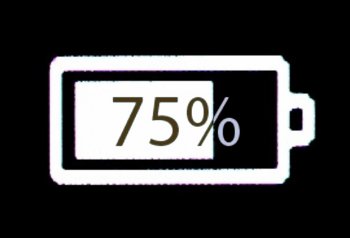
I don't know why they wouldn't just put the battery percentage in number form on top of the actual battery icon. the number would be dark when overlaid on top of the light battery meter... and as the meter depletes, the number would be inverted on the right side where it is becoming empty. Like this. https://imgur.com/Q4brlH5
Attachments
The notch is fine.
Get rid of the home indicator being on the side of the phone while in landscape mode. Just leave it on the bottom of the screen. Why take the smallest dimension of the phone and make it even smaller? Landscape games are tiny when they are boxed in like that. Because of the home indicator causing the screen to shrink, games look significantly worse on my X compared to my 6. On top of that, with the apple leather case it is kinda hard to swipe up on the home indicator while in landscape mode.
Also with home indicator moving, the swipe to change apps functionality breaks down because the location of the swipe moves on screen if you even slightly pause on a landscape only app.
I don't know why they wouldn't just put the battery percentage in number form on top of the actual battery icon. the number would be dark when overlaid on top of the light battery meter... and as the meter depletes, the number would be inverted on the right side where it is becoming empty. Like this. https://imgur.com/Q4brlH5
Because it would be 5 point font or something and apple would refuse to make anything that illegible or make the battery icon bigger and cram up the bar.
I don't see the notch. The two ears bother me somewhat, however. ")
I actually don't mind the notch at all -- it's a great use of space. By having signal, battery, and time in the spaces next to the notch, it frees up a little more screen space, rather than having a black bezel across the top with all of these info bits underneath that. I think it's a smart design decision.
I call them status horns. I know if I am on wifi, and what the time is. Though I stole that from iMore.I don't see the notch. The two ears bother me somewhat, however.
The notch doesn't bother me. What bother's me is that Face ID seems inconsistent. It's annoying if you leave your phone on the desk beside you and check it several times per hour. It's annoying if you're in bed. It's annoying if you grab it to unlock it and aren't looking right at it immediately (such as if you pull it out while talking to someone to look something up that you're talking about) and how it doesn't try again it just immediately goes to the number pad. That last part is the most annoying thing. I have to hit cancel and swipe again every time it can't get my face. Maybe I should shave and get contacts. I would have thought the machine learning would have kicked in since I've been using it for over a week now.
I very rarely notice it, and it never gets in the way.
The "notch," or sensor housing on the iPhone X is the single most polarizing design decision Apple made when creating its new flagship smartphone. Some people hate the way the notch eats into the display, while others appreciate that extra bit of visible space.
Love it or hate it, the notch is here to stay until Apple finds a better way to integrate the TrueDepth camera system into its iPhone lineup. Luckily, while the notch can be disturbing at first, most people find it's easy to become accustomed to. In the video below, we explore the notch, how it affects day to day iPhone X usage, how apps are compensating, and some ways to hide it.
Subscribe to the MacRumors YouTube channel for more videos.
Prior to the iPhone X's launch, the notch sparked a lot of discussion, much of it negative, but hate for the notch has died down as people have become used to Apple's design choice.
Apple's official policy is that developers and users should embrace the notch, and as apps have implemented designs that work around it, it's blended into the background and become less noticeable in day to day use.
There are still apps that have yet to adapt to the notch, but as optimizations continue, it'll disappear even further. Here at MacRumors, we've found that the notch isn't really bothersome at all.
One exception might be landscape mode, as it's more noticeable in that orientation when doing things like browsing Safari, watching YouTube videos, and playing games. Safari browsing is getting better, though, with a new Webkit API in iOS 11.2 that allows developers to design around the notch for a better full screen experience, and in the YouTube app, if you double tap on a video, it expands to a full screen mode that's easier to watch.
For those who absolutely hate the notch, there are a couple of new apps like Notcho, designed to edit wallpapers to add a black bar to the top, effectively hiding it on the Home and Lock screen. Notcho doesn't work within apps, though, and in our opinion, hiding the notch looks worse than accepting it.
Article Link: Embracing the Notch: How Are You Adapting to the Most Controversial iPhone X Design Decision?

I returned by new iPad Pro because it didn't have the notch.
Exactly what I was just thinking!The notch is a non-issue if you actually own the phone and apparently a huge issue for those who don’t or the media that needs to generate clicks.
Doesn't the notch exist on fullscreen when watching movies because i would find that annoying.
If you watch a lot of full screen video the notch is jarring.
If you watch video in standard mode, uncropped, then you have two thick black bars on the right and left and the actual video is about the same size as a non plus iPhone and noticeably smaller than a full screen plus video.
If you watch video in standard mode, uncropped, then you have two thick black bars on the right and left and the actual video is about the same size as a non plus iPhone and noticeably smaller than a full screen plus video.
I think people are calling it the wrong thing. There is no notch. There are two ears which are used to get the status bar out of the way of the display. I love it, it makes apps feel much more immersive.
Because it would be 5 point font or something and apple would refuse to make anything that illegible or make the battery icon bigger and cram up the bar.
Yeah, they could easily make the battery a little taller and just use the same font size as the numerical percentage that exits in Control Center. Easy Peasy.
The notch is everything wrong with Apple--they've turned into Microsoft. They used to make beautiful hardware, now they're sacrificing elegance and simplicity for some new tech that no one wanted. This is Tim Cook's Apple.
FWIW, Cook seems like a 100 times better person than Jobs, and the company is making money hand over fist. I just wish he had the vision.
FWIW, Cook seems like a 100 times better person than Jobs, and the company is making money hand over fist. I just wish he had the vision.
Register on MacRumors! This sidebar will go away, and you'll see fewer ads.