Got a tip for us?
Let us know
Become a MacRumors Supporter for $50/year with no ads, ability to filter front page stories, and private forums.
Every Apple Watch band Apple released. Ever.
- Thread starter choreographics
- Start date
- Sort by reaction score
You are using an out of date browser. It may not display this or other websites correctly.
You should upgrade or use an alternative browser.
You should upgrade or use an alternative browser.
An oldie from 2017 but still a goodie. Nike Black/Pure Platinum.

Not sure if this has been mentioned already, but I updated to the watchOS 8 beta yesterday and noticed something interesting. Apple has decided to bury most of the face color options in a second screen and the user then goes in and enables the colors he/she wants to use. This screen is organized by the season the color was released. What’s interesting is that the IS a Summer 2021 section here and these 3 colors are turned on by default. The colors are Electric Orange (only released in a Braided Solo so far), Cloud Blue (not released as any band, just an iPhone case), and Olive (only a Sport Loop so far).
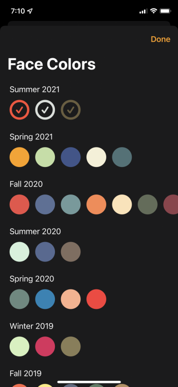
Makes me think there was going to be a Summer 2021 sport band release with these 3 colors and something happened to either delay or scuttle it altogether. Guess we’ll just have to wait and see if these colors get rolled into Fall 2021 or if they never see the light of day outside of Chargie prototypes (@athousandbands may end up having the only Cloud Blue sport band ever to exist). Unfortunately, there is no sign of Amethyst anywhere so I don’t think that color is going to happen ☹️

Makes me think there was going to be a Summer 2021 sport band release with these 3 colors and something happened to either delay or scuttle it altogether. Guess we’ll just have to wait and see if these colors get rolled into Fall 2021 or if they never see the light of day outside of Chargie prototypes (@athousandbands may end up having the only Cloud Blue sport band ever to exist). Unfortunately, there is no sign of Amethyst anywhere so I don’t think that color is going to happen ☹️
@MacDevil7334 Very Interesting! My question is where is that screen and how did you get to it?Not sure if this has been mentioned already, but I updated to the watchOS 8 beta yesterday and noticed something interesting. Apple has decided to bury most of the face color options in a second screen and the user then goes in and enables the colors he/she wants to use. This screen is organized by the season the color was released. What’s interesting is that the IS a Summer 2021 section here and these 3 colors are turned on by default. The colors are Electric Orange (only released in a Braided Solo so far), Cloud Blue (not released as any band, just an iPhone case), and Olive (only a Sport Loop so far).
View attachment 1812699
Makes me think there was going to be a Summer 2021 sport band release with these 3 colors and something happened to either delay or scuttle it altogether. Guess we’ll just have to wait and see if these colors get rolled into Fall 2021 or if they never see the light of day outside of Chargie prototypes (@athousandbands may end up having the only Cloud Blue sport band ever to exist). Unfortunately, there is no sign of Amethyst anywhere so I don’t think that color is going to happen ☹️
Thanks much,
Rindy
So in watchOS 8, Apple only shows a few color choices by default on the main color picker. At the end of the options is a + button to add more color choices. That + button takes you to the screen with all the colors sorted by season. I’m assuming Apple did this because the color wheel had gotten quite long with 6 years of band releases now in the books.@MacDevil7334 Very Interesting! My question is where is that screen and how did you get to it?
Thanks much,
Rindy
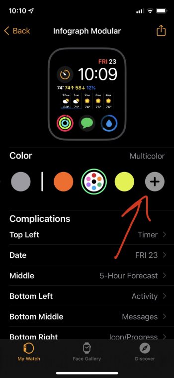
I will say that this is not a particularly good change for the average user. Only bandaholics know/care what season a color was released in. So, sorting the colors this way is confusing if all you are looking to do is color match to your band. Also, when you enable a color on the “seasons” screen, the interface does not tell you the name of the color you picked. You have to back up to the main color selection screen to find out which color you just enabled. Terrible UI design and it will be especially annoying if you are trying to color match one of Apple’s 250 different shades of blue. The old color picker may have gotten long. But ordering colors by where they fit in the rainbow rather than by season and having the color name clearly visible as you selected it was much more user friendly.
Last edited:
Yeah it’s been brought up a few times by the beta-brave members. It has made this wait all the more maddening! But hey look at all the abandoned colors on the Nike watchface…and of course they could just delete the summer section and Cloud Blue just lives on as an accoutrement for Abyss owners.Not sure if this has been mentioned already, but I updated to the watchOS 8 beta yesterday and noticed something interesting. Apple has decided to bury most of the face color options in a second screen and the user then goes in and enables the colors he/she wants to use. This screen is organized by the season the color was released. What’s interesting is that the IS a Summer 2021 section here and these 3 colors are turned on by default. The colors are Electric Orange (only released in a Braided Solo so far), Cloud Blue (not released as any band, just an iPhone case), and Olive (only a Sport Loop so far).
View attachment 1812699
Makes me think there was going to be a Summer 2021 sport band release with these 3 colors and something happened to either delay or scuttle it altogether. Guess we’ll just have to wait and see if these colors get rolled into Fall 2021 or if they never see the light of day outside of Chargie prototypes (@athousandbands may end up having the only Cloud Blue sport band ever to exist). Unfortunately, there is no sign of Amethyst anywhere so I don’t think that color is going to happen ☹️
I do feel hedged against a cancellation by the fact you bring up about my Cloud Blue Sport Band, however bitten up it is. Chargie still has one for sale!
More than anything I just want the series 6 line to end so I can take a crack at an unabridged “all the goo” photo composite.
I’ll just be happy if they debug the editor interface. It seems like they only care about the series 6 software at this point. My s3/4/5 watches all have tons of unwanted jumping around between faces and options when I try to edit.So in watchOS 8, Apple only shows a few color choices by default on the main color picker. At the end of the options is a + button to add more color choices. That + button takes you to the screen with all the colors sorted by season. I’m assuming Apple did this because the color wheel had gotten quite long with 6 years of band releases now in the books.
View attachment 1812770 View attachment 1812769
I will say that this is not a particularly good change for the average user. Only bandaholics know/care what season a color was released in. So, sorting the colors this way is confusing if all you are looking to do is color match to your band. Also, when you enable a color on the “seasons” screen, the interface does not tell you the name of the color you picked. You have to back up to the main color selection screen to find out which color you just enabled. Terrible UI design and it will be especially annoying if you are trying to color match one of Apple’s 250 different shades of blue. The old color picker may have gotten long. But ordering colors by where they fit in the rainbow rather than by season and having the color name clearly visible as you selected it was much more user friendly.
Often I will get locked out of editing a face until I reboot. The other day my gradient face would only change color on the hands!
Something I could accept on s3 but not s5.
Well that's a terrible design change. A bit surprising coming from Apple since design and ease of use seems to be one of their main factors. Even though I have 100+ bands I rarely know what season they are in, I just scroll through the colors looking for whatever matches the best. Separating shades of the same color into different groups is one of the most idiotic design decisions I've ever seen.So in watchOS 8, Apple only shows a few color choices by default on the main color picker. At the end of the options is a + button to add more color choices. That + button takes you to the screen with all the colors sorted by season. I’m assuming Apple did this because the color wheel had gotten quite long with 6 years of band releases now in the books.
View attachment 1812770 View attachment 1812769
I will say that this is not a particularly good change for the average user. Only bandaholics know/care what season a color was released in. So, sorting the colors this way is confusing if all you are looking to do is color match to your band. Also, when you enable a color on the “seasons” screen, the interface does not tell you the name of the color you picked. You have to back up to the main color selection screen to find out which color you just enabled. Terrible UI design and it will be especially annoying if you are trying to color match one of Apple’s 250 different shades of blue. The old color picker may have gotten long. But ordering colors by where they fit in the rainbow rather than by season and having the color name clearly visible as you selected it was much more user friendly.
Yeah it’s pretty bad. It’s kind of cool to see the colors by season. But that should at most be an option (and not the default option). That second screen should be sorted by color as the default. I don’t think having the ability to turn off colors you never plan on using is bad. But it definitely should not be this hard to find the color you want!Well that's a terrible design change. A bit surprising coming from Apple since design and ease of use seems to be one of their main factors. Even though I have 100+ bands I rarely know what season they are in, I just scroll through the colors looking for whatever matches the best. Separating shades of the same color into different groups is one of the most idiotic design decisions I've ever seen.
One area where there is an improvement: in the main color picker, there is a rainbow of primary colors that cannot be turned off. These colors are adjustable! Much like when you tweak the colors on a Memoji, you can find that perfect shade of blue or red or any other color. It should make it much easier to find a perfect match color for some bands. The UI for this is not easily discoverable though (you tap on the selected color on the right). But, at least it’s there. The official Apple colors from the various seasons cannot be tweaked. Only the basic primary colors.
Just a thought as to the potential motivation behind this rather interesting/odd move of making the color picker go seasonal with its sorting method…
Maybe this is meant to encourage (normal*) people to be conscious of Apple Watch bands having a high rate of turnover, and therefore prompt them to pay more attention as time passes — in case a color happens to come up that they like.
* Please note that I say “normal” with love for you all, my fellow weirdos

Yeah it’s pretty bad. It’s kind of cool to see the colors by season.
Does red appear multiple times?
Hmmm, that’s weird. My Ultra Violet has the size markings in black, not white.Does that band look original or are there such good fakes? It actually looks perfect like all the other originals. But it feels softer and stickier than others 🤔 For comparison white Gen.2
View attachment 1813173
View attachment 1813174
View attachment 1813175
View attachment 1813176
yours also looks way more purple.
Does it also have the Assembled in China stamp on the end and the serial number on the metal lug of the pin side?
eta, yeah something is definitely off with your band. Here is a pic of the size markings on a 42mm UV I sold last year, they are also black:
Where did you get that from? Was it in a box? I suppose it’s possible it’s an unreleased prototype rather than a fake but I don’t know… My UV is definitely not a soft-feeling band.
Last edited:
My ultraviolet also has black markings (purchased directly from Apple when it came out). I agree that the shade of purple looks very different, too.
Same here, black markings. Band purchased in an Apple Store back in 2017.My ultraviolet also has black markings (purchased directly from Apple when it came out). I agree that the shade of purple looks very different, too.
I had similar issues on both my S5's until I upgraded to 7.6 and haven't had any more issues since.I’ll just be happy if they debug the editor interface. It seems like they only care about the series 6 software at this point. My s3/4/5 watches all have tons of unwanted jumping around between faces and options when I try to edit.
Often I will get locked out of editing a face until I reboot. The other day my gradient face would only change color on the hands!
Something I could accept on s3 but not s5.
I was just in the online Apple store looking at bands and noticed some of them appear to be sold out…the ones I checked were the 40mm Cantaloupe sport band and the 40mm Pistachio and Cantaloupe solo loops in my size (5), and there were none available at any Apple stores in my area. I think the Cantaloupe sport was also sold out on Amazon. Is that the end of the road for them, other than the reseller market?
Only once in the Fall 2015 collection. I wonder if Apple sees all subsequent product red bands as re-releases. In any case, there is also a Red in the adjustable colors section.Does red appear multiple times?
My NZ Loop got shipped today and getting delivered tomorrow 🙌 #ComeOnAllBlacks
Register on MacRumors! This sidebar will go away, and you'll see fewer ads.


