I may have missed this ability in iOS 13 but, I just now saw that I can block stories from sources I don’t follow. I toggled that on right away.
Got a tip for us?
Let us know
Become a MacRumors Supporter for $50/year with no ads, ability to filter front page stories, and private forums.
Everything New in iOS 14 Beta 2: New Calendar Icon, Files Widget and More
- Thread starter MacRumors
- Start date
- Sort by reaction score
You are using an out of date browser. It may not display this or other websites correctly.
You should upgrade or use an alternative browser.
You should upgrade or use an alternative browser.
Apple today released the second beta of iOS 14 to developers for testing purposes, tweaking and refining some of the features that are coming in the update. Below, we've rounded up all of the changes that we found in the second beta.
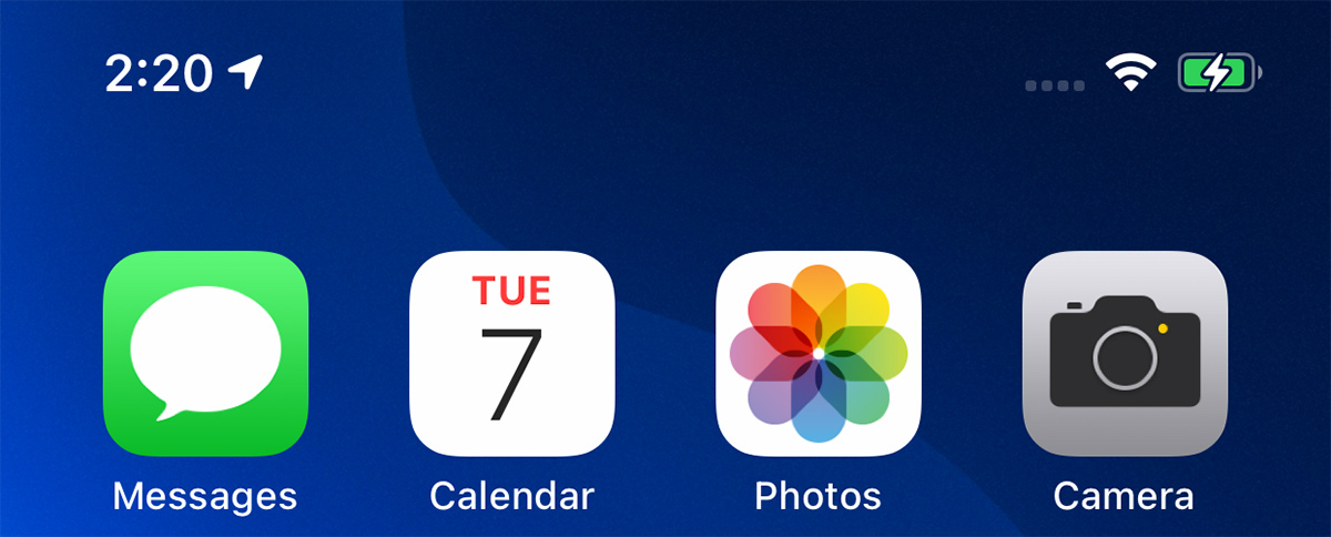
- Calendar icon - There's a new Calendar app icon in iOS 14 beta 2, with the day of the week abbreviated rather than spelled out.
- Clock icon - The clock icon has also been slightly tweaked with a bolder font and thicker hour and minute hands.

New clock icon on left, beta 1 clock icon on right
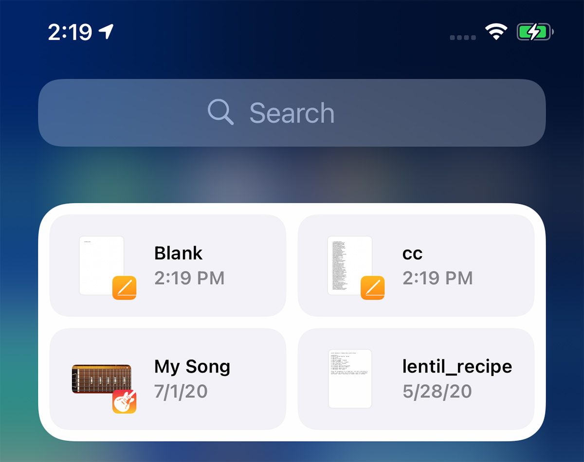
- Files widget - There's a new widget for the Files app that can be added to the Today View or the Home Screen.
- Congestion Zones - Alerts are now provided in cities with congestion zones that charge tolls, such as London and Paris. There are also alerts for license plate restriction zones in countries that have license plate restrictions.
- Weather widget fix - The Weather widget has been fixed so it no longer shows Cupertino instead of current location.
- Reminders emoji - Emoji in Reminders lists have been redesigned.

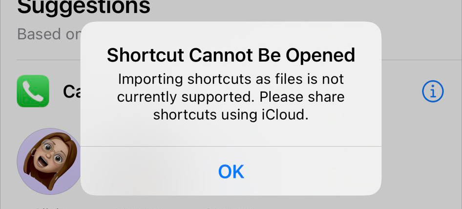
- Shortcuts - There's no longer an option to open .shortcuts files in the Shortcuts app.
- App Library - Apps downloaded to the App Library and not the Home Screen can now be deleted directly from the App Library. The "Remove" feature for other apps is now "Delete."

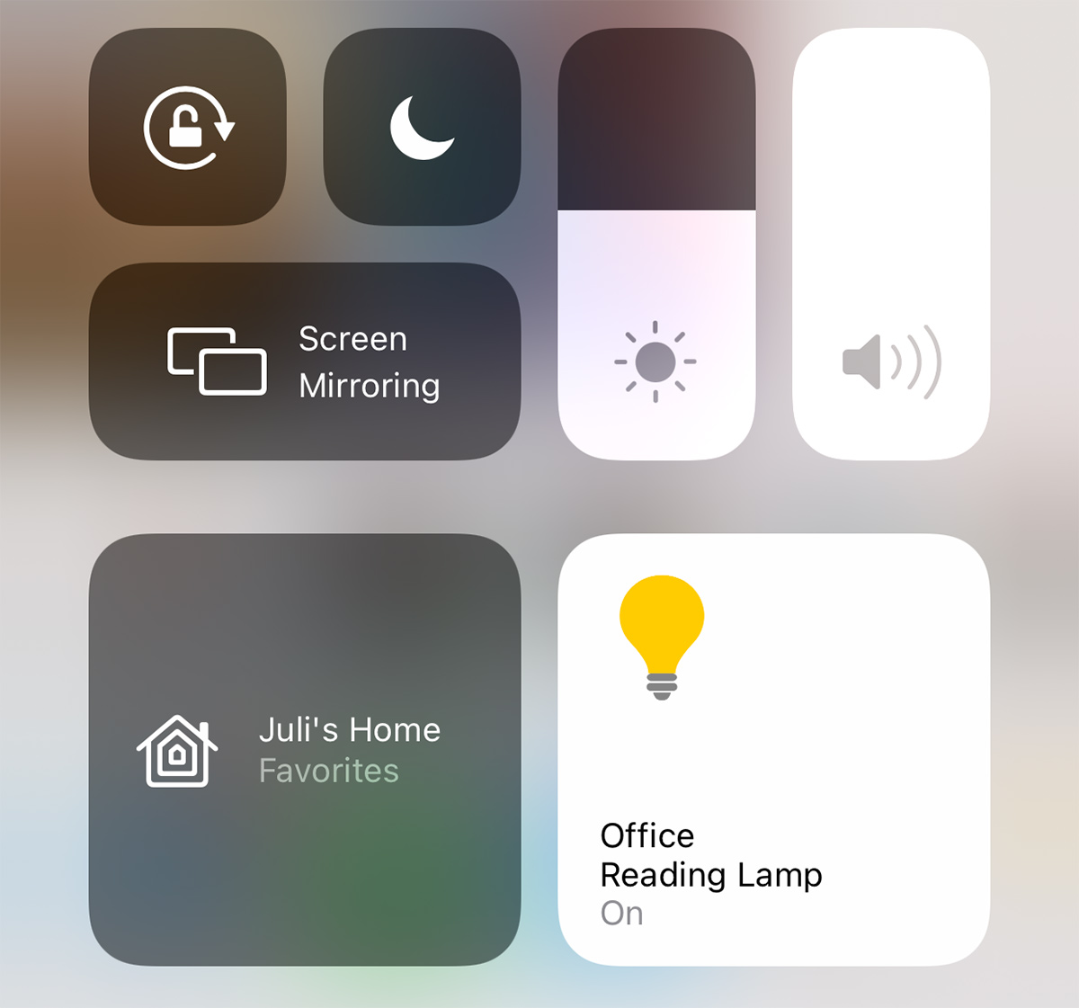
- HomeKit Favorites - The HomeKit favorites listed in the Control Center now feature larger icons for some people.
- Music - A Music app setting allows animated cover art to be disabled. The Music app also no longer features a toggle for "Show Apple Music."

- Music haptics - Pressing the play, pause, next, and back buttons on the Now Playing screen in Apple Music provides haptic feedback.
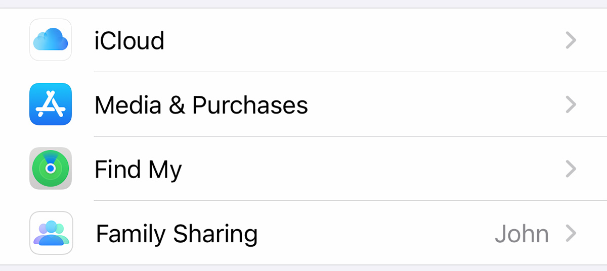
- Family Sharing - There's a new icon for family sharing in the Settings app.
- Apple Pay - Apple Pay is now available in Mac catalyst apps.
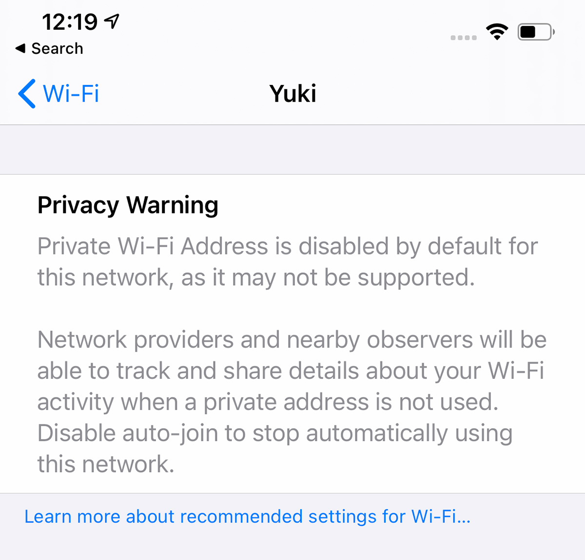
- WiFi Privacy Warning - When connecting to a WiFi network that doesn't use Private Wi-Fi Address, Apple provides a warning message in the Settings app.
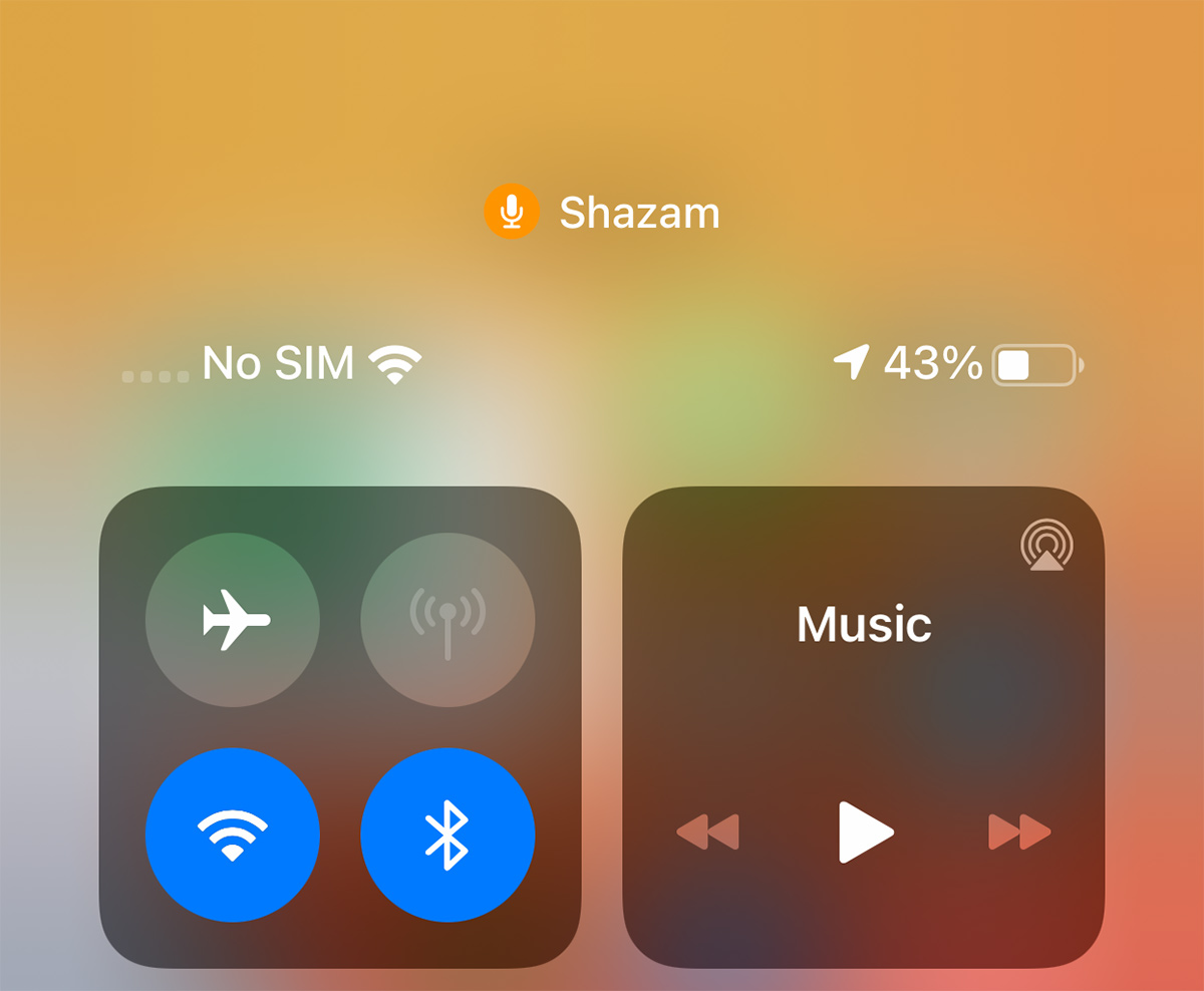
- Control Center - Control Center now displays which apps have recently accessed the microphone or the camera.
Have you found other changes not listed here? Let us know in the comments and we'll add them to the list.
Article Link: Everything New in iOS 14 Beta 2: New Calendar Icon, Files Widget and More

Battery Lightning Charge icon is bolder and a little bigger.
Start playing that music and switch to Shazam?Please i would love apple to make additional how to shazam your unkwonn music found in another app.. thats a really bit issue plus if i can find another phone to do that for me


So far I’ve noticed still no icon if you are using headphones
Search/spotlight still super broken
Otherwise good
Search/spotlight still super broken
Otherwise good
Changes in the weather app:
-Minor changes to how air quality is displayed.
-At the bottom of the weather app in iOS 14 beta one, it displayed the city name. Now in beta 2, it is displaying a street name, hinting at deeper integration with Dark Sky


-in beta 2, weather warnings and advisories from government weather offices are displayed


-Minor changes to how air quality is displayed.
-At the bottom of the weather app in iOS 14 beta one, it displayed the city name. Now in beta 2, it is displaying a street name, hinting at deeper integration with Dark Sky
-in beta 2, weather warnings and advisories from government weather offices are displayed
Looks like the medium reminders widget now displays 5 rows instead of just 4. Still no checkbox, and still doesn’t update without opening the widget.
Why do you think that?How do I do I get rid of my original folders if the IOS will generate automatic folders? I don't want to have a duplicate folder to take up more memory use.
The new App Library folders take up essentially no memory, and the same for the older manually created folders - it is trivial.
Go to Cellular, do you see Personal hotspot under there? Once using it once it should appear in main list againThis is all I see under my settings:
View attachment 931664
Damn it. Isn’t there on b2?!? For me that would be the most useful widget ever.What happened to the clock widget they showed at launch somewhere?
[automerge]1594177565[/automerge]
Netflix had PIP on b1.Netflix now supports PIP don’t think that was there before.
[automerge]1594155466[/automerge]
Not myself.
Would love the ability to toggle off the app names at the bottom of the icons. It's great being able to do this on Android. Looks so much cleaner.
Next year i guess (hope)
yes it was.Same here. This issue has definitely *not* been fixed.
Eye Contact is now an option in FaceTime settings. Was this available in iOS 14 Beta 1?
[automerge]1594179936[/automerge]
Apps need to be updated to flag themselves with the rights to be set as a default.Has anyone figured out how to change the default email and browser apps yet?
I browsed the settings on Beta1 but couldn't find anything. Not sure if they're delaying the roll-out or not.
Another iOS update with at least half of the updates completely useless or just visual stuff.
Apple needs to:
1. redesign the notification center. It's ridiculous.
2. add haptic feedback to the keyboard, and make it possible to customize different intensities to your heart's content. It's crazy that you have no feedback whatsoever if you're typing and have the phone on mute.Those who are concerned with battery can just turn it off.
3. make it possible to adjust volume for independent apps and settings and not this general thing they're doing, forcing you to do it while the thing is being played, such as separate volume control for keyboard volume, music volume, ring volume, system volume.
4. add suggestions from the address book when you're dialing a phone number. Common now Apple.
5. make it possible to customize the texting app in every conceivable way. Font size, bubble size shape color.
6. make it possible to schedule a message to be sent at a certain time/date.
7. make it possible to move the icons anywhere you want to.
8. Use an OS-wide clipboard and make it not expire. You should be able to copy text now and paste it tomorrow if you want to.
9. Give us an option to NOT go to the next email but back to inbox after deleting an email.
Just had safari crash on me in beta 2. Never crashed on beta 1.
I had safari hang completely on me a couple of times on my iPad (Air 3) on beta 1 to the point I had to hard reset but it was only a couple of times in the first day or two after installing the beta and then it hasn’t done it since. Never had it hang on my iPhone 11 despite visiting the same sites. So far no issues with beta 2 but it is early days.
So there's animated cover art that is really unnecessary, and yet another "setting" to go with it to turn it off. How much more memory will iBloat 14 be taking?
So Apple released a feature that you don't like and you're complaining that they've given you the option to turn it off?
Control center already displays which apps use microphone or camera in Beta 1, surprised no one mentioned it already
At first I thought the headphone icon disappearing was a bug, but now there's a notification when you connect AirPods and the volume slider in Control Centre changes to show Airpods. not sure if the same happens with wired headphones.So far I’ve noticed still no icon if you are using headphones
Search/spotlight still super broken
Otherwise good
Changes in the weather app:
-Minor changes to how air quality is displayed.
-At the bottom of the weather app in iOS 14 beta one, it displayed the city name. Now in beta 2, it is displaying a street name, hinting at deeper integration with Dark Sky
-in beta 2, weather warnings and advisories from government weather offices are displayed
I'm not sure how this compares in other areas of the world (and can't be sure from your screenshots) but the way the Air Quality Index is displayed is quite ambiguous in the UK, where the description is in terms of pollution, rather than air quality. So currently my Weather app shows:
Air Quality:
1 - Low
which actually means pollution is low and air quality is high.

Remember when they paid a lot of money for copying that railroad station clock face. What happened to that? Seems they paid for it, and dropped it.
$21,000,000. And they dropped it? I liked it. Is there a way to get it back? They paid for it an all...
And the plot gets thicker...
$21,000,000. And they dropped it? I liked it. Is there a way to get it back? They paid for it an all...
And the plot gets thicker...
I came here to post this. It's f*&%ing hideous in that screenshot. They had better revert... I'm not sure I can use reminders if it looks that bad.Am I the only one hating the new Reminders emoji icon things?! What’s wrong with the old simple, beautiful ones (attached)?
These new ones look like they’re in line with Big Sur’s tasteless icon changes… which are out of line with literally every other design decision Apple has made in the last… what, 7 or 8 years?! Even before that. Because back in the day, Apple’s use of skeuomorphism (whatever you thought of skeuomorphism itself as a design convention) was second to none. This 2020 resurgence is just… bad. Out of place, uncomfortable, and somehow generic-looking, like something I would expect from Microsoft (even they would probably do better than this these days), but never Apple. What is going on over there?!
EDIT: ok, I get it. These aren’t specially designed for Reminders (I just got spooked). They’re existing emoji — makes sense, because I think they’re mostly hideous, too, ha, but I can ignore them (or not use them) in Messages. I hope the old Reminders simple icons are still available.
View attachment 931592
Edit: more thoughts about this. The new icons are virtually indistinguishable at a glance. One of the great things about the current icons is that they are simple and graphic. You can identify what's what at a glance. These new ones are just a muddled mess at such a tiny size. Perhaps individually they *may* be nice icons but together it is an unpleasant agglomeration.
Last edited:
Register on MacRumors! This sidebar will go away, and you'll see fewer ads.