Got a tip for us?
Let us know
Become a MacRumors Supporter for $50/year with no ads, ability to filter front page stories, and private forums.
Full Transcript of Apple's WWDC 2014 Keynote: OS X 10.10, iOS 8, and More [Keynote Ended]
- Thread starter MacRumors
- Start date
- Sort by reaction score
You are using an out of date browser. It may not display this or other websites correctly.
You should upgrade or use an alternative browser.
You should upgrade or use an alternative browser.
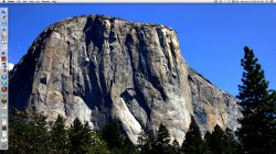
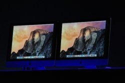
Red iTunes icon? The icons look flatter here but (thankfully IMO - if it's legit of course) not all confined to rounded squares/circles.
Menu bar shadow looks to still be there and it looks suspiciously like Lucida Grande lives on...
And um... oh I just hope it's better than that. Close to that, but better!!!
Err, it looks pretty much identical to the dock since around Mac OS X 10.6 - just in the horizontal orientation as well as vertical.
I came in to the Mac world at snowleopard.
Sees Flat: Sad clown face on
mmmm not sure how I feel about the dock
Why ? people like it when it's on the left and flat.
Attachments
I came in to the Mac world at snowleopard.
Yes, and it looks pretty much like the Snow Leopard onwards dock IF you orient it vertically.
It's 1am here in Singapore, I got beers stocked. Someone help me with a drinking game!!!
Every time they use the word "revolutionary", "extraordinary", "game-changer" or "it's just gorgeous"....a can of beer right there for each one.
Officially dont care,
hate ios 7, not looking forward to 8, hate Lion onwards, not looking forward to whatever they call the next one..
 as to why they have gone so badly off track, im assuming its blindly following Ive into the "slimmer , lighter, less useful `work of art' rather than a productive tool" mentality that seems to be apples mantra now.
hate ios 7, not looking forward to 8, hate Lion onwards, not looking forward to whatever they call the next one..
Why ? people like it when it's on the left and flat.
Didn't say I didn't like it. I always have me doc at the bottom.
Looks great - can't wait!
Yes, and it looks pretty much like the Snow Leopard onwards dock IF you orient it vertically.
Thats not the default position though.
I wasn'y bloody criticising anything just not sure how I feel about it.
Whats wrong with this forum. So bloody defensive.
Register on MacRumors! This sidebar will go away, and you'll see fewer ads.


