Become a MacRumors Supporter for $50/year with no ads, ability to filter front page stories, and private forums.
Quickview has got to be the most pointless thing. You can get the same effect in Tiger. Click on a file and do command-option-i to get an inspector. Now when you click on various files it will update and show a preview.


Erm, that is nothing like QuickLook
 
Not a good idea in my opinion. Too much clutter, I would much rather prefer individual apps. Then again, the only main one I use is Mail. I would use iCal, but it would be mainly for school assignments... And I use iProcrastinate for that.

Infact, didnt Windows have one of those.. and it now has indv. apps in Vista?

Too much clutter. What more clutter is there then needing multiple Windows for something that should be managed in one app? When you are dealing with cal\contacts\email\todos you are switching back and forth. Needing to manage three windows for that is asinine. Esp since we are now in the age of Widescreens. I'm sorry but you'll get outlook 2003 when you pry it from my cold dead hands. (And no I'm not cross enrolled in the NRA. :p )
And while I'd be the first to admit that Outlook is FAR FAR away from perfect it's a heck of a lot closer to it then Apple's consumer designed applications.

Yes Vista has ind apps. That's because MS's OS has never shipped with Cal\Contacts\Todos before Vista. Outlook and pretty much every other organizational software package has all these things integrated.
 
QuickView is also less work, especially for those who seldom use keyboard shortcuts.

I can't help but notice the talk about a white horizontal scroll bar. I assume it's the one in the Automator shots where a sheet is open (that's the only non-blue one i can see in that gallery). The reason it's white is because the window it's in doesn't have focus (the sheet does). This is normal even in Tiger.

The one i saw was here, it's for scrolling through the mail HTML sheight.
 
How come everytime we see Leopard screenshots they look like they have been scanned?

some texture going on?
 
They were GOING to do a fresh all-new look, but the people needed to do it got moved to the iPhone project. ;) :p


lol... in a roundabout way I think you are kind of right. People have been saying that OSX generally has been designed in mind with the hardware at the time. Aqua - plastic iMac, iBook etc. Brushed metal - PowerBook, Power Mac. Well now Apple has a mixture of black, white and metal hardware. The iPhone matches this as its black with a steel rim and a whitish back.

I think for Leopard, the basic windows wont be dramatically different but given a fresher look. But notice how everything else that you do with the Mac is being given the black look - its becoming common place in specific tasks - QuickLook, Time Machine, Spaces, iChat presentation gallery and video chat, iPhoto editing, Front Row, DVD Player, CoverFlow etc.

I think that is where you will see the smoked black stuff. To have it in the main windows as well wouldnt be a good idea in my opinion. I have seen some of the ShapeShifter themes where people have black everywhere and it looks horrible and reduces ease of use.

Im looking at the iPhone UI though and wondering if there will be any crossover with Leopard. Some of the stuff on the iPhone is beautiful

dsc_0226.jpg


dsc_0195.jpg


dsc_0197.jpg
 
Why would this not be the final look? (other than the fact that it sucks) Why would they change the UI a little bit like they've done now, if there is a complete overhaul coming soon?
 
My biggest problem is that toolbar icons don't stand out well against the dark grey as well as they do with unified....

case in point, apps that use brushed metal and have colored toolbar icons look awful
 
i don't like the overall look of the "new" interface. i was expecting a fresh, and more intimate look. this is UNO's deja vu. but UNO is even better, 'cause it has a clear/clean version, that for me, works like wonders.

i dislike the new interface 'cause it has lots of inconsistences: like button sizes and lots of bad alignments, and the fact that some apps have rounded corners, others don't. it's really a mess... the thing that attracts me most, were the black transparent windows. it's not unique but has something of the fresh look that was expecting in leopard.

the "new" interface is very greyish, boring, deja-vu. it's dead before it's even released. i am hoping this is not the final look of it. i am praying!! :) but i can always stick with UNO to camouflage apple lack of consistent.
oh well, let's wait and see...

PS: GRAY IS THE COLOR OF INDICISION!!
 
Horizontal scrollbars are same as ever

the horizontal scroll bars are solid white, the vertical ones are still Aqua. hrmm...

Which screenshot are you looking at? The closest I can find is this one, but the scrollbars are white in it because they window doesn't have focus. This is standard behaviour, I think.

Other screenshots show blue horizontal scrollbars: here and here
 
Black is...

Apple. 5% of the computer market. Go back to the basics. Wow everybody. Black is back. Just look at your packaging for Logic Pro. woot woot!!!:apple:
 

Attachments

  • 307198526_c74343f9fa_o.jpg
    307198526_c74343f9fa_o.jpg
    101.6 KB · Views: 158
i love that new photo booth effect... groundbreaking, to say the least! :D

i'm sure it will revolutionalise photography as we know it...
 
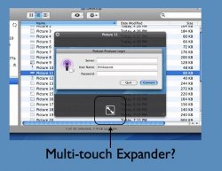
I think the Finder Quick Preview has a "button" included that could be indicative of Leopard supporting multi-touch functionality.

Have a squiz ....
 

Attachments

  • 9A410.jpg
    9A410.jpg
    96.7 KB · Views: 160
Which screenshot are you looking at? The closest I can find is this one, but the scrollbars are white in it because they window doesn't have focus. This is standard behaviour, I think.

Other screenshots show blue horizontal scrollbars: here and here

no, they were talking about this different type of horizontal scroll bar, scrolling through the stationary.
 
Or in Leopard, Apple will let you choose the GUI. Either Aqua or the mysterious Illuminous. I hope this will be the case. Give users the option of a different GUI.
 
On the contrary, if you were to do it something like Outlook, all you'd get is more button-pushing to get where you want to go.

On the Mac, you just flip from program to program, quickly and seamlessly. I love having everything seperate because it's easier to work with compared to when I used to use/tried to run away from Outlook (I hate that piece of work).

No you have tabs. Moving from E-mail to calendar to Todos to Contacts is as simple as a click. And adding a new entry for any of these items is literally a 2 clicks. NEW -> Select Appointment\Contact\Task\Journal Entry\Note\Internet Fax\Meeting request. Now lets look at what you have to do if you have an e-mail and you want to create a new calendar entry. You need to tab over to Cal. either point and click or key combo a new entry. Hopefully you remember what the date time and duration is or you will need to tab back to your e-mail to check it. On outlook it opens up a window on top of what you are working on right there. Hell I have a Macro setup that allows me to dump the text of the e-mail directly into the appointment entry and throws the contact into the attending field all from Outlook. So when I get an appointment notification I know what e-mail it pertained to due to the e-mail embedded directly into the appt. Just because you are comfortable with a certain way of doing things does not mean its the most efficient way of doing it. The simple fact of the matter is the entire business world has migrated to apps that revolve around a a unified UI. Everything from Peachtree to Outlook to Lotus to the others escape me at 5AM in the morning. What it boils down to is less windows == less clutter.
 
I think the Finder Quick Prview has a "button" included that could be indicative of Leopard supporting multi-touch functionality.

Have a squiz ....

Well if it was multi-touch, surely it wouldn't need a button? :confused:

Maybe a proud owner of 9A410 could tell us whether the button is just a new type of "open" button or something more mysterious?
 
I think the Finder Quick Prview has a "button" included that could be indicative of Leopard supporting multi-touch functionality.

Have a squiz ....

I think thats a maximise/fullscreen mode button. Look in Quicktime for instance when in full screen.
 
No you have tabs. Moving from E-mail to calendar to Todos to Contacts is as simple as a click. And adding a new entry for any of these items is literally a 2 clicks. NEW -> Select Appointment\Contact\Task\Journal Entry\Note\Internet Fax\Meeting request. Now lets look at what you have to do if you have an e-mail and you want to create a new calendar entry. You need to tab over to Cal. either point and click or key combo a new entry. Hopefully you remember what the date time and duration is or you will need to tab back to your e-mail to check it. On outlook it opens up a window on top of what you are working on right there. Hell I have a Macro setup that allows me to dump the text of the e-mail directly into the appointment entry and throws the contact into the attending field all from Outlook. So when I get an appointment notification I know what e-mail it pertained to due to the e-mail embedded directly into the appt. Just because you are comfortable with a certain way of doing things does not mean its the most efficient way of doing it. The simple fact of the matter is the entire business world has migrated to apps that revolve around a a unified UI. Everything from Peachtree to Outlook to Lotus to the others escape me at 5AM in the morning. What it boils down to is less windows == less clutter.
How is having tabbed apps better than having the apps open and using CMD+Tab?
 
Or in Leopard, Apple will let you choose the GUI. Either Aqua or the mysterious Illuminous. I hope this will be the case. Give users the option of a different GUI.

that could be good for the users from one prespective: at the first glance they have a choice. but in the other hand, for me, it would seem like apple couldnt decide what to choose. leaving the "responsability" to the user. its like you having two ways of solve a problem and wait for your "client" to choose, what, FOR HIM, is the best. the best would be apple having "a" solution that really believed in. that would seem like a solid statment for me.

and there always be skins, themes and other stuff for leopard around there.:)
 
Register on MacRumors! This sidebar will go away, and you'll see fewer ads.