Got a tip for us?
Let us know
Become a MacRumors Supporter for $50/year with no ads, ability to filter front page stories, and private forums.
Hands-On Walkthrough of Apple Music and Beats 1 Radio
- Thread starter MacRumors
- Start date
- Sort by reaction score
You are using an out of date browser. It may not display this or other websites correctly.
You should upgrade or use an alternative browser.
You should upgrade or use an alternative browser.
Where did the "horizontal album cover view" go??? The 8.4 update basically destroyed the most convenient way to browse through your purchased albums on your iPhone.
I totally hate the new Apple "My Music" UI. It requires too many clicks for basic things. Can't enjoy my purchased music on my iPhone no more, need to go back to an iPod.
I always hated the horizontal album cover view because my phone would tilt a little in the car and switch when I didn't want it to, but I hate the interface for different reasons.
The biggest omission is the ability to change the buttons at the bottom. I couldn't care less about Connect, for example. I'd like to be able to replace it with a Playlists button like I had before. Hopefully this shortcoming will be fixed in iOS 9. I can't wait to sign up to be a beta tester so I can provide them feedback!
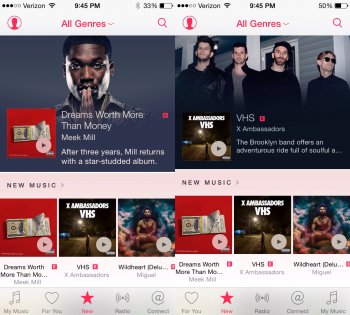
What's wrong with this picture? The screenshot on the left is from my wife's phone, who downloaded the 8.4 update around 6:30 PM EST. The screenshot on the right is from my phone. I downloaded the update near when it was released around 11:10 AM EST. Apple Music was working great for me until about 4 PM EST. Then it stopped letting me stream songs I hadn't streamed before and prompted me to join Apple Music. My wife was not having this problem until I changed her Apple ID from mine because before Apple Music was released we were sharing an Apple ID but I wanted us each to have our own account and use family sharing for Apple Music. But now nothing is working.
Attachments
I thought it was down at one point but realized I had was still attached to my router after I got in the car but with almost no signal. Once it switched to LTE I would play.Yes, there's an outage, that's known, I was just saying that it doesn't seem to affect everyone (thus not exactly "worldwide").
In any case, it seems to be back up.
Couple of early issues for me.
Quite a lot of stuff on Spotify is missing. I went to try and recreate my playlists (which I vastly prefer in iTunes where I can set my own artwork and order them properly!) but on a list of tracks i'd curated about 6 out of 35 were missing.
From bigger artists Prince doesn't appear to be on board yet.
There some quirks (maybe bugs?) like I was trying to search for stuff from my Spotify playlists to recreate the same playlist in Apple Music - occasionally id be able to search for a track and in the results right click and "add to playlist" but most of the time randomly that option would not appear and id have to add it to "my music" first then go and drag it into a playlist later. Even worst sometimes you'd get nothing but a share menu for a track.
Tracks don't start as quickly as Spotify - thats something Spotify have nailed down and hopefully something Apple will work on - they should do pre-emptive streaming of playlists too so you can skip between tracks and the first few seconds of each are already cached.
Searching is still a bit slow and clunky compared to Spotify, still a little "iTunes store-ish" maybe and not quite geared towards a quick on-demand steaming service. Also some terms such as track name and remixer didn't show up any results, but when I dug deeper that track was actually there. I kinda wish the latest releases for an artists appeared near the top and in order, so there were less clicks to just get their albums/singles in descending order - again something Spotify does better at the moment...the "top tracks" takes up too much room and is just an arbitrary selection of tracks from each artists.
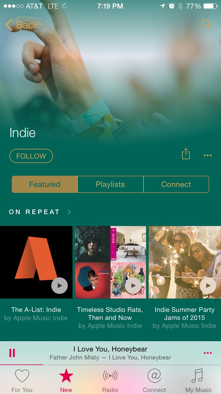
I think the themed playlists should be easier to get to in "New Music" and to be honest, maybe they should just be moved over to "For You" seen as the might not contain anything new at all?
Another quirk is that iTunes decided to randomly delete everything in brackets on some tracks so I couldn't see who the remixers were - quite cool that you can actually rename them though - although I did this and next time I went back the remixers names were in place.
So yeah, there's a few bigs, there's still quite a bit of work to do and its a bit clunky and over cluttered in places, but then Spotify get a hell of a lot of things wrong and there's missing features in their software thats been there for years which Apple Music already fixes...dare I say, Apple Music is the most indepth, customisable service...yeah, Apple made the software with more options and more tweaks than their competitor!
Quite a lot of stuff on Spotify is missing. I went to try and recreate my playlists (which I vastly prefer in iTunes where I can set my own artwork and order them properly!) but on a list of tracks i'd curated about 6 out of 35 were missing.
From bigger artists Prince doesn't appear to be on board yet.
There some quirks (maybe bugs?) like I was trying to search for stuff from my Spotify playlists to recreate the same playlist in Apple Music - occasionally id be able to search for a track and in the results right click and "add to playlist" but most of the time randomly that option would not appear and id have to add it to "my music" first then go and drag it into a playlist later. Even worst sometimes you'd get nothing but a share menu for a track.
Tracks don't start as quickly as Spotify - thats something Spotify have nailed down and hopefully something Apple will work on - they should do pre-emptive streaming of playlists too so you can skip between tracks and the first few seconds of each are already cached.
Searching is still a bit slow and clunky compared to Spotify, still a little "iTunes store-ish" maybe and not quite geared towards a quick on-demand steaming service. Also some terms such as track name and remixer didn't show up any results, but when I dug deeper that track was actually there. I kinda wish the latest releases for an artists appeared near the top and in order, so there were less clicks to just get their albums/singles in descending order - again something Spotify does better at the moment...the "top tracks" takes up too much room and is just an arbitrary selection of tracks from each artists.
I think the themed playlists should be easier to get to in "New Music" and to be honest, maybe they should just be moved over to "For You" seen as the might not contain anything new at all?
Another quirk is that iTunes decided to randomly delete everything in brackets on some tracks so I couldn't see who the remixers were - quite cool that you can actually rename them though - although I did this and next time I went back the remixers names were in place.
So yeah, there's a few bigs, there's still quite a bit of work to do and its a bit clunky and over cluttered in places, but then Spotify get a hell of a lot of things wrong and there's missing features in their software thats been there for years which Apple Music already fixes...dare I say, Apple Music is the most indepth, customisable service...yeah, Apple made the software with more options and more tweaks than their competitor!
Settings > iCloud > Family planning
"Family Planning". LOL! Way to resurrect an 80's/90's term for birth control!
So Im really liking apple music , but is it just me or is recently added smart playlist useless now. I can only get it to short alphabetical and other useless orders. Has anyone figured out how to sort by recently added.
- Figured it out , you need to go to the playlist then click songs from the top right corner then add date added to the song list view.
- Figured it out , you need to go to the playlist then click songs from the top right corner then add date added to the song list view.
There is an equalizer though. Kind of hidden, you have to go to settings then Music and at the bottom.Can't find an EQ (on iPhone). I miss it from Spotify and find the music too tiny through in-ear earphones.
Is there a way to shuffle all songs from a single artist that you have in your library? I can't seem to find that, and it's a feature I use very often. I've seen how you can select a particular album, but no way to say "shuffle all Dr John", for example. I've played around for a while now, but can't seem to find that functionality.
If iOS 8.4 got rid of coverflow, that alone is reason enough to upgrade. It is the most hated useless "feature" to me, and I was never given an option to disable it, except on my old 5th gen iPod Nano.
The biggest omission is the ability to change the buttons at the bottom. I couldn't care less about Connect, for example. I'd like to be able to replace it with a Playlists button like I had before.
I have great news for you! If you turn off the Connect feature, then the "Connect" button gets replaced with a "Playlists" button!
EDIT: It's pretty hidden so here's how to turn off Connect:
Settings app > General > Restrictions > Apple Music Connect
The result will look like this
And how does one accomplish said task?I have great news for you! If you turn off the Connect feature, then the "Connect" button gets replaced with a "Playlists" button!
And how does one accomplish said task?
See the edit to my comment above.
You guys just listened the outtake of the new Jony Ive boring video speech. Stay tuned. Beats 1. Always on.The main interface of Apple Music is white/very light gray with pink accents. But when you select artists, songs, albums, playlists etc. the UI colors change to adapt to the artwork. Yet the bottom section with the mini player and Music sections doesn't change it stays white and pink. In some cases this doesn't look bad, in others it looks awful (see below). I think the bottom section should adjust to match the color scheme of the top section. So if the top section is black and orange or green and gold the bottom section should be as well.


Also in some instances the back and search icons are really hard to read. Apple needs to adjust the artwork to make sure both of those are clearly visible. And perhaps the status bar needs to go too as it just clutters the interface.
Where did the "horizontal album cover view" go??? The 8.4 update basically destroyed the most convenient way to browse through your purchased albums on your iPhone.
I totally hate the new Apple "My Music" UI. It requires too many clicks for basic things. Can't enjoy my purchased music on my iPhone no more, need to go back to an iPod.
Horizontal might be most convenient for you but not for others and in reality it was just pretty to look at and isn't the most convenient way to browse. Also I don't understand how it takes more clicks to do basic things. Care to explain?
Are you sure she's part of your family sharing? My wife is already on my family sharing and so when I selected the family plan for Apple Music, all she did was open the app on her phone and it brought her straight to the screen where she selects her preferred styles of music.This is not working.. When I open music app on the wifes phone, the sign up page appears asking individual or family plan.
Can anyone give any help on this? Thanks
I instantly went back to Google Music for this exact reason. Such a piss off.
The new UI is a step back. Clicking through artists > albums > then having to go through each album to find a song doesn't make sense. The old way of listing songs under the albums was so much easier- especially while driving. Why remove this and require more work and clicks? I don't understand the reasoning.
Obviously you guys have not taken the time to use the app. You can still browse the songs by albums just as easy.
Yeah ... it's there. The UI takes some getting used to (I was super confused at first), but now that I'm getting the hang of it it's not bad at all.Obviously you guys have not taken the time to use the app. You can still browse the songs by albums just as easy.
My first impressions / issues.
Overall it's bye-bye Spotify for me - I would like to see the EQ and probably lyrics sooner rather than later though. Good first start -even if late.
- Siri works well if you ask for the exact match. When I say Play 'Artist' Siri gives me a message to Open music. When I open it the artist I've requested is not displayed.
- Can't find an EQ (on iPhone). I miss it from Spotify and find the music too tiny through in-ear earphones.
- I don't find the interface overwhelming (not yet anyway)
- I have family sharing turned on in iCloud but failed to set it up here. Maybe all need to be on 8.4.
- I would have liked to have seen an error message saying why it wasn't working rather than just 'not available'
EQ are in Settings -> Music. Not in the app itself.
David Pogue and CNET are kind of brutal in their reviews. Basically say app is stuffed with too much stuff....especially the New tab.
https://www.yahoo.com/tech/apple-music-is-hot-and-messy-122870003119.html
http://www.cnet.com/products/apple-music/
https://www.yahoo.com/tech/apple-music-is-hot-and-messy-122870003119.html
The Apple Music app is absolutely stuffed with features, controls, and interface. Even the submenus have submenus.For example, one of the tabs at the bottom of the screen is called New, but it may as well be called Leftovers. It’s lists of lists.
Scroll down long enough, and you’ll find lists like New Music, Hot Tracks, Recent Releases, Top Songs, Hot Albums, Discovered on Connect (what does that mean?), Apple Music Editors, Activities, Curators, Recommended Music Videos, Summertime Playlists, New Artists, Spotlight on Sia, Alternative Essentials, and so on.
Quick: What’s the difference between New Music, Hot Albums, and Recent Releases? How is a Hot Track different from a Top Song, exactly?
http://www.cnet.com/products/apple-music/
After hours spent with the app, I'm still struggling to find my way around. The New tab in particular is stuffed with too much content, including new music, recently released popular music videos, top charts and themed playlists. On top of that, there are submenus that take you to more playlists created by music editors and various brands, such as Rolling Stone magazine and Shazam. Scrolling through the page, it's hard to focus on any one spot and hard to decipher one section from the next. To make things more complicated, you can change the genre at the top of the New tab to adjust the music selection.
One of the biggest problems plaguing the design is that there are too many submenus that you can get lost in and have to back out of several times to return to the main page. There's also not much organization, with playlists, albums, videos and other groupings thrown together in no discernible order. I'm already longing for Spotify, which has a cleaner design, with everything clearly laid out.
Register on MacRumors! This sidebar will go away, and you'll see fewer ads.