Become a MacRumors Supporter for $50/year with no ads, ability to filter front page stories, and private forums.
"reduce transparency" has a severe performance impact on iOS18 somehow. It's completely counterintuitive, but it's true, at least on my iPhone 12 and on an iPhone SE 3.

The UI becomes super laggy/jerky. The keyboard becomes unusable at time, I can type 20 characters with no reaction of the keyboard (frozen) and it then starts to catch up and enter everything I typed very fast.

I hope it won't be the same with this liquid glass UI, but I doubt it.

Also reported here:
 
  • Sad
Reactions: turbineseaplane


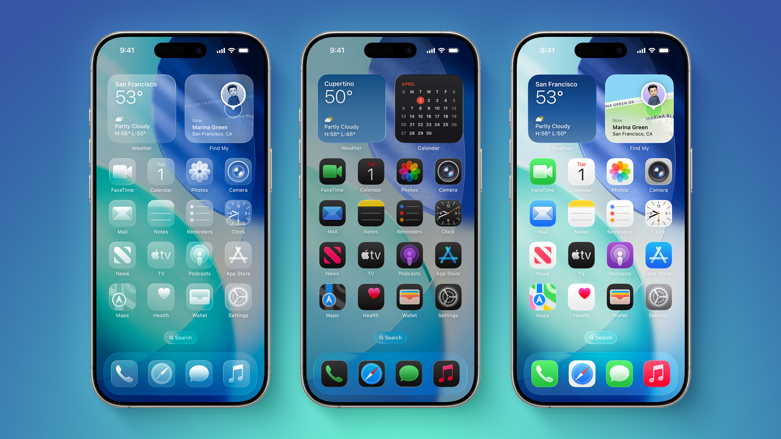
iOS 26 features a whole new design material that Apple calls Liquid Glass, with a focus on transparency that lets the content on your display shine through the controls. If you're not a fan of the look, or are having trouble with readability, there is a step that you can take to make things more opaque without entirely losing out on the new look.

iOS-26-on-Three-iPhones.jpg

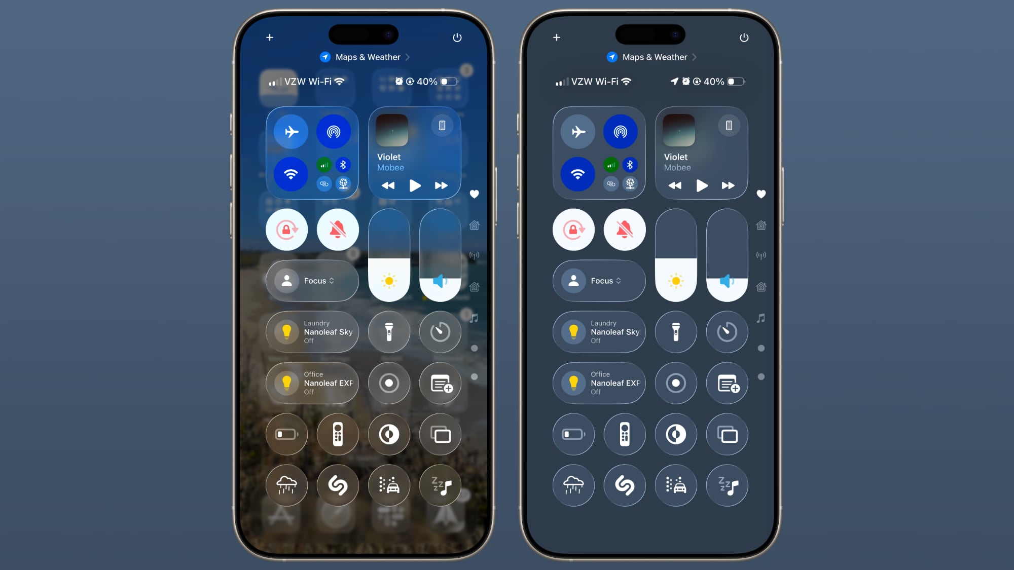
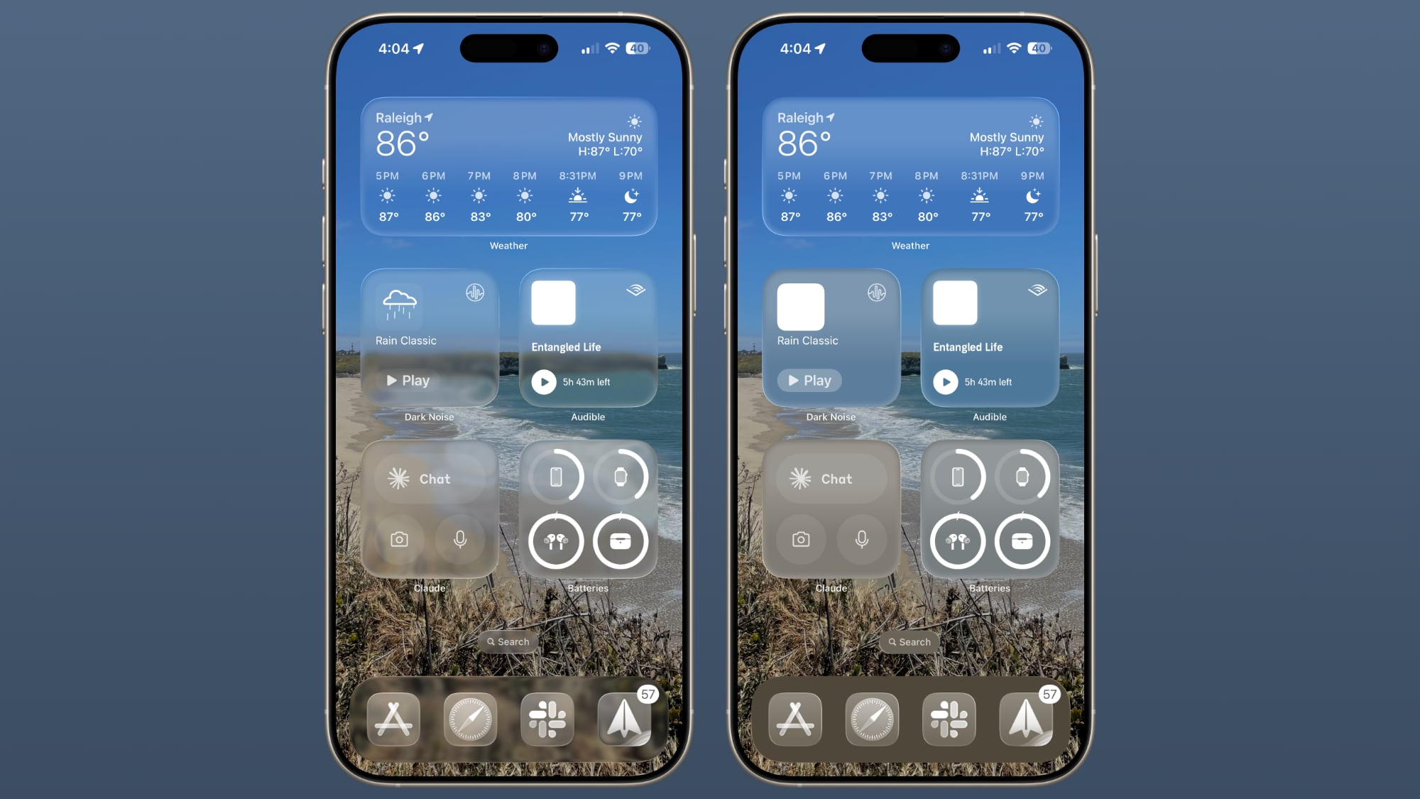
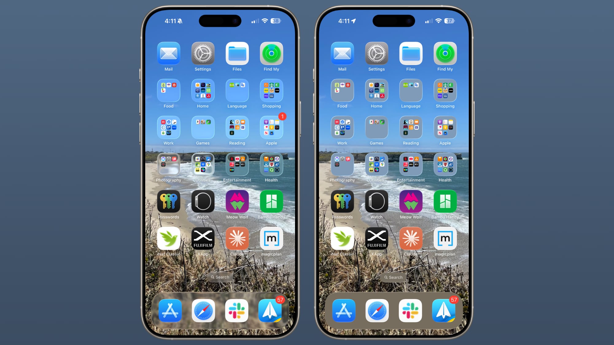
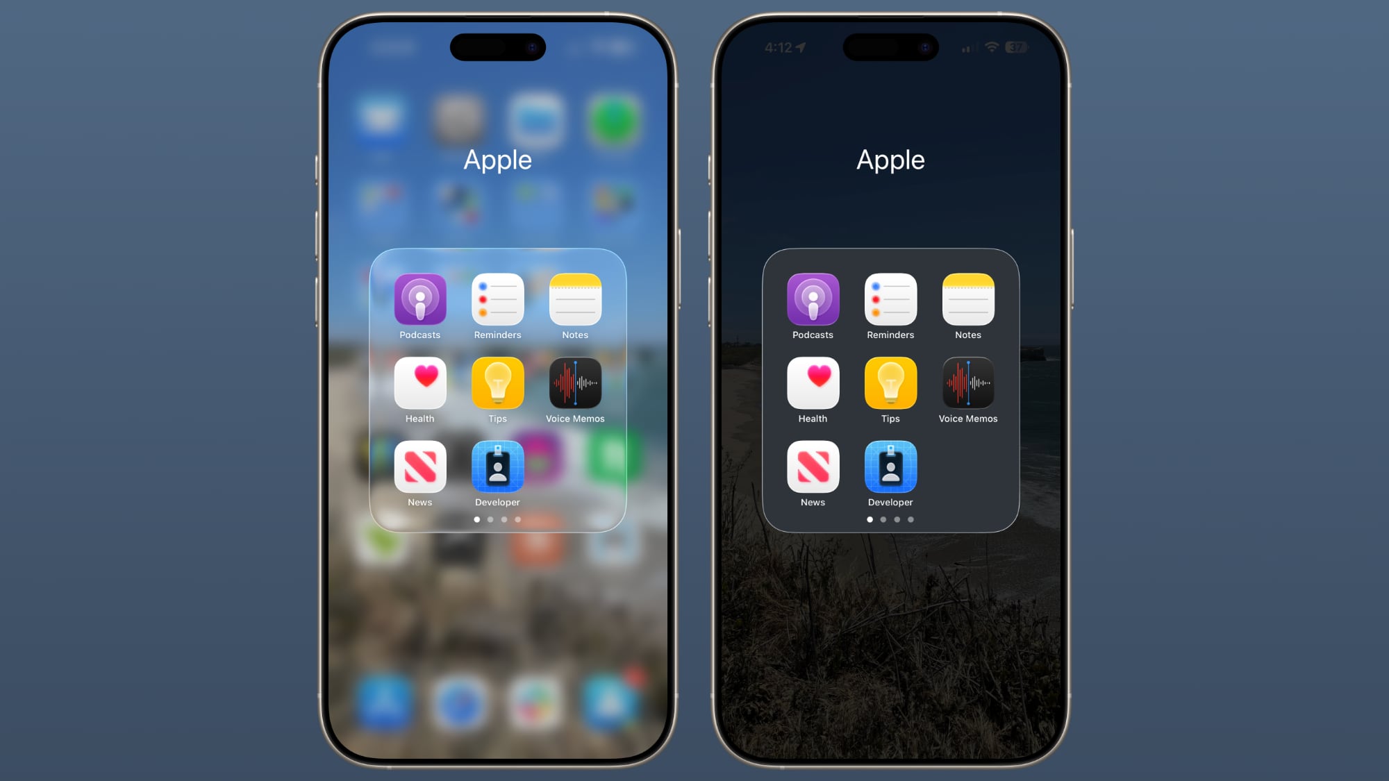
Apple has multiple Accessibility options that are designed to customize iOS for different visual needs, and one of these options is Reduce Transparency. Toggling on Reduce Transparency adds a darker background to translucent areas like the Control Center, app icons, and app folders, improving contrast.

liquid-glass-reduce-transparency-1.jpg

You can turn on Reduce Transparency by opening up the Settings app, going to Accessibility, selecting Display and Text Size, and tapping on the Reduce Transparency toggle. If you want to be able to turn the setting on and off quickly, you can add it to your Accessibility Shortcuts to get to it from the Control center interface.

liquid-glass-reduce-transparency-2.jpg

Activating Reduce Transparency does not remove all translucency from the iPhone's interface, but it does give everything more of an opaque look. It does not change the shape of buttons or return things to a pre-iOS 26 look.

liquid-glass-reduce-transparency-3.jpg

We're still very early in the beta testing process, and Apple will make tweaks and refinements to the Liquid Glass design based on user feedback. It's always tough to get used to an entirely new interface, so if you're a developer running the beta and you're having trouble adjusting or reading some text, temporarily activating Reduce Transparency might help ease the transition.

liquid-glass-reduce-transparency-4.jpg

In all likelihood, most people will adjust to the updated Liquid Glass design within a few days. Apple hasn't made significant changes to app interfaces and layouts, so even though there's a whole new look for iOS 26, Apple says it's still going to feel familiar to people.

Liquid Glass could look different by the time that iOS 26 launches to the public, and we'll see it evolve over the next few months. Right now, iOS 26 is limited to developers, but a public beta is coming in July. A launch will follow in September.

Article Link: Hate iOS 26's Liquid Glass Design? Here's How to Tone It Down
Tried it for a couple of days now. Im not convinced it is a better choice over iOS18 design wise. The aqua look makes it sometimes very hard to read messages or text in general. After all, let’s not forget we are discussing a beta version here.
 
  • Like
Reactions: turbineseaplane
Not impressed. Limits background you can use to get the liquid glass effect. Before any background worked well
Looks like Apples running out of ideas
 
  • Love
Reactions: turbineseaplane
Just why would anyone want transparent icons on a phone ?

Come on - why stop here ? Take it to the next level and reduce the brightness to 10% and add noise to all sound output.
My parents wanted a minimalist launcher for iPhone, same as 0launcher for Android (easier on their eyes). Last time we checked, there were only useless paid apps, emulating a launcher with a giant widget covering most of the screen like a darkish blob (not quite black, translucent to a point). Even these pseudo-screens will be a challenge with this new design.

Really, nobody wants their phone to be less readable. My feeling is that Apple worries about becoming the next Nokia by missing the AI boat/fleet entirely (Hey, Siri!). They anticipate screen disruption and screenless form factors (Hey, Jony!) in favor of augmented visual perception through glasses, satellite wearable or anything. Hence this design adding to the visual field instead of hiding it. The end of the black mirror, literally.
 
Last edited:
Steve Ballmer 2013: “Vista was my biggest mistake”
Tim Cook 2026: “Liquid glass was my biggest mistake”
Maybe it wasn’t Liquid Glass in the first place.
But rather the Vision Pro - depending on how much (resources, opportunity costs) that cost to make.
Not to just be a smart comment but can anyone in the industry or with a bit more knowledge tell me how does it work in regards to getting a design change like this approved.
am I wrong in thinking that surely there must be staff at Apple who pointed out that this is really hard to read?
Not claiming to have inside industry knowledge - but I suspect this came and was support from the very top.
They slowly want users to get used to the idea of smart glasses in the future.
Agree. Just like Windows 8 and its tile-based interface and start menu seemed designed to align with (and get people used to) Windows Phone’s touch interface. This reminds me of it.

I view it as primarily an attempt aligning the design with visionOS to increase user familiarity - with an ulterior motive of propping up that latter business.
 
Last edited:
Apple, u def have been losing your design touch lately. None of the new designs have the fit and polish of even Aqua. Liquid Glass looks more like a 3rd rate 3rd party skin. None of the fun and the beauty, just more clutter. And all the apps look alike now with the staleness of corp databases that all look the same. Bring back then fun notebook pages of the original Notes, and the calendar look of the Calendar. Bring soul and beauty back to Apple instead of just trying to copy yourself over and over again. I was kinda sad a couple days ago running MacOS Tahoe and it was kinda okay... But the I accidentally opened my Windows 11 vMachine in Parallels and Windows 11 is now the prettier OS. That is NOT A good sign Apple!! Please do something!
 
actually, the clear washed out look might be perfect with a black wallpaper - to tone down the obnoxious over saturated app icons
I tried that, I’m usually a black wallpaper kinda guy, but the glasslike folder edges remain and make them look, wrong.
I expected the entire design to be very nice with a black wallpaper but after trying it I was left with the impression that that was the last thing anyone thought about in the design team.
 
While I love the new look, I can understand people wanting it to be toned down a bit. I see the resemblance to visionOS, too. A taste of something I can’t yet get.
visionOS is beautiful but it's also beautiful because it's floating over a real room or a virtual environment. Transparent glass just does not work when it's floating right over other iPhone screens lol
 
Would highly guess this as well. A bit more frosty and they definitely need something else for the app icons and the icons in the control center. These thin white lines around the icons looking so cheap. Curious for the changes over the upcoming weeks. Will be thrilling.
Looks like 80s 3d lol
 
I have no words for this one. I'm kinda stumped by this whole WWDC thing. I fell asleep 15 mins in. I'm just sitting looking at the TV like thinking "Are you kidding me? Everybody seems so robotics."
I honestly thought for the first 5 minutes of watching Craig Federighi, that he was an AI character......
 
  • Like
Reactions: arkitect
Maybe it wasn’t Liquid Glass in the first place.
But rather the Vision Pro - depending on how much (resources, opportunity costs) that cost to make.

Not claiming to have inside industry knowledge - but I suspect this came and was support from the very top.

Agree. Just like Windows 8 and its tile-based interface and start menu seemed designed to align with (and get people used to) Windows Phone’s touch interface. This reminds me of it.

I view it as primarily an attempt aligning the design with visionOS to increase user familiarity - with an ulterior motive of propping up that latter business.
its not propping up the latter business, but rather the future of computing along with AI [despite what you and others may want to believe otherwise].
 
I like the transparent design very much. However it is good that there is an option to change things a bit for those who are not very keen on the new design.
 
  • Like
Reactions: mganu
I installed it on an old phone yesterday… normally I would agree that with the idea that people get used to something new pretty quickly.

But first impressions of this liquid glass thing are that it’s not good. As a UX designer, some of the legibility issues are awful. Text becomes very hard to read, and would absolutely fail accessibility guidelines on colour contrast. And for what? A pointlessly flashy glass effect animation every time you want to use some of the controls?

Apple often, sometimes unfairly, gets criticised for style over substance or usability. But this might the the worst example I’ve seen of that using Apple products for over 20 years.
 
Would highly guess this as well. A bit more frosty and they definitely need something else for the app icons and the icons in the control center. These thin white lines around the icons looking so cheap. Curious for the changes over the upcoming weeks. Will be thrilling.
Totally agree. I know it’s only the first beta, but the control centre looks terrible.
 
Hate feels an unusually strong word to use for the subject matter 🤔

I like the idea of the liquid glass option very much, though its current scope of adjustment restrict it from being far more pleasant. Hopefully the level of adjustments available will expand as the beta program progresses.

Thus far, I’ve found an issue where the Lock Screen ‘extend wallpaper’ option blends with the carrier and wifi icons significantly, as shown in the snap below.

View attachment 2519139

On reflection (see what I did there), I can’t remember whether this issue presented before liquid glass, but I’m inclined to say it didn’t, as I’ve used the same extended Lock Screen wallpaper prior to liquid glass without issue. I may be wrong!
I have this on iOS 25 as well, this isn't new.
 
Apple, think of it this way.. If it’s not pretty or sexy in real world, it won’t look good copied digitally. Clear glass like a window or prescription glasses… not sexy. Don’t copy.
 
  • Like
Reactions: Schwarzmaler20
Register on MacRumors! This sidebar will go away, and you'll see fewer ads.