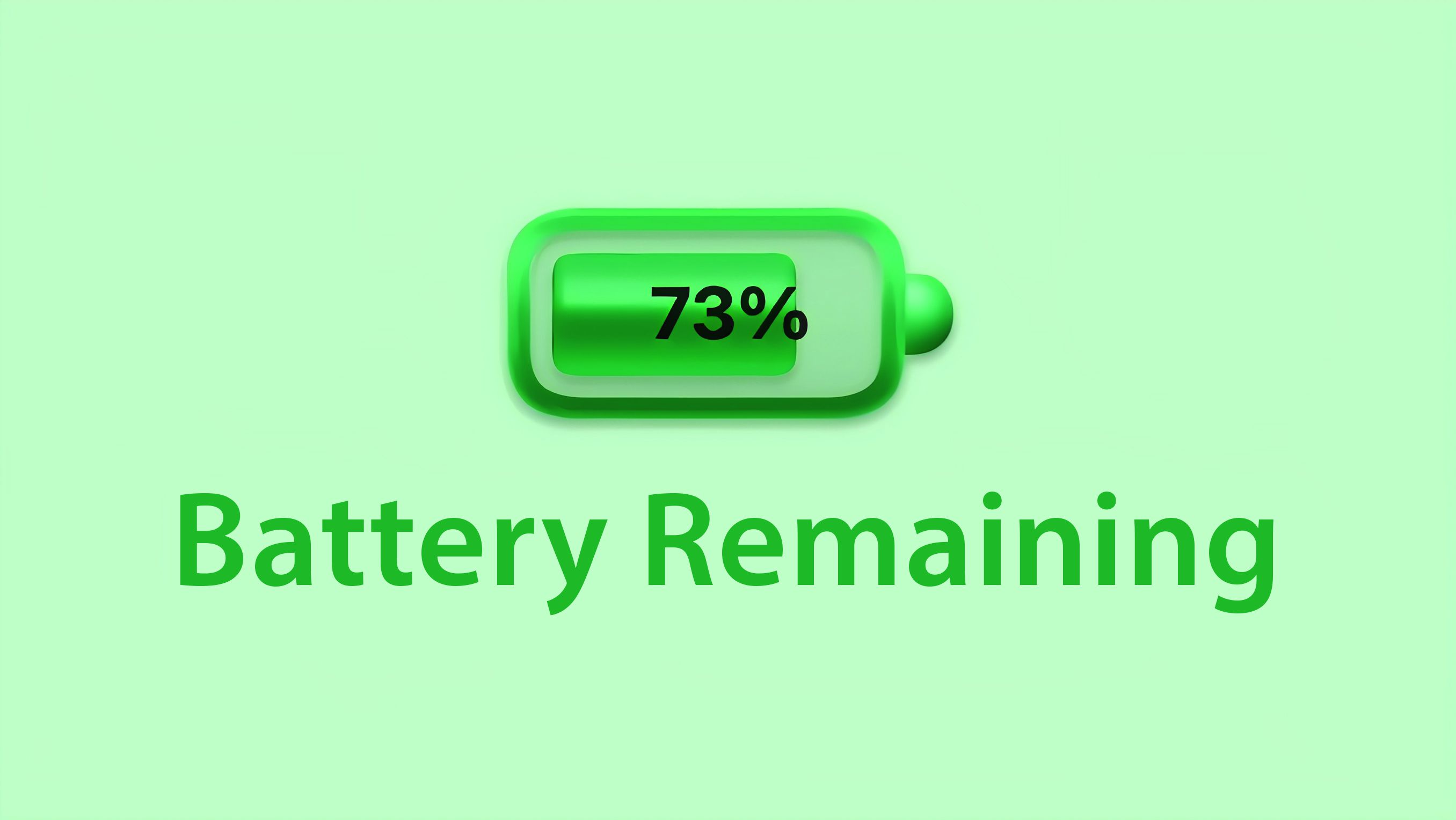
I don’t like the fact that it’s only a number. It’s a percentage %😆
Got a tip for us?
Let us know
Become a MacRumors Supporter for $50/year with no ads, ability to filter front page stories, and private forums.
Here's Why the iPhone Battery Status Icon in iOS 16 Is So Controversial
- Thread starter MacRumors
- Start date
- Sort by reaction score
You are using an out of date browser. It may not display this or other websites correctly.
You should upgrade or use an alternative browser.
You should upgrade or use an alternative browser.
For this reason alone, I wish Apple didn't have beta programs for people to test. They are acting like this is the final release, and Apple messed up. I'm a 1000% positive people requested this feature through the feedback app, and Apple listened. Is there implementation the best? No. That's why you provide feedback in the app so it can get better before release. Also, grow the f**k up people. You bitch about everything.
chill, they are simply posting ideas. no one is complaining 😅 god forbid people have opinions or thoughts nowadays.
Also, guess what? public betas exist to provide feedback so I don't know what you are even on about
As a UX designer, I find it very interesting how everybody and their dead dog is able to come up with better solutions on just about anything (and this goes well beyond software UI design, but let's stick to that), but nobody has any data/feedback/research to back up their claim that Apple is wrong and they have found a better solution.
Yes I realize this is tempest in a teapot, but it gets me every time.
Debate and ideas and finding alternatives are fine, I'm all for it, but some people need to come up with a better process than "I can easily fix this, here's how".
Yes I realize this is tempest in a teapot, but it gets me every time.
Debate and ideas and finding alternatives are fine, I'm all for it, but some people need to come up with a better process than "I can easily fix this, here's how".
That was just the stylistic decision they made, but I suspect that there were legibility issues of having just the text on a busy wallpaper. Numbers on the solid icon are easier to read.Right, but what I was getting at is, it doesn’t have to be both. Why try and smush a battery icon and % together when Apple could just give people the option of displaying a battery icon, or a %. Having both displayed seems redundant, but that’s just me.
I hate when people complain about people complainingAll these comments complaining about people complaining. 🤔
But we already know it's %. Might be nice if there were that many cookies in thereI don’t like the fact that it’s only a number. It’s a percentage %😆
Didn't know that asking for change and voicing an opinion isn't grown-up.oh grow up, people.
That’s not the issue. People migrating to an iPhone from android will look at this as a step backwards. And apple is in the business of taking users off androids hands. When a track phone has a better battery bar than the flagship apple phone. You’re gonna have a bad time.That's not better.
With a solid background it has decreased legibility.
With a busy background, especially one with light and dark in it, it has even worse legibility
There is literally a number telling you that it is 60%. I think as people become accustomed to it they will stop reading the solid icon as 100%.
If enough people come out and say, “ hey we don’t like this” then there is an issue.
This article simply states that.
Exactly.As a UX designer, I find it very interesting how everybody and their dead dog is able to come up with better solutions on just about anything (and this goes well beyond software UI design, but let's stick to that), but nobody has any data/feedback/research to back up their claim that Apple is wrong and they have found a better solution.
Yes I realize this is tempest in a teapot, but it gets me every time.
Debate and ideas and finding alternatives are fine, I'm all for it, but some people need to come up with a better process than "I can easily fix this, here's how".
I am 100% sure that Apple tried multiple designs and arrived at this solution after user-testing with both regular and low-vision users.
I am glad that Apple prioritizes legibility over making some Android users happy.That’s not the issue. People migrating to an iPhone from android will look at this as a step backwards. And apple is in the business of taking users off androids hands. When a track phone has a better battery bar than the flagship apple phone. You’re gonna have a bad time.
If enough people come out and say, “ hey we don’t like this” then there is an issue.
This article simply states that.
All the people saying this is a silly thing to get annoyed about:
Picture this, your car's fuel gauge needle remains at the same place (full), but a numerical value for the actual state of your tank is also displayed. At a glance, are you gonna assume your tank is partially filled, or completely full?
Picture this, your car's fuel gauge needle remains at the same place (full), but a numerical value for the actual state of your tank is also displayed. At a glance, are you gonna assume your tank is partially filled, or completely full?
You guys... It's a beta, it can still change. It's the 'hideous' battery icon debacle all over again. Remember how everyone and their dog hated it in the Big Sur betas?
 www.macrumors.com
Oh well, I'll be turning this off right away if it's on by default. I prefer the gauge. If I want to know the exact percentage, I'll just check it in the Control Center.
macOS Big Sur Adds Battery Usage History and Brings Back Remaining Battery Estimates
macOS Big Sur does away with the "Energy Saver" section of System Preferences, replacing it with a new "Battery" section that expands the battery reporting capabilities of the Mac. A new Usage History feature provides details on the Mac's battery life over the course of the last 24 hours or the...
www.macrumors.com
Oh well, I'll be turning this off right away if it's on by default. I prefer the gauge. If I want to know the exact percentage, I'll just check it in the Control Center.
Enjoy your technological Stockholm syndrome. You're telling me there's room on the tiny iPhone 5 but not any of the current ones.There is no room. Well there is room if you want to make fonts and elements so small that you need microscope to see them, otherwise no, there is no room
I'm fine with the design. I'd much rather look at an accurate number then hard-to-see and non-specific bars.
Maybe we need to add an image of an analog clock behind the digital time on the lock screen so people can understand what exactly those numbers are representing.Listen, telling time can be quite difficult at first too...
On pre-notch iPhones, the home-screen status bar had a dark background tint which increased legibility of the smaller text even with busy wallpapers.Enjoy your technological Stockholm syndrome. You're telling me there's room on the tiny iPhone 5 but not any of the current ones.
I like this idea, but I fear some may also find this confusingMaybe we need to add an image of an analog clock behind the digital time on the lock screen so people can understand what exactly those numbers are representing.
")
As a designer, the conversation within Apple probably went something like this:
When you've got the number, you're just looking at the number, not the battery itself. Therefore it isnt' necessary for the battery to fill up in accordance to the number.
Personally I think Apple's decision is fine and this controversy is asinine.
When you've got the number, you're just looking at the number, not the battery itself. Therefore it isnt' necessary for the battery to fill up in accordance to the number.
Personally I think Apple's decision is fine and this controversy is asinine.
Once I got used to it, I would know to just look at the # and disregard the gaugeAll the people saying this is a silly thing to get annoyed about:
Picture this, your car's fuel gauge needle remains at the same place (full), but a numerical value for the actual state of your tank is also displayed. At a glance, are you gonna assume your tank is partially filled, or completely full?
But it would need to be perpetually at 12:00Maybe we need to add an image of an analog clock behind the digital time on the lock screen so people can understand what exactly those numbers are representing.
Agree but it's the number that's hard to read. They need to make it bigger and always black on a white background. Maybe some other good contrast with red color when lowI'm fine with the design. I'd much rather look at an accurate number then hard-to-see and non-specific bars.
Register on MacRumors! This sidebar will go away, and you'll see fewer ads.