Got a tip for us?
Let us know
Become a MacRumors Supporter for $50/year with no ads, ability to filter front page stories, and private forums.
Here's Why the iPhone Battery Status Icon in iOS 16 Is So Controversial
- Thread starter MacRumors
- Start date
- Sort by reaction score
You are using an out of date browser. It may not display this or other websites correctly.
You should upgrade or use an alternative browser.
You should upgrade or use an alternative browser.
I'm all for design improvements. I do like ideas that were presented in the Tweet example. First World Problems are fine to have.Talk about a first world problem. Personally I've gotten used to the current version so don't really care at all about what percentage of battery is left. William Shakespeare's play comes to mind here: "Much Ado about Nothing"
I like the percentage number. One example my Apple Watch. After extended use, I know with a quick glance if the Apple Watch battery will last for the upcoming activities. Sleep on my watch requires about 15% of battery for normal hours. When Apple alerts me that I have 25% before bed, no worries if I do not charge the Watch. The numbers over time are very helpful. Anything that adds to my productivity welcomed. Now there is a very long list of added features that for me are just annoying.
I never had a problem estimating battery life based on the battery icon fill level - and when a percentage is needed to confirm, a 1 second swipe down gives you just that.
I wish some time and effort were put into the overall design of iOS. The GUI needs a refresh - it's been sporting the same overall look and feel since 2013.
This is all subjective, of course.
I wish some time and effort were put into the overall design of iOS. The GUI needs a refresh - it's been sporting the same overall look and feel since 2013.
This is all subjective, of course.
Just an FYI, in Shakespeare’s time, the word ‘Nothing’ was slang for female genitalia. The title of ‘Much Ado About Nothing’ is a double entendre / euphemism.Talk about a first world problem. Personally I've gotten used to the current version so don't really care at all about what percentage of battery is left. William Shakespeare's play comes to mind here: "Much Ado about Nothing"
Especially since it is a change that can be toggled off, unusual for Apple.I'm all for design improvements. I do like ideas that were presented in the Tweet example. First World Problems are fine to have.
True. Simple is what they have right now with full green even at 34.That's actually a great idea. But Apple likes it keep it simple. It might be too complicated for them.
Someone got a bit sensitive there.Also, grow the f**k up people.
MacRumors forums are there to share and discuss Apple stuff. Not everyone's opinion will mirror your own. Maybe you should grow up
To be fair, in some cases these suggestions are as good as, or better, than what Apple does, but I have-not seen a better battery suggestion yet.I'm always baffled when people think they can design iOS interface better than Apple.
To be fair, in some cases these suggestions are as good as, or better, than what Apple does, but I have-not seen a better battery suggestion yet.
I think "Alternative A" looks nicer and makes more sense, but I also don't really care all that much one way or another.
Why is a numeric indicator even necessary?
In real world usage, does it really matter if your battery is 35% or 40%? Both would be able to be estimated simply by looking at the battery fill-in graphic.
I wonder how much time and money was spent in the Apple UFO campus working out these details...
In real world usage, does it really matter if your battery is 35% or 40%? Both would be able to be estimated simply by looking at the battery fill-in graphic.
I wonder how much time and money was spent in the Apple UFO campus working out these details...
Alternative A fails WCAG (foreground/background) contrast guidelines. Then again, so does Apple's low battery icon so I actually like Apple's regular icon and the low battery icon from A.I think "Alternative A" looks nicer and makes more sense, but I also don't really care all that much one way or another.
We all (well most of us) care, but it's not the Apple it was when Steve ran it. I am an Apple die hard. that is all I use. I really know enough about how to use "that other OS" nor do I care. Seriously, all sarcasm asideWhat an absurd thing to say about apple. Do you think Steve Jobs didn’t care about every tiny detail? Do you think in making a decision he said “oh grow up?” Like it doesn’t matter. No he didn’t. You have the phone you have and the eco system you have because of people exactly doing this thing. Obsessed over tiny things. A lot of people that like apple like them because of their insane attention to detail and making things perfect. Sharing your opinion on a tiny detail that’s not correct is part of the apple culture, it’s in apples blood. Maybe you just came from android and don’t care very much, who knows, but a lot of us.. REALLY care about a battery indicator. Sorry to burst your bubble lol
True, but every manufacturer has their design ideas and one does not automatically make the other bad, just different.That’s not the issue. People migrating to an iPhone from android will look at this as a step backwards. And apple is in the business of taking users off androids hands. When a track phone has a better battery bar than the flagship apple phone. You’re gonna have a bad time.
If enough people come out and say, “ hey we don’t like this” then there is an issue.
This article simply states that.
So, I would say just get rid of the image and show a number.All the people saying this is a silly thing to get annoyed about:
Picture this, your car's fuel gauge needle remains at the same place (full), but a numerical value for the actual state of your tank is also displayed. At a glance, are you gonna assume your tank is partially filled, or completely full?
Soooooooo controversial - according to who exactly?
In the latest iOS 16 beta, Apple has updated the status bar battery icon on iPhones with Face ID to display the exact percentage remaining rather than just a visual representation of battery level, and while the change has been largely welcomed, some users are unhappy with the way it has been implemented.
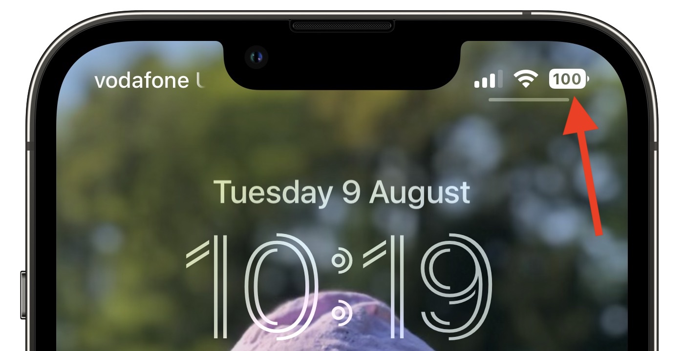
In iOS 15 and earlier, battery percent has not been present on iPhones that have Face ID because of the lack of space on either side of the notch that houses the TrueDepth camera hardware. The new design adds the specific battery level to the battery icon, providing a better idea of battery status at a glance.
In Apple's latest design, the white battery icon remains completely filled in as the battery level gradually depletes. When the semi-transparent percentage reaches 20% or lower, a fifth of the battery icon turns red and the rest of the icon becomes semi-transparent, while the percentage inverts to white.
Apple appears to have chosen this abrupt change in styling to ensure that the central percentage number remains legible as the battery level depletes – if a white bar depleted behind the number then it would be harder to make out at a glance, Apple's UI designers likely concluded.
Some users disagree with this approach, while others have suggested their own alternative designs for a battery status indicator with percentage level.
Perhaps Apple didn't anticipate that such a small design change would be so controversial, or that some users have a very clear idea of how they want their iPhone's battery level to be represented.
For some, it's simply a case of calling out what they consider to be poorly thought-out UI design. For others, it plays into low-battery anxiety, a major trigger of nomophobia. Either way, it's become a surprisingly heated topic, while it's easy to forget that the percentage display is optional (caveat: It's enforced when in Low Power Mode.)
Of course, the battery level indicator design isn't set in stone, and Apple well could change it in a later beta of iOS 16 or the final release. Whether you're testing the latest public beta or not, what do you think about the way it's been implemented? Let us know in the comments.
Article Link: Here's Why the iPhone Battery Status Icon in iOS 16 Is So Controversial

I guess, if you feel the need to be so precise. I just look at it and if it's near the middle, then I am about half..ish way down and just plug it in for a while if I am sitting at my desk.I'm fine with the design. I'd much rather look at an accurate number then hard-to-see and non-specific bars.
What? Stockholm syndrome? You obviously don’t know me. I am among first here to criticize bad decision that Apple makes.Enjoy your technological Stockholm syndrome. You're telling me there's room on the tiny iPhone 5 but not any of the current ones.
On phones with notch there is no room.
Just, my own interpretation of this animation (Juste, ma propre interprétation de cette animation):
Short video
Short video
Would rather that in a bigger font. Too hard to read cramped into the iconSo, I would say just get rid of the image and show a number.
Register on MacRumors! This sidebar will go away, and you'll see fewer ads.