Become a MacRumors Supporter for $50/year with no ads, ability to filter front page stories, and private forums.
We do, they're iPhone 5/5S/5Cs. Apple chose not to spend the extra $5 to give the Retina Mini that same quality display.

That $5 would probably translate to $50 total price increase. Apple has to meet price points and maintain high profitability. That is why the put a high PPI display in the rMini while keeping the same mediocre 68% sRGB. Most people were demanding a higher res screen; not one with better, more accurate colors.

That should come next year.
 
FWIW, the anti-glare MacBook Pros had more accurate colors than the glossy ones, but consumers preferred the ones with the glass panel due to colors popping more.
 
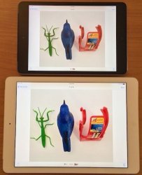
Well it's not very scientific but here is a shot of what I see. The ipad mini retina is on top and the ipad air on bottom. The ipad mini retina is an exact match although it does look washed out in the photo, perhaps the angle but you can see what the air does to the color, it blows it out over vibrant.


Image

I was hoping someone would do exactly what you did. I'm too lazy at the moment. :D That picture will likely create a debate over accuracy and full gamut, so get out the popcorn.
 
Well it's not very scientific but here is a shot of what I see. The ipad mini retina is on top and the ipad air on bottom. The ipad mini retina is an exact match although it does look washed out in the photo, perhaps the angle but you can see what the air does to the color, it blows it out over vibrant.


Image
Neither are 'exact', but to my eyes and on my computer screen, the Air wins in terms of accuracy.
 
LOL. Can't get a real photo of how it looks on the Mini Retina. When I do the compare it looks like the Mini is a closer match and the Air is way off but in these photos it looks the other way around. You be the judge. Either way they are both awesome screens. Oh, by the way, photos taken with my new Nexus 5 which is awesome!

iPad Air

iPadAir_zps2c477cb3.jpg


iPad Mini Retina

miniR_zpse1fd0640.jpg
 
Neither are 'exact', but to my eyes and on my computer screen, the Air wins in terms of accuracy.

:confused: The Air's picture is prettier and does seem to "pop" (looks almost 3d), but far from accurate on my screen.
 
Got my retina Mini today, looks fabulous, and thankfully not ghost images. I'm a designer, I'm *very* picky regarding displays and know a lot more about color spaces and accuracy than 90% of my peers, but this whole color gamut issue is overblown.

Despite the reduced color gamut the rMini has great colors, its color profile is very good. Sure it can't display accurately some very saturated colors that are in the sRGB range, but these are extreme colors you most likely won't see in real life. The rest of the sRGB range is accurate.
So in some games or apps you may see a difference between the rMini and the Air, but the vast majority of photos will look the same on both devices. Real life colors are great on the rMini. I put it side by side with my calibrated Mac display, looked a pictures (I'm an enthusiast photographer) and was very happy with what I saw :)

Also, generally if you put devices side by side, any color difference is obvious, even a very small one. But our eyes adapt very fast, and if you look at a display, close your eyes for 20 seconds, then look at another different display, you won't be able to tell the difference.

Edit: I also noticed the difference between displays (in my case between a MacBook Pro and a rMini) always looks worse on pictures than in real life. I just tried to take a pic with my iPhone and it's a lot more obvious than when looking at the devices. I guess the lesson here is: don't trust the pics on the interwebs, go to a store if you can and trust your eyes.
 
Last edited:
LOL. Can't get a real photo of how it looks on the Mini Retina. When I do the compare it looks like the Mini is a closer match and the Air is way off but in these photos it looks the other way around. You be the judge. Either way they are both awesome screens. Oh, by the way, photos taken with my new Nexus 5 which is awesome!

iPad Air

Image


iPad Mini Retina

Image


Thank's for posting this. For me there is obvious color temperature deficiencies on both the rMini and Air. The Air looks more like a Samsung AMOLED panel. The rMini is closest to natural print/screen quality but the color temperature in red is so off. It was the first thing I noticed when i got mine. Red looks like orange as you can see from your lighter.
 
If these photos are accurate representations, it reminds me a lot of the "demo" or "store" mode on many televisions. If you're not familiar or your TV doesn't have it, it's a special mode that has the contrast, color saturation, and brightness all jacked up to insane levels to try to appear flashy and impressive in store environments.

Once in your home, though, you're supposed to switch from/disable this mode in favor of a mode which produces a more reasonable/realistic color reproduction.

Surprises me that Apple calibrated the Air this way - especially since they promote the sRGB coverage of the LCD. Guess if they hadn't, everyone would be complaining about how much more vibrant competing tablets look.

I would think this is just a calibration issue since the LCD is fully capable of full sRGB coverage. As someone said higher in the thread, allowing customers to choose a color profile would be nice - "vibrant" mode for games and movies, "accurate" mode for photos and browsing, etc.
 
LOL. Can't get a real photo of how it looks on the Mini Retina. When I do the compare it looks like the Mini is a closer match and the Air is way off but in these photos it looks the other way around. You be the judge. Either way they are both awesome screens. Oh, by the way, photos taken with my new Nexus 5 which is awesome!

iPad Air

Image


iPad Mini Retina

Image

Look at the top of the lighter. The red on the air looks red. The red in the mini looks orange.
 
Ugh. I have really tried not to post anything about this rMini Color Gamut thing, but I guess I'll chime in with my observations since I tend to agree with the "defending" rMini posts here.

I have both the Air and the rMini in my home. I am not trying to defend either device as I will be keeping them both (one's for work and the other for personal use). Have been comparing the two since I first believed my rMini to be less saturated than the Air (all on my own observations - unaware of the gamut talk online). Obviously I did more extensive comparisons after reading all the hub-bub.

I am typically a very critical user when it comes to displays. If it helps to know, I own a professionally calibrated Pioneer Kuro (9th gen), a calibrated computer monitor for my work (UI Designer), have owned and sold many LCD panel phones over the past 2 years because of the displays not being up to snuff (most notably the Samsung Galaxy Note 2 for being too saturated).

My opinions after extensive comparisons between the Air and the rMini are as follows:

- First off, there is no doubt the gamut difference is real

- The colors I saw most affected on the rMini were magentas/purples and to a lesser degree the reds. Purple in general was WAY less saturated on the rMini and came across a tad more blue than the Airs pinkish purple. And reds are a tad on the orange side compared to the Air. If you are doing a comparison, google purple flowers and compare the images. NOTE: The differences might freak you out at first but keep in mind what the actual real life colors should be when observing.

- In comparisons of my own pictures (similar to the above cig and lighter examples) I too found that the rMini was surprisingly a fair amount closer to the real life subject than the Air. The Air comes off as over-saturated and smearing fine details. While the rMini was a tad (I mean a teeny, tiny bit) under-saturated from the real life colors, it yielded a much more natural representation. Reds in my sons shirt looked overblown on the Air. Grass looks a tad neon green on the Air with the rMini showing a bit of realistic brown in the image. I also honestly think the Air must be clipping color a tiny, tiny bit as I saw slightly more detail in the rMini images. It's slight, but it's there.

Like most people are saying, they are truly BOTH amazing displays. And the color gamut difference is real. I know stats show the Air as being much closer to "accurate" and that means something to me as a calibration fan, but in real life observations I can't help but feel the rMini produces more realistic color/images.

Of course this means that the rMini doesn't have the "pop" that most of us are used to on a mobile device. It's the same as when people first get their TV calibrated after viewing it in vivid (or even standard) modes for a while. It's an adjustment and feels like it's not as 3D or lively. But once you adjust you begin to actually see more depth thanks to the slight added detail it produces.

Again, I cannot discredit the raw data that is obviously showing the rMini with a color gamut that is much smaller than it should be. But damned if it doesn't make colors closer to reality and natural than the Air's near 100% gamut accuracy. To be fair, the magenta/purple colors may still win out on the Air overall, but all in all the rMini, to my eyes, has the edge in overall color reproduction.

Just my $.02.
 
I really do appreciate posts like this because I think the whole color thing is blown way out of proportion. I ordered my mini the morning they went on sale and after all of these threads saying that the screen is horrible...if I had read it before I ordered, I may not have ordered. I am very glad I did because the screen is gorgeous. And if it wasn't, I would have returned it...not try to justify my purchase to a bunch of strangers.

It doesn't really make sense to accuse someone of trying to "justify their purchase". If they weren't happy with it...they would just return it and start a thread about why they returned it.

Also, I prefer the screen on the rMini to the Air. I think the Air is overly saturated.
 
So a poster shares his subjective impressions of rMini vs the Air (presumably what a forum like this is made for), and he's treated to posters calling him delusional, telling him he's talking nonsense, and psychoanalyzing him, speculating he must be desperately trying to justify his purchase. This place is absurd.

Welcome to MacRumors forums. Take everything you read here with a giant grain of salt.
 
It's fact that when an artist or website displays something meant to be a certain color, (like magenta or violet), one device renders it accurately (Air), one device falls 35% short (Mini)

The unfortunate fact is Apple makes inconsistent choices, when they're perfectly capable of creating a consistency that reflects the quality claims they make.

Instead they coast on the strength of the brand and the logo people are thrilled to pay top dollar for. :)
 
Instead they coast on the strength of the brand and the logo people are thrilled to pay top dollar for.

Coasting? Did you see what they managed to cram into the tiny, thin, light iPad Air and rMini casings? I don't think they're coasting at all, especially right now... With the rMini screen, they probably felt it was a device with a smaller profit margin and made a cost-saving compromise that most people won't care about in the least.
 
I wonder if there would be less complain about rMini lower gamut if this was priced $329.00?
 
I wonder if there would be less complain about rMini lower gamut if this was priced $329.00?

It's not just the price but at this day and age when the tablet competition is so fierce and offering better quality displays at cheaper price points, Apple has to have superior quality to justify their price premiums. In the case of the RMini, they dropped the ball in the display department.
 
Got rMini and LOVE its color reproduction! It looks to my eyes more like a fine printed photography/art book rather than an oversaturated neon toy that Air is. (I did compare them in the store before getting my rMini.)

I don't care about those 63% vs 100% gamut numbers, the rMini screen looks just totally natural. For example, the photo of a green leaf with droplets at http://www.apple.com/ipad-mini/features/ looks very life-like on rMini, vs oversaturated neon greens on Air.

Same with, for example, the green on On/Off switches - I hate this "WTF?! Are they trying to burn the retina in my eyeballs?" green on my iPhone and on Air, but on rMini it looks like a 'normal green'.

All this hysteria about rMini gamut is totally ridiculous.

Now if you excuse me, I'll return to kissing and hugging my little friend. :D

The Air's display is extremely accurate, not over saturated. Your retina Mini is washed out. But whatever helps you rationalize it.
 
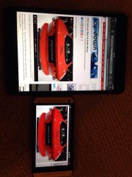
Decided to finally do a comparison between my rMini and HTC One. The rMini shows many shades of reds as orange, and a lot of deep colors look washed out compared to the One. It didn't bother me until I saw I reproduced the issue myself... As much as I'm enjoying my rMini, I think I will return it and wait for the next generation. Had the price still been around the $300-330 mark, I may have thought otherwise.
 

Attachments

  • image.jpg
    image.jpg
    392.6 KB · Views: 179
Decided to finally do a comparison between my rMini and HTC One. The rMini shows many shades of reds as orange, and a lot of deep colors look washed out compared to the One. It didn't bother me until I saw I reproduced the issue myself... As much as I'm enjoying my rMini, I think I will return it and wait for the next generation. Had the price still been around the $300-330 mark, I may have thought otherwise.

I compared my HTC One with my iPad Air, and the HTC has more saturated and vibrant colors than the Air. Did I return my Air because of this? Of course not. ;)
 
It is possible. Not everyone values color coverage (not to be confused with accuracy) like the average Macrumors poster. Some people are quite happy with the screen just the way it is. The Mini1 sold 55 million units. I'm guessing a lot of those folks loved their screens.

Mass delusion? Or was it that it wasn't (and isn't) THAT big of a deal? :confused:

I think it's popular because of the design, compactness and portability.

People loved the original Mini for those. The thin bezel was fresh and sexy. Even Apple's iPad marketing webpage was filled with Mini because I can see Apple felt ashamed about the old iPad design. It was ugly heavy boxy in the Apple's universe of "thin and light"

Only a few handful loved the Mini because it has a nice screen. The display sucked, the resolution sucked, the CPU sucked, color gamut sucked .. Hmm, gamut :D. And TBH the price sucked too for what it was.
 
It's not color accuracy, it's color gamut.

One display is closer to a black and white display than the other. Is that easier for you to understand?

It's not acceptable for Apple to be putting out a product for 2013-2014 to have 63% of sRGB. It looks like crap.

No, that's not easier because I understood you in the first place just fine :) It does not look like crap, I am plenty happy with mine as I was last year with the original mini. Some of you people are incredibly entitled and expect perfection all the time. Grow up a little please and let those of us who like the rMini enjoy what we have. Had we wanted an Air, we would have gotten one, but you don't see 10,000 threads about it.
 
I compared my HTC One with my iPad Air, and the HTC has more saturated and vibrant colors than the Air. Did I return my Air because of this? Of course not. ;)

I may try an Air if I can snag one on Black Friday.. The difference between the rMini and One is just too obvious now. As a sidenote, I looked at the Jag pic on the rMini first and figured that it was supposed to be orange-red.

Either way, I have a newfound appreciation for my One's screen :)
 
Register on MacRumors! This sidebar will go away, and you'll see fewer ads.