Become a MacRumors Supporter for $50/year with no ads, ability to filter front page stories, and private forums.
This look is here to stay

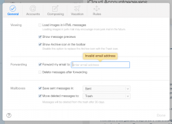
Well, it's clear that this new UI is here to stay...

If you want a glance of how OS X is gonna look...
 

Attachments

  • mailprefs.png
    mailprefs.png
    46.3 KB · Views: 1,805
It wouldn't say it's because it's beta. I'd say its because they didn't have time to redesign iOS, OS X and all of Apple's apps in the span of 7 months.

While that's obviously true, the inconsistency comment was referring to iCloud.com itself.

Also, I can't remember a time when iOS, OS X, and iCloud were ever truly consistent. iOS 6 never got ML's dock, for example. Trends happen (oftentimes in iTunes first) and they sort of trickle down into other areas.

Well, it's clear that this new UI is here to stay...

If you want a glance of how OS X is gonna look...

I wouldn't be so sure. OS X never got the old iCloud look.
 
Still need to add iphoto to icould.com and a basic apple drive (iDrive) could care less about the iwork apps since nobody I know uses these. Everyone I know uses office.

I use iWork. Outside of business users, I would imagine most could care less whether they are using Pages or Word. There is no one-size-fits-all solution to this, so Apple has apparently chosen to go the path of least resistance for the masses.

If the rumors of iWork becoming a free app suite this fall are true I think that would drive many more home and student users away from Office.
 
Ugh, the Contacts icon still looks horrible.
On the bright side, I love the new Find My iPhone icon.

Image

I agree, that's the only one on there I actually really like. If they could get the others consistent with that things would be a whole lot better.

The Reminders icon and Contacts... just awful.
 
I've got used to iOS7 now, having been running all the betas, but seeing this design on the big screen hammers home how cold and stark it is.

No part of that interface is inviting me to click on it.

Look at Mail and immediately flip over to the OSX Mail app. It just feels comfortable and easy to read. I think Apple are right to go for cleaner lines and make everything a little flatter, but this is brutal!

I love change, but I'm not sure that this will grow on people as much as Apple are hoping. Time will tell.
 
Firstly, Apple never used to be this lax with stuff. The fact they haven't got round to getting their 'marketing team' to update the iWork apps is one glaring inconstancy.

Secondly, the icons may look like like they're moving in the right direction too some, I can understand that line of thought, however there are subtle inconstancies with all the new iOS7 icons. Gradients appear on some, yet others are fully flat. The sizing and placement of elements also varies beyond consistency. These things create a disharmonies overall feeling. It's a mess.

Sure, I am being macro critical but I am a designer – who has always liked the sheer attention to detail Apple are famous for. Something just doesn't hang right with much the iOS7 look.

iWork is in beta inside another beta... The icons and the apps will be update to public release..

They are working on some icons to tone down the gradients
 
Disappointed to see the mail icon still uses an envelope.

I mean, has anyone under the age of 30 ever even seen an envelope?
 
Beautiful. Honestly, awesome. I love that they are using colors more. It makes it feel more alive and pleasing. Keep it up Apple!
 
I saw this coming...I was surprised it wasn't introduced at WWDC. But WHAT A BEAUTIFUL DESIGN. So much better than the old one
 
Very nice, i would love OS10 to have the iOS7 look, however just got 10.9 from Dev centre, and the UI changes already are amazing no more leather crap :) wonder if they change some icons too maybe simplify the os more in B6?
 
Any of you idiots complaining actually log in and toy with it a little bit?
It's nice and fluid. Love it.

The ONE thing they can do is tweak the icons, but I have had the iOS 7 beta since day 1, and trust me, it doesn't really matter what the hell the icons looks like. I mean who cares?? iOS7 is definetly a better OS to use..

It's like they purposefully want them to look bad. I don't understand Apple sometimes.
 
I don't have Beta access but is the mail webapp different?

I'm pondering switching from Gmail, based on their recent horrid decisions with compose, etc. so I'm just curious how it's different (or if it got any new features).
 
Well, it's clear that this new UI is here to stay...

If you want a glance of how OS X is gonna look...

To be fair, that actually looks pretty good. Sure, just like iOS7 it needs some work. But we're not going to see this in OS X until at least next year, by which time, we'll also have iOS8 where a huge chunk of the "alleged inconsistencies" will be ironed out.
 
Register on MacRumors! This sidebar will go away, and you'll see fewer ads.