yes. And your post basically confirms it. I don’t know the average age of people here but I’m gen z and most people I know like the new design. Most of you don’t like it because you don’t like change, regardless of what the new design language is. Someone above this post even mentioned an os from 2005. It’s nostalgia.Is it just change though?
Got a tip for us?
Let us know
Become a MacRumors Supporter for $50/year with no ads, ability to filter front page stories, and private forums.
Im sorry. But Liquid Glass looks cheap.
- Thread starter BB714
- Start date
- Sort by reaction score
You are using an out of date browser. It may not display this or other websites correctly.
You should upgrade or use an alternative browser.
You should upgrade or use an alternative browser.
I've stopped caring about a lot of Apple the recent years - as long as things works for me.I don’t know how anyone can think this is ok for a RC version out of a company with the resources of Apple.
I don't think Ive care either, how it looks at Apple anymore.
The design is pretty cheap under Cook, like a lot of other things.
As I said, I don't give much emotion to it - but I surely look forward to when Apple gets a new CEO.
I wholeheartedly agree with you about the impacts of Apple’s present priorities, I just can’t give them a pass on “complexity” grounds. Adding complexity should always be weighed against expected benefits, and if analysis determines it is still warranted (sometimes it is), all elements in the life cycle need to account for it, especially testing and validation. That means additional investment/resources, often in perpetuity, at least while the system in question is in use.I find people consistently underrate the amount of complexity big software projects have in big companies. It's not that they don't care or don't have the resources, but rather that things tend to get increasingly complex until it becomes difficult to see the forest for the trees.
I've experienced this first hand at two big tech companies and it was demoralizing - not just for me but also for the powers that be - how impossible it seemed to swim against the tide of complexity.
Of course, it doesn't help that Apple has shifted its core priority from making "a dent in the universe" to vacuuming up us much money as they can, because this shifts the focus from the actual products to spreadsheets and powerpoint presentations.
In smaller organizations there may be a tendency to ignore the additional life cycle investments necessary and eventually end up in situations like you describe (swimming against the tide of complexity). But this is Apple. A multi-trillion$ behemoth that some here will gleefully remind us can “walk and chew gum” whenever someone complains about the apparent prioritization of “emojis” over functionality.
What on earth is that pixel sh^t on white theme????

proof that the world is ending? someone's design idea, that, in my personal opinion, is neither brilliant nor terrible?
either way, i just use my mac, to, you know, do mac things... and remain astonished how hysterical people are over tiny details, that may (or may not) get sorted down the line 🤔
It used to be those tiny details that made Apple the great company they are. Let's hope they get back to that ethos.proof that the world is ending? someone's design idea, that, in my personal opinion, is neither brilliant nor terrible?
either way, i just use my mac, to, you know, do mac things... and remain astonished how hysterical people are over tiny details, that may (or may not) get sorted down the line 🤔
Maybe ChatGPT designed the UI.
It used to be those tiny details that made Apple the great company they are. Let's hope they get back to that ethos.
Exactly this.
I think what's happened is that so much time has passed, and people have aged up and out, that many don't realize that's the "why" that made Apple what it is today.
(the tiny details and attention to them)
It's eventually a real problem if they continue releasing things like this.
I've been around long enough to know that the hysteria on this thread is overblown. There's problem with Liquid Glass, and frankly I think there should be a second complimentary UI system for apps that are not content-first where glass shines best.
But the worst things are likely to be fixed as the OS iterates. Calm your heels people, we've been here before - many times over.
But the worst things are likely to be fixed as the OS iterates. Calm your heels people, we've been here before - many times over.
I’m quite happy with change. I’m a developer and I’m often having to create change: no problem with it.yes. And your post basically confirms it. I don’t know the average age of people here but I’m gen z and most people I know like the new design. Most of you don’t like it because you don’t like change, regardless of what the new design language is. Someone above this post even mentioned an os from 2005. It’s nostalgia.
The problem is change for changes sake, and the combination of lack of quality control. It’s not just this release that’s the problem.
A device to me is a tool. That needs to work. Maybe gen z just prefer things to look pretty first and function comes second? The problem is liquid glass doesn’t even look pretty at the moment. If you’re a details person there are visual issues all over it.
Last edited:
yes. And your post basically confirms it. I don’t know the average age of people here but I’m gen z and most people I know like the new design. Most of you don’t like it because you don’t like change, regardless of what the new design language is. Someone above this post even mentioned an os from 2005. It’s nostalgia.
It's not nostalgia when we are comparing to Sequoia, which was the current OS three days ago.
I don’t mind the pill controls. As for the rest, hadn’t noticed— guess I’ve been enjoying the overall design too much.Great. How do I remove all the additional ‘pills’ that contain controls, reduce the window corner radius, and the smeary 3D effects?
")
or that they continue to refine and improve their new GUI (which, historically, is what happens)...It used to be those tiny details that made Apple the great company they are. Let's hope they get back to that ethos.
nothing in the GUI is keeping me (or has kept me, since DP1), from doing the work (& play) i do on my macbook air. meanwhile, am enjoying stability and speed (not perfection, of course). seems a great time to me 🤷I’m quite happy with change. I’m a developer and I’m often having to create change: no problem with it.
The problem is change for changes sake, and the combination of lack of quality control. It’s not just this release that’s the problem.
A device to me is a tool. That needs to work. Maybe gen z just prefer things to look pretty first and function comes second? The problem is liquid glass doesn’t even look pretty at the moment. If you’re a details person there are visual issues all over it.
Well on .png images you get weird glitches even when there is like NOTHING on the left... god Apple... what have you done...

Well on .png images you get weird glitches even when there is like NOTHING on the left... god Apple... what have you done...
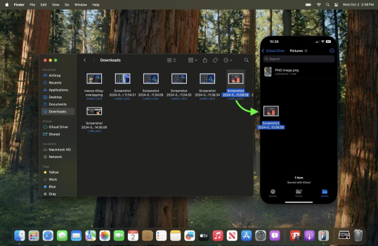
View attachment 2550781
I don't understand what functional value it brings to have things behind what you are working on be so visible.
Do folks at Apple not use their OS to "do work"?
Is it just a visual playground to ooh and ahh at as they wiggle icons and drags things around to see the effects?
It's like the next generation of the "playing with the icons on Apple TV with the Siri Remote touchpad" from when that was new.
What's bizarre is that the only consistent message Apple has made regarding Liquid Glass is that it "brings more clarity, focus to content". I don't know about anyone else, but I don't look at my content behind controls.I don't understand what functional value it brings to have things behind what you are working on be so visible.
What's bizarre is that the only consistent message Apple has made regarding Liquid Glass is that it "brings more clarity, focus to content". I don't know about anyone else, but I don't look at my content behind controls.
That is just 100% pure marketing horse pucky from Apple.
You don't bring more clarity and focus by making contrast & legibility worse while having distracting effects and translucency all over the place.
They are so consumed with their own marketing speak that they've done a full circle and are marketing the opposite of what they have done here.
It's like advertising "staying drier than ever!" by "jumping in a lake".
Awesome! I guess ChatGPT took over the Apple Development Team.

That's impressive to make Chrome look like a "lightweight App" like that.
On my wifes Mac Studio it starts right after the installation is done lol!

Honestly, there should be an option in Accessibility for the rounded corners. I can't get over how hideous this all looks. It's like a Chromebook nightmare.

They've just made everything unnecessarily complicated, and it's even more distracting.

Adding more lines for a box that sits in another box? I thought Sequoia had this figured...

Pathetic. Seqouia actually looks more modern.

They've just made everything unnecessarily complicated, and it's even more distracting.
Adding more lines for a box that sits in another box? I thought Sequoia had this figured...
Pathetic. Seqouia actually looks more modern.
Attachments
Circles, capsules, floating boxes inside floating windows inside windows, pills, bars, padding and stuffing, sorta rounded, not so rounded and really rounded corners...
Just a big vomit of UI inconsistency all over the screen.
This all makes me wish we could go back to having paid macOS upgrades so that maybe they'd hire and retain some pros and some care, thought and maintenance would go back into it again.
Just a big vomit of UI inconsistency all over the screen.
This all makes me wish we could go back to having paid macOS upgrades so that maybe they'd hire and retain some pros and some care, thought and maintenance would go back into it again.
So for me there is now just a simple way... just go back to Seqouia.
So for me there is now just a simple way... just go back to Seqouia.
Definitely remaining on Sequoia and I've also turned off updates on my iPhone & iPads and installed the tvOS profile to block updates. I don't want an "accidental update" to occur.
Register on MacRumors! This sidebar will go away, and you'll see fewer ads.