Become a MacRumors Supporter for $50/year with no ads, ability to filter front page stories, and private forums.
There are hundreds of things wrong with iOS on big screens, grid spacing is just one of them, and it's probably the easiest to fix, yet Apple neglects it which is very telling of the lacking vision of today's Apple, hence the criticism.
What's wrong with iOS in big screens? home screen looks fine on iPad Pro.
iPad grid spacing is a Health feature codenamed EFMAO (Extra Finger Movement Against Obesity)

Only At Apple - and free !
Phil Schiller won't adapt it, because it helped him lose 20 pounds (-2%)
Tim Cook estimates global surplus finger movement, with total number iPads around, to be the amazing distance to the moon ;)
Ming Chunk Know thinks the iPad mini is to be killed because its low EFMAO/Healthcare impact...
 
Last edited:
Seems more like his career path is the reason.

"Career[edit]
Duarte started his career at Psycroft where he cowrote xBill with Brian Wellington. He left Psycroft in 1996 at which time he moved to Hyper Image Productions where he was the lead designer on the Phase Zero hovercraft simulator. In 1997 he left Hyper Image Productions and moved to MagicArts where he filled the role of Vice President of Design until 1999. In March 2000 Duarte took a role at Danger as the Director of Design where his team won the 2002 Wired 'Industrial Designer' Rave Award[6] for their work in designing the Hiptop/SideKick. In August 2005 he took up a role at Helio, as Vice President Experience Design and left shortly before the company was acquired by Virgin Mobile. In September 2007 Duarte was hired as the Vice President at Palm, Inc. to lead development of Palm’s webOS Human Interface and User Experience and introduced the design of webOS at the 2009 Consumer Electronics Show. In May 2010 Duarte was hired by Google as Director for the Android User Experience working on the interface and design for Android 3.0 (AKA Honeycomb).[2]"

I knew a few technicians and programmers that worked at Danger, Inc from the first SideKick to the Sidekick II. solid blokes.

But man ... "In March 2000 Duarte took a role at Danger as the Director of Design where his team won the 2002 Wired 'Industrial Designer' Rave Award[6] for their work in designing the Hiptop/SideKick" LMAO Duarte worked at Danger?! I somehow don't think anything with the design was solely his own efforts. His best work arguably is with Android 3 moreover Android 4/5 ... that took some SERIOUS hard work and vision and to be honest Android is a LOT better off for his efforts and dare I say iOS because of the challenge brought by him on a competition platform force Apple and Ive's to get off his fat aging butt (sire) to really put in work!

I think Jony was getting REALLY bored with art exhibits until iOS 7!
 
  • Like
Reactions: Defthand
Then the question "what are they waiting for ?" arises - but answering that may delay the suggested plist fix another 5 years...

Fine, but that is a separate question. Your original claim was that apple's current projects, such as round pizza boxes, are preventing them from editing app grid spacing on the iPad. And that is not true.
 
Fine, but that is a separate question. Your original claim was that apple's current projects, such as round pizza boxes, are preventing them from editing app grid spacing on the iPad. And that is not true.
Sigh. Consider yourself a minority when it comes to answering the rhetorical question whether numerous side-activities have beneficial or adverse impact on core activities.
(before the usual hordes of patent lizards start licking their fingers : more and more outlets are offering square pizza's now)
 
Last edited:
Sigh. Consider yourself a minority when it comes to answering the rhetorical question whether numerous side-activities have beneficial or adverse impact on core activities.
(before the usual hordes of patent lizards start licking their fingers : more and more outlets are offering square pizza's now)

It wasn't a rhetorical question. As I mentioned in my previous post, you began with a claim. You claimed that Apple's current projects, such as pizza boxes, are preventing them from altering app grid spacing on the iPad. This claim has no validity.

Telling a person to consider themselves a minority has no impact on the validity of your claim.
 
Last edited:
Or, "can't please everybody" forces at work.:) This thread might not be for you either.:p

Reality distortion field is alive and well, if you think home screen looks fine, this thread isn't for you :D
"Reality distortion field"?! That's a bit harsh. Y'know there ARE people who want their iPad Pro to look like "Fisher Price's My First Tablet".
lol.gif
 
  • Like
Reactions: I7guy
I actually like things like this, but I somewhat agree that it's kinda pointless. It's also a bummer that we likely won't see anything like it. Hoping for the best though, iPad needs it.
 
Not sure this needed all the negativity. The video is quite well done.

The video is quite well done and points to the true potential of the iPad platform. A handful of fundamental changes to the platform dramatically transforms the productivity of the iPad platform.

Now the question is whether Apple will implement such concepts. Overall I think they will - they do invest heavily into iOS and now with a focus on iPads as the "new paradigm" they should add these features (iPad only) to iOS.

With known investments and enhancements planned for Siri and integration of workflow into the iOS platform - I think we will see more productivity power out of the iPad. However - as in Apple fashion - it will be done slowly.

Someone above mentioned they preferred Google Maps to Apple Maps. I used to as well - but here in Northern Virginia/DC Metropolitan area - Google Maps has been getting somewhat dodgy with freezes and odd directions. My wife and I now rely more on Apple maps as it has slowly become better, more refined, and now we find more reliable than Google Maps.

I like the concepts in the video and I look forward to seeing how they could be addressed in iOS
 
The one time I used a Nexus 4 running Android I was stunned when I first used dynamic notifications.

And a file directory... That would be amazing.

Download the Documents app by Readdle. It's free and is the file directory / finder iOS is missing. It's integration with share sheets kicks ass. I love using its built in browser with video downloader webpages to collect youtube videos and store them on my ipad for the kids.

And to OP, I think these proposed features are too complicated. Three finger drag down to get to a shelf thats basically a multi-clipboard is awkward and leads to shelf-rot - hundreds of ****** clips sitting on the shelf... then we get shelf search in iOS12? Eww. And drag drop is interesting, but not that much different than the copy paste between apps that is already implemented.

Requiring all apps to support landscape mode would be where I would start. It's super frustrating to rotate the screen to realize the app doesn't support it - and just lazy by developers these days.

Context aware and conversational siri would be number two for me. She doesn't understand what I'm saying half the time and is very limited in what she can do. Sometimes I want her to read the email I have on screen (read this email) or help me get to my content faster (find the email from Bob about Cancun) or (show me the last email from Andy) or (add Bob, Liz, and Sam to this email). I feel like Siri is missing thousands of canned actions. This is especially annoying when the text on screen shows that she understands you, but that action has not been defined in her "brain". I'm always surprised by what she can't do, and rarely suprised by what she can.

Split screen improvement would be my third. I should be able to keep pulling splits from the right side. I should also be able to pull a split from the top or bottom of the screen, or an already split panel. I should also be able to rotate a split pane to any angle I want. Mini icons on the split pane to change the split app being viewed would be really cool too. The split view app switcher is super awkward right now.

I agree with this video on the denser icons and multiple audio streams. Often I want to be listening to music in the background while I'm watching a tutorial in split screen.
[doublepost=1495375870][/doublepost]
I love my ipads. Love my pro. But I don't love the fact that I cannot make folders anywhere easily and store my content there for business purposes. Even in photos it's so lame. I want to organize simply by touch. I want videos in easy to find and use folders. I do presentations. And I'm consistently showing my entire photo library to 200 people to locate a newly transferred video. Is it me? If any of u guys have advice please share :))

I feel like a broken record, but the Documents app by Readdle does all this.
 
  • Like
Reactions: gijoeinla


Apple is planning to unveil its next-generation operating system for iOS devices, iOS 11, in less than a month. Despite the imminent debut date of the new OS, we've heard very little about what we should expect to see in the update.

Based on the fact that iOS 10 offered very few features for the iPad, Federico Vittici of MacStories, who uses an iPad for much of his daily work, has imagined an iOS 11 update wishlist that overhauls the iPad interface, introducing new iPad-only features that many pro users would undoubtedly love to see.

Vittici collaborated with designer Sam Beckett to bring his iOS 11 wishlist to life, providing concrete examples of ways Apple could redesign the iPad experience.


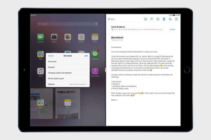
System-wide drag and drop functionality that would let users drag content between apps or from one iPad split screen window to another is at the top of Vittici's list. Images, text, links, documents, and more could be dragged using intuitive long press gestures. In the example image below, text from an email is dragged into a list in Reminders.


Yes Please
ios11conceptdraganddrop-800x533.jpg

An imagined "Shelf" feature goes hand-in-hand with drag and drop, giving users a place to store anything on the iPad they want to reference at a later time. It's similar to the desktop on a Mac, storing items for easy access.

ios11conceptshelf-800x533.jpg

Viticci's other iOS 11 wishlist items include a new Split View app picker with a search feature and a better layout, a Mac-style Finder app that works with iCloud Drive for a more consistent document-finding interface, a denser home screen, multiple audio streams, and a refreshed design with bolder typography and more of a focus on visual feedback.

For additional images and a more detailed explanation of the items on Vittici's iOS 11 wishlist, make sure to check out the full article over at MacStories.

Article Link: iOS 11 Concept Imagines Overhauled iPad Interface With Drag-and-Drop Functionality
[doublepost=1495388150][/doublepost]
The "point" is that these people don't work for Apple and have concepts that they wanted to assemble into a video and share with people. It is the same "point" of those who create artistic concepts of iPhones. They have some ideas and they're supposed to sit on them because WWDC is 3 weeks away? What is the point of THAT?

Another poster asked why they didn't come out with this 6 months ago. That's a silly statement... as if artistic creativity is something that can be planned. Maybe they DID have the concept 6 months ago but spent their spare time working on the video and it took that long.

Speculation....
Perhaps they saw what iOS 11 is going to be (minor updates) and did this as a way to "shame" Apple for not advancing iOS the way it needs.
S Racer, on top of it as usual
 
Says who? How else do you expect to access your apps? They're literally in front of your face for you to tap. It couldn't be any simpler.

Actually, the app I want to open is seldom on the current screen. I have dozens of apps on my iPad. Obviously, only a limited number of app icons can appear on the same screen since scrolling is not an option. Consequently, this necessitates having to group the apps in some manner that is intuitive to the user. Apple’s solution is app folders, but the concept is somewhat crude in its implementation; even folders can have multiple screens.

Swiping through numerous screens to find an app is laborious. Using Search to access an app is much faster but requires you to memorize every app’s name. I think something akin to MacOS’s app launcher—or one of the third-party app launch utilities—is needed. Even scrolling on the same screen would be an improvement. Anything that will limit the number of necessary screens to just one. (Screens should be reserved for open apps). Perhaps a scaled version of the watch’s app launcher is the solution.
 
Last edited:
  • Like
Reactions: viperGTS
Not sure this needed all the negativity. The video is quite well done.

It is. And the features it proposes are worth looking at. But the author is not claiming that any of these concepts are even being considered by Apple for the next or any future update. They are where he thinks the IPad OS should be heading. Interesting, but nothing in the article or video is likely to be included in the next OS. Or the one after that, or the one after that.
 
It wasn't a rhetorical question. As I mentioned in my previous post, you began with a claim. You claimed that Apple's current projects, such as pizza boxes, are preventing them from altering app grid spacing on the iPad. This claim has no validity.
Telling a person to consider themselves a minority has no impact on the validity of your claim.
Whaha - it says they prioritize empty pizza box space over unused screen space
Design "professionalism" - only at Apple...
 
Last edited:
It's a lot easier to do a mockup than to actually implement it. Just saying…

True. Yet, it’s astounding that a company with Apple’s resources, acquisitions, and hand-picked experts are unable to imagine elegant, but powerful, UX/UI features for their mobile products, as their predecessors did for Apple’s MacOS (with much fewer resources and people).
 
It's a lot easier to do a mockup than to actually implement it. Just saying...
It depends which side of the fence you are from. Generally speaking, it's a lot easier to do a mockup if you have the designer skills and experience, whereas it's a lot easier to program it if you have the developer skills and experience.
 
  • Like
Reactions: Demo Kit
I donate my Mondays to a senioriPadd class and they still swipe to unlock the ipad or iphone when turning it on.

There’s been a few comments concerning the difficulty that the elderly have using iPads. Well-meaning persons would like the iPad to be even more simplistic. The truth is, no one is doing the elderly any favors by giving them consumer electronics and appliances. The frustration the devices cause outweigh their potential value. Everyone becomes tech wary as their brains age. Even devices that were once familiar, like a TV remote controller, seem complicated. It’s best to stick with gadget-less pleasures—printed materials, written letters, phone calls, printed photographs, and physical visits.
 
There’s been a few comments concerning the difficulty that the elderly have using iPads. Well-meaning persons would like the iPad to be even more simplistic. The truth is, no one is doing the elderly any favors by giving them consumer electronics and appliances. The frustration the devices cause outweigh their potential value. Everyone becomes tech wary as their brains age. Even devices that were once familiar, like a TV remote controller, seem complicated. It’s best to stick with gadget-less pleasures—printed materials, written letters, phone calls, printed photographs, and physical visits.

I think you might enjoy reading 'The Design of Everyday Things' by Don Norman. His basic premise is that design needs to consider SAC, which is respectively:
- Signifiers: Things that signify to you what to do with them e.g. a handle means to pull, a push plate means to push
- Affordances: Something that the design allows you to do
- Constraints: Something the design stops you from doing e.g. put the wrong plug into an electrical socket
These basic design ideas affect humans of all ages and from experience, Apple tend to be ahead of the pack with regards to incorporating them into their design philosophy. That said, there will always be those few projects that fall between the cracks, but I completely disagree with your viewpoint that elderly people should be removed from technology the older they get. I feel it's up to the people who design the products to keep the innate human behaviour and heuristics in mind when designing their products for the masses.
 
  • Like
Reactions: I7guy
iPad grid spacing is a Health feature codenamed EFMAO (Extra Finger Movement Against Obesity)

Only At Apple - and free !
Phil Schiller won't adapt it, because it helped him lose 20 pounds (-2%)
Tim Cook estimates global surplus finger movement, with total number iPads around, to be the amazing distance to the moon ;)
Ming Chunk Know thinks the iPad mini is to be killed because its low EFMAO/Healthcare impact...
Well in that vein if you are sitting around not getting exercise you might as well get exercise from moving your fingers. Apple seems to have your best interests in mind! (Do I need a /s?):p
 
There’s been a few comments concerning the difficulty that the elderly have using iPads. Well-meaning persons would like the iPad to be even more simplistic. The truth is, no one is doing the elderly any favors by giving them consumer electronics and appliances. The frustration the devices cause outweigh their potential value. Everyone becomes tech wary as their brains age. Even devices that were once familiar, like a TV remote controller, seem complicated. It’s best to stick with gadget-less pleasures—printed materials, written letters, phone calls, printed photographs, and physical visits.

Ageist much? At 67 I often explain to 20-30 year olds how to use their iOS devices.
 
Someone above mentioned they preferred Google Maps to Apple Maps. I used to as well - but here in Northern Virginia/DC Metropolitan area - Google Maps has been getting somewhat dodgy with freezes and odd directions. My wife and I now rely more on Apple maps as it has slowly become better, more refined, and now we find more reliable than Google Maps.

I like the concepts in the video and I look forward to seeing how they could be addressed in iOS

Same experience here. Google Maps used to be better than Apple Maps. But not any more. Same problems with it that you experienced. No problems at all on Apple Maps.
 
I just had time to do a full look over these concept features.

First very impressive layout and comprehension of the vision.

The File Manager or 'Finder' seems initially to "satisfy all those complaining the iPad or iOS in general should have it"
Funny enough it's ALREADY THERE and has been. The only part of this concept is that it makes it accessible as a stand-alone app and NOT part of the core system like the Share Sheet or when you want to copy/edit a picture. Anyone else really see the file system being just the same as within iOS' apps? Take a GOOD look there.

Finder concept still isolates the main starter column-set for each app nothing accessible to the root. nor should it.
 
Register on MacRumors! This sidebar will go away, and you'll see fewer ads.