TheYayAreaLiving 🎗️
Suspended
iOS 16, Always-On Display! Do you want this feature?
iOS 16, Always-On Display! Do you want this feature?
Yes Yes Yes 😂😉iOS 16, Her Zaman Açık Ekran! Bu özelliği istiyor musunuz?
[MEDYA=twitter]1521944193349918720[/MEDYA]
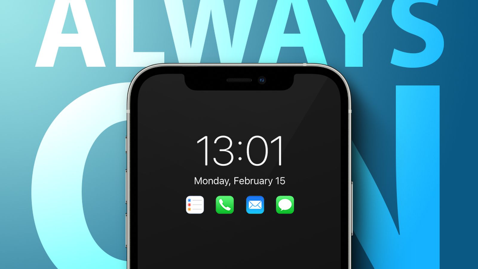
Well...you are missing the key things that most want "always on" for.Here’s a little mockup of what an always-on display could look like. It’s not quite as good as the one mentioned above, but that’s ’cause I wrote it in SwiftUI in about ten minutes. Enjoy:
On iPhone 13 and iPhone 8
View attachment 2001361
Just the raw image (the ones above are pixelated for whatever reason, this one is higher quality):
View attachment 2001362
It has the time on top, followed by the date, like a regular Lock Screen, but below that are two complications showing an alarm (if one is set, and yes, that is when I wake up), and the current battery life of the phone, this is useful for when it is charging. Below all of this is four buttons that give you quick access to Airplane Mode, Do Not Disturb/Focus, Flashlight, and Camera, respectively.
Let me know if you’d like me to add anything, and PM me if you’d like the code.
Agreed. The ability to properly "theme" a device is long overdue. The horrid process of doing it using app/icon by app/icon using shortcuts is ridiculous... and when they do it, it needs to be done in a way that preserves the ability to retain the functionality of 3D touching icons for sub-menus..If all we got was the ability to "snap-to-grid" apps without upper-left-justifying them and speed and stability updates...I'd be happy.
That said, I hope for improvements to "theming" (uptake exploded with iOS 14, but seemingly the functionality is untouched since then) and more-interactive/improvements to widgets.
Ok, gimme a sec..Well...you are missing the key things that most want "always on" for.
Email, message, etc. notifications. Usually just the symbol for those items and a number on them to show that you have new messages. You should have the option to only include which ones you want like mail, messages, Instagram, Facebook, Snapchat, WhatsApp, etc. but they are usually limited to 4 I think on most phones.
The other thing I loved about Windows version was that it was basically "black and white" to save power I'm sure, but I liked the way it looked....and it would be really dim for night mode, so it was on, but I would wake up and look over and could see the time and yes, if any notifications came through (if I wanted to see that). It really performed well as a clock on my nightstand.
Ok, how’s this:Well...you are missing the key things that most want "always on" for.
Email, message, etc. notifications. Usually just the symbol for those items and a number on them to show that you have new messages. You should have the option to only include which ones you want like mail, messages, Instagram, Facebook, Snapchat, WhatsApp, etc. but they are usually limited to 4 I think on most phones.
The other thing I loved about Windows version was that it was basically "black and white" to save power I'm sure, but I liked the way it looked....and it would be really dim for night mode, so it was on, but I would wake up and look over and could see the time and yes, if any notifications came through (if I wanted to see that). It really performed well as a clock on my nightstand.
I’ve said for ages that in-built Apple apps should be decoupled from the OS and can be updated via the App Store and not depend on iOS upgrades.This is a more under-the-hood change:
Let apps be modular or branch upon different hardware/iOS versions;
and enable nearby/under-the-same-LAN devices exchange data without needing to upload/download to the Apple servers (e.g. iPad and iPhone downloading the same app or Photo library syncing).
Ok, how’s this:
View attachment 2001386
I added indicators for messages and email down at the bottom, and the bell is how many notifications total. I would have done Twitter or something, but that’s not in SF symbols, and I don’t feel like making a twitter symbol at the moment 😛
I didn’t think to add that in the first one because the last thing I want to see in the middle of the night is social media notifications. Lol
…aaaand here you are:Niiiiiiice!
But I would prefer they are up higher …everything centered near the middle of the screen.
 www.macrumors.com
…aaaand here you are:
View attachment 2001478
…tho I prefer it at the bottom, I feel like it looks less clean and more cluttered with a pyramid of icons centered in the screen.
(also, in response to your comment about the one on Windows Phone being B&W, I didn’t do that here because the user needs to know that the buttons are buttons, and they’re orange because that’s the easiest color on your eyes if you just woke up)
Everything I've heard says that it is hardware dependent. This is probably to optimize the OLED to prevent burn-in. I think that's the only reason we haven't seen it to date.So is an always-on display hardware dependent as well as software? They couldn’t retrospectively introduce it for the existing OLED phones?
I truly, deeply struggle to believe that it’s hardware dependent. Back in 2007 I had a Nokia E62 with AOD on an LCD screen! Several Nokia Windows Phones with AOD on OLED screens in the 2010s and various Android phones with AOD on OLED screens as well.Everything I've heard says that it is hardware dependent. This is probably to optimize the OLED to prevent burn-in. I think that's the only reason we haven't seen it to date.
Take four:I wanted to stare at it more to take in your thoughts and preference about position, but "Apple logic" says that your colored buttons should actually be located on the bottom as they are today (at least the flashlight and camera) and in the same position as they are on the lock screen. So, place the flashlight to the left, camera to the right and then airplane/night mode in the middle area.
The icons and numbers in the middle need to be closer together...again, more like apple does today. So imagine the icons are much larger with either the numbers overlayed as the inverse color on them or in your gold color on top/upper right corner.
The idea is that you are able to easily see the info at a glance or in the middle of the night.
Again, just my opinion, but I find the icon/number positioning confusing at a glance.Take four:
View attachment 2001652
I actually like this a lot better.
I made the notification counters orange and moved them to the top of the screen, and the shortcut icons are now larger, at the bottom, and in a more plausible order.
*phew*
Anything else?


Hmm. I’ll see if there’s a way to add a badge like that in SwiftUI. I could probably still do it, but it might take a while. Gimme a sec.Again, just my opinion, but I find the icon/number positioning confusing at a glance.
Apple puts the numbers right on the top right corner of app icons...and I would actually prefer seeing them right on top of a larger icon.
They are just too separate for me...
Here is how Nokia Glance looked on Windows Phone.
Couldn't agree moreI truly, deeply struggle to believe that it’s hardware dependent. Back in 2007 I had a Nokia E62 with AOD on an LCD screen! Several Nokia Windows Phones with AOD on OLED screens in the 2010s and various Android phones with AOD on OLED screens as well.
All of them would move the AOD screen content around to prevent burn in; some just a few pixels at a time to the point you could hardly tell anything moved while others would jump the content around on the screen every so often at a fixed interval. For years now, Samsung even allows you to download a first party app called Good Lock to let you customize your Lock Screen and AOD to your heart’s content.
I very much doubt that any recent iPhone doesn’t have the hardware capability to do something that phones from 15 years ago could do, and can be added to literally any Android phone via various Play Store apps whether the phone supports it out of the box or not.
My guess is they will add AOD to a future iPhone generation and not backport it to existing models, as they have done with other software features previously, in order to drum up sales for “the new iPhone” but I don’t think it’s a technical limitation.

 said:
said: