Dang, if you think that this is life-changing, then some of ya'll have spent WAY too much time thinking about your laundry! 🤣
Got a tip for us?
Let us know
Become a MacRumors Supporter for $50/year with no ads, ability to filter front page stories, and private forums.
iOS 17 Photos App Can Tell You What Those Confusing Laundry Symbols Mean
- Thread starter MacRumors
- Start date
- Sort by reaction score
You are using an out of date browser. It may not display this or other websites correctly.
You should upgrade or use an alternative browser.
You should upgrade or use an alternative browser.
The most helpful feature that no one asked for and everyone will ignore.
The garment tag in the article photo is for a $350 parka. I guess I should apply for a MR job!!!
;-)
;-)
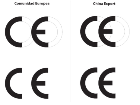
Off-topic, but every time I see that CE icon I marvel at how bad it is. I cannot even fathom how someone can be so incompetent at graphic design they make an icon whose standard use is to show up in a row with other icons, that has so much pointless whitespace in the middle looks like two completely unrelated things next to each other.
The FCC logo is kinda clever, though.
I created an account simply to say: About ducking time someone did something to make these laundry hieroglyphics comprehensible! Do more neat stuff like this Apple!
Because these symbols are international and English isn’t. Symbols are always preferred to English text when technical stuff is involved. Even for technical drawings modern standards retired certain English terms in favour of international symbols.Why don’t the manufacturers use plain English. I like this feature though.
China faked it and improved it at the same time!Off-topic, but every time I see that CE icon I marvel at how bad it is.

Differences between ce and china export markings | Kimua…
Learn more about differences between ce and china export markings at Kimua Group. Advanced engineering, lifting and transport solutions.

Laundry Lens got Sherlocked.

 apps.apple.com

Laundry Lens App - App Store
Download Laundry Lens by Alan Pegoli on the App Store. See screenshots, ratings and reviews, user tips, and more games like Laundry Lens.
Thanks I guess. It will probably be helpful since those tags tend to have microscopic text.
iOS 17 lets you air your dirty laundry.
Can’t innovate my ass!
Can’t innovate my ass!
Please, do one for the traffic lights, still confused.
Traffic signs too, they are confusing. I get honked at and flipped off often because of this.Please, do one for the traffic lights, still confused.
Symbol Shmymbol, Bleach Baby Bleach and I nuke all the germs and dirt at the hottest longest cycle for everything. Although I'm confused as to why all of my clothes are pastel shaded.
Register on MacRumors! This sidebar will go away, and you'll see fewer ads.


